The unveiling of the scheme for the revised central Wellington Library has had an interesting effect. Some people have been shocked at the price, of around $188 million, but I checked back on the estimates spoken about at the time, and that is bang on target from what they estimated when the Council voted to do it. Others have said they are aghast at the architectural changes inside the building, but again, the inside was always due for a major refurbishment as it was old and haggard and run down. Many of the architectural luvvies have been saying how wonderful it is, but I don’t honestly think there has been any real architectural focused critique as of yet, and so I guess that’s where the Eye of the Fish could stand in.
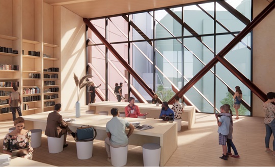
Not being an accredited member of the Press however, we were not invited to the launch, and not being an employee of Athfield Architects then I honestly haven’t got a clue exactly what they have done. All I can do is try to decode the few snippets of views they have given us and see if we can make sense of them. Luckily there are many snippets, but all without an explanation. Feel free to chip in and explain if you know more than me.
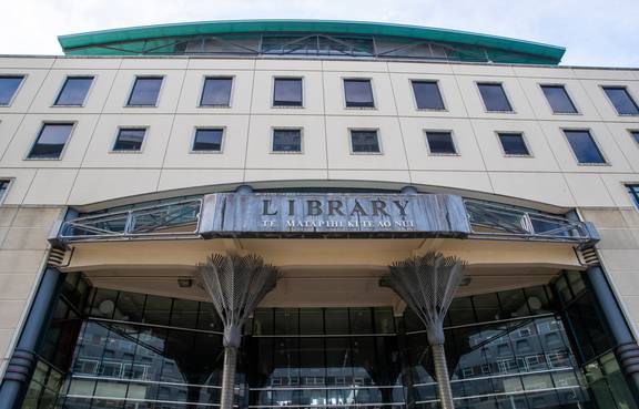
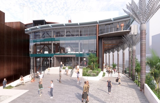
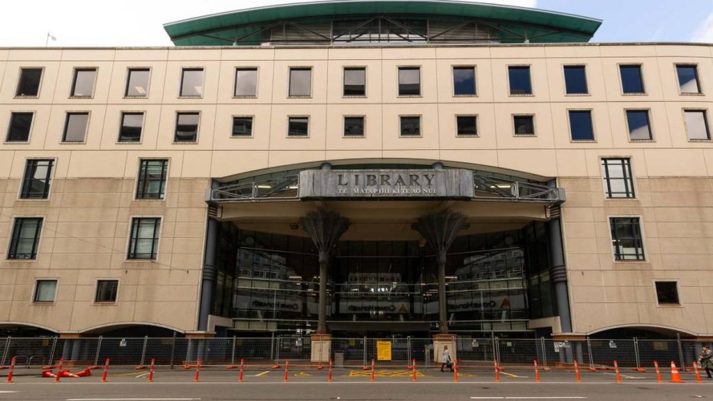
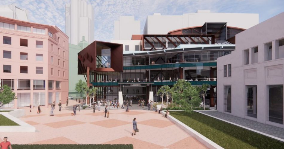
I’d like to start outside the main front door of the Library, where famously there was a wall of stone (well, concrete precast panels really) held up by stunted quadriplegic dwarf columns and some mad PoMo low-level arches. Is that still there? Frustratingly, we have seen nothing in the way of renders from Ath’s from this direction, so we are no further ahead. There are some renders showing the Nikau palm columns, so clearly those are still in the scheme, but of the blank wall, we are none the wiser. There has been comments though that they have been trying to get rid of mass and stiffness and hence concrete walls, so it could have been ditched. What it may have been replaced by, however, we simply don’t know.
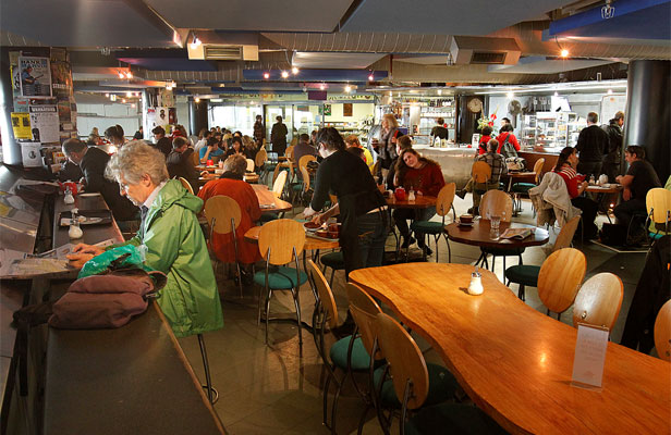
Let’s go inside then, where if you remember there was one entrance point, which then broke into two parts – either straight ahead into the Library or up some stairs to one side to get into Clarke’s Cafe, where the glitterati came to do their business and where students queued up for delicious cake. Damn good cafe. Now I’m distracted, dreaming of cake gone by… Damn fine cake too.
Yes, got it now – so there was a bank of stairs and escalators straight ahead, taking you up to the upper floors. For some reason they always irritated me because they were so badly detailed, but that is the sort of quirky detail that Athfield would produce and the rest of us would put up with – in any case, the escalators appear to have been ditched, in favour of just stairs. Brand new set of stairs, obviously. There was also a set of fluffy white clouds that floated near the escalators, ostensibly to look like a dreamy skyscape, but really just to muffle the noise emanating as a dull clank from the escalators and turn it into white noise.
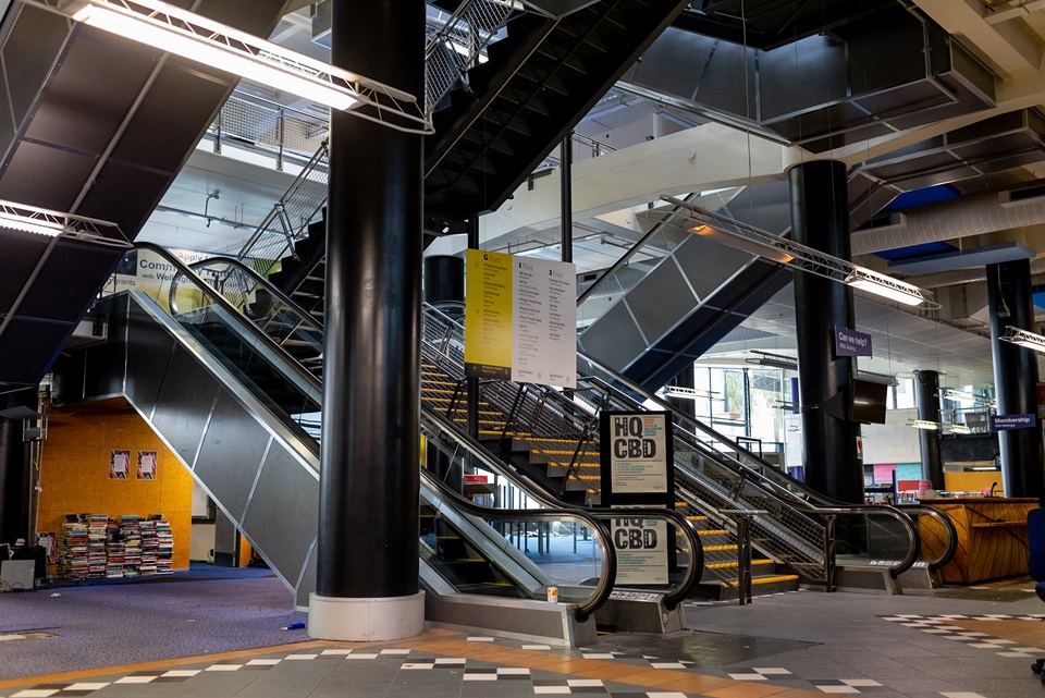
Over time though, the fluffiness lost its whiteness and instead grew dust and detritus and turned grey-brown from thrown banana peels and paper darts from passing schoolboys, and so I hope to God that they have been ditched too. The clouds I mean, and the banana peels and the paper darts, but not the school boys.
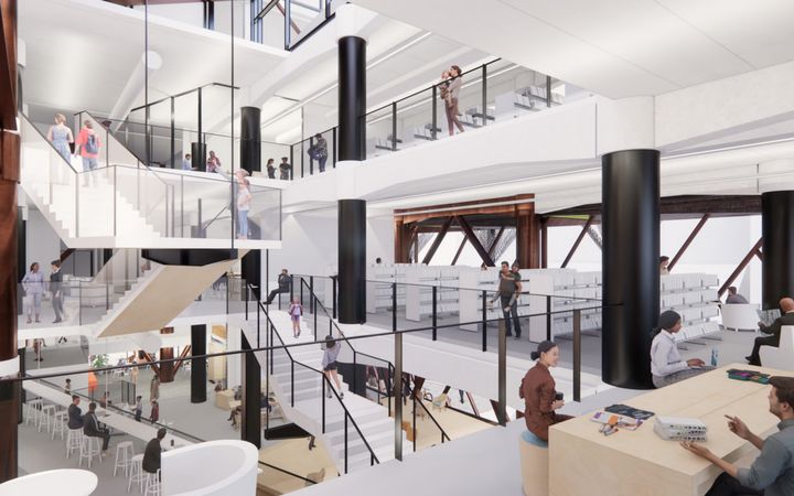
I’m picking that if the escalators have gone, then vertical access will just be from lifts now (and the stairs) and so new sets of lifts will have been factored in too, which will be far better than the old ones. Seeing as the Council offices were also accessible via these lifts it was always an odd arrangement – let’s hope they have planned for new lifts, more lifts, and much better lifts. Lifts are, of course, always a fun/tricky element to try to install in a building with base isolation, and particularly if you are coming up from a basement that is below the base isolation.
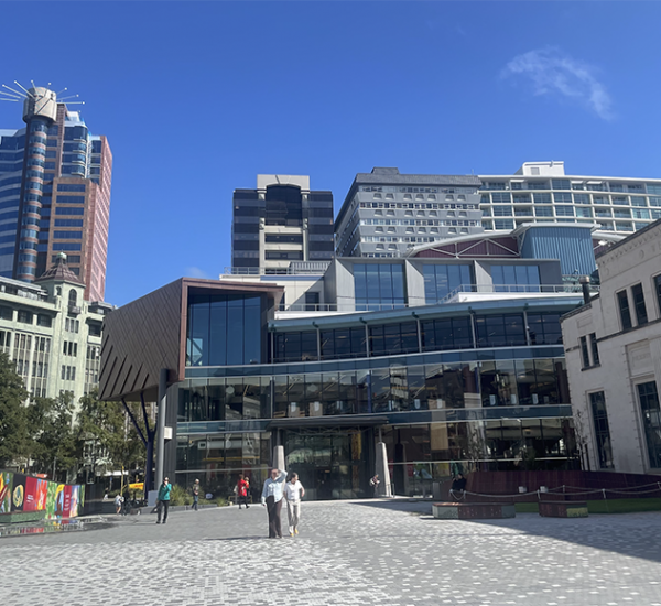
Speaking of Council offices up the top of the building, this still appears to be a thing, and I have no idea what they were like before, except via some pictures courtesy of Apple Maps, which shows us that there was a rectangular box with more stiff concrete-looking frontage, overlooking a vast expanse of blue membrane roof. Was that a leaking hazard, I wonder? In any case, it is all change up top, as there are curious new rooftop appendages. Perhaps that’s a new office for the Mayor. Would Mayor Andy Foster care to comment? They look… well, they look added on, and badly added on too. Does it matter? Does anyone ever look down on the rooftop?
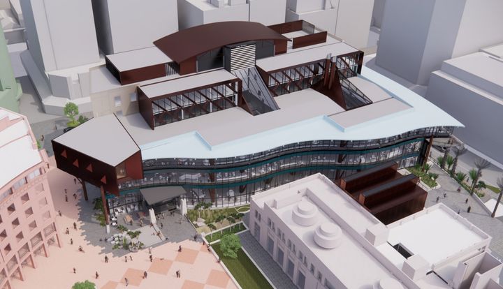
There is also a really curious new bed-side table on stumpy legs that is sitting to one side of the Library as well, in a weird dystopian reflection of the hideous black box over-bridge that used to be there many years ago. It didn’t work then and really doesn’t need to be brought back now. The black over-bridge (euphemistically called “The Portico“) was an awful piece of bad design back then, and definitely has no reason to be resurrected as part of this new scheme. Of course, what it used to do was to connect the Library to the Pink building, and allow Council staff to go from one building to another without having to let their feet touch the ground and be sullied by contact with the common people. That is you and I, in case you weren’t paying attention.
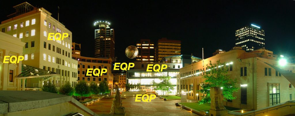
But seeing as the Pink building is also doomed to demolition, and possible replacement who knows when by who knows what, then there seems little point in the expense of this. A plea goes out from me to Zac and John and the Athfield crew – please ditch this monstrosity. I wonder if they ever read the Eye of the Fish? Probably not – few do these days, because of my lack of a regular posting. Perhaps they may find it one day, and reply…
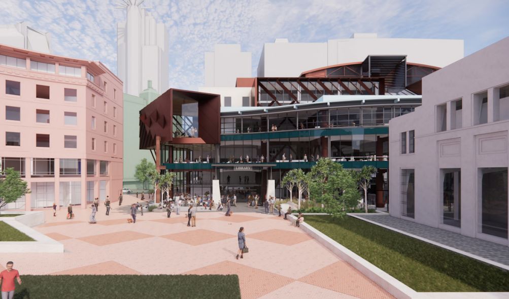
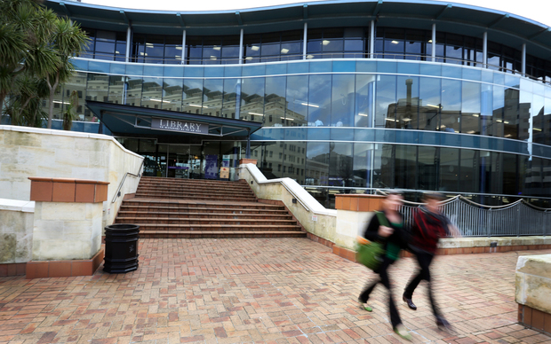
Thankfully, to the east side of Te Matapihi ki te Ao Nui the windows onto the world are still there, giant panes of glass set in wavy curving lines looking out to sea – or at least out to the Te Ngakau the Civic Square. Or, more truthfully, to the blank side of the City Gallery and the pools of water that were empty more often than not. The big change this side however is the loss of the stair up into Clarke’s Cafe, up and over the Library below and somehow slipping past the one or two small booths/mini shops up top next to the Cafe. This entry stair is gone (and along with it also gone is the disastrous manky failed green wall that someone tried to stick to the side of the stair) – but in its place we now apparently have five – count them, FIVE, entrances to the Library. Talk about an open door policy !
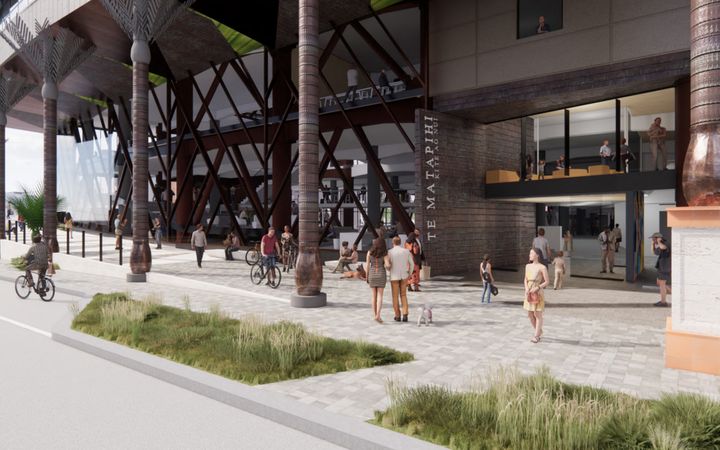
This is where the new plan really shines (I presume it does, having not yet seen any plans), with the introduction of the four new entrances. Most buildings usually only have four sides, although this is not “most buildings” and heavens only knows how many sides it has if you count all the wiggles as sides, but this should really do some great works for openness. Te Ngakau badly needs more openness for it to work, with the opening up of the sides of the square to provide more life and activity. The City Gallery is locked off behind its stone wall, as is the MFC, no-one quite knows what the Old Town Hall will look like, and the CAB and the MOB buildings are both due for the chop. That’s not going to be an easy exercise, especially when you factor in not just a metre-wide gap on all four/five/sixteen sides of the Library needed for the base isolation system to wobble around in an earthquake, but also the 600mm rise in height that the Library ground floor is going to have, ostensibly to combat climate change’s rising sea levels. In actual fact, I think it is going to be raised 600mm because that is the height of the base isolator mechanism that will sit under every concrete column – all the columns will be being cut with a diamond saw, and the column structure below will be poured anew, far stronger than before, and then one day the entire building will be jacked up 600mm higher and 88 new lead/rubber isolators will be carefully slid into place. That’s my guess anyway. Tell me if I am wrong.
My goodness, this is a long post – I haven’t written this much for ages! Feel free to leave if you’re bored. But here comes the meat in the sandwich, the bacon in your butty.
The really big issue here is that this building was built right at the end of the Post-Modern era – by one of the masters of the joking and self-referential / semi-deferential nature of PoMo. Sir Ian Athfield was a one off and was at times a brilliant architect, although at other times just mildly amusing, and no doubt he was probably at times a grumpy old bugger, the same as the rest of us. I don’t know – I never saw him grumpy, and even when he was being serious he still had a grin on his face. Personally I think he was best on houses, especially his own eco-village which is by far New Zealand’s best example of a co-housing project, and simultaneously also the worst example of water-proof detailing the country has ever seen. The practice has changed a lot since he died, or even before, and especially in relation to multi-storey buildings. Ath himself was great at the manipulation and amalgamation of small residential spaces, but I feel that the practice itself still struggles with the bigger buildings. It must be a frustratingly difficult practice to work for, with the ghost of King Ath always looking over your shoulder, and the whole world (including me, I apologise) feeling free to criticise the work you are doing. Even more so on a project this size and this important. The Library was always Ath’s masterpiece of big-scale work, with a team of five or ten (how many? I’m not sure) working on it, and anything you do to it bound by constant scrutiny from the city, from the residents, the council and of course by other architects.
Post-Modernist architecture by its very nature is going to be referring back to earlier times, and so this building has it in spades, not only to its roots in European city walls, classical orders of columns and their evolution into Nikau palms, ground-breaking integration of cafe and peanut brownies into the former hallowed realm of the Library, but also as to the appearance of its own pre-quake self. Hopefully not all things are as yet set in stone. The Portico-replacement that feels like a bed-side table to me, or to a 1950s TV set to others, should go. Yes, perhaps something should go there, but probably not yet, and certainly not that. Don’t we need to wait until the Pink building has been demolished or whatever its fate is – when we know what is on the other side of the view shaft, perhaps we rePortico then, but what is the point of doing this now? The rooftop extensions – I need to know more, but they look weird and added on, not carefully incorporated into the design. On the whole though I really like it and I’m going to wait with suitably bated breath for its coming reincarnation. It’s resurrection we await. It’s coming we proclaim.


Thanks for this, a great read. It is really good to see Wellington slowly ,catching up with smaller and nimble places that have broken down the ridiculous barriers between ‘libraries’, ‘museums’, archives’, ‘galleries’ etc. etc. In addition, the plans for a cafe spilling onto the outdoor areas should be a big improvement, especially if service and food is good with affordable prices. And that raises the larger issue of the whole outdoor area between Old Town Hall, City Gallery, and Library. Years ago we were told it would be the new ‘town centre’. But in reality crowds of people during the day, use the Lagoon/Te Papa/Circa vicinity and the city streets. This idea of a ‘civic square’ would work, if it had the offer of lots of things to do, day and night and lots of people living nearby. At least we are getting more people moving into the nearby Victoria St area. How hard will it be to have the area more like bustling friendly Bergmannkiez in Berlin, and less the Civic Square of old?
I need to know more – and re-read Levi’s first responder take a few more times to get my head around what is being proposed, but meanwhile I’d like to intercept a passing comment by fellow player Palm Tree Meads.
There is a case for a pantheistic redrawing of institutional boundaries in the cultural sector and a few shining examples of where broken barriers can lead ( check this guy out: https://www.youtube.com/watch?v=j3izd9U9xm4 ). But inside central and local government bureaucracies, talk of barriers provides useful ammunition to the neo-liberal anti-intellectualists. When mergers of libraries, museums, archives and galleries are proposed, the euphemisms fly. Silos will be busted, diversity trumpeted and elitism given a good spanking. Oh, and operational efficiencies will be achieved. In short, the managers win, the curators lose, the generalised absorbs the specialised and nuance evaporates.
Ask Hamilton and Palmerston North where their art galleries have gone. In the 1990s the rationalists of New Plymouth proclaimed the logic of combining the Govett-Brewster with Puke Ariki (the pre-merged library and museum). You can bet that there would be no Len Lye Centre if they had had their way.
Let te Matapihi be the best library it can be – and let there be proper museums and galleries around it. After all, Wellington is not Te Kuiti…
Thanks for the feedback, both of you. I like that last line, and heartily echo it: Wellington is not Te Kuiti.
It is a long slow process, writing a blog, for which payment never comes and thanks only come rarely. That post took me about 5 hours of writing and research etc – eg most of Sunday. But at least it was a decently long post, with (hopefully) some good thought behind it. My shorter posts tend to be bashed out quicker, and are not as well thought through as a result.
There was a letter to the DomPost the other day (Friday? Saturday?) from Stuart Gardyne, lamenting that people were using pseudonyms and how he thought that was unfair and encouraged nasty behaviour. He has corresponded before with this blog, and hopefully he doesn’t tar us with the same brush. I maybe behind a non-de-plume but I’m not a troll (and no, I honestly cannot claim to be a Captain, of Captain Nemo fame). As always, and as per the writers here before me, the posts here are aimed at discussing ideas and concepts and buildings, rather than actual people. I hope you don’t all mind the non-de-plumes continuing on.
A serious response…
https://www.patreon.com
Who else would pay for a weekly (give or take) serving of steamed Fish?
Clearly not many, if any, Aunt Fenny….
I have to take issue with your comments about “the portal” (NOTE: Not “the portico”). It was an important architectural component of the Library and Square’s composition that contributed to the PoMo narrative of the Square Precinct – it was intended to provide a strong expression of “city gate” – framing and drawing the eye to a distant view of the Monastery above Oriental Bay – and making a formal and visual drama of entry into the Civic Square from the city – a formal “gap” in the composition of the “city wall” frontage of the Library to Victoria St.
It’s visual aesthetic aside (and I’m inclined to agree with you here) its removal was (in my view) a great mistake as it immediately devalued the “framed” experience of entry into the Square from the city streets on the inland side of the Square and took away much of the previously strong sense of the city entry to the Square. While the new design doesn’t rebuild the portal (impossible given the likely future demolition and replacement of the curved and earthquake-compromised CAB building) it does attempt to increase the sense of entry of “the gate” referred to above.
I also lament the apparent removal of the original (and ground breaking) “public route” through the Library – up from the Street Entry through Clark’s Cafe and on through to the exit and stair down to the Square – as this was one of the real innovations of the original design where the traditional “guarded and monitored” internal space of the library was broken open and democratised by the ability to take an open, public route through the building without having to pass through the inner sanctum of the library itself.
As a side bar to the apparent removal of this public route is the removal of “the bridge and stair” exit from the building to the Square on the Square’s side of the original building. This did two important things for the Library’s relationship to the Square – it dramatised and legitimated the existence of the “watercourse” (or ponds) between the Library and the external edge route along the Library’s glass wall to the Square and provided an experiential public integration between the Library as a discrete building form and the Square as the city’s principal public space. This now appears to be at risk of removal which is a sad state of affairs.
While I realise and accept that the Library required an update, I don’t believe this should have been at the expense of the original visual and experiential qualities of the original library design – which was a “wall to the city” balanced by a “giant bay window to the Square” from the rippled glass wave of the building’s face to the Square and the way the interior space of the Library expressed that. All the new internal daylight sources provided to the revamped interior and the extensive new areas of perimeter glazing would seem to suggest a major downplaying of the original architectural intent – something that wouldn’t sit well I imagine with the recent Grade 1 heritage listing of the existing building.
There is no doubt that the requirement to update the Library was a necessary and complex task.
It is that this should occur alongside what can only be described (in the hands of Ath’s own firm!!) as a complete frontal lobotomy of the original (and still utterly relevant) urban design concept of the Library and the Square, is a very sad outcome and simply points to what we have lost in no longer having Ath’s genius and city building ability that was the creative drive that made the admired Square and its surrounding public buildings in the first place.
Stuart Niven.
NB: My opinions have come from being a former member of the original Civic Square Design Team, a close friend and admirer of Ian Athfield, and Wellington City’s first urban designer)……..in other words, I was an “insider” to the process that created the Square and brought it into being and (now) a very sad observer of the way the City has allowed (and continues to allow) this extraordinary and unique civic composition fo fall into disrepair and in attention……… also expressed in the recent, and utterly woeful, WCC strategy for the future of the Civic Precinct.
How the City can choose to wilfully and comprehensively forget the detail and rationale of one of its most important civic creations is completely beyond me!
S
I have come late to this discussion, as I had been under the impression that EotF was hibernating. Very pleased to see its woken.
Stuart Niven, you will be further disappointed about the future of te Ngakau. I’m not but I suspect you will be based on your lament about changes to the Library / te Matapihi. I’m not because the old Civic Square, along with its successes and strengths, has many flaws. But will it become a better urban space or something lesser.
I imagine the following will happen,
1. CAB will be demolished and the Ngakau opened up to Victoria St (and Fork and Brewer!). Whether that site gets rebuilt may depend on what happens to the MOB. How best to address the resulting openness to the street will need much thought,
2. the abandoned and seismically compromised Capital E will be demolished. BTW Capital E will occupy part of te Matapihi,
3. the seismically compromised City to Sea Bridge will be demolished due to CapE demo and to allow light rail to pass along Jervois Quay. The median strip columns get in the way and I think the height clearance may also be an issue. As it turns out the top of the bridge is a very well used and enjoyed space – people love to linger there and its Rewi Thompson / Para Matchitt design is special. However a view from the Ngakau to the harbour and an at grade pedestrian crossing are also appealing. Chris Kelly visioned this several years ago and I’d like to see his scheme again,
4. with the bridge gone the ramp down to Harris St / Victoria St corner will be redundant. I am aware why the ramp was created however it has had some unexpected consequences which Ath and the design team may or may not have predicted. Having worked on the Gallery I am aware of its consequences and have come to the conclusion that its more of a problem than a success. It is a barrier preventing the Gallery connecting to Harris St. It creates a more or less continuous ‘inactive edge’ to Harris St, and along with the ‘dead’ edges on the other side of Harris St creates one of Wellingtons least urban streets with nil active edge. It largely prevents pedestrians accessing te Ngakau from Harris St. And most detrimentally, it allows pedestrians to take a short cut and avoid passing through Civic Square – robbing it of much actively. I will be delighted if and when it disappears. A consequence will however be that the new te Matapihi NE mezzanine entrance (one of the three new entrances – not four) will be high and dry and the Harris Street nikau colonnade will lead to nowhere.
In addition is the vacant Illot Green site. All this leads to an uncertain future with the probability of a partially completed urban precinct for many more decades. Thankfully the Town Hall and Library will rejoin the Gallery and MFC (which actually doesn’t really contribute much to the Square) within 3-5 years.
“Hibernating” ? What a wonderful idea – to go to sleep for 3 months of the year… Good to see you back here Stuart G and Stuart N – and great comments, both of you.
What a wonderful response, and from someone I respect so much as well! Thank you Stuart Niven! Where even to start to reply?! Perhaps I don’t even try to reply, but leave it up to others to post their views – but I will just post a couple of Links to previous posts where we discussed the Portico/Portal.
from January 2013, Maximus posted this: https://eyeofthefish.org/meh-portico/
from October 2014, Maximus again posted: https://eyeofthefish.org/portico/
The late, great, lamented Maximus ended the second posting by saying the following mad piece (you’ll need to read the full post for it to make any sense):
“Where was I ? Chained to a rock, or being thrown out the door several stories high above the entrance to Civic Square? I forget. Umm, oh yes – details. Yes: the portico must have been designed to be held firmly at one end, and then to seismically piston in and out at the other end, like a giant black square pistoning thing, but instead we now know that it would destroy the buildings at both ends, and then plummet to the ground, killing all the Japanese tourists gathered in the City Information centre below, and then crashing through the thin floor slab to implode and pancake in the basement carpark below. You’ve got to face it: that would be one helluva crash. But not a good thing. So: let’s farewell it with a song:
“Goodbye Portico, although I never really knew you at all, you had the grace to hold yourself, while those around you fall…”
The heritage listing probably has some background info you would find interesting?
https://www.heritage.org.nz/the-list/details/9761
Under the ‘additional info’ dropdown.
Disclaimer: I wrote the list entry.
Kerryn – that is an AMAZING entry. You seriously deserve a medal for that. In fact, if you’ve got energy like that, you should come and write for the Fish.
Everyone – you should go read that entry from the link above.
Thanks! I’m lucky I get paid to do this writing :)
This building was really ground-breaking in its time and I feel that has been lost in recent public discourse. It was absolutely the Tūranga (the newish Chch library) of its day.
I did and I absolutely agree. A really comprehensive (and highly readable) collection of description, history, anecdote and vital statistics about the building. If only all our significant buildings had this kind of record, along with photos and drawings. That way we might have a better chance of stopping some dick knocking them down for no good reason or societal gain. It could be called the Architecture Archive – or something like that…
Great post Nemo. What I would like to see from WCC / Athfields / “whoever happens to be the latest and greatest consultant gratefully accepting ratepayer funds to rescheme existing schemes” is how the individual projects – the library, Town Hall (which by the way with the MFC development decision no longer has the Music Hub in the adjacent MOB to provide the amenity that wont fit in the Town Hall footprint, an issue for a whole separate discussion), MOB, CAB, City to Sea bridge, the basement – all fit within the Te Ngākau Civic Precinct Framework. From the outside it appears WCC are maintaining the isolated building by building approach started by the Town Hall rather than considering and responding to the wider outcome – don’t even mention LGWM’s mass transit route / station. I remain hopeful our rates are being put to someone tracking the overall response to the vision and maybe even informing the individual designs – perhaps the new library portal is addressing this?
Anonyfish – oh how I too wish that Athfields and others would feel free enough to come and join in the discussion here online. Sadly though, that hardly ever happens – we plebs only find out the results at the culmination of the event, not beforehand or during.
All that aside however, I am sure that one or more (probably several) practices in Wellington are currently considering that very question. How indeed do all these projects fit in? Completely coincidentally, that is also something that I started to do last night while bored – so there may be a post on that in the next day or two, but in the mean time, you’re welcome to keep commenting – and if you work for Athfield’s or another big practice, feel free to contribute to the chat !