
Happy New Year everyone! Â I realise it’s mid February so the New Year is far passed in reality, but in mind, it seems like it was only a couple of days ago.
Over the past few months I’ve come across some links that related to urban design that I thought people might enjoy and I’ve filed them away with the intent that over the Christmas break I’d put them up. Â So here we are, only 6 weeks later and I’m finally getting around to it! Â Well done minimus!
So here’s what I’ve collected
#1
No doubt you’ve heard the urban legend Auckland sprawl covers more than Los Angeles? Â Or that Karori is the largest suburb in the Southern Hemisphere?
Well this website is fantastic to test those claims.
http://mapfrappe.com
It’s not the most beautiful of websites but it is clear in its function. Â It allows you to compare two different parts of the world at whatever scale you’d prefer.
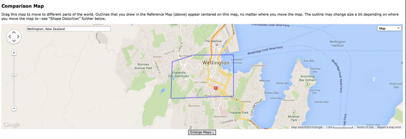
So first of all, let’s look at Auckland CBD versus Wellington CBD. Â Using this website you select what you want to compare and then draw an outline which will be overlaid on to the other map. Â here in blue is an indicative outline of Auckland CBD.

Outline of the Auckland CBD Area
And here is the same outline superimposed on to Wellington.
Auckland CBD compared to Wellington CBD
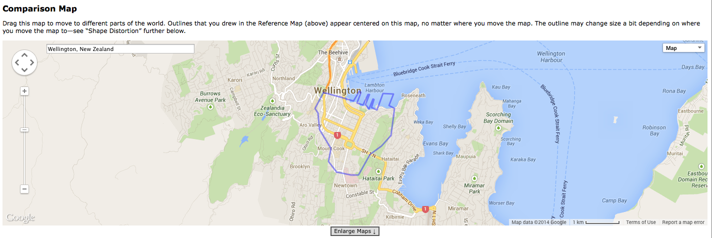
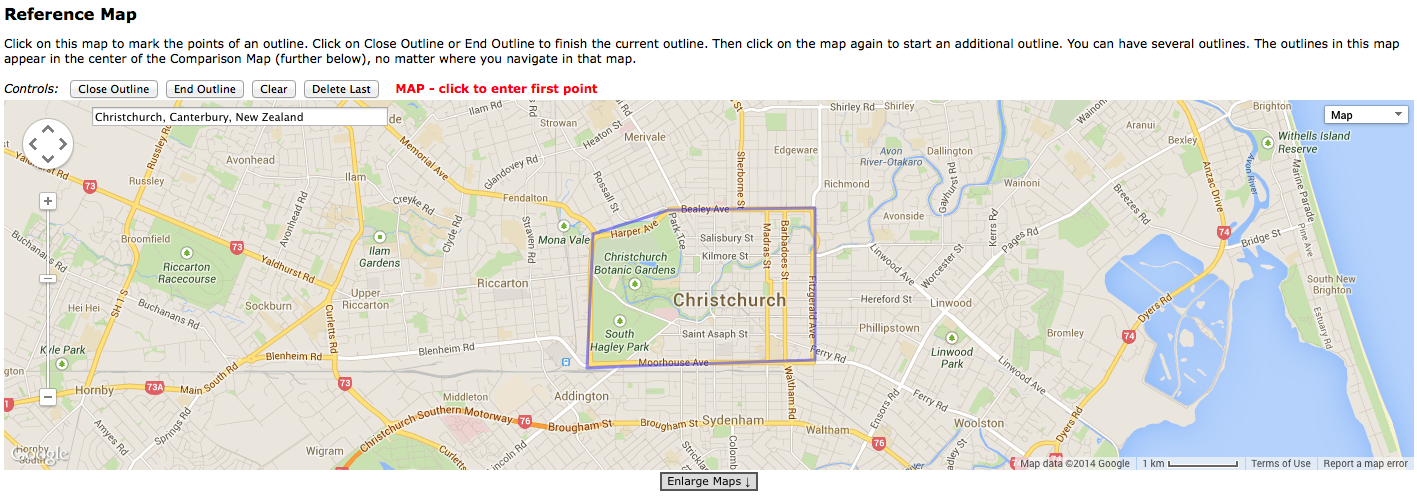
Next, and this one is quite interesting, check out Christchurch within in the 4 avenues to Wellington CBD.
Here is the outline of Christchurch
And here’s the ChCh CBD overlaid on to Wellington
Overlay of ChCh 4 aves on Wellington CBD
Finally here’s Auckland metropolitan area versus Los Angeles. Â First here is an image of the extent I’m comparing. Â I was a bit sloppy with the tracing… but it gets the point across.
Outline of Auckland Metro
And here is the shape overlaid onto Los Angeles. Â Tiny!
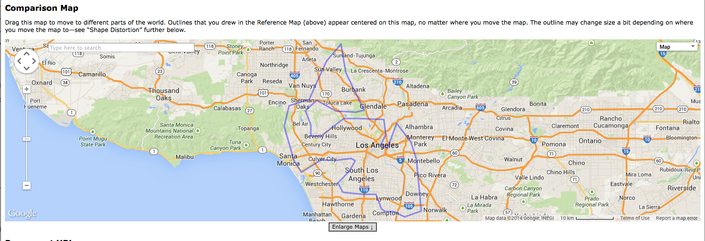
Auckland metro region compared to Los Angeles
It’s a fun site, and I’m not going to go into all the various iterations as it’s best just to have a play.
#2
The next one takes that analysis to the next level. Â It’s all fine to understand the geographic coverage of a city, but how about the density? Â How about where people work? Â Are they walkable? Â Are they full of open space? Â This site helps compare world cities on a variety of variables, and is fascinating. Â Unfortunately you are limited to a variety of pre-selected cities, but Auckland is included. Â The maps appear to be mostly at comparative scale. The scale graphics don’t match, but if you zoom in one map, the others zoom, so it would seem they are comparable.
http://www.urbanobservatory.org/compare/index.html
as some examples

Comparing population density of London, New York and Tokyo

Comparing population density of Auckland, New York and Tokyo

Comparing population density Auckland, Chicago and LA
You can even compare traffic flows on the motorways.
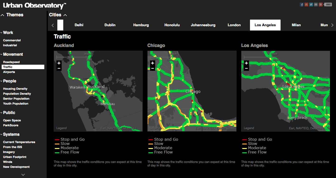
Motorway traffic flows – Auckland, Chicago & LA
Here’s an interesting one comparing open space in Auckland, Perth and Singapore.
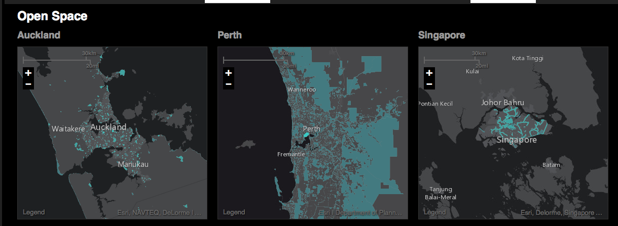
Comparison of open space – Auckland, Perth & Singapore
Unfortunately, unlike Mapfrappe you are limited to the preselected cities, and oddly the only Australian city is Perth?!
#3
and there is this image, via this website:Â http://www.neptis.org
This image is pretty interesting as it compares a variety of cities at the same scale and compares urban form, density, roading, and transport.
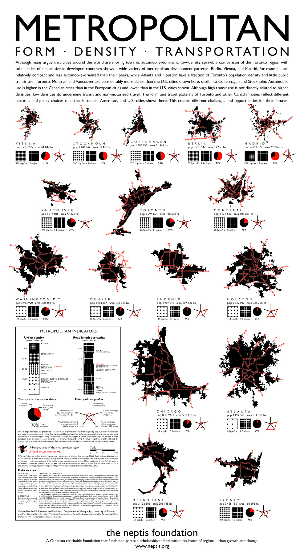
Comparison of urban form for selected cities
#4
Finally, and this website is a deviation from the others, but this is a tool to help imagine the future of our cities.
http://streetmix.net/-/99851
This web based tool is incredibly easy and is deceptive in it’s graphic simplicity. Â This tool is increasingly being used by towns to encourage public participation in how the future of the city should be designed.
http://www.theatlanticcities.com/commute/2013/01/digital-mixing-board-your-street/4555/
http://www.streetsblog.org/2013/08/12/meet-streetmix-the-website-where-you-can-design-your-own-street/
It is an incredibly simple website but allows you to quickly and easily see the implication of various planning decisions.
To begin with, let’s say I want to understand the implications of changing the amenities along a stretch of street.
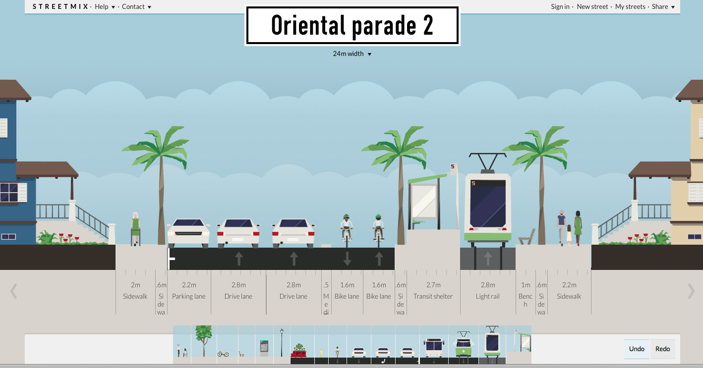
Let’s say we’re looking at Oriental Parade.
Here we can create a loose version of the existing conditions. Â (I’ve added additional lanes of traffic for the hell of it, but you can model it more accurately)
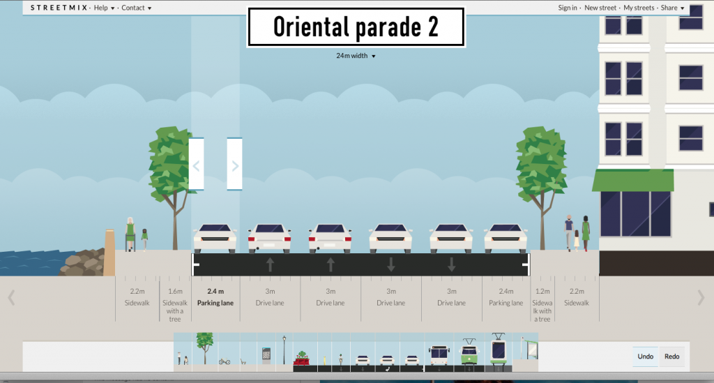
Oriental Parade 2 – existing conditions
So here we have a 24m wide street (you can adjust this to suit whatever you’d like). Â Within this 24m we have two lanes of traffic in each direction, plus parking on each side. Â In addition we have a footpath (or sidewalk) and tree planter on each side.
The bottom images are the library of parts you can use to make up your street scene. Â Clicking on either side (where the water and building are) will bring up options for the type of site you want on the side of the street, including building type and height.
So what would it look like if we started to modify this?
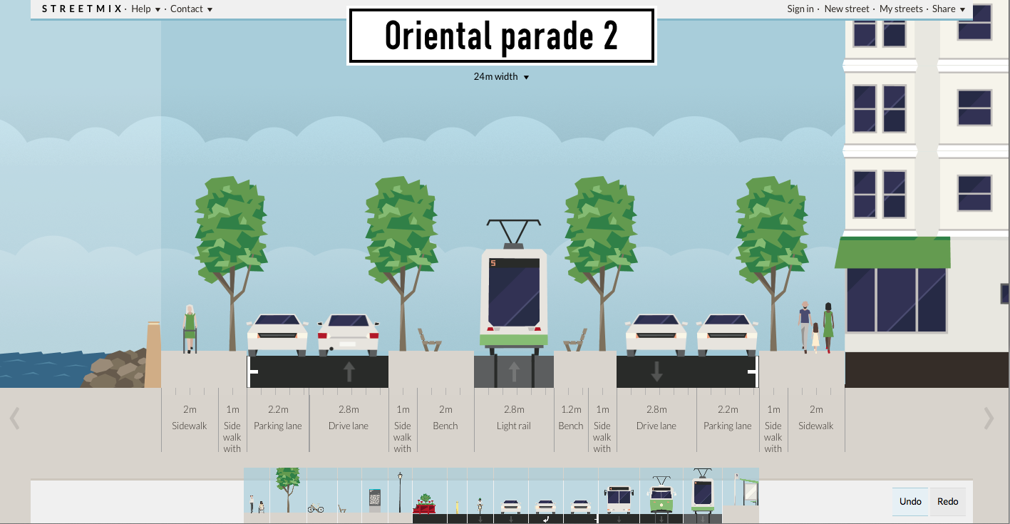
So the first thing is WE NEED LIGHT RAIL! Â So, let’s delete one lane of traffic in each direction and put light rail in the middle of the street, with more trees and more footpath space. Â This is starting to feel better. Â But what else should we do?
Maybe the light rail isn’t in the right place. Â It needs to be closer to the shops. Â Oh and hey! Â What about bike lanes?
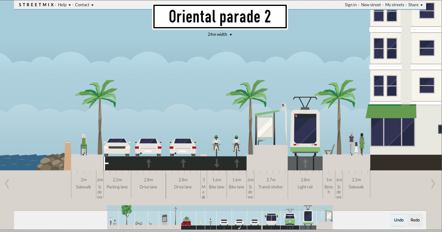
Shifting light rail
And did you notice… PALM TREES!!!!
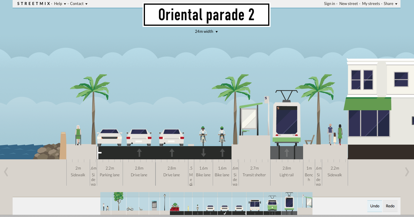
Streetscape with shorter building
and we can see what it looks like with shorter buildings
or…
street with houses
what if we had houses on both sides?
So as you can see, it is a bit simple, but it does allow you to tinker with the composition of a city and understand how something as seemingly simple as adding bike lines can impact other attributes of the street. Â It will be quite interesting to see how this develops.
Anyway, that’s what I’ve got! Â Hope it’s interesting….
minimus – that’s not just interesting – its a bloody fantastic resource! Well done – thank you
Max, you are one fantastic fish
Sorry Minimus, my bad typo.
Excellent work
No doubt about it – Minimus IS the big Fish of the family. I’m loving these links!
Hello, this is interesting! I am amazed at the size of Los Angeles in the first examples you give. I’ve been to LA once, and remember driving for what seemed like days, just to get anywhere. A sunny city, but a nightmare to get around… This sort of explains things – it IS a nightmare, because it is so huge – and your map of LA doesn’t even show the half of it as it extends down almost to San Diego.
OK – just for the Grandfather (and, I admit, for me as well), I’ve done a reverse version – overlaid the urban part of LA over Auckland. It’s large! See it here:
http://mapfrappe.com/?show=16139
Ha! it works! and here it is in comparison to Wellington…
http://mapfrappe.com/?show=16140
Wow. LA is reaaaallllllllly large.
That’s a lot of fun. I nearly got Nelson and Khandallah into the LA footprint. Now for the bigger question – Karori gigantism. The last time I traversed Wainuiomata it seemed a whole lot bigger than the Marsden stretch. Any decisive infographics on that one?