The south wind blows strong at the Wellington Airport: nowhere more so than in the architect’s eye. This scheme was sprung on us a year or so ago, with dramatic renderings of a radically leaning building as the new airport control tower. A certain amount of artistic license is expected in the architect’s image supplied, but the sight that is now reaching high into the sky from the carpark out the front of the Warehouse in Rongotai is proving seriously quirky, and that’s even before the cladding has gone on.
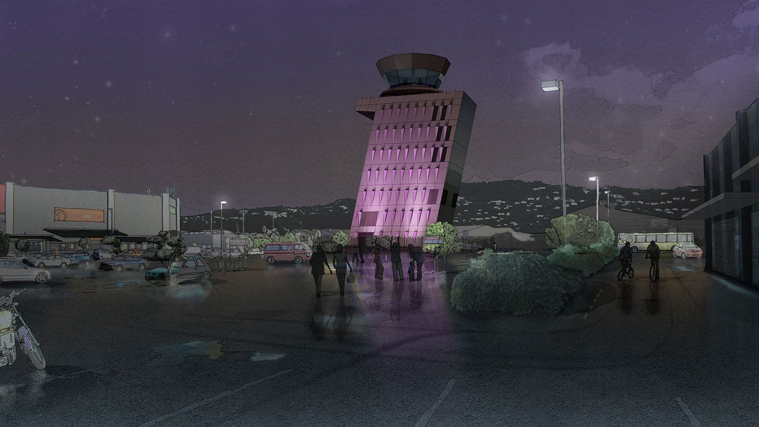
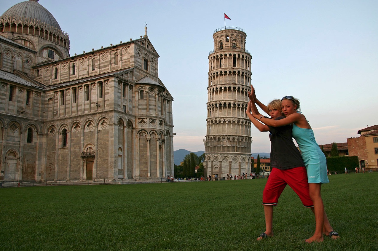
The building is steel framed, and sits on base isolators on a massive concrete raft foundation. The leaning tower of Pisa, the silliest, most famously leaning tower of them all, skimped on their foundations and have been regretting it ever since. Mind you, I’m not sure if they had even invented concrete back then, in 1173. Pisa sits on a very flat, waterlogged plain, slowly draining into the river Arno, and to site the three massive marble buildings on the site was perhaps always going to be asking for trouble. After all, the name “Pisa” is allegedly Latin for “swampy marsh”, so: go figure. The Duomo and the Baptistry stayed upright, the Campanile tower unfortunately did not. Problems started early on, and continued. When they started to notice a problem, the correct response probably would have been to stop, tear it down, rebuild the foundations, and proceed on again. But they chose not to, and they soldiered on, making little adjustments at every floor, so that now, even if you tried, the building could never be truly vertical. Getting to a maximum of about 5.5 degrees out of kilter, and almost collapsing in a pile of very expensive tourist-laden rubble, the tower has now been dragged back a bit more upright to a far more stable tilt – just under 4 degrees (note: Wikipedia says it reached max 5.5 degrees, Stuff says it reached a max 10 degrees. Mmmm, who to trust?). Regardless, Pisa is now known for one thing only: the lean that just won’t quit.
On the new Control Tower in Wellington, engineers Holmes Consulting and architects Paris Magdalinos and Studio Pacific have certainly not skimped on the foundations, but their building will certainly be leaning anyway – it has an angle of 12.5 degrees built into the design, with base isolation built into the slab. Contractors are Hawkins Construction. Being so close to the sea, and in a tsunami zone, they had to do a fair bit of work in the ground before anything headed skywards, and no doubt if there is ever a tsunami, this will probably be the only thing still standing. There is a thick web of steel columns, beams and bracing that provides a sturdy lace-like effect as it rises from the ground. Stairs have recently been craned into place, the stair opening on each floor moving sideways a little in order to keep the stairs running simply vertical. The lift, if there is one, will no doubt also be strictly straight up and down. The control tower will be 32m high – the Pisa tower is 55-56m tall – so even if it is only half its height, the Rongotai tower will physically hang out a lot more than the Pisa tower was ever allowed to. One question I have though, is why on earth did the airport buildings ever get built on the other side of the runway? Wouldn’t life be so much easier if the terminal was over this side as well? Certainly public transport would be easier…
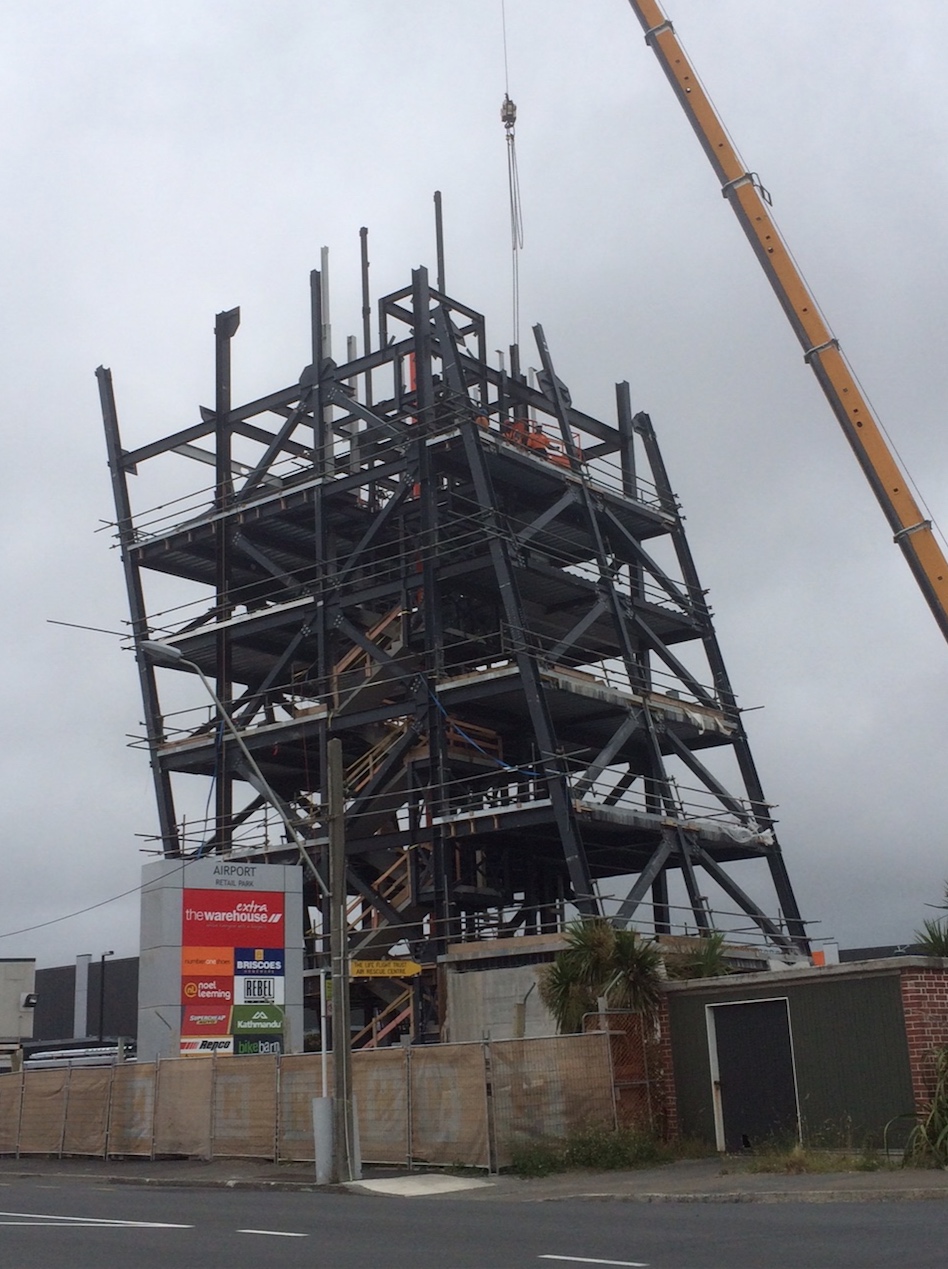
I resisted putting the title of Leaning Tower of Rongotai on this blog post, but it is an inevitable title for the building. There are other leaning towers of course, including those intentional as well as accidentally occurring. It’s not really possible to make much comment on the building until it is totally up and finished, except to note that the structural system does not appear to have been expressed in the planned external facade. In some of the renders online, the cladding seems regularly trapezoidal, whereas in other renders it appears to have been struck by Spiderman’s web, with a thin layer of facade laid out like netting. While the steel structure behind is for the most part rigorously orthogonal, fixing the structure squarely to the ground, the cladding looks as though it will have a resolutely slanted appearance, in keeping with the windswept, just-about-blown-off-my-feet game that the building makes overall. Regardless, the awkward junction to me was always going to be at the roof: first the odd little serif at the top of the tower, like a stray piece of Times New Roman in an otherwise Helvetica world, and then the transition from rectangular tower base to the 14-sided? polygonal control room up top. Wellington’s architects will be watching with eagle eyes to see how well that is resolved in the final building.
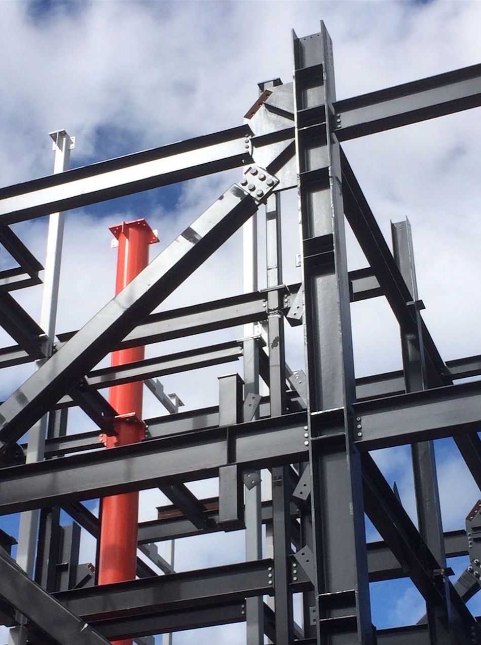
At this stage in the construction however, the most interesting thing (to me, anyway), is the giant orange pipe descending vertically through the building. Large bright orange pipes are not normally an essential part of a building, so I am guessing that perhaps this contains a special function – comms relays perhaps? radar? fast delivery lunchbox supply shute? air-traffic controllers swift exit route? or is this just the column that tells the crew if the building is actually leaning over or not? do they dangle a plumb line down the orange pipe and see if the building is still behaving like a more traditional vertical thing, or if the lean has got a lean on? you tell me…
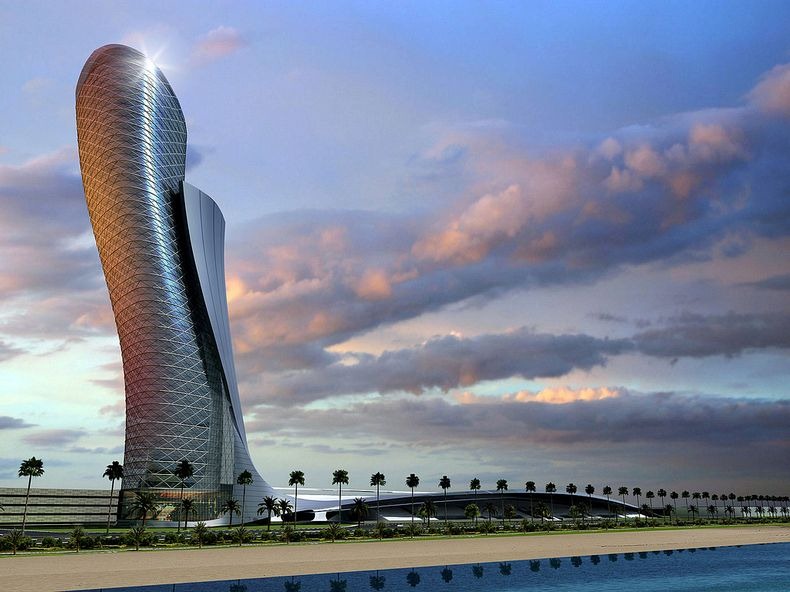
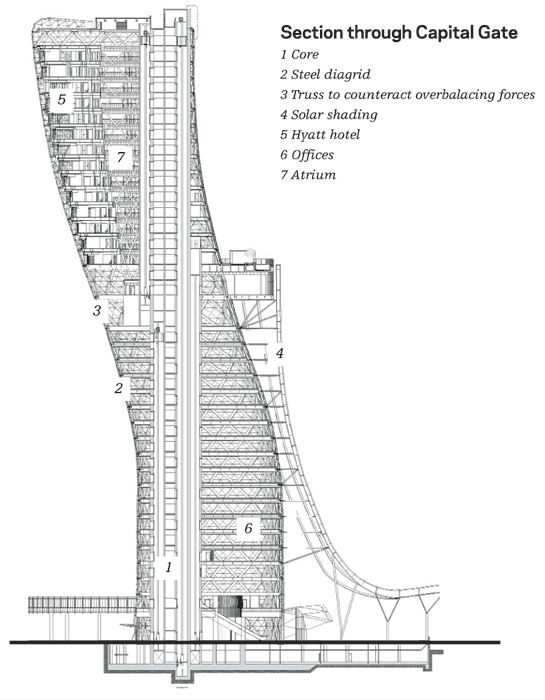
Post-script: Capital Gate tower in Abu Dhabi. Thanks Mr Henry Filth!
..
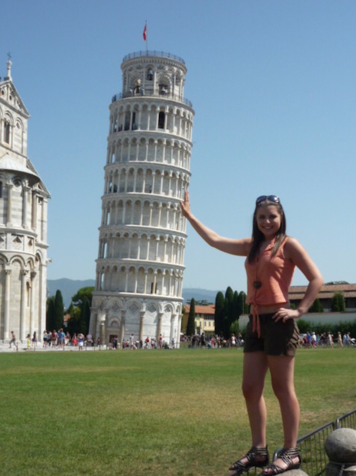
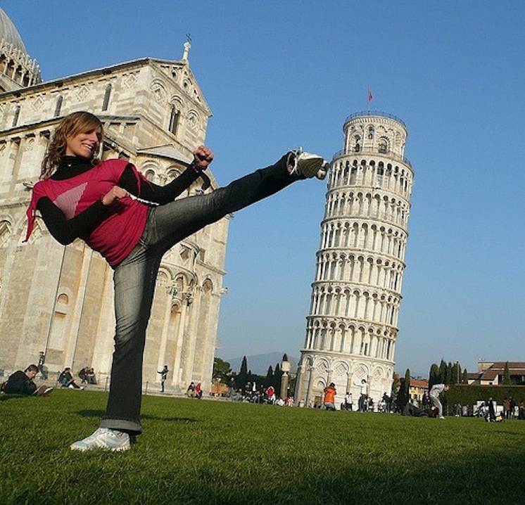
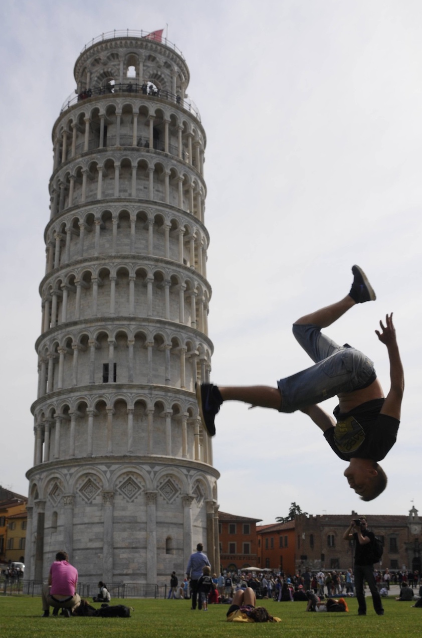
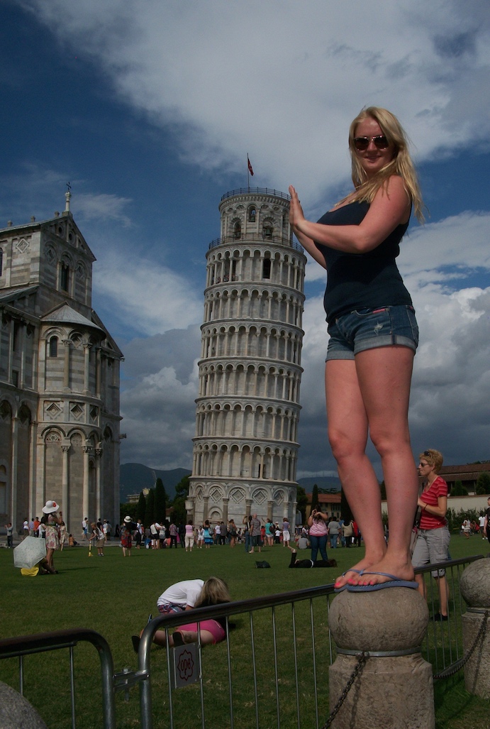
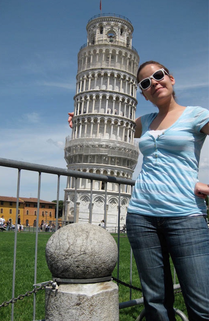
I’m going to leave you now with a foretaste of things to come in the forecourt of The Warehouse in Rongotai, where one day we may see tourists composing themselves into hilarious, obligatory, side-splitting poses such as these. Banal it may be, but it is a sure sign that you have connected with the public if they start interacting with it to this degree. Enjoy yourselves people, no one has ever done that before….








I like the serif observation, although, if I’m honest, more Clearface than Roman…
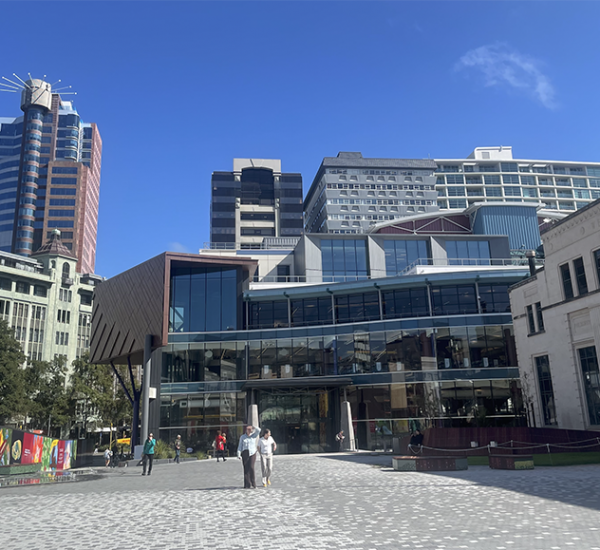
Wacky context for the building, almost as wacky as the relationship between the main form and the control room above. I suppose simply reusing the old one and whacking it on top of here makes good ‘sustainable’ sense tho, even if it does look like a blistering barnacle or whatever effect the designers were aiming for.
Also, Happy New Year Levi!
Why thank you m-d, it is nice to know that there is still intelligent life on earth / in Wellington! I was feeling a bit lonesome here! I don’t know 100% for sure, but I am prettttttty sure that the top is not reused. I know there is a Building Recyclers across the road, but somehow, I don’t think that the top will be shifted form there to here. If only for reasons of timing, as well as wanting something shiny and new.
There are still a few sentient beings in Wellington!
Details of the tower are at http://wellington.govt.nz/~/media/have-your-say/public-input/files/public-notices/resource-consents/2015/george-bolt-st/appendix3-design-statement.pdf, which shows that it does have a lift (surely compulsory nowadays?).
The external lighting sounds as if it will be fun:
The LED lighting to the tower illustrates the wind environment in which the tower sits:
1. The lighting is driven by wind speed, gust and direction data either collected at the tower or nearby
2. The lighting colour is determined by matching wind direction to the colour wheel so that southerlies are a cold blue and northerlies are a warm orange: these are at the opposite sides of the colour wheel. Other wind directions would have colours from the colour wheel e.g. the west is green and east is crimson and so on.
3. Lighting intensity is matched to wind speed, so the colouration is more intense and the coverage of the building runs to a fuller extent when wind speeds are higher
4. The lighting also reflects local gusts so slivers of light appear like a graph reaching up the building when wind gusts occur
The airport environment is also recognised:
1. When planes on their takeoff or landing roll pass perpendicular to the tower on the runway and when the appropriate data feeds are available to Airways, the lighting will shimmer as they [theoretically] move from one side of the tower to the other
2. The size and speed of the shimmer varies according to the size and speed of the plane
….oh, in that case, there really is no excuse for the mismatch between the main tower’s use of the ‘dumb’* language of Supermodernism and the language of conventional functionalism of that wart on top?
*’dumb’ in the original sense of the word, rather than a value-laden judgment (or not).
derp… my post is in response to Levi. Betterbee got in while I was drafting that gem though.
I note that they do say that the elevation of the ‘cab’ is indicative in figs 33 and 40 of that doc that Bb links to…
Because the architecture is a collaboration between SPA and PMA, is there a chance that PMA designed the control room (or, as you put it, the “wart”) on top, and that SPA designed the tower? Surely not. It is an interesting mix however. Magdalinos have the experience with airport control towers, having done the Napier airport’s tower, and more recently, the Christchurch one as well. Studio Pacific, on the other hand, have a record of doing interesting (and sometimes controversial) work with the airport itself.
BetterBee – thanks for that helpful and incredibly well informed comment. Makes me excited to see this building in action! Sounds like a world first to me – a building which shimmers in reaction to a flight going off. Cool as!
I can’t be sure, but my guess would be that the “serif” as you call it, would be to enable the window cleaning gantry to swing clear of the inclined glazing.
Also: the tower is intended to lean INTO the predominant Northerly, not lean away from the less frequent Southerly.
Interesting group of pictures of Pisa. Is it just your inherent nature to mainly feature women trying to topple over the building, or is that a reasonable selection of actual photos taken?
Regardless, I can’t see a world-wide rush of people to the carpark in the Warehouse to try and capture similar photos.
This extract from page 18 of the RC report may answer the mystery around the orange column?
…the system of structurally supporting the tower’s cab roof could be changed from a triple external column arrangement to a single central internal column. This suited the controller’s visibility demands at Wellington Airport and simplified the structural load pathways in the building.
Name – yes, I spotted that too, and wondered. It is very orange, all the way down, and so while this makes sense up at the top of the building, I’m not sure it makes any sense lower down. If you look at the plans, on the last page, it shows the circular column on grid B2 as being proudly on display in the centre of every single lobby space. So, it definitely runs from the centre of the control room (or “cab” or “wart” or whatever you want to call it) straight down to the ground, highly visible, bright orange at every floor. It’s “on display” and my inclination is to say – “so what?” There has to be more to it than just that. Sandwich delivery shute is my current favourite reason.
Harry – the bet is on. My guess is that the DomPost will run a series of photos of people trying to push/pull/support the Leaning Tower, as that’s what they like. And re the mix of subjects – an informal poll of people posting pics of Pisa is that it is almost all women with their hands on the giant pole. Its not me, its them! Honest!
Of course, it does rather depend on where you are standing…
https://s-media-cache-ak0.pinimg.com/736x/74/a1/82/74a1823b1522be3cb069251d2ab6875c.jpg
“Everybody was Kung Fu fighting….”
The old tower may be up for sale soon; a very rare occurrence as control towers are normally within airport boundaries, not in suburban streets with their own address and mail box (36 Tirangi Road if anyone is interested). The neighbouring carpark (34 Tirangi) is on a separate empty land parcel and I’m sure will get snapped up in a jiffy. The tower could be turned into quite a fun place to live though I suspect it will need a major makeover and someone with deep pockets.
….but maybe a bit noisy? Good view of the airport though! Imagine putting your living room up there – better than a wide screen television!
Maybe you could pop in a photo of the Capital Gate building in Abu Dhabi. It’s got a decent lean and a nice wiggle to go with it.
Thanks Henry – you’re right, it is an excellent example of a leaning building and I don’t know why I didn’t include it before. It leans 18 degrees, which is really quite incredible, but uses a basically similar principal – a vertical core supports the leaning tower part. Except that in their case, the central core is a pre-cambered concrete core, built with a slight bend in it to the other direction, that straightens out after the tower is completed. A stupendous feat of engineering. Architects are RMJM, but Wikipedia doesn’t tell me who the engineers are. Skyscraper City says that RMJM are the structural engineers as well. They used to be just architects – i think they designed the NZ House in London – but they appear to be pretty clever at designing wiggly towers now…
Re: Capital Gate. There was an episode on Megastructures about it. Absolutely fascinating.
https://www.youtube.com/watch?v=ezI0HMqOj_I
Also, what kind of architect decides to add a protruding pool and bar on the outside of the building, halfway through construction!?