
The post here at the Fish on Swan Lane has provoked interest from regular readers and others. While the comments in the last post segued into discussion on 80s nightclubs – actually quite fascinating – and makes me wonder – are there any nightclubs left in Wellington? Do people still go out dancing? If so, where? But I digress. I also got interest from a friend who is very keen on analysis of public spaces via a process called Space Syntax.
Space Syntax is both a science (developed by and for architects) and a business (owned by some Brits who developed the software at UCL) in London. There are a number of different softwares available, analysing things in slightly different ways, but all working off the basic premise that Connectivity is the key to getting cities to work properly. They’ve developed theories, backed up by factual evidence, that better spatial connectivity corresponds with both increased property values and lowered crime rates; better health outcomes and other marvellous statistics. It shows that dead-ends and cul-de-sacs are things to be avoided (despite your classic kiwi developer doing nothing but cul-de-sacs). As an aside: cul-de-sac means, in French, the “end of the bag” and to me, is just as non-enticing.
And as we all know, persons who live at Bag End do not want too much excitement. Even for their Eleventh-First birthday.

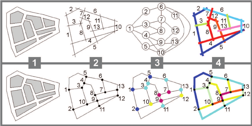
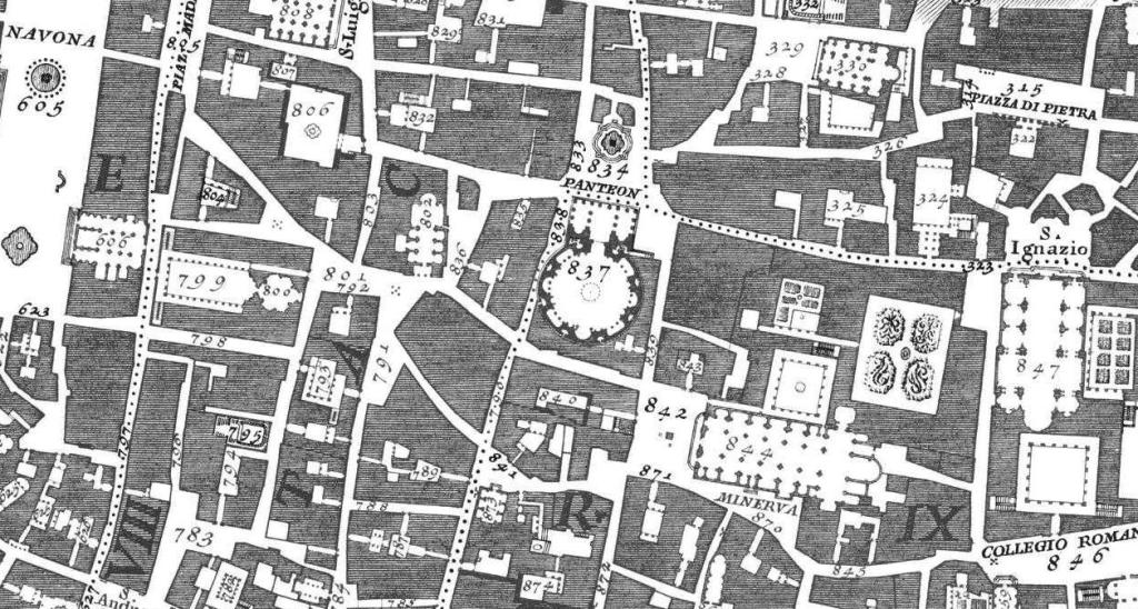
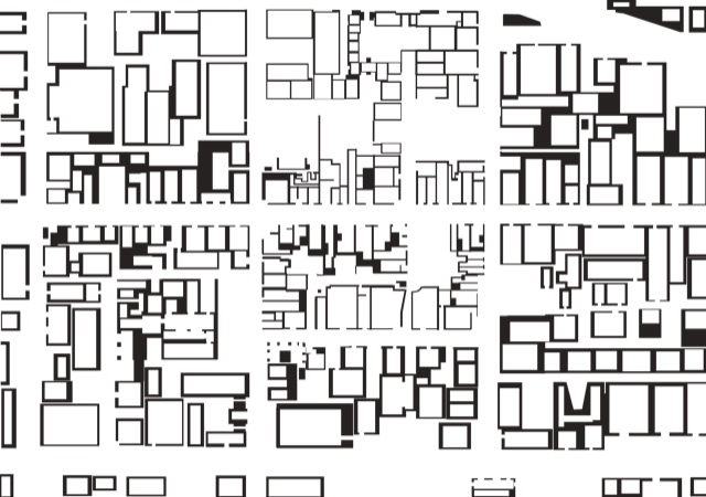
So, let’s have a look at the Cuba St area using the Space Syntax program DepthMap – licensed for non-commercial use by UCL. My friend first drew up a map of this part of town using the technique invented by Giambattista Nolli, the guy that famously depicted Rome as a series of black and white ‘figure/ground’ spaces. Not public vs private, or street vs property, nor inside vs outside, but instead an amalgamation of all of those – everywhere that is open at ground floor, vs everything that is closed, solid, built, or otherwise not accessible. Here’s a part of the classic Nolli map of Rome. Followed up by an equivalent Nolli map of part of Wellington, centred around Cuba St and Swan Lane. Although not entirely scientific, the map has shown the internal spaces of shops and restaurants as, broadly, open space. Walls and non-public areas are therefore ‘not public’ and so, solidly black.
You can see the difference in the way the cities have been created – Rome being more organic, with winding, uneven, haphazard street layout and many buildings with colonnades and loggias and porticos and inside-outside spaces; vs Wellington’s Te Aro area which is of course relentingly rectilinear and ruthlessly rubicoid. We can’t change the cards we’ve been dealt – we have a grid here, and always will have – but can we tweak it? Yes we can!
Now, here’s a look at the Cuba Swan area again, but this time analysed through DepthMap, using the principles of Space Syntax. We can see that the linearity of Cuba St sparks the software off quite excitedly. It turns Cuba St red and orange, implying that the software sees great connections from one end to the other. Well, that’s true – it is Cuba St, after all.

The Swan Lane / Garrett Street area also shows signs of life – other streets and shops etc have turned pale blue, which means that all the areas that have turned the dark blue are not well-connected. Curiously (and I’m not sure how the program knows this), Ghuznee St and Vivian St are way less well-connected compared to Cuba St. I think that this is picking up the fact that on the plan, shop fronts are open on Cuba St, but are not generally open on Vivian St and nothing too exciting is happening on Taranaki St.
What else can we see? Well, we can see that Glover Park is barely registering on the scale of connectivity – whereas Swan Lane is a light aqua green colour, implying something good is happening there.Again, I’d say that is fairly accurate. But the next plan shows something completely different, with a slight variation on that Nolli plan – what happens when we show where cars are parked? Indicative only, but parked private cars definitely have a severe effect on public space in the streets – this map indicates just how much of an effect it has. Cars parked in the street are, in effect, a little bit of private colonisation of the strictly public realm – and cars parked in the Swan Lane and Bute St car parks show just how much public space they take up.
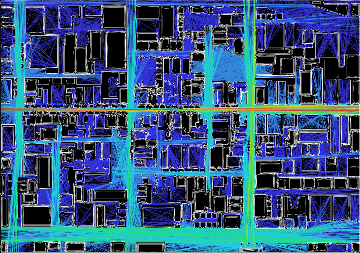
Yes – effectively they are blocking some of the life out of the street – certainly blocking out some of the connections, which is what the software is relating to here. The strong red /orange tones of connectivity down Cuba St are muted in the extreme – as are the bulk car parking blocks shown on this plan.
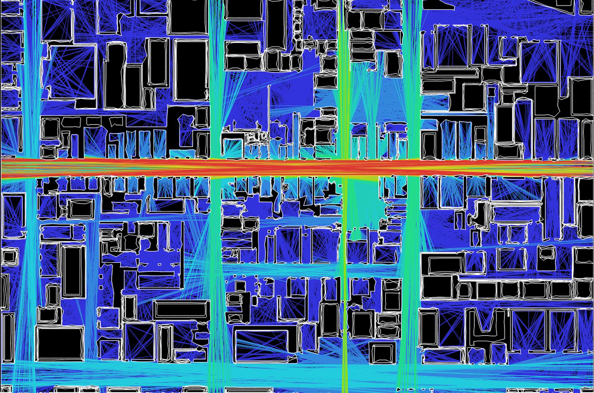
Finally we come to the proposal that was suggested – to knock down the barriers at the West End of Garrett St (through / under the National Building.). To remove the cars from Swan Lane Car Park. To break through McCarthy buildings into Ghuznee St. The connectivity is vastly improved. You can see the connections start to increase, as the lines change colour around Swan Lane. The key connection seems to be the move through the end of Garrett St, which has really livened up the screen, more so than the move to demolish Monty’s. It has also taken the opportunity to see some possible connections through Marion St and into the Briscoe’s car park – not actually possible at present, but you can see how it would be a potential possible route. If the city really wants to build successful Laneways, they need to be using this sort of analysis to test out the theories first.
I should note that Yes, there is something odd going on with the black squares and white lines on these examples I’ve been sent – for some reason the lines have turned out into many smaller wobbly concentric circles of some buildings, but: no worry. I think that in principle, the software indicates the issues well….
I’m presuming that on the Wellington maps that north is to the right (not intuitive), with Cuba St the horizontal red stripe, Ghuznee the left-hand green/blue vertical, Karo Drive the right-hand one, Victoria the top and Marion the bottom horizontals);
and that red=fully connected, through the spectrum to violet=fully unconnected, black=non public.
Is that correct?
Hi Betterbee – yes, it has been generated from the orientation of the initial WCC map of Cuba / Garrett, so you were nearly right:
North is to the right
bottom pale blue horizontal = Taranaki St, which makes:
middle short street blueish street above Taranaki = Marion St
Cuba is horizontal red strip in the centre,
and going from Left to Right on the map above, we have the vertical stripes representing:
Abel Smith, Wigan almost hidden in the blue, Vivian St in blueygreen, Swan Lane / Garret in bright green, Ghuznee in another bluey green.
Egmont St is dark blue horizontal on right hand side, with a thin sliver of Leeds St on the next picture up. Victoria St is wide blue diagonal band at top right – probably because the boundaries were clipped, it was not picking up the connections there.
And yes: “red=fully connected, through the spectrum to violet=fully unconnected, black=non public.”