Courtesy of one of regular readers, some photos of the Hearst Tower in New York. The building was started way back in the mists of time, say 1920-30, and so has a somewhat grand podium, with tall sculptured figures guarding the entry – but the tower was never constructed – I suspect the Wall St crash may have been a reason for incompleteness. Fast forward another 7-8 decades, and Foster and Partners (yes, he of the storming Norman fame) are commissioned to continue the job and top it all off at last. Here’s the pics:
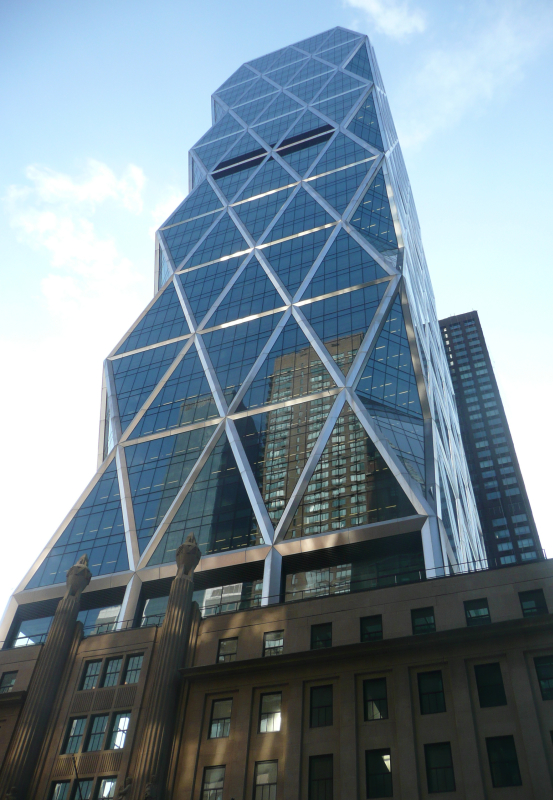
So, in a manner perfectly befitting a city that is still reticent of tall buildings in the post September 11 era, Foster proposes a giant triangulated, tessellated tower on top. I don’t know why, but it reminds me of a Crunchie bar. You can imagine the selling job would have been easier with a massively structurally dynamic skeleton like that – and it’s clearly demonstrating lessons learned from the Gherkin as well in its external cladding.
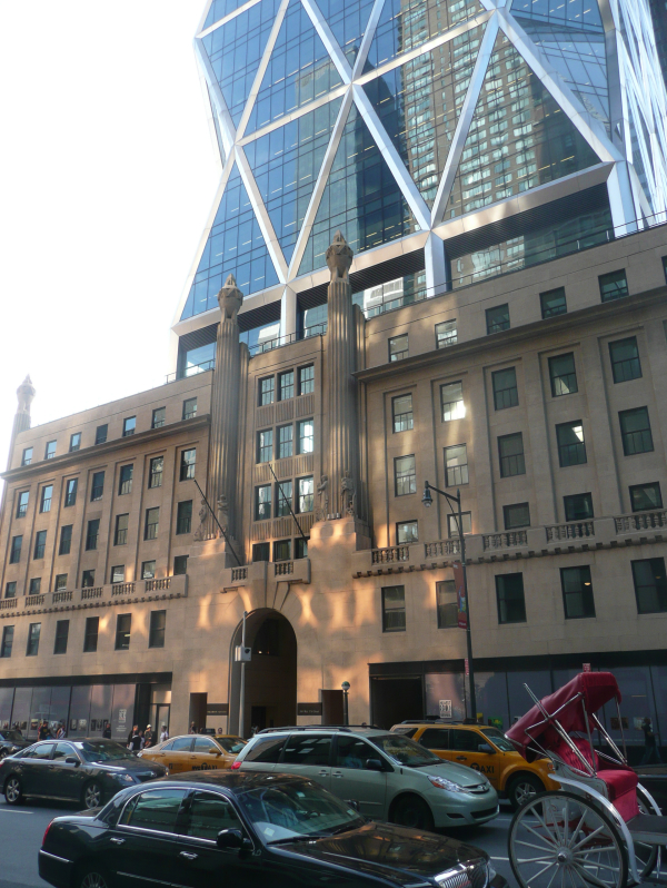
But, as David has noted, it’s proportions are a bit ungainly. It could have been taller, or thinner, or both. The repetition of the floor structure is a little too chunky and clunky to ever be a thing of beauty, apart from a bravura show of strength.
The junction between the two, old and new, is where all he’ll breaks loose apparently, with some stunning lobby spaces climbing up through the void space in between. No pictures of that unfortunately.
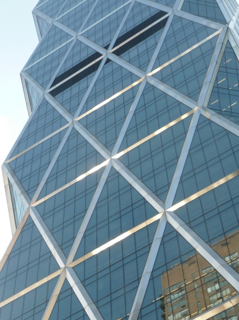

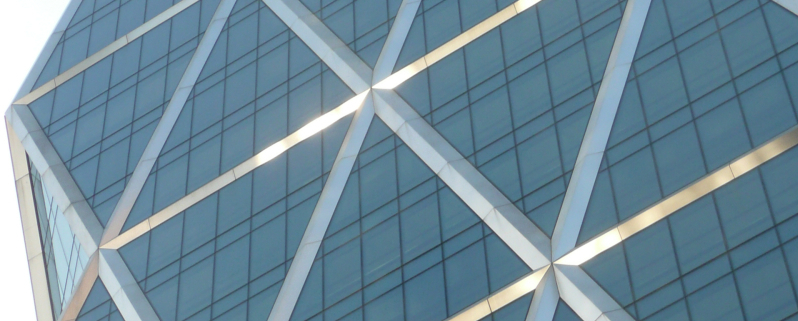


I recall seeing it almost finished when I was lasy in NY – around 5 years back. The foyer features (I think) a 3 storey high painting in mud by one of lord foster’s artist friends… I agree it looks stunted standing alone in a pic like this but in the city its height is akin to its neighbours…
Do architects of these sorts of structures ever consider how the windows are supposed to be cleaned? The front-face is fine but those edges with overhangs look like a window cleaner’s nightmare.
@John H: Yes — architects spend a huge amount of time working out how these buildings are cleaned and maintained.
Oddly enough, I’m looking at the rig plan of this right now and this is no problem, a very easy example. There are some real window cleaning challenges in NY, but this is not one of them.
Jason – I’d be interested to hear what sort of projects you’re working on over there in the big apple. Anything exciting for us kiwis back home ?
I worked on this in NY, but now am back in switzerland.
http://www.56leonardtribeca.com/
this project is a casestudy in a window washing masterclass…
aah yes – that one would be tricky to wash. Not to mention the person who has to work out way to clean and polish the top of the Anish Kapoor. Rather you than me….
As you can see, we’re taking a slight break over the Christmas / New Year break, and will be back later – some time in January, or perhaps even February. There’s a whole ocean out there to swim in!
Any suggestions for subjects of discussion, or if you have a building you want to feature, just fire them in and we’ll post them up when we’re back on board.
contact at eyeofthefish dot org
Our best wishes from all at the Eye of the Fish.
Suggestion for when you’re back: I’d be keen to hear some critique of that outsized black box thing by the lagoon now that it’s almost complete.