…and so the process starts again. Athfield Architects, and Willis Bond, have put in another proposal for the Site 10 site at Kumutoto, presently the site for around 40 slumbering campervans, bang slap in the middle of the waterfront. It’s not the best use of the site, although understandably quite popular for visiting tourists to have waterfront accommodation without the humungous waterfront hotel bill. WWL have tried for some time now to get all the sites sold off, to gain money for the refurbishment of the remaining parts of the waterfront. WFW, on the other hand, view it as their self-appointed, God-annointed role to rule over the waterfront and stop anything other than grass from growing there.
The latest proposed addition, is a curiously truncated version of Athfield Architect’s previous competition-winning triumverate of parts for the waterfront. A recap, with links. We wrote about it here and also over here – it is so long ago, that even though the Fish has been going for 6 years now, the main discussion was held on a previous blog-site WellUrban. So, despite it being nearly 2014, we’ve transformed ourselves back in time to 2008. Examples from a conversation there:
WellUrban said:
Kumutoto:
Option A: Some interesting geometry, but the architecture is not compelling enough to make up for its urbanist shortcomings.
Option B: Bold and inspiring, but wildly impractical for the climate.
Option C: Cheeky and potentially iconic, but perhaps derivative and definitely a political minefield.
Option D: Quirkily appealing at Site 8, handsome and urban at Site 9, but unconvincing at Site 10.
Option E: Some interesting deviations from the brief, but impractical and overscaled.
Option F: Striking design and inventive spaces at Site 8, pleasant and practical at Site 9, and quietly innovative at Site 10.
A certain Maximus noted at the time that:
I think that many of the schemes could quite simply incorporate an indoor sports centre into the ground floor – and i am sure that if the architects were asked to incorporate it, or wihdraw their schemes, then all objections would miraculously be withdrawn.
Let’s face it: the ground floor of site 10 is not really suitable for retail, especially on the road side. Its a big, wide, smelly, fast, steaming motorway, and there ain’t no-one going to be looking for a new frock down there. But a big glass wall into a thriving sports centre (think of Auckland Uni’s Rec Centre – one of the most interesting bits of Auckland’s otherwise mediocre urban landscape). Now that’d be good !
To which the WellUrban reply was:
Maximus: I certainly agree that in terms of location, Site 10 would be better for indoor sports than for retail. However, to replace not just Shed 1 but Shed 6 as well, a huge and relatively uninterrupted section of the ground floor would be required. All of the entries divided up the ground floor with lobbies, atria, parking and ramps to the extent that getting even two courts, let alone the three required, would be nearly impossible. I don’t know how much flexibility the various structures would offer, but I hope that indoor sports could somehow be incorporated there.
I wonder if anyone will ever take hold of that suggestion? It has wings – it can fly! Sponsorship of the ground floor by Red Bull perhaps?
Interestingly, of course, the Athfield scheme was selected (Option A above), and then the potential tenant hated it and the whole thing was abandoned. A few years later, a different developer teamed up (with Studio Pacific Architecture if I recall correctly), and proposed a very different building – just for Site 10. No-one has dared to seriously put forward buildings for sites 8 and 9 recently…. The StudPac building was like a giant toasted waffle – crunchy pattern on the outside, and probably lots of jam on the inside. We wrote about it here, and there is a good back-history there as well.
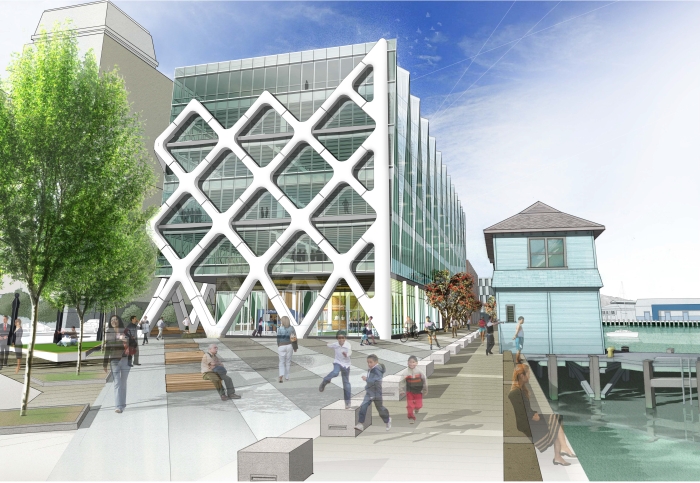
Of course, that proposal was taken to the Environment Court, once again, the ever-present Swan stuck her beak in, and the building was unceremoniously thrown out. Then, limbo ensued. Car-parks and camper-vans abound.
So what is the new proposal like? Well, basically, much like the previous Athfield design on first look, but a couple of floors smaller. Smaller, but maybe not small enough? It still goes through the Environment Court’s recommended maximum building height for that site, and that’s going to be a stiff arguing point once more. Waterfront Watch may have the spirit to get excited about the extra floor, but has anyone else? There’s some small discussion going on at the DomPost, and a reasoned discussion going on at the Scoop site.
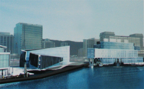
I can’t find any good images of the proposals anywhere yet though – Scoop has published two tiny images, but I think that really before it can be discussed, we need to see something more.
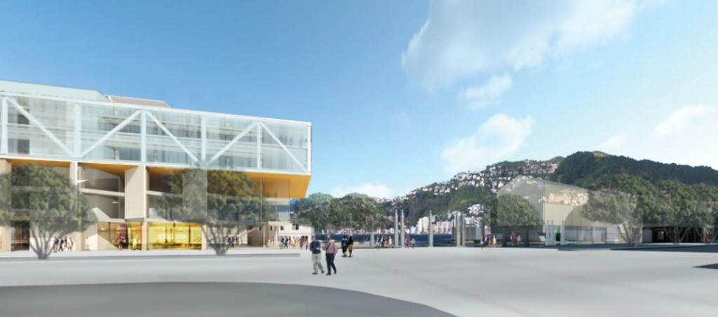
Update: Luckily, a helpful PR person at a local government has sent us through some better quality pics. But we still need more! Athfields – want to email us some plans to: contact @ eyeofthefish.org ? That’s be grand thanks!
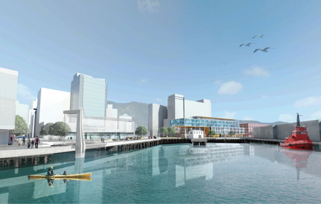
And of course there is this:
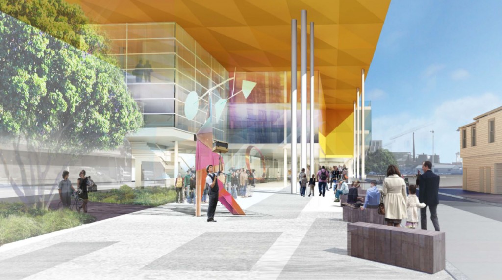
In terms of words, so far I’ve found this:
The Willis Bond proposal
A six-storey office building, the appearance of which will be broken into two primary horizontal forms.
A ground-floor public pedestrian link through the middle of the building, connecting Waterloo Quay with the harbour.
A colonnade providing a sheltered walkway from the Whitmore St gates to the railway station.
A large glazed three-storey space with a civic portico that overlooks the Whitmore Plaza.
A publicly accessible ground floor, which will include shops, cafes and bars, as well as office space.
The potential for a publicly accessible rooftop restaurant and roof garden overlooking the harbour.
Well, all of those are pretty much a given of course, for anyone wanting to build on the waterfront. But what of the building? Tell us what you think. Tell Wellington what you think. Tell the whole wide WORLD what you think… Don’t be shy….



Welcome back Max!
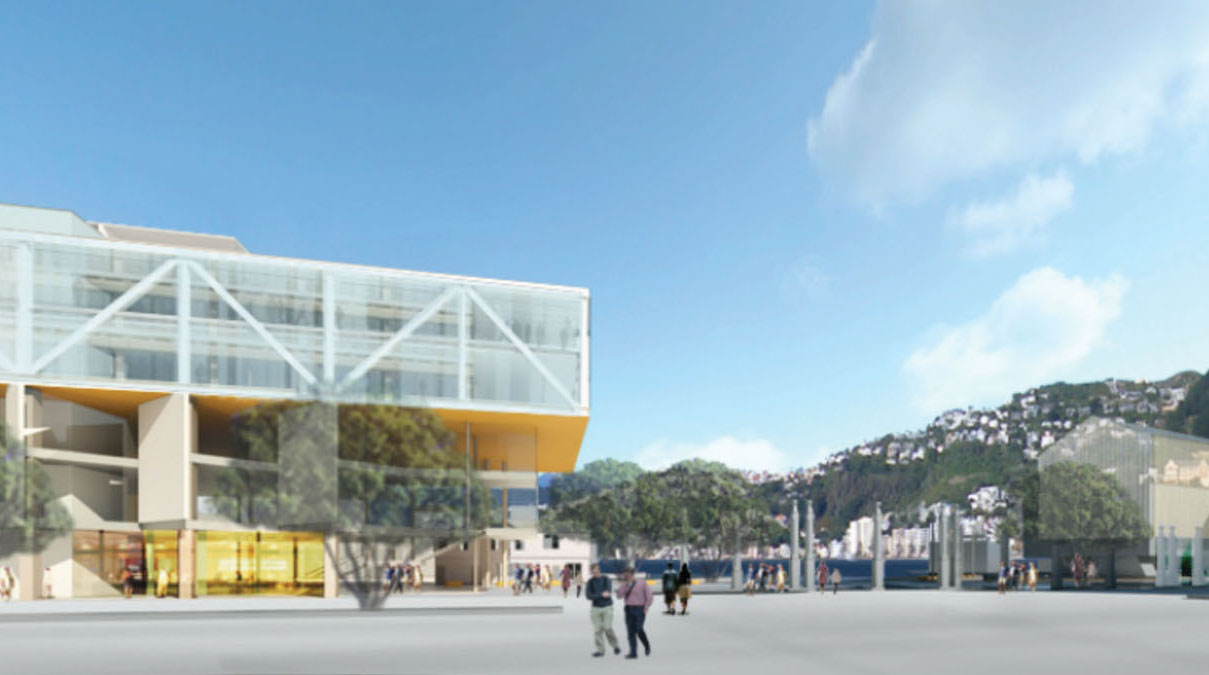
I have a question and a plea. First why are the renders weirdly ephemeral and transparent? Confirmation of the Scoop conspiracy theory about drawings which minimise height, bulk and visual impact?
The plea is to just get on a build something. Give me a reason to go there. Somehow Auckland’s waterfront has completely overtaken us.
[…] building proposed for this site over recent years, it is sure to be challenged by some – see eyeofthefish for more on the politics. by Athfield […]
Thanks Starkive – yes, I did have a little break, and was tempted not to come back, but you know, duty calls….
You’re right – the renders are weirdly transparent. That’s not normally the case for Athfields, who usually use a Stantial rendering to showcase their work, and this is clearly not a Stan. Therefore, also, it’s not a final proposal. In fact, what it is showing, in a washed out manner, is the other building as well – the site 8/9 building – to indicate the effect on the ‘gateway’ of the other side. Presumably that is not actually being proposed yet, so it is just ghosted in as an indication.
And yes, you’re also right about Auckland’s waterfront. Do you know that it won the overall grand poobah award at the NZ Landscape awards this/last year? The runner up was Wellington. But I just don’t get it. Wellington’s waterfront is clearly miles better, and what’s more, is well used. Aucklanders have this weird thing where they drive to get to the waterfront, then park, and then take their kiddies for a play in the new Wynyard Quarter, which is basically a piece of colored AstroTurf in a concrete silo. No sight of the water. Bars and fish shops nearby. It’s a rubbish waterfront really, completely uncoordinated, but has nice stylee colored lines on the Tarmac. I don’t get it – but then I never did understand Auckland, a series of suburbs in search of a soul.
Broadly speaking, as far as I can see, this latest design is exactly the same as the previous design, with some subtle changes in height. The two story high void at ground, has been enlarged to three stories, while the three story offices extending out above, have been reduced to two stories. Then, the rooftop extension upwards, which was three stories, has been reduced down to just one story. Overall, the building used to be 9 stories, seems to have been reduced down to 6 stories.
The bit that hasn’t really changed is the large overhead structural cantilever structure, which projects out towards / over the little old Ferry building. Athfield’s previous scheme had a support leg right in the water, as far as can be told from those tiny renders up top – while the new scheme does not extend out that far. Have I missed anything out?
Royalty! Goodness me, I don’t think we have had a toff here before. Welcome along your Royalness. If that is really you. But, yes, you are, of course, absolutely right. That is all they have done, shuffled some floors. Nothing more.
There’s something very fishy about that last render. Judging by the shadow being cast from the timber seat, the sun appears to be streaming in from the direction of… Oriental Bay. Unless something very catastrophic has happened to the orientation of the earth or the sun, there has never been a time when the sun rises from due south in New Zealand. Methinks that jolly busker may not be quite so happy balancing his box on a stick if he is standing in an all-day shadow?
Would like first to point out that Swann does not have a beak but along with a very hard working committee and loyal members dating back to 1996 we successfully defeated Variation 17 which would have allowed 22 new buildings on the Waterfront and joined with Chaffers Make it Happen to stop 170+ townhouses on what was then called Chaffers but now Waitangi Park. We have also had 4 trips to the Environment Court winning 3 of them.
Would like to quote here some points made in the Court’s decision on Variation 11 (a) probably no other part of the city attracts such impassioned scrutiny (b) Variation 11 is regarded as being development driven and intended to facilitate inappropriate and oversized buildings which will not take account of adverse effects on the environment (c) there is a clear understanding that this area provides the main open space for the central city and is primarily a place for people (d) views from the city streets to be preserved and improved where possible – tug wharf refurbished and access to water for fishing and pleasure boats improved.
Over the years many overseas consultants have been invited here – Ann Breen and Dick Rigby of the Waterfront Centre in Washington DC (who suggested a winter garden, maritime heritage of the harbour, new and expanded play areas) – Jan Gehl a Danish Architect favoured a string of low rise artisan and cafe style buildings similar in height to the Port Nichiolson Boat Sheds and Cathy Simon another American architect who said our waterfront should be the major green space in Wellington and a local architect wrote about the “dense-ification” in our city and said we dont want to end up with urban slums (like Auckland) and we have to ensure that the city keeps planting, green parks are as crucial as the built fabric”.
Recently I asked several councillors whatever happened to the Blue Skies competition for the Outer T and what an attraction Martin Jenkin’s Concept for a national and maritime theme park would be on this site to include the Heritage Eastbourne Ferry Terminal not just for Wellingtonians but the thousands of cruise ship passengers and visitors from out of town, not a 6 storey office block and one has to wonder how many more restaurants, coffee shops are neede, last count there was ten in this area and any amount across the road on Customhouse Quay not to mention a highly recommended new restaurant in the Huddart Park building across from Queens wharf. There has also been over the years members of the public submitting plans for a winter grden (again in the Blue Skies competition)
There has even been a suggestion for provision of an open air concert platform and a place to hire cycles, scooters, crocodile bikes, for cruise ship and visitors arriving by bus and train to make their way to Te Papa and Oriental Bay.
In conclusion Waterfront Watch and its members(mail out to over 700) and friends are not anti buildings but are committed to preserving this public space for the people of Wellington and future generations and whilst we will support appropriate development that enhances public spaces and usage we will question any excessive development that privatises and restricts public access, remove views, downgrades our heritage or introduces excess shading or wind issues…The waterfront was given back to Wellington by the Harbour Board and is a place owned by all Wellingtonians.
Have just reread your article again Maximus and a correction as it was not the Newcrest Holdings building we were in the Environment court for but the district plan change V11 where developments could be granted discretionary consent by the council skipping the need for a resource consent process with public participation. It was a total shock this design was published while court proceedings were taking place over proposed waterfront development restrictions.
Thanks Pauline ! Comment re beak was an attempt at humour… never mind. Your points and Waterfront Watch history duly noted.
Dont be so hasty to agree with Pauline, she can’t claim that she and her Organisation are not anti-building on the one hand, and then crow about beating back all the building projects on the other hand. Waterfront Watch is unashamedly totally anti-development of any kind, except for wanting a big outdoor space everywhere. and then she asks why there is no progress on the BlueSky the Outer Tee – which is a fair question – but surely the answer is that the WWL don’t have the money to do it, as they haven’t sold the site 10 land to a developer yet… You can’t have your cake and your pavlova and eat them both Pauline.
T800…Wellington is screaming out for a conference centre and WW promoted the Overseas Passenger Terminal as an ideal site but no of course more money for the developer from apartments…..
Of interest is of course the latest failure of retail is in the Herd Street building…..again WW supported the Doreen Blumhardt collection and the Printing Press Museum to go into the ground floor but certain councillors at the time said they had enough Trusts…… what an attraction they would have been and of course both these collections were lost to Wellington.
Pauline, for the benefit of us that don’t know, what exactly is / was the Doreen Blumhardt collection? I have to say that I am dubious about the sound of a Printing Press museum – despite having a close personal interest in printing presses, I have real doubts that there would be more than 2 or 3 people per day (possibly per week, or even per year) that would share your (and mine) evident passion for the giant steel rollers of the Gutenberg and Heidleberg world.
And, I suspect that you are even less an expert on designing Conference Centres than I am, but I’d venture to say that the shape of the wharfs at both OPT and Outer Tee are hopelessly too long, thin and narrow for a modern Conference Centre.
Doreen Blumhardt was one of NZ’s top potters and her incredible collection was offered as a gift to WCC but declined as I said, (was actually at the council meeting) and was very gratefully accepted by the Dowse museum.
Re the printing press I think it is headed to Kapiti now and understand it will hae a working model which could draw school parties etc
Another valuable collection which was also declined many many years ago was the Musical Castle family collection of string instruments, which went to Auckland….
I am not an expert on designing conference centres but have attended conferences at the OPT and also used to be a wonderful venue for Balls when the Majestic Cabaret closed down….It is very close to a number of hotels and Te Papa an added attraction not to mention a stroll around Oriental Bay and to the Monastry…..
Trust you have read the Dompost today relating to the upgrade of Unisys House on The Terrace and BP House on Customhouse Quay, who needs another office block on the Waterfront!
Pauline and crew seem to believe Wellington is the home of the endless summer. Last day of spring was today and it clearly isn’t. 140km/h gusts and rain this morning.
Bicycle, scooter and crocodile bike hire (for the pleasure of the locals???) can be accommodated by pretty much any old kiosk as they are now. And they’ll be only as popular as they are now.
An open air concert space might be nice… on a calm, sunny day – but this isn’t Sydney, or Barcelona, or San Diego – try enjoying anything like that on the waterfront on a day like, well today for starters. How would this not be a white elephant? How many cancelled concerts would that involve?
A theme park????? Like Coney Island? See above. How many places with populations the size of Wellington can support these even in reliably fair climates?
The idea of a specialist museum is bizarre for a waterfront site – the whole point of being on the waterfront is allowing people to enjoy the view outwards, a glance at Te Papa reveals that museums and art galleries have greater reason to look inwards.
A conference centre is equally bizarre for a waterfront – a large empty void, seldom used and consistently excluding the public and outside light for the benefit of exhibitors and presenters. Hotels at least have the good sense to bury theirs on the ground floors.
As for not wanting any more restaurants, I can only imagine this is because commerce is involved.
Basically WFW advocate against anything that people who live and work in Wellington might DO on the waterfront: No living there, no working there, no more eating or coffee there, definitely no shopping there… so the only thing left is to jog/stroll under the endless summer sun(!?).
What way is there to enjoy the waterfront during bad weather?
If we’re going to build without any regard for our climate, we may as well build a ski lift to Brooklyn – wouldn’t that be wonderful, when it’s snowing?
The city isn’t just for cruise ship tourists and retirees – why not allow the things that draw the rest of the population in too? Places are much more fun with people.
Pat suggest you go on to Waterfront Watch website Newsletter 78 – September 2012 where you will see Martin Jenkins Nautical and Theme Park entry into the Blue Skies competition and other ideas like hosting round the world yacht races etc….Certainly no Coney Island or an inward looking museum……
Hi Pat. Saturday – little business in cafes and restaurants, a number of people on the waterfront – disproportionately ‘retirees’. Note premises with ‘To Let’ signs. Sunday – waterfront loaded with people, little business in cafes and restaurants at Kumutoto end but loads outside Eis and the bank under the wharewaka, big wedding on entrance of marae/iwi corporate head quarters, lots enjoying park at Chaffers that was going to be loaded with town-houses before despised luddites and retirees kicked up a stink. Noted: vacant premises soon to get competition from millionaires row. Note to tell Bleakley and Chamber you views on conference centres. Yep – not like Barcelona – they dealt to the built up environment before the Olympics and still have a vibrant waterfront when it is cold wet and miserable. Now, your ideas that will make the waterfront an inspiring place for all Wellingtonians are????
Barcelona – metro population 5 million.
Average summer high 29 degrees celcius, average winter high 14 degrees.
Average rainy days per month 3 to 6.
8 months of the year are at least as warm as what we call summer.
Barcelona is the ideal climate. Wellington it is not. It just doesn’t get as cold or as wet or as miserable.
The only to-let signs I see are at the front of the Herd Street phone building – which is marooned by the marina, car parks and the park. There are no connections between those businesses and the nearby environment (not to mention the places that opened there used the Sydney logic of the better the view, the worse the food – Wellingtonians are more savvy than that).
Want to make the waterfront inspiring? Give people a reason to be there, some shopping, some food, some cheap fun. People make a place interesting.
Pat and Peter and Pauline – you’re all raising some interesting points, and I’m glad you’re all getting on so famously. I have to say that I think Pauline’s concept of the pull of Doreen Blumhardt’s undoubtably fantastic pottery, is wildly overstated. Sadly, the world has moved on since the 1970s Ms Swan, and let’s face it : pottery is no longer a big draw card with the general population. In the 70s we had a burgeoning ceramic industry and home made craft pottery was highly sought after – nowadays everyone just buys cheap crap from the warehouse and briscoes and really, pottery is not going to work as a draw card at all. I’d agree that the waterfront is not even the right sort of location for a gallery at all, seeing as galleries are all about inward focussing within a black box, no views out, or light in etc – you have no idea what it is like Pauline, working with Exhibition designers, who will not tolerate any daylight in or out of an exhibition space. They’re fanatical nazis against views out – probably one of the reasons that the exhibition at Zealandia is sooooo unconnected with the bush there, is because the exhibition designers had their way. Opportunity lost, as far as I am concerned.
But I digress. Yes, there are always For Lease signs up at the Herd St Post Office, but not, you will notice, at the Meridian Building or Steamship Wharf. It is the closeness of people, and the interconnected ness of the city near Kumutoto that makes that part work, whereas Herd St is just an isolated spot sitting in a little island of its own, and it’s no wonder that places go bust with the ridiculous high prices they are charging. I went once to get some Fush and Chups from the Greek guys there – but it was something like $17 and that’s just not worth paying, despite the nice location. But, they have to charge those prices, to afford the rent being charged by the mercenary landlords. Unless, of course, Wellington Waterfront is involved, to give a big subsidy. But if it’s not, and they don’t, then they will continue to go bust. It will be interesting to see what the relocated White House will do when it is up and running at OPT.
Pat, lived in Barcelona for a while – temperatures are relative. Could you possibly now address the change from built up to open spaces that their waterfront undertook and how that relates to the reverse process that Wellington is threatened with for lake of more inspired ideas. Also – if the Herd Street location is a problem, how will the OPT fare and what effect will it have?? Your final comment is, I think, the sort of issues Pauline tried to address but of course, there could be generational issues that need addressing since the young and unwealthy seem to only blossom on the waterfront on sunny days and the more inclement days seem to be the domain of a much old cohort.
Maximus – it always impresses me the way you can move from dogmatic and sometimes disparaging to opening up the realm for more constructive dialogue. Hope this thread produces some of the latter as Wellington will benefit from the implementation of ideas that cater for more than just the well healed 30 odds who have a sense of entitlement and the older executive class that know they own the world. Unfortunately, our Council and WWL seem to be in the thrall of anything that Athfield and his team come up with, which of course has a limited financial capture and consequent target market. The city is much bigger than that.
Don’t let me stop you from commenting though, Pat and Pauline and Peter, I’m enjoying this. But I do just want to take up on the point that Halibut raised, that of the weird angle of the sun, coming from the south. You are, my little fishy friend, absolutely right. Athfield’s famed distortion reality field (not nearly as well known as that of Steve Jobs) has in fact warped the photons coming from the sun, and his office high on the hill in Khandallah has in fact mirrored the sunshine so that it now bounces off the Odlins building.
God forbid we actually had a shop on the waterfront that actually sold pottery…that would be private enterprise and we can’t have that.
It is a good point though – while it is a lovely picture, and shows off the space to advantage, I do wonder though, if the Athfield architecture factory shouldn’t create a new view, one that is a bit more realistic with the sun’s rays. How about a lunchtime shot, say 1.00pm as that is a popular time down on the wharf for lunch. The buskers might even be out by then (they tend not to be up at the crack of Dawn) as the last drawing implies.
And perhaps even an accurate depiction of the area at, say 4.00pm on a sunny Sunday in winter, when the waterfront is packed full of happy Wellingtonians, like it was today. Every time the weather goes bad here, we stay inside and hate it, and the next day when the southerly has died away, and there is a short break before the return of the nor-wester, we Wellingtonians flock back out to the waterfront like sparrows to a pie shop. So: what would this much vaunted public space be like then? Will the sun be able to penetrate through the city, and under the over-arching portico, to fill the 3-story high space with sunshine?
This will be my last comment but the pottery is not for sale Pat! It was a generous donation by one of New Zealand’s top potters Doreen Blumhardt but of course declined by the then WCC but happily accepted by the Dowse.
Pauline, I’ll admit that I haven’t paid a whole lot of attention to Waterfront Watch over the years – what little I have heard of them has tended to be shrill opposition to, well, everything that isn’t an open-air carpark. Which is a shame, because probably you’ve got a few not terrible ideas.
I say probably because when I looked at your website just now your “vision” page was just pictures of the waterfront. In order, there’s a picture of Te Papa, a monolith that closes at 6pm, a carpark and a private apartment block and retail/restaurant space, some people fishing, another carpark (albeit a market 4 hours a week), Te Papa again, a kiosk, two pictures of Waitangi Park, a park defined almost entirely by its relationship with a private apartment building and retail space, the Overseas Terminal, which you apparently weren’t a fan of, and an old shed.
Neither of us are architects, but let me tell you something about space. It’s almost entirely defined by its relationship with what’s around it, size, shape, proximity, and function.
Taranaki, Wakefield, Cable and upper Victoria are wide and lined with low-to-medium-rise buildings and open space. Cuba, Willis, Lambton, and Courtenay are not. Aro Valley is interesting and exciting. Rongotai Road is not. Te Aro Park is exposed and uncomfortable, Midland Park is not.
Ask yourself as a pedestrian any day of the week which of those you prefer. Ask yourself why it’s more pleasant sitting in front of the boatsheds at Clyde Quay than at the end of the overseas terminal 400m away. There’s less sun, less open space, a dearth of outdoor furniture, and it’s almost the exact same view. Ask yourself why you felt it necessary to cite the range of overseas consultants you’ve brought here, and why you brought them here in the first place, these people with no connection to or relationship with the land or the water. Ask yourself why you only have 700 members in a community of 200,000 despite being in the news every other month.
Ask yourself these questions, update your website with a vision that is coherent and articulate and that excites people, and then come back here so we can have a serious conversation.
I used the phrase “almost entirely defined” twice there. That’s not nice. Never write when you feel frustrated and powerless I guess is the lesson here.
Bizarrely, Waterfront Watch seem to want to turn the space into a campsite.
http://www.stuff.co.nz/dominion-post/news/wellington/9495011/Beach-or-dump-for-freedom-campers
I can’t imagine a worse place to camp in the whole of New Zealand!