There’s an old saying that you should never work with animals or children, and it’s been proved many times: witness countless Hollywood films like Kindergarten Cop and Daddy Daycare. Cujo. Critters. Lassie.
Woof, woof: barking mad.
I rest my case.
There’s another saying too, that goes something like – you should never publicly declare your love for something or else someone will promptly take it away from you. It is like when you were at primary school and had a crush on the cute red-headed kid in the next row, who promptly went off with someone else in 4F and flaunted their relationship at you. Or like Manners Mall, which nobody ever said they loved, and now its going to become a bus-lane instead (comments close on Friday – get your feedback in to Council now). Only here, if it is a building, they’ll just go off and demolish it out of spite, as I discovered recently when I went in to Council to check something out, and found this instead:
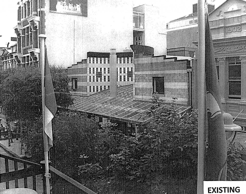
No sooner, it seems, than I had declared that my all time favourite Wellington building of the 1980s was this Polychromatic Block building by Stuart Gardyne, the Cutie of Cuba St (the building, not the Stuart: do keep up!), than this happens: a developer rolls into town, pistols drawn, clutching a Resource Consent, arms braced ready for a fight.
“We’re going to take this here building and rip it to shreds in front of your very eyes…” he drawls, spitting spittily into a spittoon. “We’re going to rip off that quirky little face you like so much, and leave it looking reeeeeaal ugly.”
( Note: imaginary, paraphrased conversation, not a depiction of actual conversation at all… )
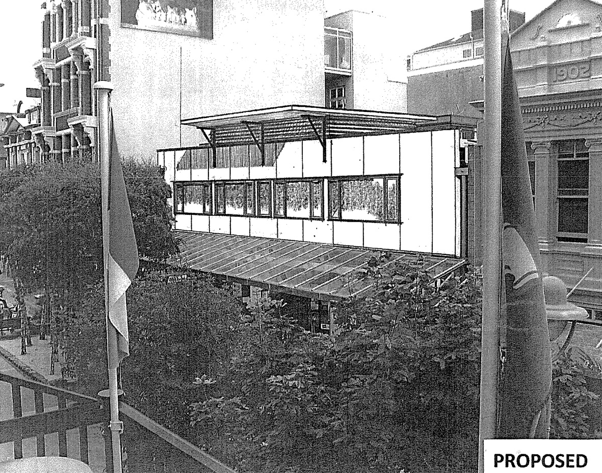
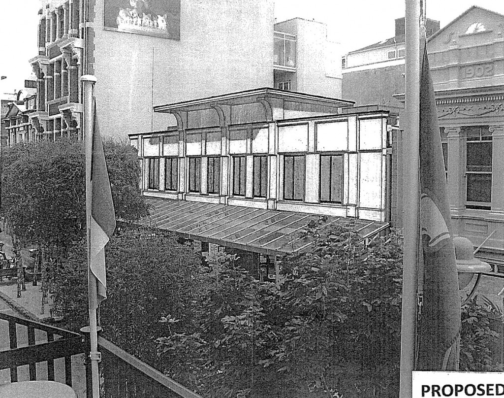
So ugly, in fact, that the architect involved (yes, architect, not just some rogue western draftee) was originally proposing some fibre-cement boards plonked over the top, and some steel brackets screwed through the front, in a parody of a classic Western style shack, but without the grace of a John Wayne or a Clint Eastwood to carry the day. The brackets carry a flat cap, surrounded by louvres, the dullest of dull details. Even McDonalds are pulling it off better these days, louvering their McCafe facades. It’s the sort of thing that looks bad enough in the suburbs, but looks even worse in the city: a dull, blank slash of windows, brutally piercing a flat, formless facade that has lost any semblance of the certain joie de vivre that so permeates the original. I really am dreadfully disappointed: if this happens, then truly the only good thing left from the 80s will be my old Cure records.
Its a curious conundrum: the original building, by Gardyne when he was at Structon, is a witty, colourful homage to the 1930s, utilising ordinary materials such as concrete blockwork to create a product that is quirky, amusing, and stands proud in the street. Yes, it is a piece of Post Modernism, but a rather good one in a sly little way, without heavy, overt references to the past. Yes, I can see that there is a small segment of lost revenue space, but the shops gain a cozy entry, and I still shop there regularly at the chemist. I pick up my weekly copy of the Capital Times from beside the non-lit lighting post. The ex-Mayor lives next door, the tables at the Bristol are always full of the same people (that old bloke with the beard – does he live there, or what?): its a colourful part of town.
The design above, which at first I assumed was a joke when I discovered this application at the Council, is so bad that it is laughable: although sadly, it was deadly serious. Lacking in grace, at least it contains honesty: Developer-Modern, Builder-Shed Hardies-Sheet style, if we could coin a current phrase for it. It’s ugly and it knows it: it’s not trying to be anything else.
And then along comes this, the Remix:
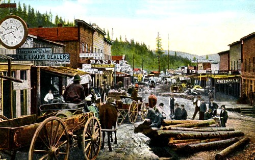
I’m really not sure whether I should laugh or should I cry: the design is now harking back a good century or two, no longer Developer-Modern, instead it is now a sort of pop-top caravan for the Medici family. It’s less ugly, to be sure, but now just seems false and hollow. Is it real or is it Memorex? The pilasters look a wee bit ‘olde’ but lack rhyme or reason. The capitals, if we can call them that, are a less than slick parody of a retro classical facade. Do I see a reference to the Temple at Karnak, or am I reading too much into it? I suspect so: this one is just as bad as the first. I’m sure there will be another version to come. Let’s hope that whatever is left of the Urban Design team at the Council has the ability to say a big fat NO. Although no longer a Gunfight at the OK Corral, it is still a Calamity in Deadwood, and as such, deserves to be railroaded out of town.



Blame Cuba Street design guide for such contextual lovliness: design guides = lowest common denominator…
On the one hand we have a serious heritage issue – for heritage to be a viable concept, then buildings of all eras need consideration. As you have pointed out, there aren’t many examples of pomo that are this, well, pomo… making this a pretty important building. I’m not exactly a heritage advocate, but if the wider public have that desire (and it appears they do), then it needs to be administered consistently – in spite of ‘area character’ guides.
On the other hand we have the issue of good urban architecture, and while I have no love for the building in its current state, I can at least acknowledge that it makes a positive gesture to the street environment through difference (if nothing else). The ‘carved-out’ entry recess makes this a little ‘urban event’ in the general facade wall of Cuba Mall, which the liveliness of colour and detail reinforce.
There is little between the two proposed offerings – the one the natural outcome of cheapness, the other the natural outcome of cheapness plus character design guides. Neither of which are actually uglier than the original in my opinion, although, as I’ve noted above, the original has other merits that these proposals appear to forego (I am assuming that they will ‘utilise’ the full footprint of the street frontage…?).
Can you please nominate Te Papa as your next favourite pomo special – I’d love to see some developer-proposed ‘improvements’ on that one…
“the one the natural outcome of cheapness, the other the natural outcome of cheapness plus character design guides”
I think you mean “cheapness plus character design guides minus sensitivity minus talent”. A really good architect could work with the design guide to produce something stunning, or that at least makes a welcome contribution to the street. And if I read Maximus correctly, it would seem that the second version hasn’t been approved either, so we can’t necessarily blame this on the design guide.
It’s also worth noting that there’s no such thing as a “character design guide” in Cuba St any more. PC48 replaced character areas with heritage areas, and while that propvides blanket protection for (most) buildings in the area with heritage value, there is no separate design guide. The Central Area Design Guide, if I’m reading it correctly, requires _all_ buildings to respond intelligently to their context. While it emphasises that in heritage areas consistency is usually more important than contrast, there are no specific guidlines for new buildings in Central Area heritage areas, beyond more specific height rules.
So, the first version ignores its context. The second is an overly literal attempt to “comply” with the context without really understanding it. It’s probably an architect’s perspective, rather than an urbanist’s one, that says “design guides = lowest common denominator”: you’re thinking that design guides frustrate creative architects’ attmepts to create stunning original buildings. Well, sometimes, and that’s not always a bad thing: a coherent city doesn’t come from every building straining to be different. But really the design guides exist primarily to _raise_ the lowest common denominator: stopping crap buildings or at least raising them to the level of medicority. Many if not most buildings are designed by (or for) those without the desire or ability to create great architecture, and if design guides help turn rubbish into something half-decent, then they’re useful. They just need to be applied intelligently so that the occasional spark of genius isn’t extinguished.
I’ve been racking my brains to think of what the original building looked like, and have just realised that it has a certain “Piazza d’Italia” quality about it. From memory. Must go and check it out to see if that is true.
Incidentally, while it seems we can comment on this post, the ability to comment on old posts seems to have disappeared. What happened?
Nice response – it seems you can’t be too flippant anywhere anymore… (which is probably a good thing). I was assuming (incorrectly?) the second version was approved…
Yes – I did mean to imply “minus sensitivity minus talent” within the label of ‘cheapness’… My ‘equation’ is not the result of a pro-architectural stance however, rather the cyncism associated with the those cute little design guide type sketches which end up becoming designs in the wrong hands. It becomes hard to turn them down in such instances – I think it better that they weren’t offered to begin with. I didn’t realise they had been dispnsed with in PC48 – it seems I have some revision to do…
And I am definitely all for intelligent contextualism as a default position (but not an exclusive one – we probably wouldn’t have seen the original building if that were enforced back in the heady 80s)
JCB – hmmm, Piazza d”italia? not so much, I think.
re the comments disabling on old posts – we were getting monster spam dumping on all the old posts – so now have restricted comments to those posts just in then last month.
W Pomo – (nice nom de plume, by the way…). The Council provides a great little service of putting out lists of Resource Consents Applied for (which I peruse, to raise alarm bells or not) and then another list of Resource Consents Granted – which thankfully often does not contain the same addresses. It’s worth subscribing to – it’s free, and its helpful, and it is democracy in action. But shush, don’t tell Nick Smith or Rodney Hide or they’ll make it illegal.
[…] This post was mentioned on Twitter by EyeOfTheFish. EyeOfTheFish said: New Post: Calamity Jane – http://eyeofthefish.org/calamity-jane/ […]
Please name the architect.
We need a “name and shame” in this instance.
I need to know….
No. He shall remain nameless. I’m too appalled to mention it.
Courage, Maximus, courage! Are you too appalled because they are a star architect and should do better or because they are total unknowns…? Who are you trying to protect and why? Someone you know and respect? If they put their work in the public domain, the public deserve to know and you – as a blogger (and the one who raised the issue inthe first place) – is surely obliged to tell us. Or do we have to go find the resource consent and post it here in a comment….?
Ha ! Not a matter of lack of courage, more that he already is nameless – ie I had never heard of him – and I suspect that he should remain nameless. I meant more that I was appalled that anyone calling themselves an architect should do this.
If it was a cadet in their first 3 months in a drafting session in Whangamata, or Hicksville, then I would understand.
If it was a Starchitect, then I’d love to post it. But no….
And I’ve just found out that another of my favourite bits of buildings is biting the dust, as we speak. More on that soon…..