There has been a lot of discussion on the subject of “ugly” buildings recently – it is a subject that seems to excite a lot of people. Over on the DomPost there is an article featuring Councillor Nicola Young talking about how there is the opportunity of getting rid of some “eye-wateringly ugly, and cheap building(s)“. She claims that her opposition to some of those buildings was not just about aesthetics, but practicalities.
“They’re not good, resilient buildings. We need to make sure we put up good buildings that are dry and don’t leak.”
The problem is, obviously, that it is not just the ugly buildings that leak. Nor can you argue that just because it is ugly, that it automatically should be knocked down. And nor can you agree that members of the public know anything about the subject of architecture. My guess is that most of them could not even spell the word correctly, let alone be qualified to say whether something is ugly or not.
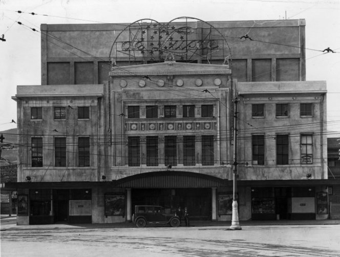
But there’s the thing – you don’t need to be qualified to have an opinion. And here’s the other thing – opinions are 100% subjective, so what one person thinks is hideous is as equally valid as what another thinks is beautiful. According to the DomPost, some “Neighbourly users say the Beehive is Wellington’s ugliest building” – which it obviously isn’t. Sure, it is unusual, in that it is circular in plan, and it may be a little confusing to those of little brain as to where / how to get into the building (its pretty obvious when you are there – just enter on the ground floor entrance between the two Parliament buildings), and it is no doubt annoying to those inhabitants who are trying to find their office after a few drinks (allegedly a common occurrence in the circular central lobby on each floor). But none of that can make the slightest difference in its visual appearance – i.e. it is not ugly by any of those standards. Yes, it is a highly unusual building, but No, there are no circumstances under which you could honestly say that it is “ugly“.

Well hold on right there. What does the word “ugly” actually mean then? It has a number of meanings, number one of which is: “very unattractive or unpleasant to look at; offensive to the sense of beauty; displeasing in appearance.” There are other meanings too, such as: “morally revolting” (i.e. crime), “threatening trouble or danger” or “mean, hostile, or quarrelsome“. But the really true meaning here is that ugly, to most people, just means “disagreeable, unpleasant or objectionable“. Those are things that you literally cannot disagree with – if somebody else finds a building objectionable, and you don’t, there is absolutely nothing you can do to make them change their opinion – except perhaps, by education and explanation.

But we live in an age where we don’t like things being “explained” by people who consider themselves to be “expert” in the subject. Architects, obviously, should know more about the subject than the ordinary person-in-the-street, and indeed that Stuff article quotes someone from the ivory tower of Victoria University, who is apparently an expert in ugliness. Senior lecturer Guy Marriage said: “it’s often the “ugly ones” that remain standing. Economics doesn’t work with ugliness. People with money will just be looking for opportunities. There’s an opportunity to lose some great bits of Wellington too.” I’m not exactly sure what is meant by this, but I guess that what he is trying to say is that just because one person thinks a building is ugly, does not mean that therefore that building will be demolished. Chances are, the good looking buildings may be demolished and the ugly ones remain. He then goes on to say that “there were a number of buildings on Kent and Cambridge Terrace that could be happily bowled and no one would shed a tear”.
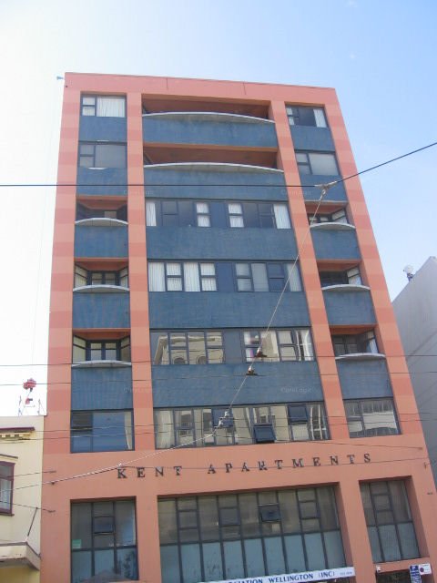
That is undeniable – virtually all the buildings along Kent and Cambridge are hideous, apart (of course) from the Embassy Theatre and the old tall Post Office building near Alpha St. That’s just my opinion, of course, but I defy anyone to name a building along there that couldn’t be replaced by something better. Does that mean that buildings along Kent Tce / Cambridge Tce are more ugly than others? Or does that mean that it is more like: All buildings in Wellington are f***ing ugly, take your pick of any of them.

Or is it more like a situation of: all modern buildings are ugly, full stop? Is it that the public just don’t like the same sort of buildings that architects like? Hold on – who even said that Architects like these buildings? Maybe they are human after all, and hate these bad, boring buildings as much as the rest of us? I can’t imagine, for instance, that the designers (or owners) of the blue building in the image above, are particularly proud of it. But is it ugly? Or just interminably boring?



I wouldn’t say that the blue building is ugly so much as it is dull,flat, lifeless and prosaic
Ugliness requires some effort, it’s maladaptation is a form of growth and development, even if it is in a visually sick-inducing direction
Check this one out for a really ugly building, it looks like a bad 80’s remix of a Bond villain’s lair done on the cheap with a few columns so big that you’d swear you were in the midst of some gargantuan chess game
https://www.trademe.co.nz/property/residential-property-for-sale/auction-1871820247.htm?rsqid=c3200e06ec404ab1a7793359de80c581-015
Someone made an effort
That same someone shouldn’t have
Well hello 60 and welcome back. I was wondering where you had got to. Checking out property up in the Rangitikei I see? And yes, I do believe you’re right – that is pretty spectacularly bad. But the Estate agent thinks it is great – “The unique hexagonal form of the expansive residence is a masterpiece of design and engineering.” And over 6,900 page views – it’s popular with someone! I wonder whether the builder designed it, or the engineer – pretty sure there wasn’t an architect involved – although it has been very carefully done to a high standard of tackiness. That’s the thing – beauty is in the eye of the beholder – as is ugliness.
It may be influenced by rotary milking sheds if it isn’t actually a rotary milking shed tarted up.
Paul – Extreme levels of tarting up must have been happening if it started off as a rotary milking shed. It is so hard to tell. So much easier in the competition for World’s Ugliest Dog.
https://www.theguardian.com/world/2019/jun/22/scamp-the-tramp-worlds-ugliest-dog-contest
While I agree with Nicola Young that the only way is “up”, her Karori old-money views on architecture are not much different from Prince Charles.
Back to the blue building… I wouldn’t dismiss it out of hand. It’s humble little workhorses like this which make small businesses possible in active cities. Try setting up a car stereo warehouse in Majestic Tower or the Briscoes barn.
Seems we are still suckers for pointed brickwork, verandahs and recessed windows, though. We hanker after that elusive “character”. Unfortunately it seems like 60 or so years ago a bunch of cheapskate developers read the first page of a Mies textbook and figured they could ditch ornamentation and solid internal walls, call it modern and pocket the difference. In a decade or two we went from the equally workaday (but character-filled) Francis Homes building over on Taranaki St to this. Many aspects of usefulness survived the stylistic change, however. There are plenty of examples of these solid 3-5 storey urban sheds being stripped down and re-purposed for new commercial or residential users.
Hi there Kumara – a loong time since I’ve seen you here – been away on holiday? And, yes, I think that Nicola really does see herself enjoying a long weekend at Highgrove…
Starkive – too late – i’ve already dismissed it – i know you’re right and that it is a humble little workhorse, and that it is not so much ugly as just plain tedious, but still – its one of those that could just go away and no one would notice.
Cambridge Hotel could be nice with a bit of TLC and I’m sure some people would enjoy the brick Congregational Church on the corner of Lorne Street. And you couldn’t call that sweet brick house (between the unlovely VWs and Range Rovers of Gazleys and the equally unlovely KFC) ugly – surely!?
The Pharmacy Building has some Art Deco charm and the Armstrong Prestige building tries to be something other than ugly.
And then there is the Hannah Playhouse – so ugly it is beautiful?
Other than that, I agree with 60 MPa – there are a bunch of ‘wallpaper’ buildings that create an acceptable urban fabric without being especially handsome or ugly. The worst aspect is not necessarily even the buildings (and there really are some shockers), but the spaces between that host all of those car yards. Mind you, Paddington has shown us that what can replace these empty sites might not be that much better.
Levi,
I think the main building they are gunning for, is the Gordon Wilson Flats.
Heritage values aside (of which I think there are some, but over-ridden by all other concerns in this case), you cannot deny that it is now, being structurally unsound and dilapidated, and too costly to repair given its size – ugly.
Far better that it comes down in a controlled manner, than to be a dangerous collapse in a gentle temblor, or a not-so-gentle Wellington super-zephyr.
And in it’s place, something that is exemplary in both form and function. It’s not like we are short on creative architectural talent in Wellington. =)
Seamonkey – saying that Gordon Wilson flats is ugly is grossly unfair. Yes, it looks terrible at the present, but that is because it is uncared for, and unkempt, and covered in graffiti. That’s like saying that just because I haven’t washed for a few weeks and have got bad hair and lots of acne, that I should be killed off.
No, No, and thrice NO..!! Gordon Wilson flats is actually really interesting inside – possibly the most interesting apartment building in Wellington (as you would know if you have ever been inside it). It is completely able to be restored, renovated, and lived in as a series of very modern and desirable apartment dwellings. There are a couple of similar buildings around the world – there was an almost identical one in Auckland (but I believe it was demolished last year?), and there is the Unite d’Habitation in France (Corbusier’s brilliant apartment block), and a few others – but it is a brilliant building that should be kept. It is also not likely to fall down in a quake, let alone a “gentle temblor, or a not-so-gentle Wellington super-zephyr” – opinions on how delicate it is are widely varying.
Re: seeing inside Gordon Wilson.
Thanks to two innovative and dedicated Vic Uni students, we can.
https://www.thewellingtonapp.co.nz/news/architecture/vr-heritage-proposed-for-gordon-wilson-flats/
https://www.victoria.ac.nz/news/2018/08/preserving-history-through-virtual-reality
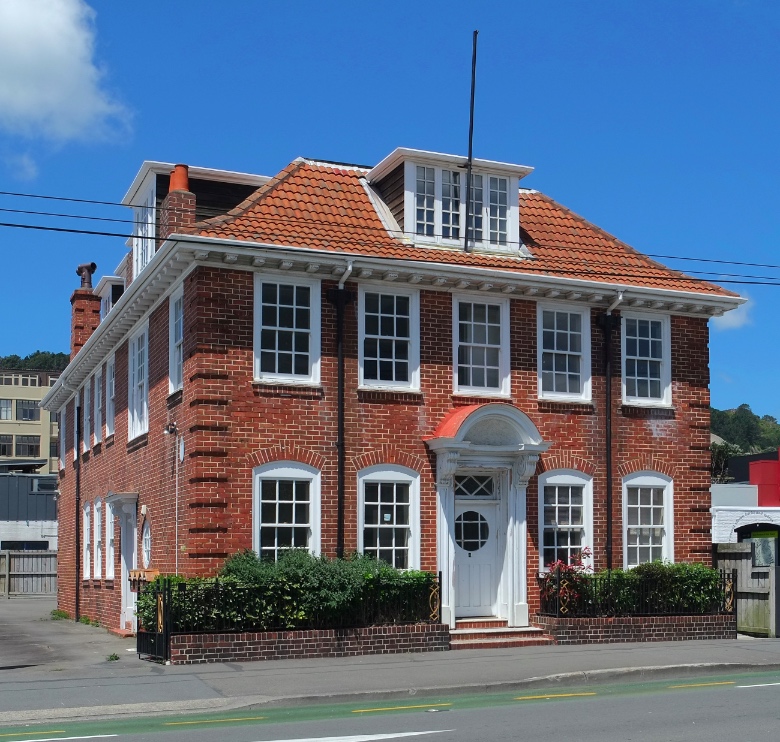
Is that simulated mock-Georgian brick thing half way down Kent Tce still there? The red of the brick used to blend so nicely with the KFC next door. . . such a shame it didn’t have proper New Zealand corrougated iron sides. . .
Henry, yes, it is still there (and picture added above). Called Elliot House after Dr James Elliot, its original occupant, it was both his home and his doctors practice. Built in 1913, so yes, it is definitely neo-Georgian – and although it is Grade 1 listed, there is something odd about it. Is it the proportions? The brick detailing? The windows? Somehow something just doesn’t feel right to me here.
Seamonkey – thanks for finding those. Does that mean that you are a Vic student then?
Poundbury avant la lettre.
Le prince de Galles a beaucoup à répondre….
Interesting discussion. Ugliness is a state of mind, mostly, in my view. Humans – and other mammals – are very visually focused, especially with regards to the face. Hence your cover picture, of the man in the bodice (or woman: its hard to tell), looks ugly not just because of the protruding ears and forehead but also because of the pimple on the cheek, the wrinkles, the odd garb and the sagging flesh of the breasts (ok, maybe it is a woman after all). Children will often pick on someone who is visually malformed – adults too. In a similar manner, packs of chimps will often harass a deformed chimp to death, because they are not conforming to the ideals of chimp beauty (whatever they are).
Similarly with buildings. There is no end of ugly buildings really, if you look hard enough, but the examples you have shown are more bland and drab rather than mind-searingly ugly. As 60 MPa says, “ugliness requires some effort” and it is often when someone has tried – and failed – that it becomes really objectionable. The Majestic Tower fits well into the category of ugly in my view, as it is mis-shapen, with one side circular, the other has square projections – and the wild spiky fringe up top is just embarrassingly bad. They tried hard to make it good – but hey, it was the 80s or the 90s and there wasn’t much hope for success.
Leviathan,
The Elliot House was significantly altered in the late 80’s which may help explain some of the oddness.
“The valley between the double pitched roof was converted into a third storey and covered with a flat roof. Dormer windows protrude from the original roof line and interior was completely refurbished.”
In more recent history the illustrious Neil Patel was fined for un-consented alterations to the interior and the addition of a series of infinity units to the outside and I believe it is still vacant.
FYI: Wikipedia says: “The Ugly Duchess is a satirical portrait painted by the Flemish artist Quentin Matsys around 1513. The painting is in oil on an oak panel, and shows a grotesque old woman with wrinkled skin and withered breasts.”
“A Grotesque Old Woman (or The Ugly Duchess) is perhaps the best-known of his works. It served as a basis for John Tenniel’s depiction of the Duchess in Alice’s Adventures in Wonderland. It is likely a depiction of a real person with Paget’s disease, though it is sometimes said to be a metaphorical portrait of the Margaret, Countess of Tyrol…”
Thanks Dawid for that – I knew about Mr Patel’s renovation work on the building, but not about the roof. Beats me how it has got a Grade 1 listing then! Shows we must be a bit desperate for a spot of Mock Georgian….
Gary – thanks for your erudite contribution. It got me onto researching the history of that painting – have been reading up about Quentin Matsys for the last hour. It’s funny where conversations go on this site – that’s why I like it. All i can say about the Majestic Tower is: Yes. Totally agree with all that.
Levi – no, not a Vic uni student (past or present). Just a nerd who loves technology like that, among other things.