Hysteria grips the nation. Foolish words are said by foolish people, about mediocre fontography.
But what do others have as a logo? How do we compare?
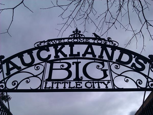
What does Auckland have?

Oooo, that’s boring. Official though. Their PR campaign is separate:
What about over the ditch, in the West Island?

That’s, ummmm, boring, and simple at the same time. But I guess it is recognisable.
What about that other Aussie city? The one that we are apparently so like…
They used to have a REALLY boring naff logo – Then it got much more interesting:
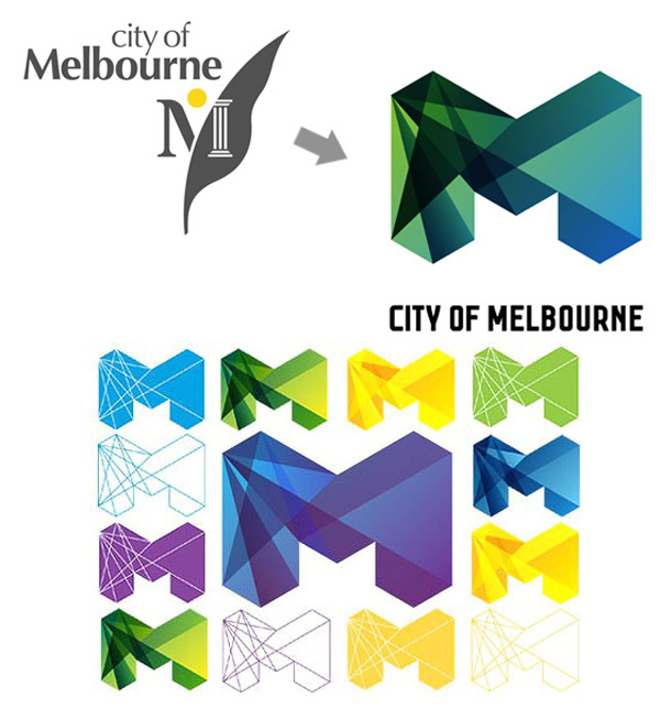
Now it’s gone all official, as well as sexy and sort-of-architectural:

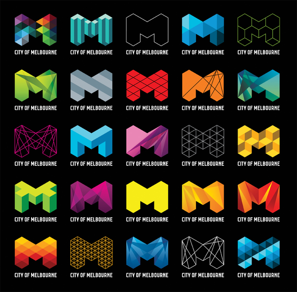
And now they’re doing funky multiples. Damn those clever Aussies! Federation Square finally has a decent purpose!
But what if we just turn their campaign on its head?
There! Problem solved!

But, we might get a bit sued for plagiarism. Hmmm, think again.
What did New York do?

Yep, and seventy million T-shirts later, this is still going strong.
What about San Francisco?
Oh god, tedious officialdom. This one is less elaborate, but no less boring:

Their sports teams are much more graphically funky:
OK then, time to wrap this up, and select a new logo.
My final suggestion, therefore, is, something that we are already world renown for:
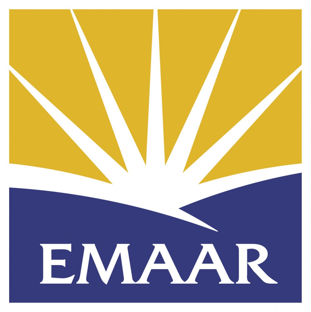
Postscript: And just speaking of plagiarising city logos, the City of Amarillo in Texas, had a bright idea…. which turned out to be someone else’s idea. Seems that Emaar in Dubai really got to it first…. have a look and see what you think….
That’s… pretty similar… What an astonishing coincidence!

The inverted Melbourne logo would have gone down a treat if we had Morrison in the mayoral office instead of CW-B.
Looks pretty sexy, I must admit.
Meh, what’s a lawsuit worth against the warm fuzzy feeling of a nice city logo…
Interestingly, the WCC still uses its coat of arms as its “official†emblem. I recall how it used to appear on all manner of material (letterhead, signs, on the sides of council trucks etc) but I believe it is now only used to “seal†documents to make them legal. There is a nice remaining example of the crest on the side of the Michael Fowler Centre facing Cuba Street.
http://www.iponz.govt.nz/cms/image-library/trade-mark-images/image-coat-of-arms-of-the-city-of-wellington/image_preview
John H – actually, I think that must be MY coat of arms.
Poisson, rampant, sur la crest. Suprema a situ.
I really like the Melbourne ‘M’ – which got me thinking that you could have a Wellington ‘W’ that looked like bush-clad hills with houses clinging to them. And little roads winding up them, with tunnels. Ok, maybe not. But on the subject of hills, how’s this for a solution to Wellington’s sunless gullies?http://www.theguardian.com/world/2013/nov/06/rjukan-sun-norway-town-mirrors
Carringtonia yes please we need something like that in Mitcheltown and Aro Valley! Need it installed before the next winter!