I’m very excited to see that work is really going ahead on the replacement for BP House in Wellington. As a city, we’ve been a little quiet for the last few years – the Dom’s reporter got it a little wrong when he said no new building had been built for the last ten years – but it’s not far off. There has been a lot of energy spent on retro-fitting buildings with increased seismic resilience, most notably the Majestic Centre, which has been ferreting away for a couple of years now doing major structural work on their core. Vital work, to stop the entire building collapsing in the case of a major quake. Other buildings, like virtually every crappy Chase Corp building in town, are also being seismically reinforced – corner of Courtenay and Tory is almost done (a Naylor Love project), while the Reading Carpark building has re-opened, just a mere 2 years after some tiny Seddon quakes stopped it from working. It’s all money well worth spending, but its not glamorous and new and exciting. Whereas this new building will be all that, and more.
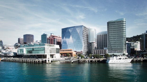
When this building was first announced, there should have been an outpouring of applause. We need this building, we really do. Like the Meridian building in front of it, it is being designed by a cracking good team of Studio Pacific Architects, and Dunning Thornton consulting engineers. The most exciting thing is, of course, that it is going to be base isolated, and correct me if I’m wrong, but this will be the first tower building in Wellington – maybe even the first in New Zealand – to have base isolation. This is a system that was developed here in the Hutt Valley, and is now used around the world, so it is massively important that we can demonstrate it working on a tower building on reclaimed land at the edge of the harbour.

We all know what happened to buildings on dodgy land down in Canterbury during the quakes, and those nearest the water suffered particularly badly. The Christchurch Town Hall (just confirmed again to be retained – hooray!) is largely intact and in perfect condition with the exception of its foundations, which have spread and slumped towards the water. It’s going to be a major task to jack the whole building up, cut off its feet, and rebuild the foundations – in fact of all the money going into that rebuild, most of it will be going underground.
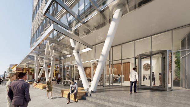
So this project will be one to watch closely. Buildings such as Meridian, about as close to the water as you can get, have long piles going right down to the rock beneath the harbour’s reclaimed edge. But Meridian is presumably also relatively light – only a few stories tall – whereas 20 Customhouse Quay is far taller. What I am really liking about this project is that the diagrid reinforcing structure that Cattanach has proposed for the building is evident right from the ground, and then subtly informs the elevation up above. Clear glazing up above will allow fantastic harbour views, and also help bounce light off in all sorts of interesting effects, like a giant Swarovski crystal. The Telecom building does that too, in Willis St, to great effect, but this one will work even better thanks to its location. This has been tried before, with a building that Athfield Architects designed (not proceeding) for the site next door:
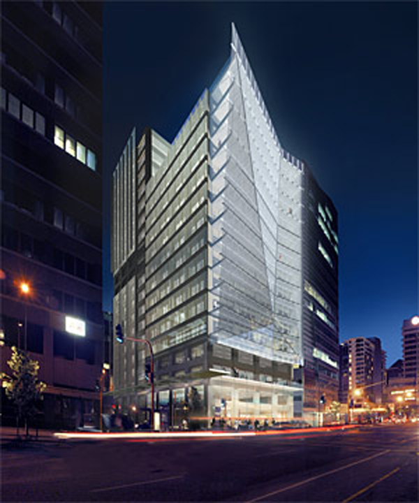
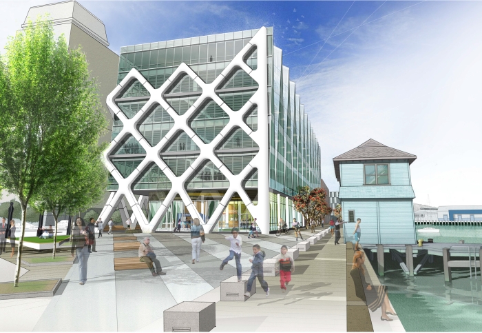
…as well as the ill-fated Studio Pacific building for site 10 on the waterfront, that is also not proceeding:
It would be good to know a bit more about the ex-BP project but details are thin at this stage. How will a 5-star green rating be gained with that massive wall of glass? Will it be twin-skinned as its little brother across the Quay? What is happening on the other facades – is the crystalline crinkling of the facade extending onto the western face as well or is that just butting up against the neighbours with nothing to say? We can almost see the north wall, but what is happening with the south wall? It reminds me, a tiny bit, of the Hearst Tower that Foster designed and built in New York, but there the base was already defined and the new tower could ascend unfettered and perfectly crystalline into the sky. We don’t have that luxury here in Wellington, and nor do we have Hearst’s unfettered budget.
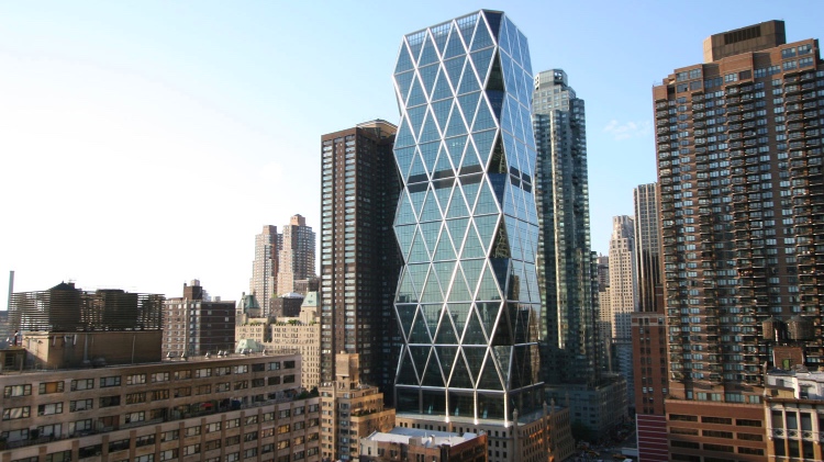
So: this is the start of the new Wellington. Who’s next ?


Stumpy. That’s what a friend of mine said tonight. Awkwardly proportioned and a little bit stumpy.
Well, no, i wouldn’t call it stumpy at all. It is, after all, about 17 stories tall – which is reasonably tall – for Wellington. Hard to tell if it is wider than the previous BP house.
The diagrid proportions though, are interesting. If you look hard enough at the main picture, there is another structural grid visible inside the larger external metal grid. By the looks of it, with nodes every 3 floors.
Existing BP building is 12 stories tall.
New building is 14 stories tall, according to the DomPost report you linked to. Not 17 stories, as you say above.
“If you think no-one cares about what you post on teh interwebs, just make one spelling mistake”
At 17 or 14 stories I can see why someone might think it is stumpy but if it goes forward as designed I look forward to seeing the scudding clouds reflected in it’s visage
Not the ugliest I’ve seen
Exactly. That facade, with it’s different facets, should sparkle and be interesting, in a way that other more rectilinear facades cannot.
Alan: thanks for spotting that mistake – my bad!
Why did the Athfield building next door not go ahead? It looks interesting as well – imagine if the two of them were built, next to each other, with their fractured facades – what a spectacle!
There was yet another Athfield design proposed for that area which I think pre-dated the 1987 share market crash. It was pretty spectacular in terms of architecture, height and engineering. Was to be c.35 floors and had a Lutyens-inspired apartment “village” off to one end at ground level. The idea was of a lightweight building where the weight was taken at each level by an exoskeleton rather than having the to carry the weight all the way to the ground through the building. Waterfront Watch would have had kittens had they been around at the time.
https://drive.google.com/file/d/0B6_SV2Aa8Vl_c3VQNjUwNGNhbTQ/view
It’s interesting seeing the proposal set against Wellington in all its 1980’s glory
[…] the need for solar control on this tower compared with the Hearst Tower in New York (refer to our last post) – here’s that picture again: There, the tower (much taller) is also a diagrid, and is […]
For more on 20 Customhouse Quay, refer to this next post:
http://eyeofthefish.org/more-on-customhouse-quay/