I’ve been quiet about this new proposed building because Scoop, Stuff, and the Arch Centre appeared to be taking a lead on discussing it – but discussion seems to have died down already. Public submissions close on March 9 – ie Friday, but this is the submission period before a more formal Resource Consent application.
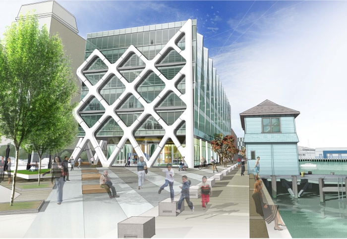
This is the most important new building on the horizon – well, OK, given the current parlous state of the construction industry in Wellington, just about the only new building on the horizon, but you know what I mean. It’s a controversial site – the rabid grannies at Waterfront Watch appear to think it is the end of the world, because it blocks views when you’re driving along the waterfront, but if the public doesn’t really care too much, perhaps they are fretting over nothing. Waterfront Watch certainly do have a good role to play – their point of view that there should be NO buildings on the waterfront is controversial, but their championing of the anti Variation 11 clause is a really interesting battle, and one I agree with: buildings on the Waterfront should be publicly notified, rather than just given approval by some faceless body behind closed doors. This site really does belong to all of Wellington, and so all of Wellington should have their say.
I’d just like to take a look back at the previous proposals for this site – way back in 2007 there was a competition for the sites 8, 9, and 10. In what I thought was a pretty odd decision by the judges, all three sites were won by Athfield Architects – we blogged about it here. The Athfield building for Site 10 looked like this from a similar angle to the image above:
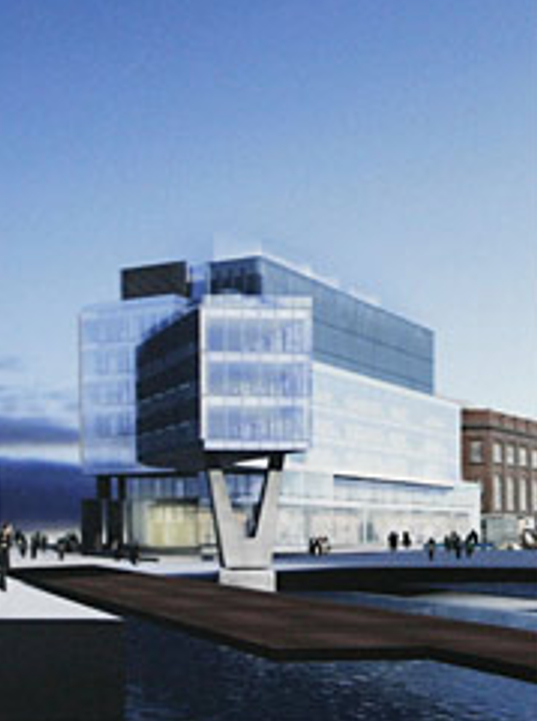
So we can see from that picture that the building footprint has retracted quite a bit, and no longer reaches like a giant finger into the waters of the harbour. In that Athfield picture the old Eastbourne Ferry building seems to have been wiped from the face of the earth, but we can see from this other picture of Ath’s that it was just nestling in the undercroft:
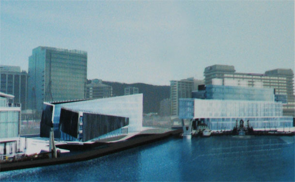
By comparison, the building from Studio Pacific (with structural engineering from Dunning Thornton) will look like this from a similar angle:

It’s a very different building – it’s far more interesting in many ways than the previous boxy number (although without the giant finger / toe dipping into the harbour) – and the involvement of the engineers has been presumably more to the forefront on this building, with the big exo-skeleton wrapping around 3 sides of the proposed new crinkly box. That’s the bit that most people seem to be concentrating on discussing – does it look sexy? does it look boring or bland? has it been done before? can it be done here? why is it being done on 3 sides not 4? Comments on Stuff seem to be running both for and against it:
AND #33 01:59 pm Feb 08 2012 “Hide that ugly NZ Post building I say! It’s so hideous – from all angles. This part of the waterfront is an ugly barren concrete jungle and the sooner something is done to it the better for Wellington & all of us. Seriously, when is the last time anyone actually went to this specific part of the waterfront and spent some time there & enjoyed it!? Good on the developers for beautifying the area and making a large portion of it a great, weatherproof and interactive public space, & a more welcoming one for cruise ship passengers.”
fmacskasy.wordpress.com #42 08:50 pm Feb 08 2012 “Building high rise office blocks, on reclaimed land, right by the shoreline. Oh how bloody clever is that? I wonder who the poor buggers will be who will be working in that death-trap with the Big One hits Wellington? And who will take responsibility for building that disaster-waiting-to-happen? Silly question; no one will. To the powers that be; this is not a good idea. This will end badly.”
Yevan #10 09:22 am Feb 08 2012 “Watch as millions are spent on the monument to greed and wealth, while the %1 tell everyone there is no money and wages have to be cut. The government are preaching to people that they better do without in order to save for their retirement, so what is the deal with this? What use has Wellington of another monument to the wealth and greed of the filthy few, Wellington is a city that belongs to the people which belongs to everyone. These people have the technology to work from anywhere; we do not need this hangover from the industrial age that constantly reminds us of the inequity in our society. The people of wellington need to light it up for once, enough is enough.”
argh #40 07:01 pm Feb 08 2012 “Why won’t somebody think of the children?!”
Comments on Scoop are more typically against it (it is run by Lindsay Shelton, a former head of Waterfront Watch, after all, so many of his followers will be posting there), although at least Jitterati adds some much needed humour:
Sigurd Magnusson, 8. February 2012, 21:31 “Where will the motor homes be located now? I walk past the carpark each day and notice a fair quantity of use by tourists.”
Elaine Hampton, 10. February 2012, 21:38 “You know – just because we have the coolest little capital in the world (and speculators want a piece of the action) doesn’t mean it can’t be ruined by another UGLY building. And whatever the debonaire mock ups look like, the real thing is nothing like it. This is awful – the Waka was bad but this is just appalling. Who was it said it was just a piece of ‘waste land’? I think these inner city camp sites / open spaces are what give Wellington its human scale. The waterfront land was donated to the city, and should remain open space for residents and visitors, not leased to speculators at effectively peppercorn rents. Tthere are already too many buildings on the waterfront. Some people do not think we are a city unless we look like a mini New York, never mind how hard it is to live in for most people. We may be the 99% but the 1% appear to have the law bent to their benefit.”
Jitterati, 9. February 2012, 2:24 “You can tell it’s a brand new building, they haven’t taken off the protective wrapping yet.”
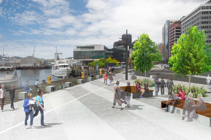
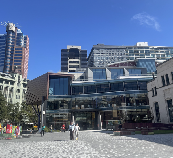
Most of these comments just talk about the outside of the building, or the blocking of the views. But to me there is something even more important to discuss – the inside:
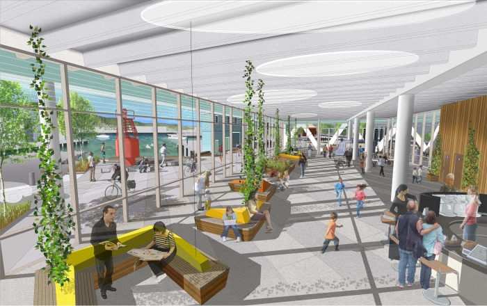
This internal space has been designated as ‘Public Space’ and is proposed to be a non-corporate space, just for Wellingtonians to hang out in. It is described as “a generous public winter garden / indoor plaza on the ground floor which is seamlessly stitched into the waterfront promenade and public spaces via sheltered colonnades and walkways.” How does that work exactly? How does that work for you? I’m interested to know.



To me this proposal in much more box-like than the athfield scheme – one focuses on form without any thought to the surface, the other on minor shifts in surface and putting structure on the outside to hide it’s boring form. Frankly, neither really gets the balance right… and I do love that we have camper vans giving the finger to big commerce on our waterfront, so will be sad to see them go.
But back to the interior (caveat the below with the fact that I didn’t make it to the briefing session with studpac, so comes from a position of ignorance). I can see how a space like this would work in a public service building (e.g. library etc), but I find the concept really, really difficult within a commercial premises. How does a passer-by distinguish this glassy atrium from the BNZ one or Waggamamma? One might think they had similarly evocative prose written about their connection to the waterfront promenade or sheltering capacity, but without an active community function within the building I fail to see how this space will pull in the public. I’d love to be convinced otherwise, so can’t wait for the discussion.
Rushed thoughts before class:
I like this. I prefer any building to an open-air carpark. Public space is defined by it’s edges not its acreage.
I’m excited by the prospect of the indoor public space – provided it isn’t a 400 degree greenhouse in there. I like that there will be somewhere in this city to sit without having to pay for the privilege. Where are you supposed to go with your sushi if it’s raining and you don’t want to eat at your desk?
Now to complete the Silver Mile (Courtenay to Station) they need to convert the Chaffers New World carpark into a continuation of Blair Street and line it with bars and shops, and add some shelter along the way.
I feel like there should be more ladders from the harbour – I’m pretty clumsy and I’m always worried about the lack of ladders in case I fall in.
I like the exo-skeleton and I like the idea of a winter garden. A city I used to live in had one and it worked well. But… Anything would be better than the concrete wasteland that is there at the moment.
I think that corner of the waterfront could do with a tidy-up. Why are we loading ferries there? I think some of that industrial activity could be moved down the harbour a bit. Then we’d be able to join up the Stats/BNZ zone with the Meridian zone via new medium-rise buildings and public facilities.
The Athfield alternative looks dated. The extension out over the harbour looks like the sort of thing East Germans would have done in the 1970s. Doesn’t the Upper Hutt City Council chambers have something similar going on?
Lastly… Why are all the people in the pictures translucent? Will we be sharing the city with a ghost infestation?
pretty generic shit in the landscape department. not too sure what that tree is but looks like it would last 2min on a good wellington day. feels like too many small bits of shit. The waterfront is a hard, tough and robust place and it seems the structure is the only things that acknowledges this. Architecture seems secondary to NLA. The bit of fluff on the harbour facade does little to excite.
Why no colonnade on the harbour edge?
wintergarden = bullshit marketing tool. On a sunny day your outside. A howling southerly your out at makara and not looking at some double Ts
What about the poor cyclists. I see the photos have a few pictures of cyclists trying to navigate around the building. What a joke. Its getting really bad on the waterfront esepcially in this area. The site of the building is a pinch point between traffic, pedestrians and cyclists at the moment. Wasn’t this one of the reasons that the hotel on the wharf was stopped?
One way to solve this is for the council to put a full cycle lane (as big as a car lane) along the quays and makes it safe for cyclists to cycle on the road.
I’ve been thinking about this one, and wondering why its failure to ‘excite’ me seems so unsurprising to me. I should be more upset about the fact that, while it perhaps is not a ‘bad’ building, it surely doesn’t qualify in terms of the vaunted ‘design excellence’ for new waterfront buildings. Perhaps I am getting a bit jaded by contemporary architecture more generally, I thought…
But now I’m wondering if there aren’t other site specific issues at play here. Pretty much all of the new work on the waterfront is in the ‘object in space’ genre – one that I find wholly uninspiring on the whole. Without meaningful relationships with neighbours, controlled by frameworks such as the street, the buildings have to try harder to be complete and autonomous. This is exagerated of course, by the contrast between the slick aesthetics of contemporary design, and the more robust aesthetic of the existing waterfront.
The Athfield proposal attempts a more interesting relationship to site, and the Meridian building starts to make nice relationships with space and contecxt on the plaza side (I’m wholly unconvinced by the relationship to the waterfront promenade on the other side though). Chaffers address the promenade nicely (except for its atrium). Let’s not talk about Te Papa at all.
It is a conundrum – how to achieve aesthetically and spatially integrated objects-in-space given the nature of the site, and there really isn’t much in the way of successful precedent here. I recall at least one masterplan showed quasi streets and blocks at the railway end, importing a more urban framework to deal with this issue. The alternative, which is what we are getting (and the proposal above is another prime example), is a series of separate almost autonomous buildings in their own little plazas. I’m really not sure if that is approrpiate or not…??
I’ve been grating about this project. Something bothers me about it, and the fine words mentioned in the press releases. Then it grabbed me: Winter Garden.
Really? A winter garden? That’s an overly optimistic phrase. There is a large building above, blocking all access to the sun dammit! A winter-garden would normally have a glazed roof and walls, and be a very warm, sun-lit space, full of leafy fronds and ferns, growing plants and sheltering people. A frothy green wintergarden next to the sea would be a drawcard.
This space is not a winter-garden. It is a corporate lobby masquerading as a public space. If it is closed off at night, then its not public at all. It needs to be open through to people all night long, and most of all it needs to not have a roof.
I went down to site the other day – it was basked in sunshine. There was bugger all view of the sea except right at that end, and there was a strong smell of car exhausts and a whiff of fish, but overall, I gotta say: this could make a nice park. A proper winter garden in a park – I like that idea!
For Wellington this seems to be a pretty average building concept. Another angular glass rectangle, exoskeleton, crinkled or otherwise doesn’t seem to demonstrate the kind of ‘outside the box’ architecture the city has fronted up with before. Why try an exterior form you might find ocurring naturally around the city? (Ref the Aqua tower in Chicago). Not advocating a tower, but that kind of exterior could equally be inspired by weathered driftwood tossed up on the Petone Foreshore or the puddles left by a receding tide. In a horzontal format I think you’d have a winner. This kind of weathered appearance also goes well with the capitals legendary elemental character in one of the windiest parts of the city.