Slight change from Wellington – how about we look at the Hutt for a change?
And yes, the Hutt is due for a change. Tenders are open for Lower Hutt’s new Square, which starts to make sense of the jumbled mess of parking that is currently outside the New Dowse. Design of “The Square” is of course by Athfield Architects, who did such a great job with the rebuild of the Dowse itself. It will be a “space for outdoor events, sculpture, exhibitions and leisure activities.” And it is proposed to look like this:
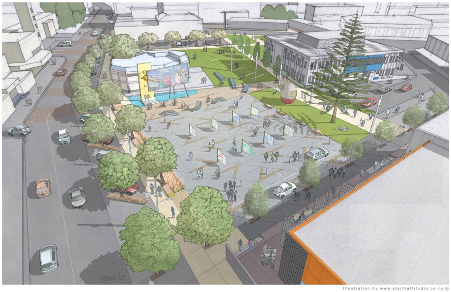
We were sent this from WCC’s friendly PR person – thanks Richard – I presume this went out to the DomPost as well, but as far as I can see they never ran it – which is a pity, as it deserves a wider audience than this modest (but highly influential) blog can do (modest cough).
The Square is all part of the Hutt’s “CBD 2030 Vision” which Hutt City Council Chief Executive, Tony Stallinger is really proud of – and who sees “The Square becoming the cultural heart of the city due to its proximity to the various civic buildings and The Dowse Art Museum. New car park spaces will be created first and, after Winter next year, stage two will see construction of the final elements, including a water feature that taps in to the valley’s natural artesian water supply and a large digital screen.”
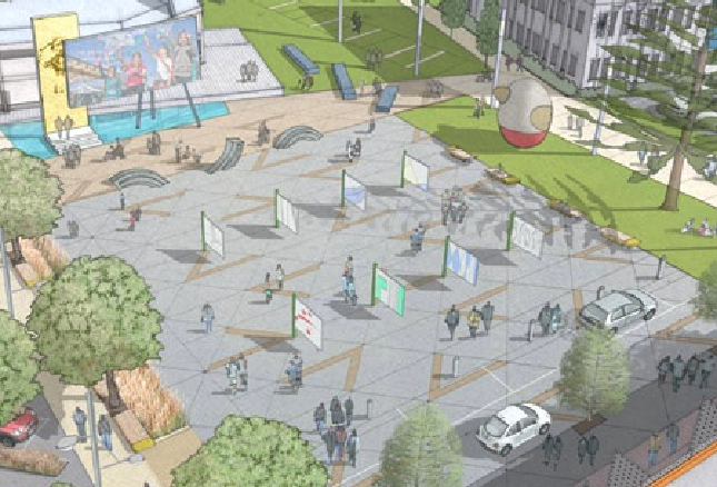
We all know that the Hutt’s public spaces are currently a disaster zone – a model of flawed fifties urban motorway planning, colliding with a staunchly non-heritage viewpoint from several of the Councillors in the past, and one of the worst wandering ring-road designs outside of the Bull Ring in Birmingham – so it is way overdue for a decent tune-up. The current precinct around Hutt’s collection of groovy 50s buildings (such as the Horticultural Hall) is beset by a cross road and there is little enclosing of public space with an almost suburban layout to their public buildings : surrounded by grass or surrounded by tarmac, either way they feel marooned and abandoned.
There is no doubt that the area concerned is crying out for a different scheme to what is there at present – although, I’m not entirely sure that this scheme is the answer to everything, but it does go a fair way. It attempts to anchor the ugly little Visitors Centre into the overall vision with a nearby pool, which looks across a proposed urban plaza to the New Dowse beyond. There is a fairly large space of public “Square” which is the home for “Art” and “Sculpture”, but also, sadly, home at least for a few cars as well, if these pics by Stantiall are anything to go by. The PR release says:
“Athfield Architects have responded to the community’s call for a space that everyone can enjoy both day and night and have drawn inspiration from their successful design of Waitangi Park in Wellington. We’ve put a lot of energy in to developing a multi-use space with extensive input from the community and almost every team in council.â€
Hmmmm. Day and Night? I’m not at all convinced that this will work as a public space, or that any parallels can / should be drawn with Waitangi Park in Wellington (one of my favourites, and phenomenally successful as a multi-use public place). Waitangi Park works because Wellington is an intensely urban environment, and it is a welcome green release from all that grey. But this “Square” is doing the opposite, tricky, and almost impossible task of trying to be an Urban Square in an otherwise almost park-like setting. As a place to go, to hang out, with friendly interactions with people passing by, it is missing a number of the really important parts of any urban composition.

But what would I know – after all, Fish don’t even have legs to walk around the inner-city on. So let’s look instead at what others have to say. Jan Gehl, of course, has published widely – always worth a read. His latest book, Cities for People, is a really useful resource for those interested in urban planning. There’s also the Grand Urban Rules book I reviewed a while back, with several slightly sardonic rules of engagement with the urban fabric. In matters on-line, there is an organisation in the USA called the Project for Public Spaces, or PPS.org, which has published / blogged quite widely about these factors. In an article titled What Makes a Successful Place, it notes:
“Great public spaces are where celebrations are held, social and economic exchanges take place, friends run into each other, and cultures mix. They are the “front porches†of our public institutions – libraries, field houses, neighborhood schools – where we interact with each other and government. When the spaces work well, they serve as a stage for our public lives.
What makes some places succeed while others fail?”
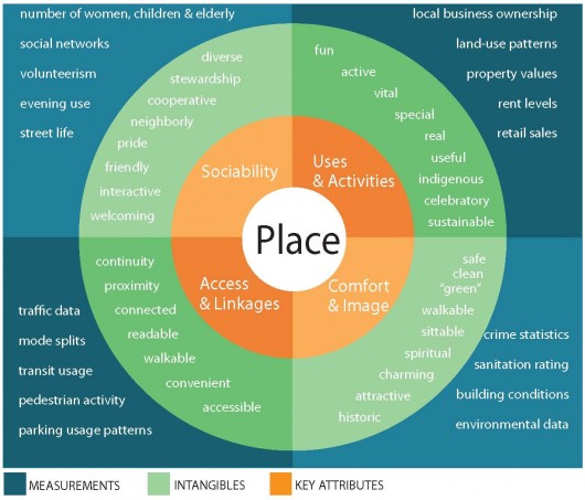
“In evaluating thousands of public spaces around the world, PPS has found that successful ones have four key qualities:
• they are accessible;
• people are engaged in activities there;
• the space is comfortable and has a good image; and finally,
• it is a sociable place: one where people meet each other and take people when they come to visit.
PPS developed The Place Diagram as a tool to help people in judging any place, good or bad:”
So: hate to rain on your freshly concreted parade, but this scheme does seem to break some of the important rules on successful urban place design. Things like:
• Being on a pedestrian walkway – from one place, to another – having a continuing flow of pedestrians past the door.
• Enclosed space – somewhere for people to sit with their backs against a warm sunny wall, occupying the periphery of the space.
• Overlooked space – not crowded by blank walls, that encourage vandalism and graffiti, but having people living and working nearby that give a sense of ownership to the space.
But I’m hopeful that this space can prove me wrong.

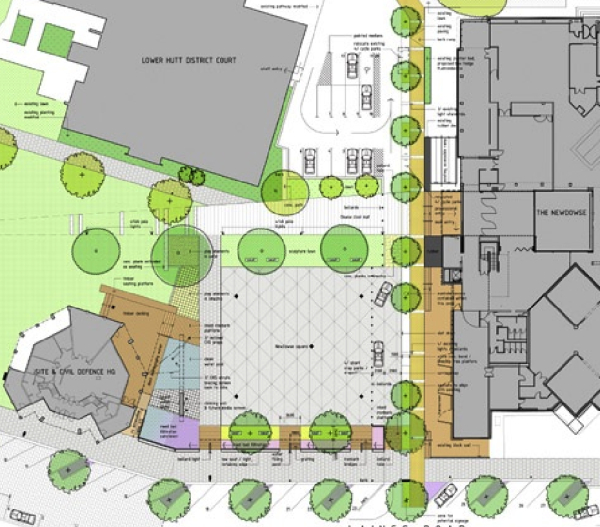
It’s easy to be a naysayer, but… this looks awful. And I reserve my outright hostility towards design for very few things, but this is terrible. It looks like a car park. And what the hell is that loch ness thing coming out of the ground? The rendering look like they were copied directly from 1950’s public plaza design.
If it’s successful, I will eat my words, but my immediate reaction is that it looks like death. People in the suburbs don’t inhabit flat open hardscaped places. They scurry across them with their sprogs in tow, to do their shopping.
Yeah I agree a carpark to make anyone mentally ill. It used to be a carpark and now it looks like a carpark with flags in the way and ground markings ideal for angled parkers.
The square is in the wrong place too. I think it has to be next door to Westfield to be of any use to Huttites or preferrably on the roof of the mall – lots of space there..
I hate to be negative about this scheme, as I think that public space measures in the Hutt need all the support they can get. However, you do both make very good points – points that both the designers and the backers will already be acutely aware of. The Dowse knows full well that the Westfield Mall is the place where all the Huttites go, and they would love to get part of that mall footfall traffic. But they are that all-too-crucial 200m away from the outside edge of the Mall, and that means driving, not walking, to your average car-bound shopper.
We’ve also got to keep in mind that the budget on this will have been modest, as there is not a lot of slop to go around. The illustrations will also be an artist’s impression (Stantiall, a former architect who worked at Athfield’s, does most of the illustrations in Wellington / New Zealand / hell, almost the World, now) and so I suspect that the “art” depicted is left deliberately generic at this point. Yes, there is a Loch Ness monster looking artwork diving in and out of the concrete, but I imagine that this is code for “artistic work by major local artist that can also be used as children’s plaything and withstand bogan vandal attacks”, as is the giant puffy / inflated looking chicken sculpture slightly north.
I’m more concerned at the cars shown also using the slipstream in the square. We all know that Hutt culture is synonymous with car culture, and it is difficult to take them kicking and screaming away from having carparks directly outside anything. This scheme reduces the amount of carparking to just over a dozen carps (new word – I just invented it), but still retains a “drive-by” lane through the edge of the square – sorry, The Square. No doubt this will have been argued strongly for and against, but it seems a pity that it has been retained really, just where people interplay needs to be. People, especially children, really don’t play well with car traffic.
They should be creating an intimate park with cafes. What are you going to do at the square when there’s not any events happening, just stand there?? Sit on the edge and stare at an empty space? At least in Palmerston North there is a lot of foot traffic and the area is surrounded by retail/dining.
“…and a large digital screen”
Yes, that won’t get damaged/nicked in short order.
I was going to say, isn’t this just copying Palmerston North? But then again PN copied LH by expanding their already monstrous mall, [T]he Plaza.
On [T]he Square itself, the design could help itself out by having a bit more green area in it don’t you think? But otherwise if it is to keep with it’s hard surface heritage, active edges would go a long way; not quite an Italian plaza (the right type of plaza), but it would go a long way to improving the quality of the LH CBD.
Max>as is the giant puffy / inflated looking chicken sculpture slightly north
A couple of years ago, a friend dragged me off to Te Papa to see some wobbly chicken sculptures that were on the roof and they looked exactly like the chicken sculpture here. Except Te Papa’s were only waist height.
Which is very odd. Did the architect see the Te Papa wobblies and then spend time designing a giant sized one in his drawing program? Or is this some sort of architectural motif?
“Hutt City councillors last week spent two days at a retreat where one of the major issues discussed was how to advance Making Places, the council’s 30-year plan to rejuvenate the CBD. Mayor Ray Wallace said the plan was crucial for the future of the city, and councillors agreed the CBD needed to be much more vibrant.
One of the key components of the plan was a second bridge over the river 400 metres south of Melling station, improving access for train commuters and vehicles into the heart of the CBD. But Mr Wallace told Hutt News last week that it had become clear the idea was not realistic.”
http://www.stuff.co.nz/dominion-post/news/local-papers/hutt-news/4631295/Second-Melling-bridge-not-realistic
davidp – tell me more about the chicken! what was the sculptor’s name? I’m intrigued…
well, a quick google shows it could have been this person: Seung Yul Oh
He / She does chickens. Big time.
http://www.tepapa.govt.nz/AboutUs/Media/MediaReleases/2008/Pages/SculptureTerraceRonnieVanHoutSeungYulOh.aspx
Arthur… That is what I saw. Nice job finding the page! They all had different coloured bases, similar to the red base of the Giant Chicken of Lower Hutt. I took a few photos and would be happy to e-mail them if someone can nominate an e-mail address.
Or, you can see a photo of them here:
http://starkwhite.blogspot.com/2009/03/performance-sculpture-at-te-papa.html
Which still doesn’t answer the question of what one is doing in Lower Hutt. Is the architect a fan? Did he/she see the exhibition? Is a giant wobbly chicken part of the standard art palette in the drafting program?
Well, I suspect it may mean that The New Dowse has bought one of the sculptures and has it in storage, and is planning to install it in the garden.
The previous head of the Dowse, Tim Walker, was very keen on buying interesting new up and coming artists. He probably was the one who secured the artwork