The demolition of the Portico in Civic Square is about to start soon, apparently. Is anyone going to miss it? Soon after it was first proposed to be demolished a year or so ago, a friend of mine (a prominent architect in town) received a phone call from someone who felt it was an outrage that it’s demolition be thought possible – but he wisely declined to be outraged. There certainly hasn’t been a great outpouring of concern from the public. Portico? Meh!
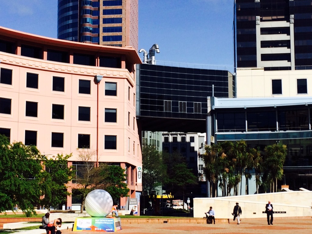
Dating from Athfield Architects more vigorously civic days of the new City Library, the portico is one of the few items of architecture in Wellington to have such an overtly civic urban design aim: enclosing Civic Square. The history of the site is simple, and most of you will know it better than me (we also discussed it heavily back in January 2013 – worth reading for the comments afterwards!): the area we now know as Civic Square was once an ordinary street, with a lot of car parking for City Council workers. As part of the creation of a Civic precinct in the late 80s / early 90s, the road was closed, City to Sea bridge built, the old Library converted into the City Gallery, a new magnificent Library building built, and the Council’s civic chambers extended to wrap around the whole. A portico over the gateway entrance to the newly pedestrian used square proudly proclaimed to all who could read the urban signs, that “this be land of the people” and cars were forevermore buried underground.
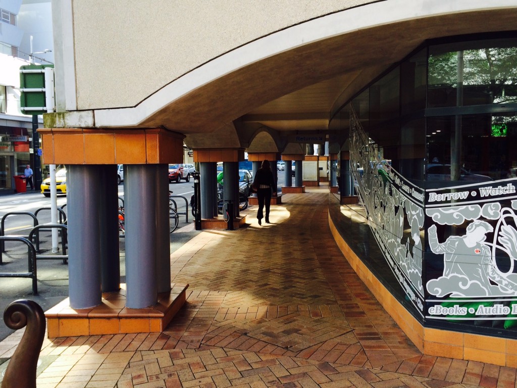
As far as Post-modern statements go, this one’s a doozie. Take the Library first – no, go on, I insist. Although Post-Modernism as an architectural style is now thoroughly reviled, and no self-respecting architect would be seen dead proposing a Po-mo building now, the Library building is a triumph of its time. We have a pseudo-classical facade to the Victoria St frontage, with low fat vaguely Doric straight pipe columns in groups of four, holding up a concrete facade above. The columns are uncomfortably low, almost ineptly so, and for reasons unknown, and yet this creates a colonnade of space in a city without colonnades, and a space where the wind and the rain cannot actually drench you, unusual on the east side of a street that channels the winds. They are low enough to almost crack your head as you walk between them, and from the front the building looks deformed, almost hammered into the ground, and yet, somehow it works.
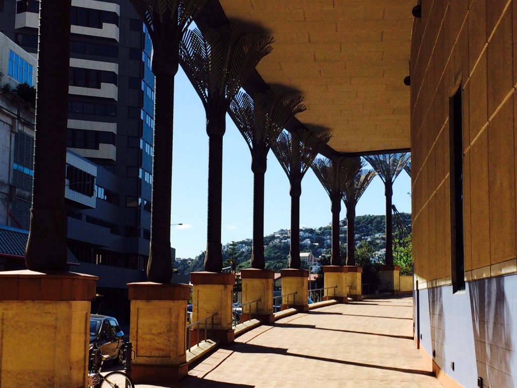
The Library then continues its theme of colonnades as it continues from the entrance, wrapping around its north side – this time in the form of a row of giant copper-clad Nikau palm columns, once again loudly portraying our south pacific heritage in preference to the more ancient Grecian orders. No Doric orders here – nor Ionic or Corinthian, but instead the Nikau-ian order proudly marches its way uphill, leading us on a road to – where? – ultimately nowhere really, but it does it so well that 30 years down the trail, I think it still brings a smile to most people’s lips. That has to be applauded – take a bow Mr Athfield – as there are few Po-Mo buildings still raising smiles and looking good in the world today.
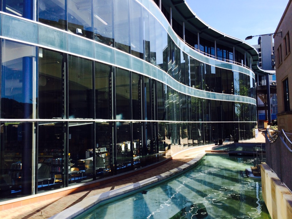
The Library then continues on its journey of an architectural smorgasbord, as it selects a wibbly-wobbly wavey motif for its east facade, completely different from the other two facades, and recalling that behind all the tomfoolery on the front, the Library is actually a strictly modernist building at its structural heart. This is probably my favourite facade, with the slickness of the full height glazing curving in and out, and overlooking a series of pools and waterfalls that the council sometimes bother to fill with water, when they are not causing leaks into the carpark below.
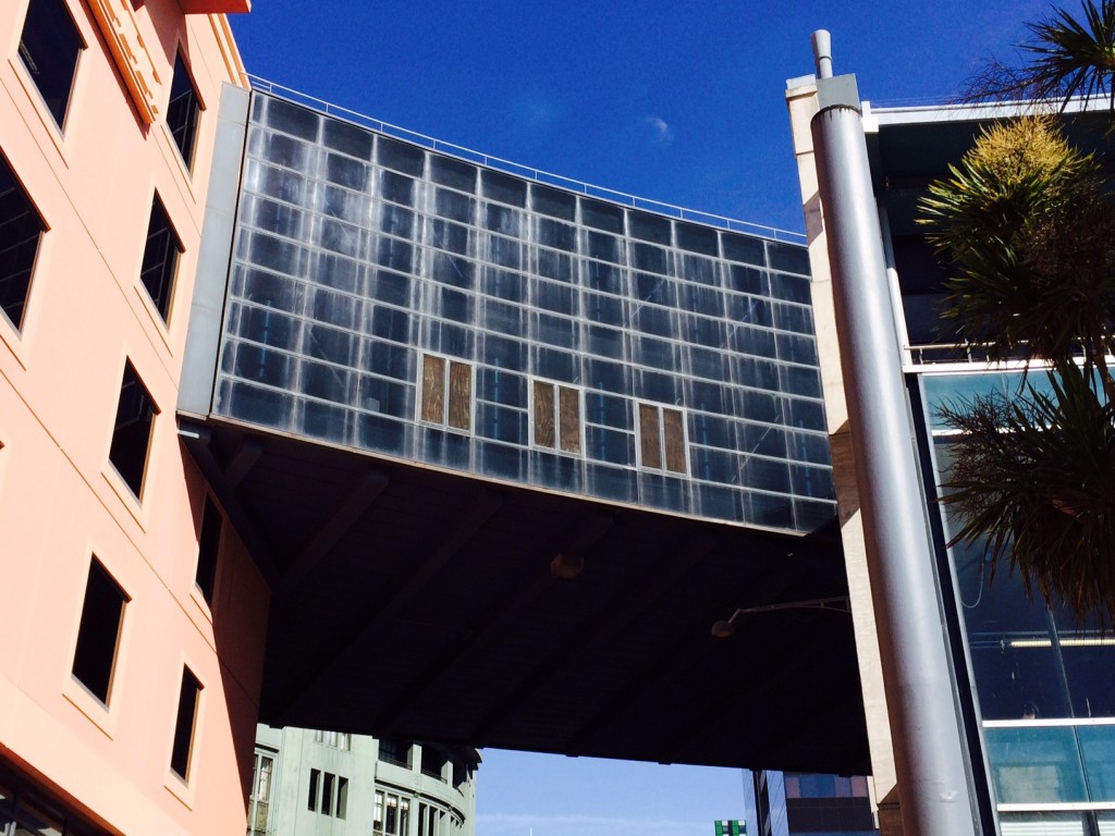
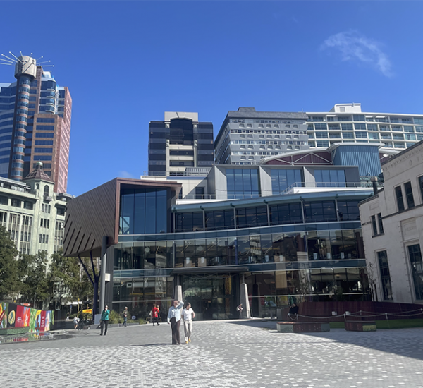
There is a fourth facade of course, and that is where the Portico lives. But not for long. Within a month, it will be under demolition, and not before time I feel. It has always been the fly in the ointment to me – instead of being built in the same happy smiley Po-Mo style as the buildings on either side – it is built out of black pained steel and black smoked glass, a sort of Darth Vaders bread-basket spanning the gap. It’s purpose was three-fold: firstly to provide some extra space for all those Council workers overflowing from the Civic building (constructed at the same time, and also featuring a tall colonnade, but not by Athfield – it was Stephenson and Turner); secondly to allow the Council to connect with the Library physically without getting wet (although apparently that link was never really ever used); and lastly to provide a civic gesture of enclosing the square. It never really worked at this last point to me: two stories of malevolent black building suspended several stories abover ground had bugger-all effect of providing wind and rain protection at ground level, and all it did was block out the views from the Dominion building and the Evening Post building, both fine works of architecture that deserve to retain their civic views.
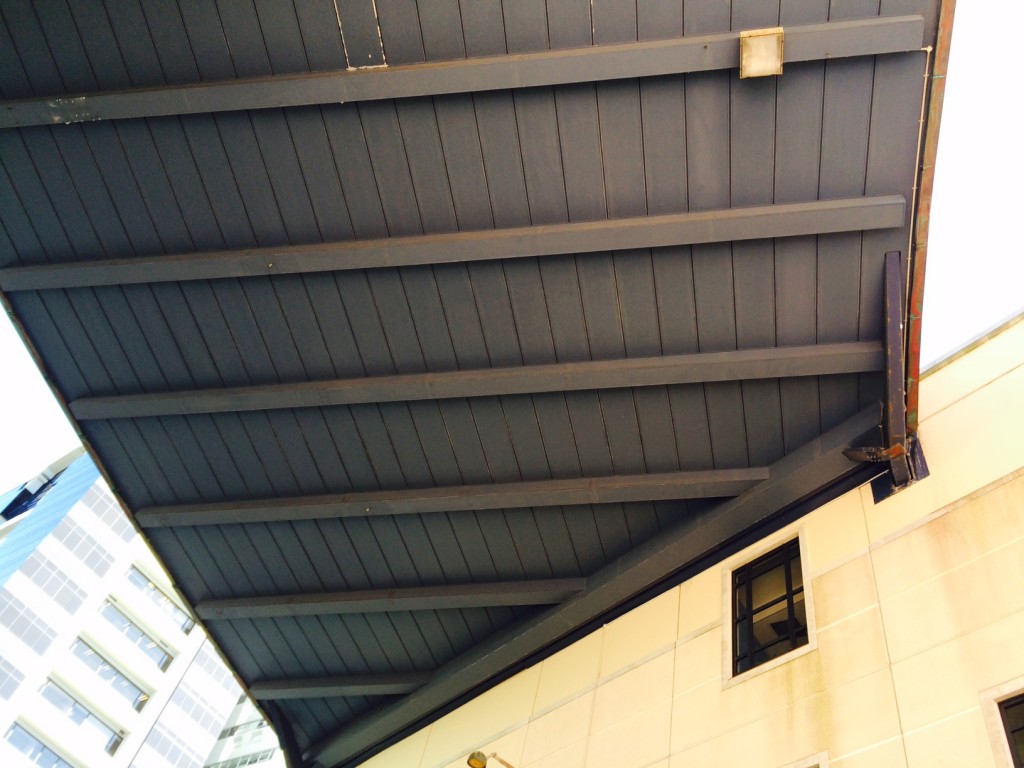
I suppose that as a structural solution it deserved some applause, as it spanned the width of the gap between the buildings effortlessly, presumably with some giant steel trusses secreted away inside. Unfortunately, as we have now discovered, it’s rigidity also made the buildings at either end all rather vulnerable to structural collapse – in the case of a decent sized earthquake, this portico would act like a giant battering ram, and pulverize the other buildings into dust, or something like that, involving calculations of structural resonance and adequacy of seismic movement joints. I dunno the exact reasons why – you’ll have to ask an engineer – but it means it has gone from being a useful thing to a very bad thing, and it must be destroyed.

But I never liked it anyway. It was oppressively black (and no, Sue, I’m not being racist), and badly detailed. It was an ugly slab of architectural death, and that’s the truth. On the east facade, overlooking the Civic Square, there were / are (still are, until it gets demolished) some windows (from memory, three) that were actually doorways opening out into the void. I don’t know what this was like from the inside, but from the outside it looked like they might be just ordinary doors, probably with a sign on the inside saying “Do Not Use”. Perhaps these were the doors to be used in the case of an emergency evacuation by low-flying space-craft? Or doors to be used by unsuccessful candidates for election to Council? Or even a doorway for the deletion of extraneous urban design team members, and heritage experts, as that team seems to be continually reworked, in an endless torture like having an eagle feast on your liver each night. You know, that Greek legend with the chappie chained to a rock. Prometheus. Unpleasant.

Where was I ? Chained to a rock, or being thrown out the door several stories high above the entrance to Civic Square? I forget. Umm, oh yes – details. Yes: the portico must have been designed to be held firmly at one end, and then to seismically piston in and out at the other end, like a giant black square pistoning thing, but instead we now know that it would destroy the buildings at both ends, and then plummet to the ground, killing all the Japanese tourists gathered in the City Information centre below, and then crashing through the thin floor slab to implode and pancake in the basement carpark below. You’ve got to face it: that would be one helluva crash. But not a good thing. So: let’s farewell it with a song:
“Goodbye Portico, although I never really knew you at all, you had the grace to hold yourself, while those around you fall…”




I’ve always felt that if they needed to free this portico-thing from causing damage to the surroundings, that they should just install some giant columns beneath it at each end, taking the gravity load down that way. Of course there would be a load of rework to do to free it from the structures at either side, and some pretty big foundations to dig down below, but at least it would save it from demolition.
Grant I’m gonna take a guess here structurally and say that a thing made to be hung downwards, when converted to being supported from underneath, may cost so much in reworking that it’s cheaper just to demo it.
What I do know for sure is that it is an expensive locale to work in, what with re-routing pedestrians and traffic and so on so I’d say a weekend quick demo job may be the cheapest solution
Only on EOTF would I see the term “Nikau-ian”
Well, Grant, yes, that may be possible, but is it really desirable? For a start, as a staunchly “modern” part of this very Po-mo building, the columns would probably want to be thin and sleek, not big giant columns as you say. Or, on the other hand, you could have some massive stonking great Po-mo columns, celebrating the post-modernism of it all. Either way, it would need to be more than just columns – it would probably need some form of cross-bracing or giant brackets as well, therefore complicating the whole thing. Probably better to just be done with it, celebrate its disappearance, and move on. My question to you is: what would you do to replace it?
60 – you like that? I was toying with just Nikauan, which might be more grammatically correct…. But no packet of squirrels with this one. Re the quick weekend demo – I suspect a little longer…..
I recall being a student at the SoA in the late 80’s/90’s when Ath was a tutor there and was busy designing this area with two other leading Wellington Architects. The stories of the 3 of them working on the overall concept told by Ath were hilarious and the wibbly wavey wall was described as the result of a fruitfull round table discussion with one or both the other architects, one of whom Ath, and I will always recall this, told us was nicknamed “gridlock”. As Ath told the tall the wibbly wobbly wall was a response to Gridlock trying to impose another grid on the library. The result stood and became what it is to this day.
Is that the Defenestration of Prague by any chance?
Starkive – yes, it is, indeed the Defenestration of Prague. One of my favourite words – and one of my favourite castles/cities too, although it can’t have been much fun being tossed out the windows. But it also looked, just a little, like certain people at Council…
DC – welcome along, and with a story like that, you can come and comment any time! Excellent tale. I wonder who “gridlock” was? Denny, if you’re reading this – do you know?
I’ve always felt that the dark neutrality of the floating box kind of suited the space. Architecturally, it doesn’t compete with the adjoining buildings and allows them to retain their individual identities.
And while PoMo architects might have seen the opportunity to dress up the gap between the buildings to communicate the idea of ‘entrance’ to the Civic Square with whatever kitsch dross they could muster (e.g. the Library entrance), I think the decision not to is pretty much in accordance with the sorts of urban spaces the Square was modelled on – and I am very thankful for that.
But on the other hand, seeing as the Square isn’t integrated into the urban fabric in the manner of the spaces that it is modelled on, perhaps a more celebrated entrance would help to overcome its dislocation?
We need to talk about Mercer Street…
m-d : fine – Mercer St – take a seat, and tell me what’s wrong. Is it the large amount of traffic being pushed through? Is it the parking? Is it the appalling layout of pedestrian crossings near here, which prioritise routes for cars instead of people on foot? Or is it something else….?
“tell me what’s wrong” …
All of what you are then listing, except that’s true for basically every street in central Wellington.
D.
I’ve always felt that Mercer St should be 100% pedestrian, except that previously the buses all went through there, and now they’ve moved all the buses to Manners, they’ve routed the cars through there instead – and filled it up with taxis. Damn shame. Its a major processional walking route to the sea – there should be no cars there. Wellington for the people!
“Wellington for the people!”
Not sure if you’re being facetious? Yes, the design and layout of Mercer St and its transition to Wakefield St is hilariously bad, but there are cars and trucks in the city and their drivers need to go places sometimes without improper urban-fabric-killing motive. Sometimes those people are on Willis Street northbound and want to make a right turn. There’s an ill-conceived one-way system knocking out Dixon, Manners, and Willeston Streets, and Bond Street is closed. It’s counter-intuitive maybe but I think opening these streets up to two-way vehicle traffic (and fixing the layouts!) would work out better for pedestrians. You wouldn’t have couriers hurtling up Victoria Street at 4pm looking for a way to turn right.
Hi, it’s been a while.
Hi Jason – yes, haven’t heard from you for ages. You are correct in saying that cars need to go somewhere, but in my very humble opinion, you’re incorrect to say that et should go there. If you think about it, there is a whole, civic, grand urban plan going on in that area – from the old Evening Post building (next to the hideous Majestic crap tower), you can look out across the street (and the current sea of traffic), through the current portico’s arch / under croft, right through Civic Square, across to the City to Sea bridge, and out to the lagoon (and not quite to sea, as the Star Boating club is in the way). You could argue that this is just a series of happy coincidences, but I believe it is more than that – it’s part of the grand plan.
As such, I envisage that this is an area for people, crossed only by 3 streets, and I reckon that the importance given to cars at Mercer St should be very much reduced, or deleted entirely.
I hear you – and I sympathise because you’re right that it’s probably Wellington’s most important “city-to-sea” link – but my concern is that taking away Mercer Street (and, crucially, the intersections with Willis and Victoria Streets) will have the effect of making the latter more highway-like.
I don’t think vehicle traffic should be prioritised in Mercer Street at all – the opposite, but I think both Mercer and Bond Streets are necessary to slow and disperse vehicle traffic in the whole area.
This might be more convincing with a bit of MS Paint magic.
—
On a more Portico-related note, I remember hearing a few years ago that the Council were looking at converting the ground floor frontages from the Portico round to the Town Hall entrance into cafes, etc. This never happened but perhaps with the Portico gone this will seem a more inviting proposition. The Portico itself to me feels like a divider, rather than an entranceway.
I might be grave-digging a bit here, but anyways…
I saw the work progressing on the portico removal today, and i think the end result for many will be discovering just how ugly the sides of the adjacent buildings are – having not been designed to be seen unadorned as they soon will be…
unintended consequences and all that.
Merry Christmas, Happy Holidays, or whatever floats your boat!