One of the things that really annoys me in life is when people deliberately try to obscure the truth. Trump, the GOP, climate-change deniers, Covid vaccine scarers – all highly stupid and irresponsible. But this sort of behaviour should never happen with quality practices of registered architects.
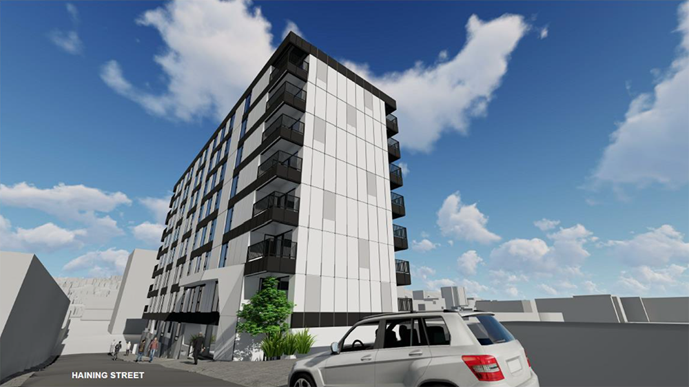
A proposal has come into Council for a revision, of a revision, of a revision of a building that was never very good in the first place. The “Due Pensione” and “Quattro on Haining” of about 10 years ago has been revisited once more – with yet another change of architects. Is this the third architect on this project, or the fourth?
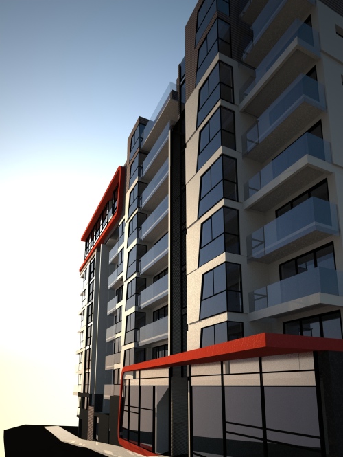
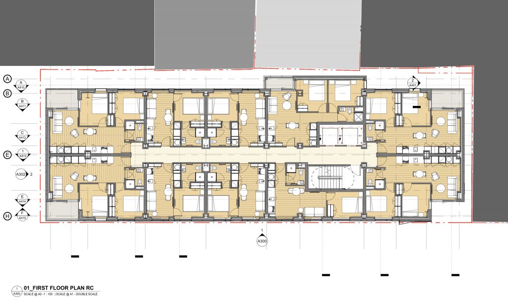
As usual, it is a Tower project of apartments in Te Aro, and although the original proposal tried to push the “design excellence” button to claim a reason for going extra height, despite a complete lack of agreement by the Urban Design advisor at Council that there was the slightest amount of excellence in the design at all, the latest version has dropped a level so as to fall fully under the height limit, and thereby escape the full public scrutiny it deserves. The claim for “excellence” has also been dropped – ie they know it is a low-ball proposal. The revised design has also dropped off the majority of the balconies, so that the poor bastards who have to live inside this squalid lump will have little ability to enjoy the outdoors. The developers (shell company “Downtown Developments”, director Simon Nightingale) have also taken the opportunity to delete all the car parks in line with the latest Government Urban Design guidance, so there will be another 54 car owners looking for parking in an area that is already full to the brim with cars. Instead, it is a spooky underworld of “storage” boxes. “Nice”. Shown here is the First Floor plan instead.
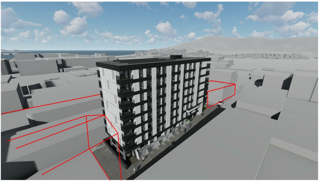
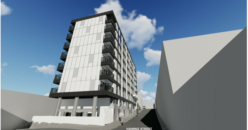
But what really gets me annoyed is that the renders accompanying the proposal have blatantly mis-represented the surroundings. I’m not going to name the architects (at this stage) as I think they will feel highly embarrassed and ashamed to be pointed out like this – normally they do quality developments, although more recently they have produced some real shockers, including this one. But to omit information on the application to this extent should be an offence under the code of ethics of NZRAB and should get them some stern words from the NZIA as well. It is a total, absolute travesty of what an honest representation of a building requires – what an architect should be all about.
To set the scene, the proposed building is set in Haining St, on the south side of the street, one of the narrowest little lanes in Wellington. The proposal may be legal in reaching the height limit, but it will shade this street to a considerable degree, both in winter and in summer. Is this what our rogue Councillors really wanted when they voted for new, tall buildings in Te Aro?

Haining St is one of my favourites – along with Frederick St it is the home of historic Chinatown in Wellington. Not one of those tacky fake Chinatowns you may see overseas – this was the real deal. Heaps of heritage in these two narrow streets.
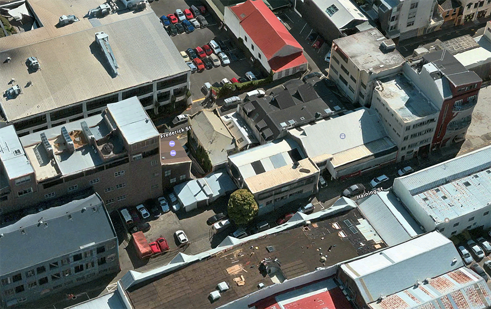
Existing buildings are heavily built up but are almost universally only two storeys tall. Nearby, to the north, buildings sit at a mixture of two, three, and five stories tall, with some of the best streetscape in Te Aro. It is charming at the moment – this building will kill all that charm. The building sits hard up against the pavement side, but will be set back from the northern boundary by only a metre or so, and so many of the apartments will be facing into a blank wall instead of gaining any sunshine. It is density done really really wrong. Just for a bit of nostalgia, here is what our predecessor Maximus said way back in 2008. It is just as valid today:
“But what saddens me most is that the proposal ignores the delicate nature and history of Haining Street, which after a half century of neglect, is just starting to get its Mojo back via reoccupation of the formerly industrial wasteland. A giant elephant’s foot like this would just squash the life out of the street, and Wellington becomes worse off for it – it just seems inappropriate. Wouldn’t it be much nicer to work with the urban fabric of the surrounding buildings and work towards a more human scale of neighbourhood? Perhaps even one that celebrates and recognizes the original Chinese character of the area, as they do in many cities abroad?”
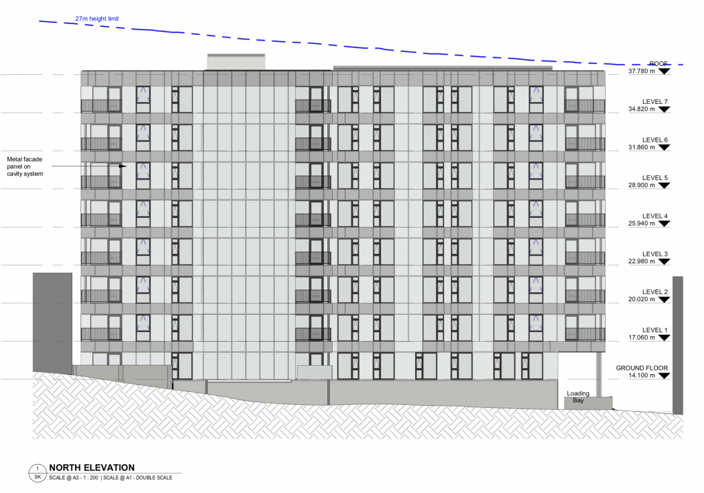
Despite the existence of neighbouring buildings up to five storeys high, the drawings showing the proposal “in context” show very little recognition of the extremely tight urban surroundings, and miraculously, the north elevation of the proposals (above) show no surrounding buildings at all, despite the reality of the situation.
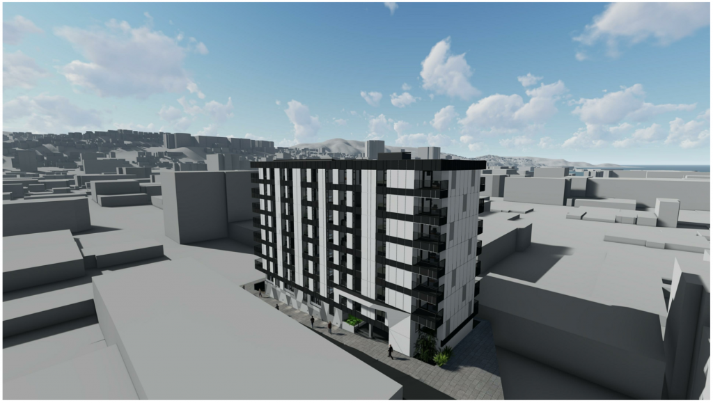
Should a depiction this bad be allowed? Should it even be countenanced by a practice which puts itself out as a quality, award-winning practice? Just how bad do you have to be to get told off?

I’m hoping that the Council officers assigned to this application can see through the layers of misinformation and deliberate deception, and ask that some more accurate, honest drawings of the actual context are produced, instead of this travesty that we see here before us. Personally, I don’t think that even the architects are convinced there are no names on the drawings and their Design Statement is as lacklustre as the building itself.
- “Design Concept: Contemporary Architecture.”
- “Design Drivers: Respecting adjoining building forms. Strong horizontal lines. Abstraction created by an articulated façade creating strong light and shade character and use of robust high-quality materials.”
Perhaps this project really does need to go back to the metaphorical drawing board.
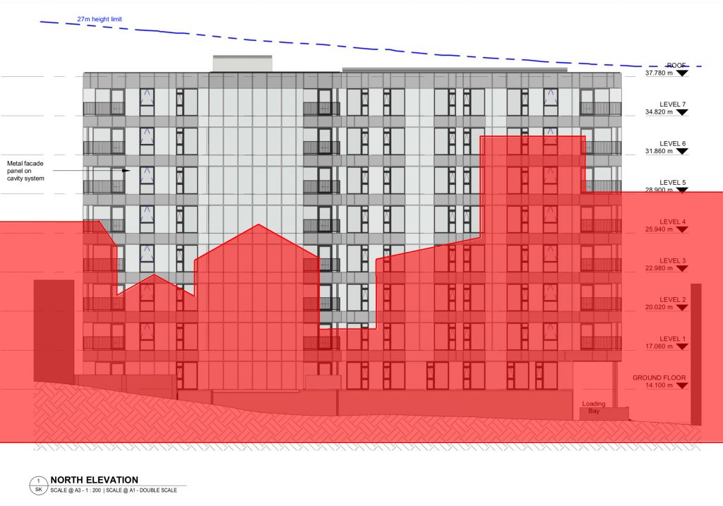
I can see that this site is badly underdeveloped at present, and it could be the site for a really exciting new project given the right architect and a developer with the interests of the city in mind. As it fronts on to the beautiful streetscape composition of the Chinese Masonic Temple and the courtyard of the U Boutique Hotel, there are some fantastic vantage points in the building that could be taken care of. At present though, it appears (through my really hasty, unscientific mock-ups) that the courtyard is not recognised at all, and instead of taking advantage of the situation of the Heritage building / streetscape to its north, the proposed building just seems to present a flat, bland, boring facade to the sunshine and fresh air at that point, while simultaneously asking the many small one-bedroom apartments to look out into a blank metre-wide void to the next solid wall.
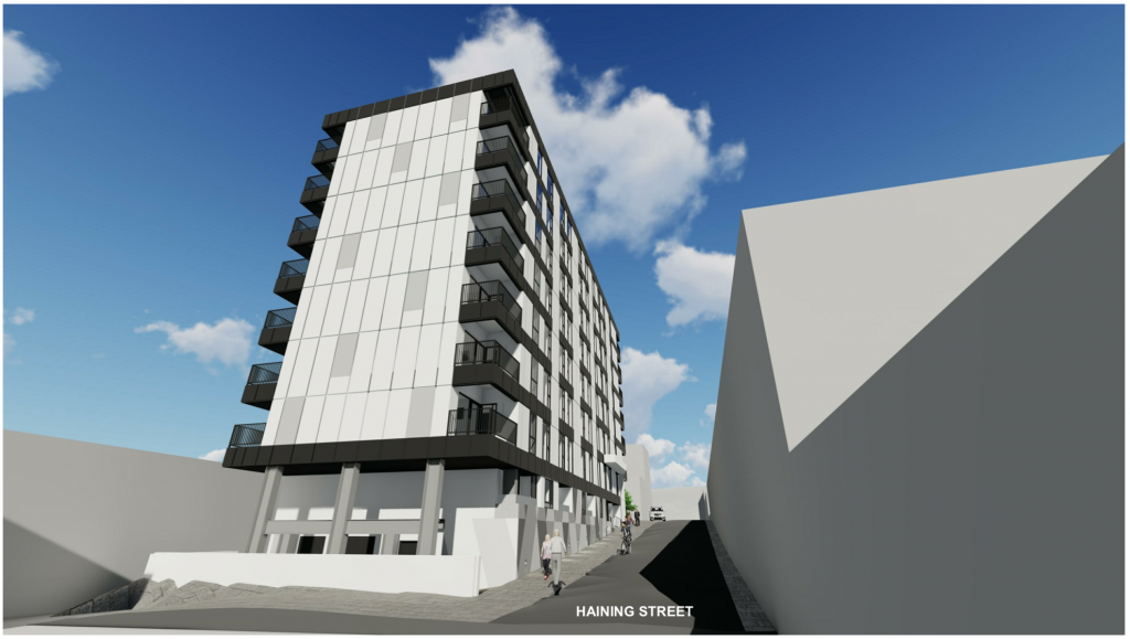
This is really bad architecture and it creates an abysmal streetscape. The developer is asking for an extension to an extension to a Resource Consent that is now completely dead. The building is a tired, awful proposal that does not fit at all into the surroundings. We can do better. Our City deserves better. The Urban Design department at Council should demand better. Downtown Developments can do better. And the (nameless) architect MUST do better.



I dunno man, Haining Street is hardly Cuba… She’s pretty grim at the moment! There are plenty of midrise apartment buildings around the city that block shade over their surrounding streets – why single this one out? It plays by the district plan development envelope.
If we’re going to put this much scrutiny over relatively in-offensive midrise blocks in the CBD, why even have permitted standards. We need many more standard, fine, normal buildings to help solve the housing crisis.
Having more people living nearby will help the local shops on Tory and Taranaki in that part of town as well.
Because I’m incensed that the architects are misrepresenting the truth. Architects are meant to be better than that. Lying about property is what Estate Agents do – and that’s why they rate alongside Used-Car salesmen as the least trusted of professions. We need to be able to have accurate representations of the truth – not this. Some poor buggers are going to be living in there, facing a blank wall only a metre away.
Plus, I really like the old ChinaTown area. Haining St is indeed pretty grim at times – going to get a lot grimmer once all the sunshine goes from the street.
Hey Nemo, Great work lately, the fish seem to be growing too, judging by the comments section.
I have to agree a little with Matt on this one about Haining street in general, I think you’ll have to try a little harder to convince me its such a lovely part of the city. Frederick on the other hand seem to have some nice streetscape.
But I’m no where near as chilled as him about this development. It’s the way in which it completely disregards it’s surroundings that is the biggest issue for me, context in architecture is everything. I’m not sure Haining and Frederick St can take buildings this high without turning them, into shadowy canyons, Orientation of the street and lots is maybe a problem.
I think a solution has to be something like an urban design panel, with actual power and the ability to force re-designs, ultimately raising the bar for everyone. Maybe a rotating lineup of the city’s best newly retired architects and urban designers, stopping one firm or person having too much influence. The current system seems to allow developers way to much sway to shape how the city is developed. The Development just down the road (The Paddington) make me more angry to be honest. The developers had the nerve to say apartment buildings would shade the site too much, on a site that has 7 or 8 story buildings on its northern edge. The unlucky people who bought the townhouses under the shadow of those buildings will be very disappointed.
Frederick and Haining are equally important due to their traditional role as the home of the Chinese community in NZ for around a hundred years. Challenge accepted – I’ll try and show you both / all what is so good about the area, in an upcoming post. Also seems time for a post on Paddington….
I hear bad things about Paddington
I sure as hell haven’t heard any good things said about it!
The cupboard under the stairs gets called a wardrobe, crooked framing, builders walking off the job
Not sure why there’s a reference to the height limits in the new spatial plan given this proposed building complies with current district plan heights?
And I thought WCC removed parking requirements from new buildings in the city centre a long time ago? Is Haining Street outside that area?
Hi Conor – yes, you may be right, in that the building may legally comply with the District Plan in terms of height – but not in bulk. The District Plan was altered years ago to stop the sort of travesty of design incompetence that Wellington got with the Terry Serepisos development at Century City, where one apartment builder built up to the boundary, and the next apartment development was built up to meet them. Apparently some of the people affected had windows and decks built hard up against a blank concrete wall – so zero natural light at all. Owners had to move out, convert the apartments into “storage spaces” and lose massive value in their properties. We should be better than this – repeating the same sort of bad development. I blame the Council Planning Officers for even allowing this across the plate in the first place – if I was at the Council when a proposal like this had come in, I would have tossed the scheme out at the first hurdle. There’s no point in building fresh shit my friend, when there is enough existing shit to go around. Build better or go home.
Shit seems to sell for about 800k at the moment, so clearly not enough of it :)
some of these units are small – very small – and without any sunlight, or any hope of ever seeing any, I’d expect those units to be super-cheap. Perhaps they’ll even give them away. Free cardboard box with every apartment! Or vice versa…
Yeah, discovering that some clown in your line of work has done something that’s “professionally offensive” isn’t exactly a great feeling.
But be careful- such irritation can lead to the unanswerable question of “Why do New Zealanders put up with this?”
Why indeed.! I guess we are just not very good at this city-building stuff. Other countries and their much older cities have had centuries of experience at slowly building up a readable streetscape, creating intricate urban conurbations that wrap around our lives with a vitality that we all crave and surely deserve, but rarely get delivered to us in NZ. It’s ironic of course because this very area used to be full of character – quirky, quaint, poverty-strewn character it is for sure, and while some would no doubt say that it was a filthy den of iniquity with broken down houses and the poorest of people, others would point out that it was a vital streetscape of vibrant immigrant life with Chinese greengrocers, Chinese laundries, Chinese gambling dens and all the fascinating culture that went with that.
What rules around bulk and height existed when the historic building on Haining Street were built?
I think back in those days there was no rules at all. The Architectural Centre was set up back in the late 40s, in part to encourage the WCC to actually think about doing some town planning, which was a foreign concept back then.
Due to the perceived slummy nature of Haining, no one built higher than 1 or 2 storeys tall back in those early days. The buildings constructed in the 1950s, to drive out the slum-dwellers, were 3 storeys tall, and it became a desirable sunny location.
I take your point about the importance of context, but shouldn’t “another 54 car owners looking for parking” read “54 apartment owners grateful that they don’t have to pay for parking that they don’t want”?
I’m not really worried about the car parking – as you know, many people don’t want car parks these days. But regardless, some of them will want one, and to not provide any at all strikes me as a bit foolish. In some recent apartment projects in Auckland, more creative developers like Ockham have proposed, say, two car parks, for the use of ride share car parks, like Mevo or City Hop. That seems like a more sensible plan to me, effecting a drastic reduction in the number of cars on the streets, but giving people an option to hire locally. I just mentioned the car parking as a way to paint a fuller picture of what sort of development the city is getting.
Nice post!
I completely agree that it seems quite deceitful to not have the current context in the renders.
ANd even to my ignorant eye it does look like … a shitty box, lacking the streetscape engagement of Paris’ Haussman-area boxes (for example).
I’m curious though…. character / heritage and sunlight are getting a lot of trots at the moment as trojan horses for NIMBYism.
You mention that the design could take advantage of the courtyard, and the Masonic and U outlooks, but “It’ll cast shade” and “but this was Welly’s Chinatown once” seem like discussion-ending statements: “no development here that’s not 2 storeys max”. I’d love to know whether you think say the proliferation of 6+ storey buildings that we need in Te Aro can be done in a way that’d get the wink of approval rom The Fish’s sharp eye?
Pictures (even just typologies or examples) would be super helpful for us ignoramuses who are pro density but don’t know enough about architecture…
Thanks for the comment Isabella – the young, wokester, anti-heritage, anti-character brigade are getting far more coverage at the moment than the ancient creaky old folk accused of being Nimbys, due in part to the dynamism of youth and their social-media savviness. But I think that both sides have a point. I’m certainly not putting myself in the Nimby category – I can’t really, as I’m pro-architecture and pro-development, but not just architecture for the sake of it. Architecture and development are needed, and needed at the best possible quality levels at all times. But buildings last a long time, so we need to build good buildings, not just build for the sake of it. Whatever is built here now will be here for the next 50-100 years.
All buildings go through a phase of being desirable when shiny and new, then over time deteriorating to a less desirable state, and in the end being either demolished and destroyed if it is failing, or getting renovated and restored if it has “good bones”. There is enough shit architecture in the world, and we certainly don’t need to build more of it. Constructing buildings that are aiming at the crappiest end of the scale is a soul-destroying exercise. Constructing buildings where the inhabitants have only one outlook in life, and that is onto a blank wall less than 2m away, with the only light coming down from 4 floors above – that’s worse than any slum tenement I know of. It’s reminiscent of the Walled City of Kowloon, which I went to once, and it was the scariest place on earth outside of a Taliban training camp. It’s incredibly bad architecture and is something that no Council planner should be saying Yes to.
To me, we should all be aiming to build a city that we are all proud to live in. Allowing buildings to go up that force their own residents to live in damp, cramped squalor from day one, and that contribute nothing to the streetscape but wind-tunnels and shade, is not what we are here for. Yes, of course Wellington needs lots more housing, but that does not mean that we should automatically say Yes to “build any shit, anywhere”. Every building needs to be carefully considered and add something good to the community, building the best that we can do, at all times.
I’d actually be really happy for Te Aro to be a suburb of 6 storey buildings, rising up to taller 10-12 storeys on broad, north-south thoroughfares such as Taranaki St and Victoria St. But these narrow east-west cross streets are no place for 10 storeys plus. A height appropriate for the width of the street would seem more logical – allowing sunlight into the street on at least some days of the year.