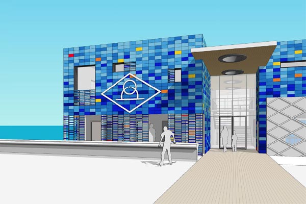
The Maranui is being slowly rebuilt, but the Lyall Bay saga goes on. Last week Wellingtonians were given a preview of the proposed new Lyall Bay clubhouse, that has now had to incorporate additional changing rooms and toilets for the public. It sounds like they were not too happy with the prospect unveiled.
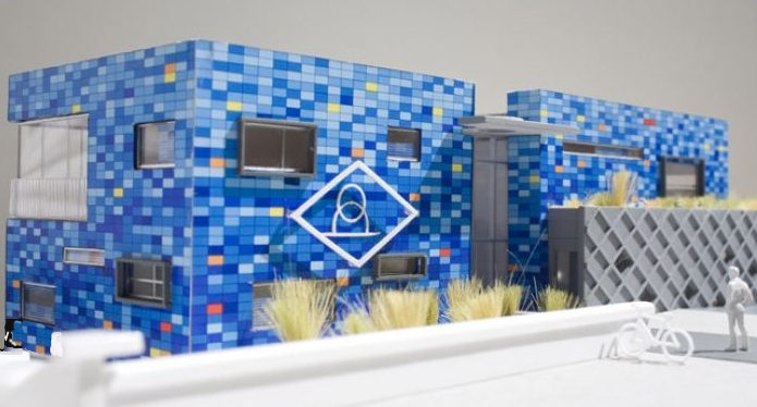
It is a very similar offering to Archaus’ previous design, which was also a blue tiled box with a concrete climbing wall type thing. There’s a picture of the previous version below, or you can refer to our previous postings here, or on the Maranui here, or when we discussed the famous “fifth scenario” here. But it is back again, with a few changes, and so it is worth discussing it again. The DomPost of course delights in reporting that not everyone is happy:
“Lyall Bay resident Scott Wilson described the planned clubrooms as a “hideous monstrosity”. “It’s a seriously ugly building.” He was worried the clubrooms would be longer than the present building, partially blocking his view of the sea. Neighbour Geoff Loose said the plans did not fit the character of Lyall Bay. “It has a ramshackle feel to it. It’s best left as it is.”
Although The Lyalls are trying to put a positive spin onto the development, with the club rooms designed “so as not to be visually obtrusive”, the picture above shows the changes that have occurred – the architects have tried to stretch the existing bulk upwards to incorporate the new Council requirements at beach level. The end result is a fairly solid looking box – still covered in blue – and split in two with a high entry door, and still encrusted with concrete climbing grid on at least 2 sides.
While the moves have made it more bulky, that in itself shouldn’t make it a real issue – after all, the local population fought hard to get the Maranui saved, and that really is just a big lump of slightly heritage 3 box pileup. But, however, Maranui does seem to have a slight air of comic elegance, and the retro look of the creamy yellow weatherboards, as impractical as they may be, obviously has struck resonance with the locals. Does the blue Lyall box, by comparison, really cut the mustard?
While it is obviously the simplest thing, to opt to push the existing envelope, and keep the current colour scheme, at times there has to be something in tearing up the old scheme and starting again. While the design is definitely gutsy, it was not a thing of beauty to start with, and the moves to bloat its already stretched body are not really doing it a hell of a lot of favours. I can sympathise with the neighbours who are annoyed that it could block their view, but not with those that think it is too colourful – the speckled blues are a lovely touch, and hopefully will outlast the savage beating that buildings get in this harsh environment.
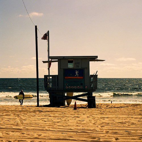
But the issue of blocking out the view is one which I really think that the architects could have, and should have addressed: visual penetration at pavement level, with a recognition of the perfectly justifiable desire to see the sea, the sky and the horizon instead of an area of blank wall. Take, for example, the classic California beach patrol raised hut on legs, as shown here: she’s got legs, and she knows how to use them…
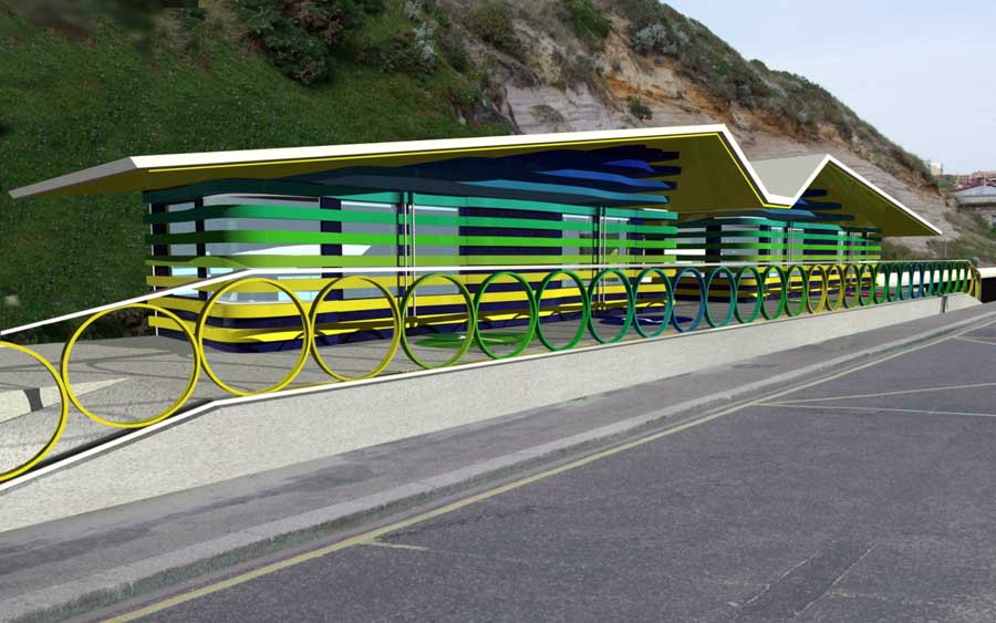
It is one of the reasons that local architectural supremos Architecture Workshop excelled so well at with their Oriental Bay changing rooms – small, discrete, beautifully detailed, and not obstructing the view. All things not exhibited in the current Archaus scheme. It is one of the more difficult projects to do well, and I don’t envy them: design a building that has no ‘back’ side, on a highly visual location, with disabled changing rooms requiring ground floor access, and still produce a thing of beauty – it takes an architect of great skill to pull it off smoothly. Athfield Architects did not manage to pull it off on the nearby point with the Marine Centre the other year, and I’m not really sure if Archaus have managed to pull it off here either, with the rehash of their previous scheme. Perhaps Archaus really should have taken the opportunity to go all out and have a go at something new. At the end of last year, a place called Boscombe, in England, held a competition (now there’s an idea!) to design new changing rooms near their new surf break, and the winning design (shown below) has really broken with the previous tradition of little diddy silly huts dotting all along the foreshore. Things this design has got include: an interesting roof profile (like a birds wing), vibrant colouring, and most of all, a degree of visual penetration, even though it is on the other side of the road.
‘The Seagull and Windbreak’ by Peter Francis Lewis of Brighton design consultancy AEREA in conjunction with a:b:i:r architects was successful in winning the £100,000 scheme…. …Francis Lewis said “the seagull is represented by the canopy roof, each wing covering a pair of semi-detached beach huts. The curved horizontal bands of the exterior take their cue from the classic windbreak.”
It’s good to see the Poms at last venture into something more exciting along their beach front. Question for us is, which no doubt the public will answer (if this Resource Consent is publicly notified), is this Lyall proposal exciting enough for Wellington? Or could it be better? Your thoughts and discussion welcome here…



I bet if they clad it in cream/white weatherboards, it would be a shoe-in. i think that much of the perception of bulk is probably due to the attention that the design calls to itself rather than its outright physical dimensions – I could be wrong though (it has happened before).
I don’t find it terribly attractive, but understand that as a personal viewpoint (for example, I think even less of the gull-wing thing above). However, if it does get built, and turns out to be particularly photogenic (which I am sure it will), then I suspect that it will soon achieve a certain ‘iconicness’ – although the tiling evokes little more than a giant blue conveniences block rather than anything to do with surf-lifesaving. The incoporation of that logo on the facade gives it a certain corporate atmosphere too, which perhaps is a clever contrast with the manufactured alternativeness of the other club along the beach… (I suspect not)…
Speaking of which, if that building (Maranui) had never existed, and someone proposed putting it there now – how well do you think that would go down? Almost certainly with much less enthusiasm than calls for its restoration I would think – which perfectly illustrates the sentimentality at stake here. In that respect I doubt whether any proposal would gain traction in a site like this.
The Ath intrusion at the point is a whole other kettle of fish – that site is undeveloped, of visual and cultural significance as a landscape (even in its current bastardised form), and the construction of a major building (not to mention business venture) there would have destroyed one of the best qualities of the south coast – the lack of buildings on the seaward side of the road (the few that are there are very minor indeed). here we are looking at a building with a public function, on the site of a building that has been there for many years, in a location that is almost wholly an artifical construct. there is much less at stake here 9aside from the individual views of a few residents across the road)…
How well would Maranui go down if it wasn’t already there? I agree – probably not well at all. And what the grumblers at Lyall Bay don’t seem to acknowledge is that with this one new Blue going up, it will involve the demolition of THREE existing beige / cream buildings that are there at present.
I agree with Michael it does look a bit like a public convenience, a Modernist Hundertwasser toilet, although the Architects could spin the facade as being more swimming pool than toilet. I think that area needs brightening up a bit, Lyall Bay has a certain bleakness to it, even when the sun is out. Pop a couple of VAWTs or wind turbines on top to make it ‘sustainable’, that will really give the locals something to complain about.
I can never quite understand the visceral association of “tiles = toilets”. To me, they could evoke all sorts of things, from butchers’ shops to 30s tube stations to Portugese architecture to swimming pools to every other new bar on Courtenay Place (though come to think of it, Courtenay Place _is_ a bit of a toilet).
Is it a kiwi thing? That would seem odd, since it’s a while since I’ve been in a public toilet here that had anything as flash as tiles on the walls.
That’s a good point – I think it has more to do with the tiled domestic bathroom rather than any particular built typology (such as a public toilet/convenience block). The association with the rituals of bodily hygiene is a pretty strong one – probably more so than references to butchers’ tiling (which has been pretty absent from most kiwis lives for a long time – since the rise of the supermarket…). Similarly, underground railways and Portugese swinning pools don’t figure to highly in the everyday life of a kiwi. Go figure…
While I would agree with Tiler Durden (real name ?!!) that a Portugese underground railway station would undoubtably be a thing of beauty, I think here it is a case of mere functionary hygiene and sea-spray-wipe cleanability.
On the other hand, the cladding material could be anything at all, and this will still be boxy as… Which is not necessary a bad thing, given the undoubted boxiness of the big Mara next door. Granted, this box does have a hole right thru, even if filled with stairs. But all that aside, this scheme still feels more than a little bit… well, meh.