Last week, was of course, the unveiling of the iPad, Apple’s biennale Next Big Thing.
However, on a more local note, last week also featured another product launch: the iLoft, or 85 Waterloo Quay. Normally a property development isn’t pitched as a ‘product’, but in this case the cue comes straight from the developers themselves. Their promotional effort is certainly prolific, boasting not one, but two websites, a twitter account, and a (now defunct) webinar.
For all its enthusiasm, the general voice of their marketing appears ill-considered. As with Apple, their choice of name suggests either naive ignorance, or an arrogant attempt to generate buzz. Given the gaudy slogans and colours spread across the iLoft promotions, Conrad Properties seems to have gone for the former.
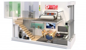
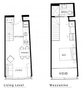
If you can get past the absurdity of labeling a building with a prefix popularised by consumer electronics, iLoft serves as a decent description of the building and its inhabitants. The development features 288 units, with the majority being approxmimately 41m2. This size — and the i —indicate the target market: the young professional.
Each of these units is distributed across two levels. The architects — ArcHaus — used a similar loft layout in their design for Tattoo, and its good to see this approached repeated.
The Archaus website reveals something of an interesting history to the building. Initially designed to be office space, the development has since been adapted into a residential apartment block. Given the recent glut in the commercial marketing, this move isn’t so suprising, and is doubtless a cheaper option for the developer than redesigning from scratch.
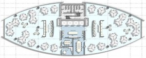
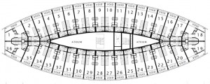
In terms of the design, this change from commercial to residential explains the somewhat atypical move of placing apartments within a curved building profile. As an open plan office, the shape of the exterior matters relatively little; cubicles and partitions can be reshuffled to accomodate all variety of arrangemenets. However, when trying to fit residential apartments into such a space, the (re)arrangements have produced somewhat interesting results. Shrinking and shifting the building’s core to the center has created a double-height atrium area on each floor that curves into a point at either end. Meanwhile, the curvature of the facade means that each of the apartments tapers slightly as it approaches the facade, so the apartments end up being slightly trapezoidal.
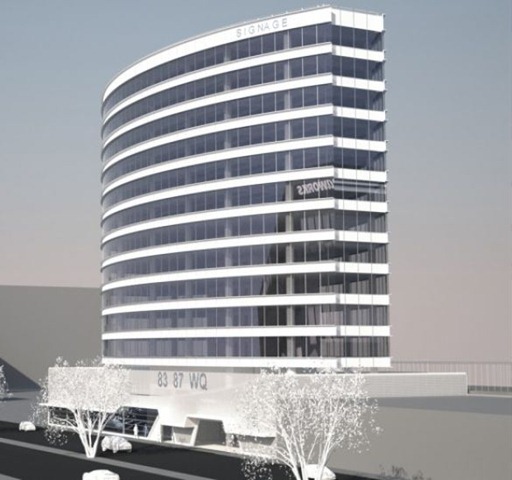
Moving outside, the exterior is a bland curtain wall, made slightly more elegant by the slow curve that spans both sides of the building.
The rendering on the right shows that the ribbons between each floor have a kind of double border; appearing almost like curved i-beams that wrap around the facade.
Down at ground floor there is a glazed street face, presumably for commercial tennants. Diagonal arches interupt the car-park masking screen, echoing some of the design elements proposed for Due Pension. Its a shame that the curves of the upper floors couldnt be continued at street level, and as a result two parts of the building seem distinct and unrelated.
Anyway, your thoughts?
Hat tips to Mark and SkyscraperCity for bringing iLoft to our attention.
The Eye is undergoing something of a redesign at the moment. A lot has changed already, but a few more features and tweaks will be added over the next week or so. Overall, we’re looking to make the comments system more flexible and engaging, as well as add some more location-based features to tie posts more directly to the places they mentioned. Feedback would be much appreciated.






Looking forward to seeing all of the new look ‘n’ feel, but I am a bit concerned about the disappearance of the comments count from the front page. Given that I could never get any joy out of the old comments notification option, it was the only way I could see whether it was worth clicking through for new posts. Surely it can be fitted into the new home page?
Interesting that the development is being promoted as being part of the Centreport masterplan, when as far as I can tell, it’s not even on Centreport land? Still, good to see some confidence trickling back into the property market.
Is the building smaller than it was before? Not as tall perhaps ? And a very different structure with the double height space.
It’s still rather reminiscent of Pirelli / West Plaza in plan of course, but it will never look as elegant given it’s inherent stumpiness.
Re: the name, it has about as much pizazz as Kraft Australia’s naming competition for the derivative of Vegemite – iSnack 2.0
The guy who won the competition was pretty embarrassed and said he only put the name in as a joke.
Yesterday I had a look at the display room on the site.
Hilariously, the mock apartment appears to have little relationship to the typical apartments shown on the plans. It’s more a collection of unrelated rooms. Uh, yeah…
What really struck me was that if you lived in an iLoft apartment, you’d effectively be living at the train station, with the train announcements, and the sounds of the engines providing an urban soundtrack.
And when AC/DC played at the stadium, you’d be able to crack open a window and enjoy the concert for free.
I rather like the design, but I’m not sure I’d want to live in that location.
Ahh – so that’s where you add comments. Who went ahead and moved my cheese anyway?
Front page is awful – especially the way that the coulmned most recent post relates to the older posts…
The map may just win me over though, especially if you tag/label the site of interest via google, so that it shows up here when the map is viewed…
Oops – have to take that back – the homepage’s most recent post shows up in 2 columns in Safari, but as a more distinct (and thus successful) single block of text in Explorer – what’s that all about…?
Thanks for the feedback m-d and starkive. Part of the pain of working with the web is that different browsers read and present code differently — hence the two columns in safari, but not in IE. Anyway, the next round of changes will be up by this weekend at the latest. Definitely going to address the front page (image banners for posts, # of comments, date posted etc). Markers on the map is also in the works (as well as being apple to see an overview of posts in a single map).
In regards to the iloft, isn’t it interesting that it fronts onto the stadium walkway? It almost reminds me of that hotel perched above the High Line. Except that the stadium walkway is barren, the building is less dramatic, and there will presumably be less exhibitionism. Come game time though, it could be a nice view of the crowds streaming in an on.
oooh, oooh, i see what you’re doing. An aerial photo appears of the area you’re blogging about? Very clever. But how do we get it to work? Can it work for commenters, or just posters? And can you tell us how to get little pictures by your name, like Robyn’s, or yours, – or how to withhold it if not wanted? Cos i know some commenters change their name and may not want to be identified by the same pic….
Use the “view map” button at the bottom of the screen – next to the ‘comments’ icons…
Doesn’t seem to work that well on the old mobile. Have you got an app for that? Mobile fish would be fun.
“For all its enthusiasm, the general voice of their marketing appears ill-considered. As with Apple, their choice of name suggests either naive ignorance, or an arrogant attempt to generate buzz. Given the gaudy slogans and colours spread across the iLoft promotions, Conrad Properties seems to have gone for the former.”
I’ve just being doing some research on Conrad Properties – one of many companies under the Directorship of Benjamin Dearlove and Jamie Hutchens. They’re responsible for such ‘gems’ as the Soho apartments on Taranaki St, which has a virtually identical plan and elevation to a building in Federal St in Auckland, another rounded one in Vincent St in Auckland, and a hulking great block called the Aura in Auckland’s Cook St. No signs of quality anywhere in there.
However, they do seem to have a very high opinion of themselves – their own website for Conrad says that Jamie Hutchens, Director, B.Const.(QS), MNZIQS (Hobbies: Jogging, fishing and golf) is described as:
“Measure for measure, Jamie is one of the best there is. As a trained quantity surveyor, Jamie has an astute assurance and expertise about the way he approaches his role as a Conrad development manager. He sticks assiduously to every project making sure that all the details are correct, checked and signed off every step of the way. Jamie is a pivotal part of creating and maintaining the confidence our clients justifiably have in any project involving this company.”
Really nice when you get to write your own PR, isn’t it?
What with the law faculty n’all more students are keen on hitting this area – I’ve been working on the changeover of QV House down on Thorndon Quay to student apartments this last month.
At the open day I thought it would be Asian students but was surprised to see plenty of first-time flatting pakehas – does this mean that Gen-Y are becoming natural apartment-dwellers?
Trouble brewing
http://www.stuff.co.nz/national/3366310/Residents-raise-the-roof-over-building-height
Yes, I too was fairly astounded over the proposed height of this. But there is really only two questions to ask here. Is this building within the height limit for the area? If so, then there is no cause to protest. But if it is overheight, then – by how much, and also, why no notified consent? I must consult my Map 32 !
Speaking of QV House!
http://www.stuff.co.nz/national/3368254/Thorndon-Quay-building-evacuated-after-fire
Damn vinyl layers..
60 – did you do that? No smoking on the job !
Vinyl layer’s torch burnt through his own gas hose – all the boys were running in to help ’til he yelled “gas bottle” and they all ran out again…
Surprisingly little damage all things considered and, critically, no-one was hurt.
I wasn’t even in the building at the time and besides, I don’t even smoke. Don’t you know that smokers have lower IQs, Maximus?