So the big news of the week, in Wellington at least (if we ignore the wars in Iraq, Syria, Sudan, Ukraine, etc), is the proposal for a large convention centre and accompanying Hilton Hotel smack bang in the middle of the city. The City Council will be voting on it this week, but it’s not out for public consultation. While it feels a little trite to be worrying over such first world problems of what it looks like, while the world keeps erupting in war after war after war, when all anybody really wants to do is watch the football; we still have the issue of a large empty section in the middle of town, for which a developer is planning to fill with a very large building. In the eyes of Wellington – is this the best we can do for our city? In Urban Design terms – what are we getting for our capital city – how does it work? Actually, nobody knows yet, because we haven’t seen a plan – all we’ve seen so far is this very pretty picture.
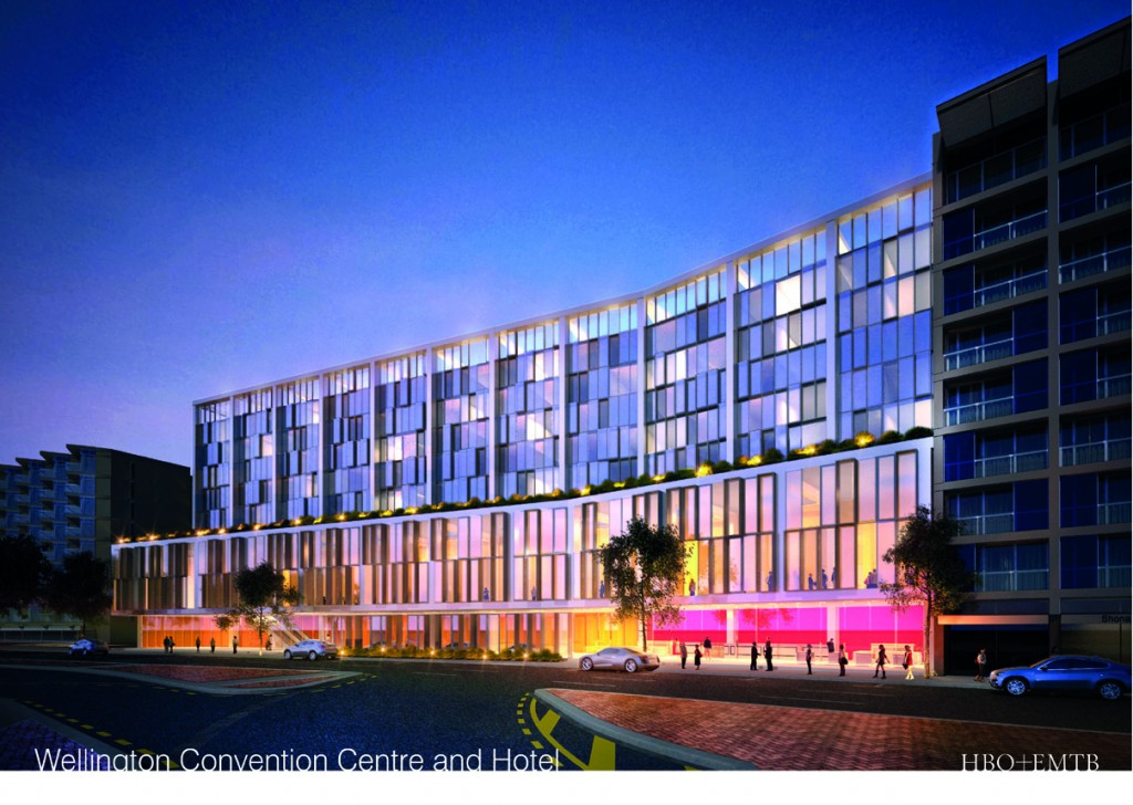
But I want more than just a pretty picture. I want substance. I’ll leave the bean counters to debate the net worth of a $2m cost to Wellington each year, but there is more than just the Hilton at stake. What I’m more interested in how it fits into our grand city plan (that, of course, implies that we do have a grand city plan).

…

So there is no plan for a Casino, which once upon a time was seen as a saviour for Wellington’s ills, but the Convention Centre has, it seems, taken the place as the piece of infrastructure de jour – if you don’t have one, you’re nowhere. Lower Hutt wants one, although the logic of that really hasn’t been thought through. Who wants to go to Lower Hutt? Where would you stay? Where would you go to eat out? The answers to those questions are quite simple: No-one, Wellington, and Wellington. Auckland wants a Convention Centre as well, even though they already have a large one – just for the hell of it, they want something bigger, and seem to be quite happy to accept bribes to the government to get it, with Sky buying off JohnKey with a few hundred more frazzled Chinese pokie players. Dodgy, dodgy, dodgy, and he’ll probably burn in hell for it, but who cares – its Auckland, and they’ll do what they want. Queenstown wants one too – and their $52 million deal is all the more relevant, as their Council is proposing to pay for a large chunk of it themselves: $29 million.
On the surface, Wellington has got an extremely good deal on the table. An (almost) reputable developer, an International Hotel chain, and an economic boon to our fading rose. This city definitely needs an economic boost. But I still want to see some details. What’s the plan, Stan? Well, the Architects for the project are HBO+EMTB, whoever the heck that is. Actually, in Wellington it’s Michael O’Brien, but I have the feeling that there may have been a bigger team involved – the HBO+EMTB team evidently has offices all over Australia and throughout Asia, as well as a couple of satellites in NewZild.
“HBO+EMTB is an established, regional design practice. We design responsive environments, delivering sustainable, humanistic solutions that integrate commercial imperatives and social objectives.
The HBO+EMTB group offers multi-disciplinary expertise in architecture, interior design, workplace solutions, urban design, landscape design, heritage and planning. These complementary services achieve quality, cost and time efficiencies for clients – from project inception to occupation. Representing a century of design excellence, HBO+EMTB’s history is complemented by a fresh perspective.”
OK – so what about a plan? Alright then, I’ll do one.
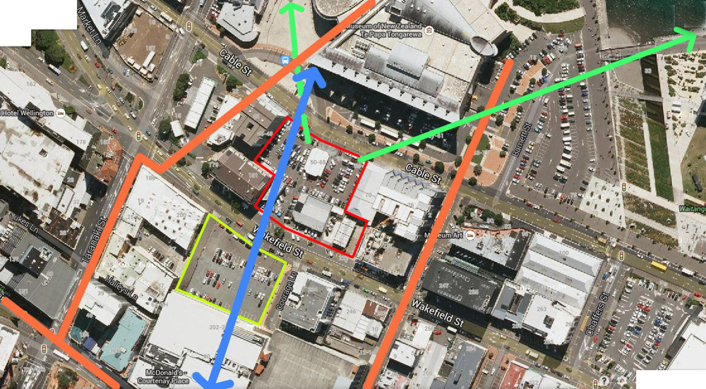
I’m trying to figure out how it fits into the city context. At present, if you want to go from the main street of Wellington’s action-packed night-life (ie Courtenay Place), you have to wander off down some awkward footpaths on either Tory or Taranaki St. Neither of them are good experiences. The desire line, which I’ve shown here in blue, leads you straight from Courtenay Central, direct to the waterfront and to Te Papa’s front door, and it passes straight through the site for the Convention Centre (outlined in red). Its a route that I often take as a shortcut direct from the St James to the Foxglove, say. Its always been a bit dodgy, given that until recently it was a working car yard, and they hated people crossing their patch without buying a new Alfa, but it needs to be recognised as a major pedestrian route. Trouble is, of course, that Coundown are planning to put their giant foodbarn in the way, so the protection / recognition of the route needs to be set down in stone even more. It would be a tragedy not to do so. The planners and urban designers at WCC have been banging on about laneways for ages – now is your chance! Anna Harley? Gerald Blunt? Jan and Clay? Tom Beard? Andy Foster? Iona Pannett? Celia?!? Whoever the heck is in charge of things down there at WCC, make sure you preserve a route through!
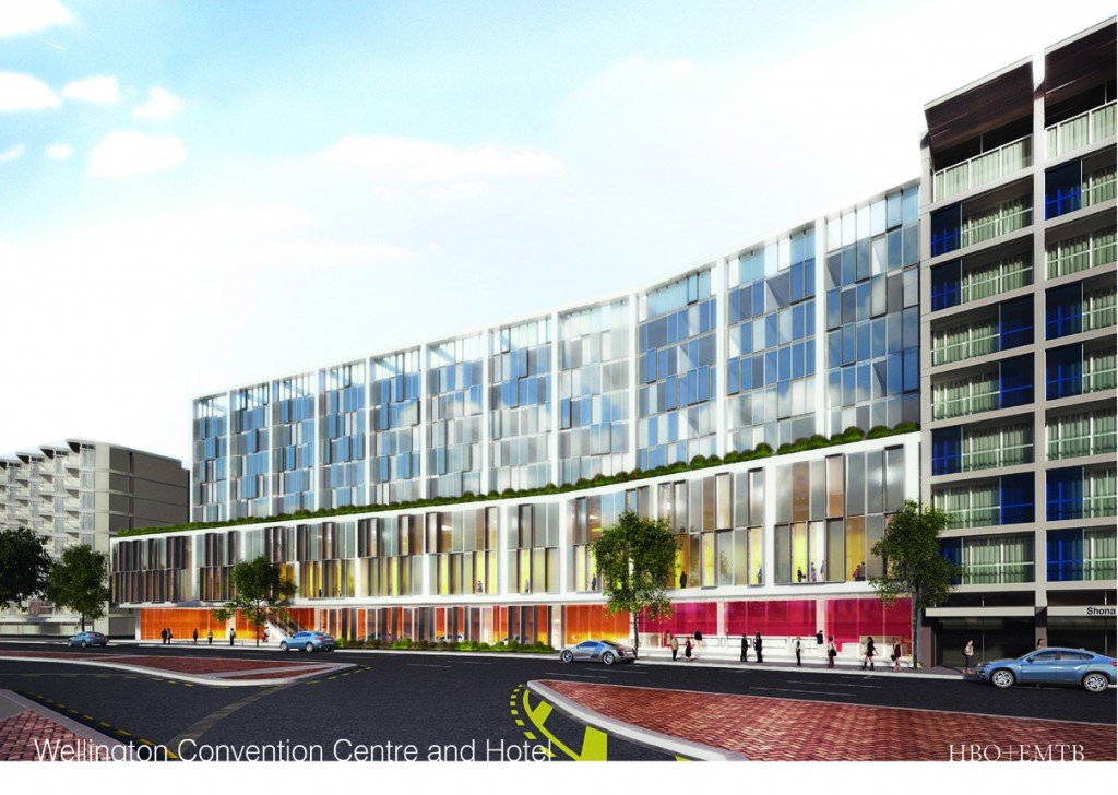
Of course, most of the time the building isn’t going to look like that sexy night-time shot. Most of the time we see it, it’s going to be daytime, and look like this (above). It’s competent, it’s modern, glassy, and fairly bland, but then again, Hilton Hotels are nearly always bland, and Mark Dunajtschik also loves bland. So for him, this is probably pretty exciting. Personally, I’d be looking the other way – what about the view out to the front?

Or the view out, to the rear?
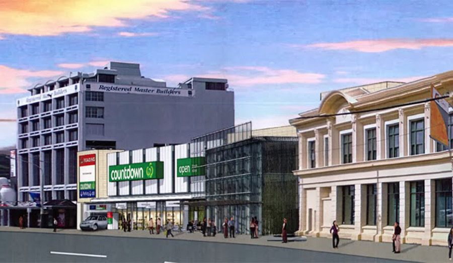
Even though the views out aren’t the best, this has the potential to be a fantastic asset for the city, in just the right place. Yes sure, it has a mini-motorway swishing up either side of it, and the view out is just of the arse end of Te Papa, but it is perfectly located to be in the middle of the city. It has a massive carpark already existing at one side (which presumably will get fixed one day…) and the national treasures of Te Papa out the other side on your way to the best little waterfront in the world. It has a entertainment zone of fast food stalls and movie theatres nearby, and a supermarket on tap. Some of the best beer bars nearby (Hashigo Zake anyone?) and even access direct to Waitangi Park. Best of all, for me, it could possibly also double up as the long awaited venue for mid-sized events, like bands and – heck, anything is better than the awful shed 6 or the TSB ! Bring it on!


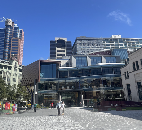

I was meaning to ask about the Reading car park. And the James Smith’s car park. It’s coming up on a year since the earthquakes and the things are just sitting there derelict and fenced off. Have they been abandoned?
According to WCC, they “have been closed by their owners while the buildings are inspected for possible structural damage from recent earthquakes”. (http://wellington.govt.nz/services/parking-and-roads/parking/car-park-buildings) Surely it doesn’t take a year to perform a structural inspection of a parking building?
http://www.stuff.co.nz/dominion-post/business/commercial-property/9806169/Readings-20m-development-faces-delays
Wouldn’t it be more economical to just bowl over the parking building and rebuild it from scratch, instead of attempting to fix it?
I think your website is a giant post-industrial dildo violently thrusting its way to Internet obscurity.
You need to learn how to write less stilted and overly constructed articles. The crap you write is quite a shlep to read.
Funny how a giant violently thrusting post-industrial dildo keeps you coming back for more D Dauerteig – it seems you really want some…
I meant D Sauerteig… now where’s the edit button on this site :(
M-d and D Sauerteig – yes, that was an interesting comment. I’m not sure if it was a robot spam mail, or if there is a real person behind it, but I liked the imagery and so let it through. The amount of spam we get here is massive – most of it still trying to sell Christian Laboutin shoes, or Michael Kors dresses, but I would wonder whether anyone has ever bought a pair of Christian Laboutin shoes from a spam email, ever. And interesting, spam nowadays has gone very multi-national, with quite a bit of spam completely in other languages, like Russian, Chinese, Arabic, French, as well as fluent Gibberish.
Anyway – back to the Hilton!
Begs the question of course, if this website is post-industrial, then what is a pre-industrial dildo? My mind boggles…
My guess is that it is a spam, due to the word shlep (misspelt – actually should be schlep: meaning a long, heavy haul). Obviously yiddish, and so therefore likely to have been written by an American – probably New York jewish. Which is kind of ironic, given the whole Hilton anti-semitic background from a 137 years ago:
http://en.wikipedia.org/wiki/Joseph_Seligman
But yes, returning to the subject at hand – the site for the convention centre is an incredibly central site for Wellington. It appears form the renders that the plan is not for any public thoroughfare, but instead for a wall of glass. The building looks about 10 stories high, and looks to completely block off the street from the city – do we just want a blank wall of glass? I’d suggest not? What is up with architects these days?
I thought it was too funny to be spam, and no click through links. No Max, I think you have a real fan…
Hilton – well, I’m impressed that it isn’t just a great dumb box with blank walls, which is what I would normally expect for a convention centre. We have a marginally more interesting dumb box with patchwork glazing pattern. I like the indication that they appear to be thinking about improving the pedestrian environment, which is a really good move in that area. Pity it is on such a busy route and doesn’t really facilitate the building properly opening up to the footpath.
As for the link through from Courtenay to Te Papa – wouldn’t it be better to actually improve the street environments of Tory and Taranaki than put in a poky little access tube through the supermarkets and proposed convention centre? Better to improve the crud we have than set up competition through the gift shops of privately owned developments…?
But I think this is a great spot for a convention centre, and hopefully will lead to the Council thinking about the public face of that part of town, and doing something to improve it (you’d have thought Te Papa would have been sufficient to start that ball rolling though, so I’m not holding out too much hope though).
Thanks Alan and m-d – I’m just thinking back to the days of the “overbridge” craze, which must have been in the late 1970s – early 1980s. If I remember rightly, there was a series of overbridges in that part of town – there was, I think, if I remember right, one across Manners St from the Oaks over to the Opera House lane? The remains of it still continue, from the carpark behind the Amora hotel, over the road to the MFC car-park. Did this once extend to the sea? Was Manners St ever really that busy? Were there others in town? All i can recollect is the overbridge up at Kelburn from one part of the uni to another.
Nobody really uses overbridges anymore – did they ever? – and as you say m-d, the ground is popular. But there are some real tight hot-spots on the walking routes, with the corner of Courtenay and Taranaki a real pain – enjoyably tight at the moment, but if you wanted 2500 conference goers to safely traverse over to Courtenay, I’d venture to say that it is not satisfactory in its present condition. I’m not after a grand processional avenue, but a number of (ie at least one) laneway routes through could well be a good idea. Connections and circulation, both physical and virtual, are the networks that we make our cities with. In this case, we’re lacking thje physical.
m-d>As for the link through from Courtenay to Te Papa – wouldn’t it be better to actually improve the street environments of Tory and Taranaki than put in a poky little access tube through the supermarkets and proposed convention centre?
Bowling the parking building would help improve that end of Tory Street. On one side of the road you have Mountain Safety House and some other pleasant buildings. On the other you have a blank wall. Surely someone could work out a development that included the current outdoor Reading car park and the earthquake-damaged parking building site, and that would improve Tory Street.
Maximus, the Overbridges you speak of went from the Oaks to James smith’s which in turn was linked through to the parking building and then subsequently across Wakefield street to allow access to the Michael Fowler Centre,
I Think the idea of the latter was to allow everyone coming out from the Popera at the MFC to make a quick getaway in their SUV and get back to the Suburbs to catch up with the late news on Telly,
Wheras these days the trend is all about keeping peope in town so they actually spend more money on such expotic things as dining out or some form of liquid refreshsment.
Getting back to the Convention centre and linkages, one of the good things about it being tied into a hotel is that they tend to have very long opening hours, and combined with the Cinema/Supermarket they should both be able to facilite at least some form of public thouroughfare until at least midnight every evening, – at least its a start.
Design is uninspiring and bland. Looks like Amora Hotel V2.0.
greenwelly, I too am keen on seeing a Popera – presumably the Pope singing in an all-boy-band? And so you remember the overbridge to the Oaks as well – I still find that a bit extraordinary. Was the Oaks ever that popular? Was Manners St ever that grungy that mere mortals could not touch it with their feet?
jp@mailinator – You’re right about the design being uninspiring and bland. I’d mark their report card: “Could do better. Must try harder.”
I’m sure there will be pressure on them to do so. The last thing that HBO+EMTB would want to be know as is: Wellington’s most dull and boring architects. Their problem is that they are working for Mark Dunajtshik, who is Wellington’s most dull and boring client, but the only one who has any money left. But the development desperately needs a touch of panache, a dose of glamour – in fact, it needs a big stiff broom and a clean sweep to be honest!
Over on Stuff, there are the usual mad-dog pack of rabid comments from some people, but on this occasion there are also some more sensible commentary, including:
Chitara – “Pretty picture, especially when you compare it to the space on Google maps. And then you start noticing things…
Like that it can’t possibly be that airy out front, because the perspective is from somewhere back against or inside Te Papa’s building and a good half that space we’re seeing out front is Te Papa’s entry driveways, minus the inconvenient signage, trees, streetlight poles and bollards. It possibly could if it were properly set back from the road, more similar to Hotel Intercontinental, but that’d mean giving up land space. Especially as Intercontinental has wider footpaths outside anyway. Hard to tell if that tall-windowed section above the pink ad yellow lit street-level is actually a 2-storey-high overhang.
I wonder where the 80 or more cars that the 165 rooms’ occupants may require will park, or will this deal include land on the Wakefield St side for a connected parking section? I can’t imagine they’d have that much underground so close to the waterfront in an earthquake zone.”
and
Teard – “Let’s hope it’s just a concept drawing at this stage. There’s a lot of aspects that don’t meet the Council’s own design guides: it lacks articulation, it breaks the alignment of the street, if here’s a pedestrian connection through to Wakefield St then it’s hard to find, I can’t see a verandah, and if you look closely it seems that there might be a porte cochere in the middle – a feature that’s terrible for pedestrians. But I’m sure all of that will be worked through before it gets to the resource consent process, right? Right?”
and
Jerry – “Yes great, lets get a Hilton into Wellington. But for God’s sake, come up with a credible design that doesn’t just resemble another 1970’s looking rectangular box. If the photo accompanying this story is the final perspective of the proposed development, I say sack your architect and engage someone with vision.”
And just in – the WCC decided today (behind closed doors) that the proposal would go out for public consultation in July. I’m guessing that they will want to try and limit the discussion just to the business case – $2m a year – should Wellington be involved – but I’d like to think that the population also gets a say on the urban design and the architecture as well. How best to do that?
Perhaps I just start by saying – can we see a set of plans please…
Hi all – Just to say that the urban design has indeed been discussed. I have raised it with Council management to work with the other parties as part of negotiations. The pictures are I am assured just pictures (the media and even blog sites have to have something !)- so the design, pedestrian access through the site, and design of public space outside are all things we can and will discuss, and I would encourage people – especially those who think deeply about issues of urban design and architecture like “eye of the Fish’ contributors to make submissions to say that these issues are important.
Getting the design right, and making the area around the convention centre/ hotel attractive, will all add to the life of the area and the attractiveness and success of the convention facilities. That is in all parties best interests.
Warmest regards
Andy Foster
Chair – Transport and Urban Development
Wellington City Council
Thanks Andy, helpful to have your comments here. I certainly do hope that contributors will file some intelligent comments when the opportunity arises.
Consultation starts 8 July:
http://wellington.govt.nz/have-your-say/consultations
In a recent DomPost article (The Making of a Museum, 4-6-2014) it was reported that:
“The grand plan was to have a tree-lined boulevard running from the museum and carillon right down to Courtenay Place.”
Maybe your pedestrian desire lines were felt to be necessary a long time ago!
Sorry to drag the conversation back to pre-industrial (1680) dildos but I couldn’t let the opportunity to include this link go past. It’s on Google Books so I don’t think it quite falls into the NSFW category but it’s probably not for kiddies or prudes. Quite a remarkable book really…
http://tinyurl.com/lp6wojl (click and scroll up)
Nigel and John – I thank you. Please await the next post with…. …anticipation.
Tough crowd.
jp@mailinator.com – how about backing up your criticism?
The venerable Tommy Honey told us at Architecture school that you needed to be able to explain up your criticism. Otherwise there is no valid basis to what you are saying.
Uninspiring and bland? How so?
Amora Hotel v2.0? Really?
(is it the horizontal banding of the Amora? No not that…. Is it the hipped top of the Amora? Nope again. Is it the lack of a base, middle and top like the Amora? Hmmm…. No. Is it the sheer brutality and width of the Amora? Uh uh. Last time I looked the Cable Street site was about half the width of the Amora…
I can’t see the basis of your criticism. Can you enlighten us?
“The last thing that HBO+EMTB would want to be know (sic) as is: Wellington’s most dull and boring architects..”
Really Maximus?!? In a city with Peddle Thorp buildings and a bunch of other dross and cheap apartments, this design would make them dull and boring?
Yes, the design is a little… under-developed, but I for one am happy to give them a bit more time. It seems like it is pretty early on in the process….
Thanks John K – yes, it is early on in the process for us (people of the city) but apparently this has been going on for some time with the Council, and so the design has already been subject to a lot of discussion. Cable St is already lined with tall apartment buildings (well, tall for Wellington at 10 stories) and while they’re all competent (at least the ones either side by architecture + ) they’re still pretty much background buildings. Te Papa, whether you like it or not, is the most important building in the area, and by its very nature and it’s design, it stands out the most.
There is an argument therefore, that as THE convention centre for Wellington, this building should have a little more street presence. At present it is really only saying two simple things – one, follow the street, and two, have a podium for a couple of floors, then step back, and follow the street. In terms of articulation of facade, so far that seems to be it. Just a stretch of glass with a kink in the middle of it. Now, I’m confident that there is going to be a lot more. There will be another facade, on Wakefield St, that we haven’t seen yet, and there is going to be a massive column-free convention hall or something like that, which is clearly not on this facade (as the columns from the slab block of the Hilton would create a grid of structure non-conducive to a successful convention centre). There will be restaurants, giant foyers, probably a gym and swimming pool, the ability to process hundreds of arriving delegates, a link way through to connect between Courtenay and Te Papa, and a whole lot of hotel room design that we still haven’t heard about.
But minimus discussed the whole thing about convention centers some time ago – and how they are often killers of the urban realm. How their large blank walls and many fire exit doorways just kill off any livelihood on the street. The urban design of a convention centre is really important to a city, and needs to be discussed at length to get the best possible result, and conversation about it needs to be ramped up, and not clamped down.
Maximus, I am not trying to shut down discussion / criticism. Far from it.
My ap[ologies if it seemed that way.
But it needs to be an intelligent conversation. Your last comment was spot on. Excellent.
jp@mailinnator’s comment was the exact opposite. Dull, uninformed and boring. It added nothing to the conversation.
The Council has started the Consultation:
http://wellington.govt.nz/have-your-say/public-inputs/consultations/open/convention-centre
Closing date 5.00p.m., 14 August 2014
You can also send the WCC your comments:
by email to conventioncentreproposal@wcc.govt.nz
by letter to:
Freepost WCC
Attention: Baz Kaufman, Manager, Strategy
Wellington City Council
PO Box 2199
Wellington 6140
[…] proposal to build a combined Convention Centre and Hilton Hotel is a good proposal for Wellington, and it should be encouraged to go ahead, with some strong urban […]