Following swiftly on from the post about the hole they’re digging, today I wanted to look at what is going to fill it. We posted some time ago on the project (just over a year ago) when it hit the papers, with a hideous green render, and speculated that the building would have a bit more development before it hit the site. And so it has. Thanks to a helpful tip off from one of our daily Fish readers (thanks Mark), who spotted that Willis Central have upgraded the info on their website, there are some spanking new images to view coutesy of the wonderfully talented designers and rendering team at Architecture +.
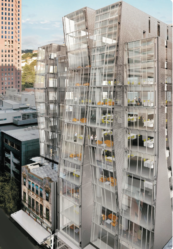
The facade still wiggles in and out, like a frozen image from Len Lye’s water Whirler (when it’s working) in the same pattern that we saw first in the earlier green depiction. You can check out more on this building from Mechaniker’s blog here and his photos here. But in these latest renders, the glass has been shown as an enticing total transparency. Will it really be that clear or will it be bleakly dark reflective green, like so many other double glazed tinted behemoths around the city?. If we look closer we can see that the building is not twin skinned (like Arch +’s last building for DoC), but instead is pushing right out to the boundary and beyond with the angled glazing.
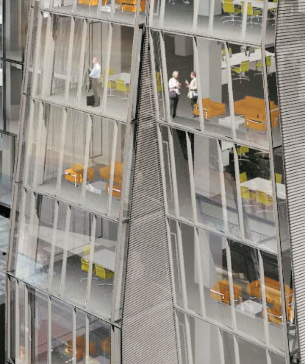
Looking even more closely we can see several curious things: there are no opening windows (a pity, given the green credentials of DoC House), the mullions stagger vertically up the building, and the triangular reveals to the projecting walls appear to be a material like weatherboard or even corrugated iron. Surely not: despite Ian Cassells being partially responsible for the tanalisation of Cuba St (hat tip to Honey), I’m sure there is a more sophisticated material being used.
The elevations are more resolved, more slick, although basically still unchanged: a more sophisticated rendering does bring a more mature presentation to the fore. I sometimes wonder if architects shoot themselves in the foot by releasing unresolved renders – a good old atmospheric hand drawing will give a better, more friendly result than a quick, amateurishly bad render can ever hope to. On the whole though, the development looks simple, keen and practical – not as outlandish as it did once. There has been little murmur from the uncaring public, nor of course a whimper of dissent from the architectural community, although not everyone was happy with the proposals last year – one commenter grumpily stated that:
“Am I the only person to find this design really weak and child-like? The wavering facades are as if the designer could not make their mind up, and the junction with the very dignified building that houses the Vault is oppressive and hugely clumsy. Ye gods, that’s the most insensitive junction i’ve seen since Britney was snapped getting out of that limo.”
Hmmm, there’s a visual we really don’t need reminding of. So: onwards and upwards.
At ground level, on Willis St, the carefully animated graphic shows a healthy amount of happy shoppers and joyous Telecom workers entering the building, off to develop new starburst logos or find another reason to slow down your broadband speed. It’s great to see the old building fully restored – and indeed, even the gracious old stair that formerly lead to the Vault has been retained (but we hope, a higher handrail installed as the old one was lethally low).
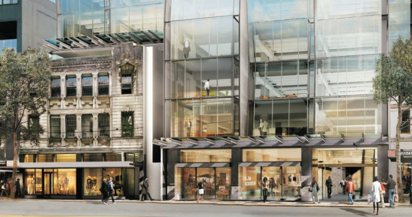
Again, the transparency here is enticingly see-through: I’m hoping that they manage to pull it off, so to speak. Certainly their competitor Vodafone have managed that with their Auckland building.
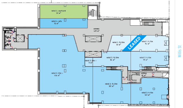
It’s worth looking at some plans while we’re here: we spoke last year about the desire for a public route through,
“With a bit of luck and good management by the consenting authorities, a through walkway and publicly accessible lift up to Boulcott St should also be available. That’s one of the great things about Wellington – the enforced cooperation of large commercial tenants to share their hill-climbing vertical transportation with the general public.”
and that has been carried out in the completed scheme, right from Willis St:
up to Boulcott St:
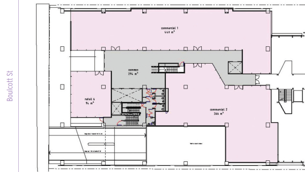
The Boulcott tower will of course (sadly) destroy the view that Antrim House has held for over a 100 years. Built for Mrs Hannah, of the shoes fame and Hannahs factory fame, Antrim House (now the home of the Historic Places Trust) has possessed a marvelous lookout over the city and through to the sea until Chews Lane and Willis Central came along. No doubt they’ll not be that impressed, although presumably they’re happy with the old building being (partially) saved down on Willis St. So, apart from them, does that mean that most people are satisfied? Maybe even me? Well, almost. But there was one other thing we spoke off last year, which the renders still do not show:
“Of interest in the finished building will be a potentially giant atrium, rising possibly 12 stories up from ground level where currently exists only deep plan gardens and retaining walls behind the existing shops.”
I’m unsure if that has made it through unscathed. There is a remnant of green right down the bottom of the northern side, with a probably overly hopeful grass lawn next to the cafe (the green patch on the plan above). The cafe is on the way to the pedestrian lift right at the back of the site, which must be in the depths of that hole we showed yesterday. But no sign of a giant atrium between the 2 office towers. We spotted it last year in this picture but have lost sight of it from the plans in the latest incarnation. And that’s a pity. Wellington needs a few more buildings with massive areas of free public space, even if it is skinny in plan – but especially if it is 12 storeys high.
Let’s hope that it is just missing off the letting plans shown here, perhaps still floating between the two towers (whereupon the tiny angled stair poised in the slipstream on the lower plan). While I’m quietly hopeful that the atrium is still there, I suspect that it may be organised for Telecom workers only, and not open to the public, who will still be sliding reluctantly along the narrow corridor to the lift at the end. Yes, the uncomfortable narrow slot that looks like a mugger’s paradise. If we could just gain some better public access along there, and get public access to that atrium, I’d be a very happy fish indeed.
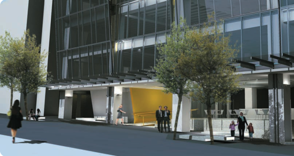
I’ll leave you now with one last final picture from the team at Architecture + , yes, it’s the entry on Boulcott St.



Thanks for the kudos Maximus!
As much as I dislike Telecom as a company (their over charging of broadband and strangle hold on the Southern Cross Cable still bother me), I really am impressed with the overall look of this building. It is really different, and I think fairly tasteful.
Lets face it, anything is better than what was on that site, especially that they are retaining the lovely old facades down on Willis Street.
I’m hoping for a Mojo on the Boulcott Street side though… maybe my wish will be granted… Mojo is in EDS House which as far as I can tell has a smaller in-building population, so this mammoth building surely will command its own up-market cafe (or two) for the tenants.
Now, I better go update my little blog with some new photos!
Maybe not too bad. And definitely better than that 1950s Neo-Stalinist abortion it’s replacing. Will fit nicely with Chews Lane.
As long as it isn’t turned into a gigantic green slab of glass. Please God, don’t make it gigantic green slab of glass.
Back to 1950’s Neo Stalinist abortions … anyone have any idea of what might happen to the buildings just north of the site? They look ripe for being nuked, given all the improvements on Willis in the past few years.
“Please God, don’t make it gigantic green slab of glass.”
– Yes, I’m hoping the same. I strongly suspect it won’t be as transparent as in the pictures, but perhaps they won’t need as much shading as the street will be so narrow and canyon-like once this is in?
“Back to 1950’s Neo Stalinist abortions … anyone have any idea of what might happen to the buildings just north of the site? They look ripe for being nuked, given all the improvements on Willis in the past few years.”
– Refer to the comments after our post last year. Belong to a Singaporean company, and they’re keen to develop / redevelop, but as far as we know, no definite plans yet.
i have to admit, the various planners on this project and the giant monster across the road have done a good job in both keeping the feel of this part of town alive and breaking up their giant office blocks enough that the street doesnt feel dominated by single projects. special congratulations go to them for not ‘over tidying’ the facades of the older buildings they’re using.
i wonder (as i do whenever i see a design with strongly identifiable design characteristics such as wiggly walls!) how this building will look in 15 years time, when fashions change.. will it be iconic, or an awful eyesore representing the worst of 00s style..
Thanks for the images Max (and the reference – I hadn’t heard tanalisation for awhile…). I was looking at the Chews Lane Apartments the other day and musing how they got it so wrong in Newmarket with the apartments they allowed to be built over the railway station. The most expensive shopping in the country and the apartments are the cheapest looking block in a city of cheap looking blocks. Chews Lane – and now the new Telecom – show how architecture can contribute so successfully to the urban fabric. More power to the architects and shame on Auckland for not paying enough attention to their urban environment (but when do they ever?).
i think you’re all being sucked in by the renders. The facade won’t be transparent really at all. The tilting, tinted screen will just look like large planes of mirrow, reflecting the sky and the buildings opposite. The windows, and the ceilings, will appear dark grey green, as does every other building. The only true picture of how the building looks is the boring back elevation onto Boulcott St. That shows the dark, grey, bland facade at its truest.
And true to form, Ian Cassels is practising what he preaches by reusing the old frame of the Airways Bldg.
I think there are some missed opportunities particularly regarding the boulcott street side and the connection from there to willis. Having been a pedestrian commuter down boulcott for several years, I have a strong desire to see something other than parking garage entrances facing the street. It’s nice that they have included 1 ground floor retail spot, but looking at the render it still reads as if it is a parking garage entrance – low, dark and cavernous, only with a few seats in front. Boulcott has incredible foot traffic, yet it is one of the most hostile pedestrian streets in the city.
Secondly while there is the appearance of a connection between Willis and Boulcott it still has the appearance of a service corridor, a pathway that is grudgingly provided instead of the introduction of nice interior space. What is it with this city? The weather makes it practically unliveable 50% of the time, yet we have an absolute dearth of captivating interior spaces. And don’t give me the excuse that it’s private property and there is no incentive for a celebrated quasi public interior space – western capitalist societies have a long history of such spaces, the winter garden in the heart of NY’s financial district is the best example.
Achieving a clear glass facade would be nice, but for the majority of users a path that allows one to get out of the rain and wind, and not have to walk across car parks, loading docks, and generally unpleasant spaces would be far more enriching.
You’re right there – that is an absolutely appaling subteranean Rat Run, twisting every which way but loose and I wouldn’t venture through there without an impending sense of mugging.
It’s funny how a twisty windy footpath can be so enticing and yet inside a building it just has an awful atmosphere. I’d be keen to see a light-filled hallway there for sure instead ov that current plan.
“that is an absolutely appaling subteranean Rat Run, twisting every which way but loose and I wouldn’t venture through there without an impending sense of mugging.”
Word has it that the final version will be much more direct and legible. And even with the twisty version, I’d hardly be afraid of mugging, any more than in any of the through-block links that join Willis & Boulcott (Grand Arcade) or Lambton Quay & The Terrace (Capital on the Quay etc) at the moment. And if, as suggested, there’ll be a cafe next to the courtyard partway between Willis St and the lifts, then it will be far from unpleasant.
Whoever gets the window washing contract will have a license to print money as that alternating convex / concave facade will be a sod to clean properly
I am reliably informed that the renderings are courtesy of BotzDigital. http://botzdigital.com/