The newish route of State Highway One, known as Karo Drive (oh, such droll naming – the Karo tree is a vile weedy thing exploding black pustulant seed pods all over the surrounding area, and grows like crazy – perfect for Cars…), has for the last decade or so had a series of forelorne landlocked lumps of lost and lonely land scattered along the length of the bypass. Triangles of doom and gloom, seemingly forever abandoned by everyone including NZTA. An eighth of an acre in an awkward shape, next to a motorway on-ramp – who would possibly want that? Well, actually, quite a few as it turns out recently.
The best known and most enjoyable of these, without a doubt, is the Bresolin corner bar, crafted onto the end of the old Citron restaurant, and probably exactly on the same GIS space as the long forgotten original location of the Bodega Bar, when it was actually a bar. The Bresolin brothers reworking of the corner (don’t know who the architect was, but it is brilliant) has made a silk purse out of a very skinny old sows ear, and when you’re in there, the noise of all the drunken bar patrons almost drowns out the noise of the motorway roaring past on the other side of the fence. Quite an amazing transformation, and well deserving of a gold medal for city mending, in the fine way that the Bresolins always manage to do.

The other three nearby corners all have very different ways of resolving the issue of “what to do with this land?â€. One, a tiny pocket park of stupid design with a park bench no-one would ever want to sit in, was then expensively dug up and reworked as a far more expensive pocket park of marginally less stupid design, but with lots more concrete. A marginal improvement.
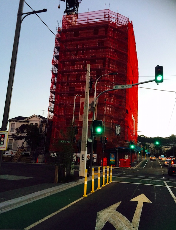
Another nearby site on the corner of Victoria and Abel Smith St, has had a very different resolution. Here, DLA Architects and Ebert Construction have created a massively engineered concrete building 9 floors high, of apartments (presumably reasonably expensive ones to cope with the large cost?). DLA Architects is one of those smaller practices who doesn’t appear on the architectural map very often, and from memory they formerly did quite a bit of work in Wanganui (before it became Whanganui). I’ve been following this build with interest (but was too busy to blog about it) and have to say I was amazed at the size of the foundations, and then amazed at the fully shuttered concrete core on a project this small. It is now nearing completion, and has a wall of what looks like precast panels cladding the rear – a blank facade, painted silver (same as DLA offices…) and resolutely facing north. The front facades are a very different solution to the normal array of apartment elevation options, with none of that wall-to-wall glass and balconies you see so often down near the waterfront. Here, the cladding seems to be a semi-random assortment of vertical panels, some solid, others as windows. The presumed advantage of this is that it will give a decent amount of privacy from all the traffic coming along Victoria St. Can’t wait to see what the insides look like. Will the visual appearance of vaguely random external wall panels translate into a coherent design aesthetic on the inside also?

Diagonally opposite that, on the corner of Karo and Victoria, the developers of another tiny triangle have taken a totally different approach. Instead of massive concrete pile foundations and a 9 storey building, they have gone for a simple retro-suburban solution of good old 3604 based timber frame, clad in a quick fire polystyrene cladding system. As a comparable development, I’m presuming that a 3 storey timber building would pay the bills off far, far quicker than a nine floor concrete cored tower, and so it will be interesting to see if they are both rented out, or sold off individually. The Sto cladding gives the smaller apartment building a mock-heritage-era appearance, finished in two-tone tasteful creamy greys. Presumably, and quite probably, the nearby traffic noise will go straight through these walls, in comparison to the solidity of the DLA project. Here are a few photos of the construction of this, over the last few months:
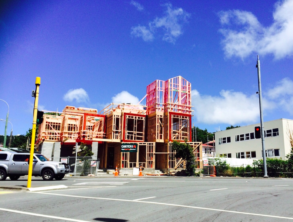
Foundations were pretty simple, just concrete blocks and slabs. Much quicker than across the road.
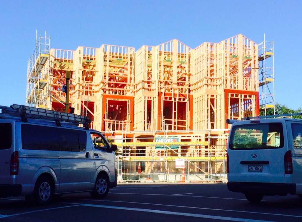
A very few simple steel lintels – but for how many apartments?
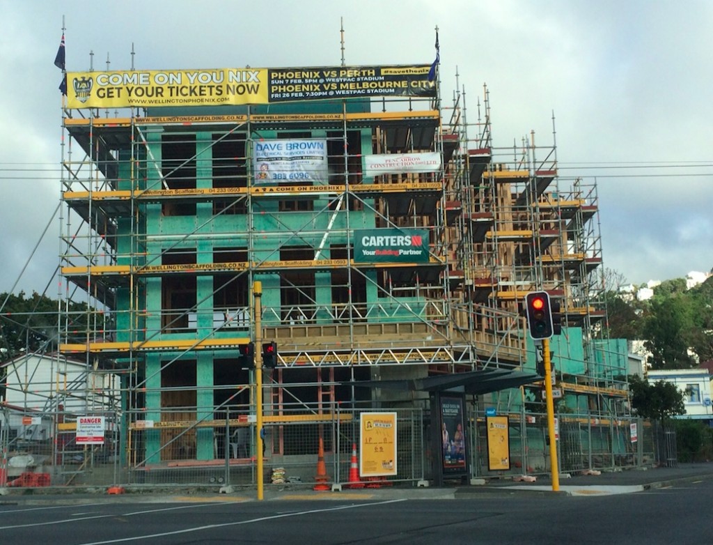
Then obligatory RAB for the Cavity:

I’m not aware who the designer or architect is / was – do you know? Please drop us a comment down below! Thanks.
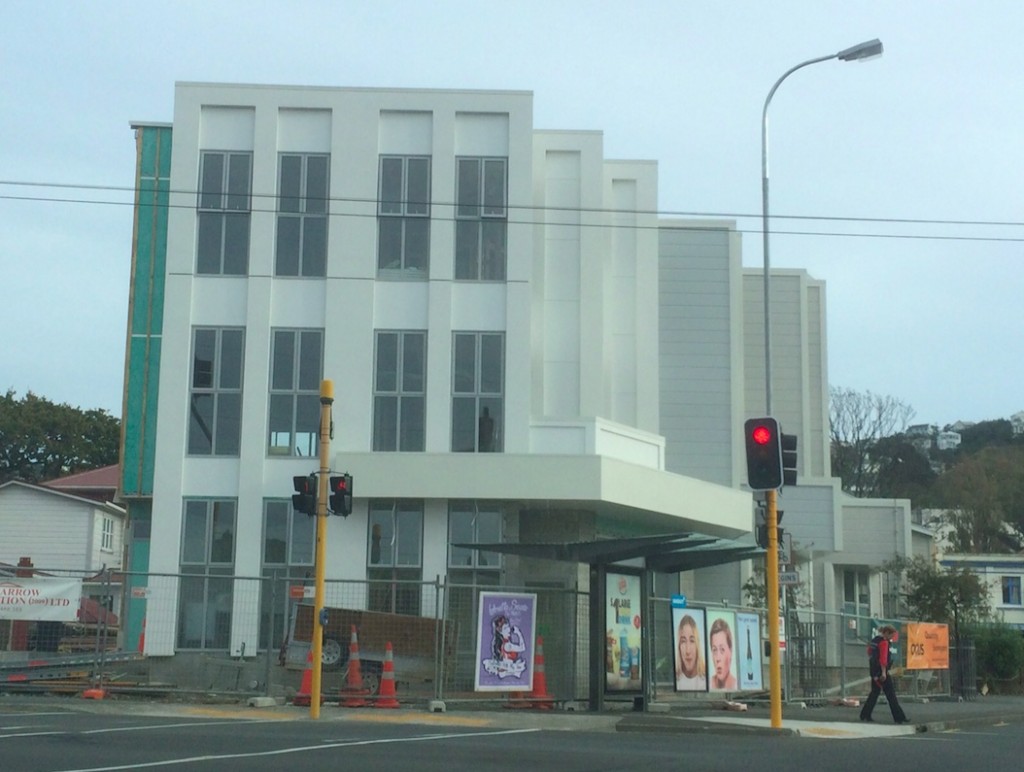
And then, just like that, the building was complete and the scaffold came off. Not at all what I expected on the unveil! Much more mock-deco than I expected. But interesting, nonetheless.
Lastly, we also have another contender starting on the block, with a further triangle of land recently sprouting a fence and an ArcHaus sign. ArcHaus are much more well known than DLA, with an amazing track record in getting work in town, despite rarely getting any architectural awards for their efforts. I’ve no idea what this one will look like, nor indeed even if it is also going to be apartments (although I presume it will be residential, possibly similar to the brilliantly compact Tattoo and Canvas apartment contracts nearby – not much call for new office blocks or retail along this route). So: watching with interest! ArcHaus, do your best!

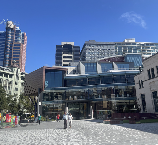


pretty certain bresolin was done by the fabulous peeps at Aths….
the smaller timber scheme is designed by AYMAC
I read somewhere once that the name of Karo Drive was decided in a competition, and the winning entry came from pupils at Te Aro School (Kids + Aro)
Joseph, you’re correct in that it was named by the local school kids – they’re cleverer than i thought.
cm and Arindam – thank you both for your info. Haven’t heard of AYMAC before, but yes, it does seem like their sort of work. It would be great to do a cost comparison with the other project, to see how they stack up financially, although i suspect that the city urban designers may have had more of a say than I suspected – north of Karo is probably 27m height limit, while south of Karo is probably Inner residential…
Leviathan – both sides are Central Area – you can check here: http://eplan.wellington.govt.nz/#!Start – the height limits change as you go along that side of the road.
The botanical name for Karo is Pittosporum crassifolium. That road should be known as Crass Crescent.
Interesting analysis of the very very slow urban healing process of the star-spangled clusterf#@k that this intersection is – a brilliant example of an overlay of motorway design language banally layered over an existing street grid…
However, I take issue with your comment that the Bresolin Bros project should have some kind of award for city mending. A Quick perusal of the recent local architecture awards demonstrates that such high-minded outcomes don’t even get a look in when determining what is ‘good’ architecture… Aim much lower my fishy friend…
On a slightly related note, I am having trouble understanding the precise politics of the Better Te Aro push. There is admiring talk of shared spaces, but quite a lot of less clearcut stuff about traffic flows and local business needs – along with cycleway slagging. They also don’t want “a mall like Manners St” which ceased to be a mall some years ago. What does it mean?
Starkive – or should I call you Ironman? – that’s the subject of a soon to be upcoming post on this very website….
m-d – I’ll meet you at the bar there for a drink after work one of these nights, and we can discuss that very point until the cows come home. Although, keep in a cow in Te Aro is difficult. There’s lots of bullshit but not much hay.
William and Splanned – thanks for those comments.
Breaking news – AYMAC are already extending the design of their building, with a series of small steel portals popping up in the last couple of weeks – is this the start of new medium density houses, or is it just garages? Time will tell…
[…] Well done Mr Dickson – of course, the Dickson from DLA Architects, the architects for the building we were just talking about the other week. Haythornthwaite is a designer of many years standing, recognisable at least as much for his […]