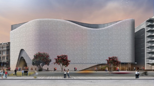
Well that’s a welcome wakeup call – options for a blinging new face for the proposed movie museum and conference centre in Wellington. Talk about Bling bling! And unlike yesterdays post on Erskine, today at least the architects are named, so we know it is by Studio Pacific Architecture, and that tells us that the results should be pretty good. And here it is:

We spoke about Studio Pacific coming on board at Christmas last year, and it is interesting to read back on the comments at the time – people expressing hope that with that team, we should get some pretty exciting results. And with this proposal, we certainly have.
Of course, with a proposal looking not unlike a blindingly white fish with a large eye, there is no reason on earth why I’m not going to like this proposal. It’s Maori mythology, its the head of the fish, it’s Moby Dick and the great white whale all rolled into one – and it is the name of the blog that Philip started ages ago, and that Maximus carried on for many years.
Here’s the other side of it for your delectation as well:
Everyone loves a shapely backside, and this looks like Marilyn Monroe in a tight white sequinned dress. Delightful. I wonder if it will shimmer in the wind, like one of those old signs, or one of those shimmy dresses that girls wore in the 90s…
Back in 2014, there was another proposal, by a different architect/developer team, and it had a Hilton Hotel on the roof – big glass expanse looking out over, well, actually looking out at the side of Te Papa. Then the Hilton pulled out, and the developer jumped ship, and the whole thing was looking rocky for a while.
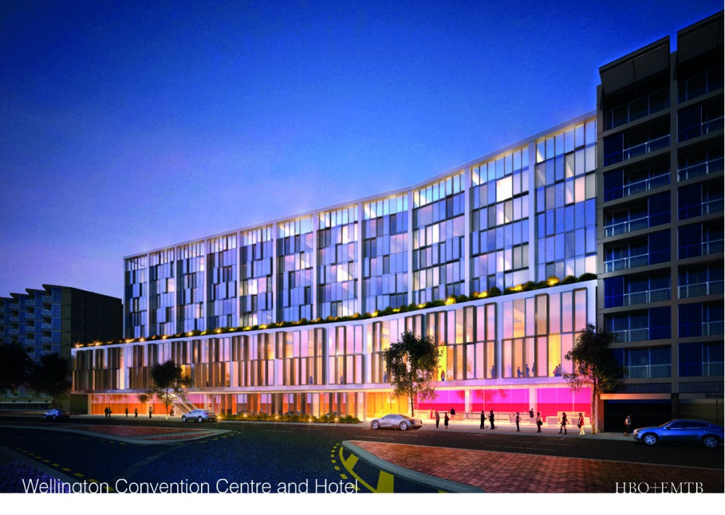
I think that a worry was that if the Convention Centre was built without the Hotel on top, the whole thing was going to be a bit of a short stumpy piece of infill. Miraculously, the project seems to have grown enough in height so that it is no longer an issue.
But there is a catch with this: as a Council funded proposal, there is an option. Either have a scheme which can fit the budget, and look a bit simple, or pay a little extra, and have a scheme which blows you away. I know which I prefer, but for those who are dour and penny pinching, here is the option:
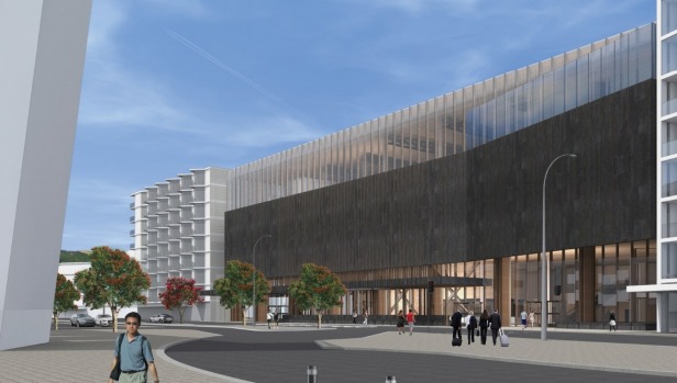
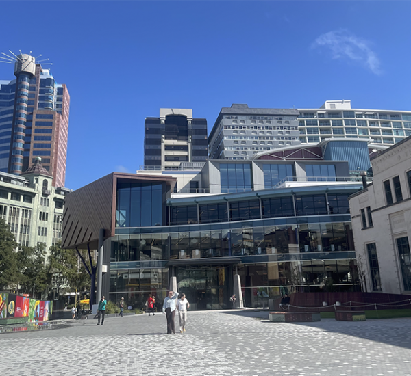
That, I think, is the front, a fine, simple, modernist structure. Here is the backside:
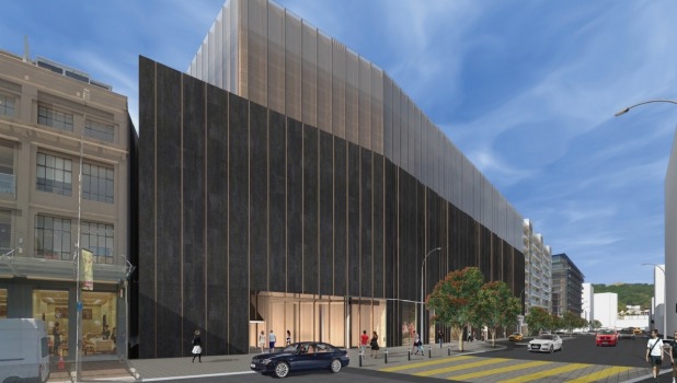
I know which one I prefer – what do you think?



“…which would sell Wellington in the same way as the Opera House does for Sydney, or the Guggenheim Museum for Bilbao, the studio says….”
I think you have to be pretty careful in comparing yourself to those two buildings. I know that they are talking about the “effect” of those buildings and becoming a destination in their own right, but still, big shoes to live up to.
I do like the form of the fish, but I think it will come down to the materiality as to whether it works or not. Perhaps that’s where the extra $15m is going?
I don’t mind the form of the second scheme. I think they have left the skin of this ambiguous so as to play up the more expensive fish option. But this could also work if the materiality was right, say corten to the base with glass channel to the top section…
But they have definitely made the fish renders more evocative.
“…Then the Hilton pulled out, and the developer jumped ship, and the whole thing was looking rocky for a while…”
Actually…
The council announced the scheme before Mark D. had secured the land. The land owner then realised he had him over a barrel and changed the price and the terms of the deal. While the renegotiation was happening, Willis Bond swooped in and gazumped Mark D.
All fair in love and war and all that, but it’s interesting that the new scheme looks like a fish, as the land owner is a bit of a shark.
So the Hilton didn’t pull out, and the developer didn’t jump ship… Just sayin’
good points, thanks Anthony. I’d be interested to know more about the scaly fish skin – what it is made of, whether it is the waterproofing layer or just external bling – and also whether the skin alone pushes up the cost the extra $15mill, or is there more exciting stuff as well? That big swoopy opening looks pretty inviting – its going to invite a lot more people in through that front door.
Hmmm. Possibly a cheap shot, but fellow Wellibloggers Over the Net ( http://overthenet.blogspot.co.nz ) have spotted something on their echo-finder:
http://californiathroughmylens.com/wp-content/uploads/2015/12/Broad-Museum-Night-1-640×427.jpg
Goodness me…. their full, highly tongue-stuck-firmly-in-cheek comment here:
http://overthenet.blogspot.co.nz/2016/08/breaking-entertainment-news.html
If the Fish goes ahead, (and it should) this part of Town is going to start looking quite funky,
There will also be Xero’s mesh box on the Taranaki street corner,
While Courtenay Central is also refreshing its look into something alo less bland….
Xero’s mesh box ? That one must have slipped by me – I wasn’t aware of what it has got planned (sorry I have been a bit distracted lately). And / but / yes indeed, Courtenay Central really REALLY needs a refresh. That place is an absolute dive….
http://www.stuff.co.nz/dominion-post/business/commercial-property/10688632/Xeros-new-home-will-be-all-wrapped-up-in-city-first
Anthony, I am reliably informed that the Hilton developer was enticed away from Cable Street by the promise of a cheaper bit of land at Centreport. Rather than being gazumped it was more a case of the grass was greener until Mark D figured out building on wharfs is not that easy and when he came back everyone had moved on, shark and all.
Helen – you need to check with your informant. Cable Street was always preferred. Centreport was a last minute negotiating ploy when the land owner changed the terms of the deal. Mark D wanted nothing to do with the wharf due to the cost of building on it, but needed it to try to get the shark back to his original deal. Which obviously didn’t work.
Whatever the current standing of Gehry in the architecture ratings, not everybody thinks that Bilbao has been a success ( http://www.psfk.com/2015/05/bilbao-effect-starchitecture-frank-gehry-architecture.html ),
There are also unsettling parallels between the cargo cult impact of the Guggenheim on a small Spanish city and the view of New Zealand film history and culture you can get from Miramar.
I’ll leave the question of who jumped what shark to others, as I know nothing there beyond what I read in the papers. But I’m glad that Mark Dunajtschik is out of the picture here – he’s a lovely old duffer, but without a shred of design sense in his body as far as I can tell from the projects he has done.
Starkive – yeah but nah, but yeah but nah… its a good article, and a nice story, but there are very few similarities between Bilbao and Wellington. We’re not a post-industrial backwater, we don’t have European Union largesse pouring millions through the door, we certainly don’t have an inspirational Mayor, we don’t have an audience of 350 million people living just a short plane ride away, and we don’t have a single building by a world-famous starchitect, let alone a whole flotilla of them. We don’t have an elegant underground Metro by Foster, nor plans to develop the Miramar peninsula by Zaha – instead we have Cassells planning lumpen crud on Shelley Bay.
Instead, we have to take the building on its merits, and on its content. There is no doubt that Jackson and Taylor’s teams can pull off fantastic, polystyrene-based fantasy worlds, and so I have absolutely no doubt that it will be a magical experience for all who enter (and, hopefully, as someone said here, it damn well BETTER have large amounts of work by Jane Campion, Vincent Ward, Ian Mune, Geoff Murphy, Merita Mita etc, as well as Hobbitses and Elvenfolk). But you have to ask yourself – if you were a visitor to Wellington, and saw the grey building opposite Te Papa, would that entice you inside? Meh.
But if you saw that white diaphanous skirt flying up, doleful whale eye looking down, engaging tunnel with promises of mystery at the end – wouldn’t you want to cross the road and go exploring?
Levi – I wouldn’t get my hopes up about actual New Zealand films (aside from the Jackson/Taylor axis):
“On display will be memorabilia from the sets of movies directed by Sir Peter and worked on by Sir Richard’s Weta Workshop, as well as items from their own personal collections. The two Hollywood greats are avid movie memorabilia collectors, and the items on display would be “rare and unusual”, an insider said.” – Dom Post
A lesson might be learned from the Museum of the Moving Image in London, which had a similar purpose – and a much greater potential audience. Opened in 1988 with big initial numbers, it ran out of steam and was closed by the British Film Institute in 1999. Despite lots of boosterish talk, it has never reopened. Even with the BFI’s huge archive of films, photos, posters, costumes and props – and a whole lot of star power – it turns out that there isn’t a sustainable audience for movie memorabilia in a city of 8 million people and 30 million visitors.
Really? That’s disappointing to hear that the MOMI has closed – I used to go there all the time. Well, not to the Museum part I guess, but certainly to the Movies that were on there. What about the one in Melbourne? the ACMI
https://www.acmi.net.au Very much like the MOMI I guess, but seems to be thriving? The problem with MOMI was always that it was on the other side of the river from where the tourist masses were – it’d be like putting the Wellington Film Museum in Petone.
I’m not sure that the Tate Modern, Imperial War Museum, London Eye, Globe and South Bank Centre can all be on the wrong side of the river for visitors…
ACMI started as a movie museum and high-end cinema complex, but after similar struggles with permanent displays has evolved into a venue for exhibition blockbusters like the DreamWorks and Game Masters package tours, both of which were picked up by Te Papa. Not sure that cannibalising that market would be universally popular.
Politicians, local and national, have been falling in love with the Wellywood idea since the 1990s. Museum professionals not so much. Museums are complicated and expensive to operate – even more so when they need to be regularly refreshed to keep audiences coming back. Who is expected to pay for the running costs of the Movie Museum? If it is going to be public money (and it almost certainly will be) who will be Peter to Jackson’s Paul?
You might know about an answer to this – has Nga Taonga Sound and Vision (formerly the Film Archive) been involved in discussions about taking a part in the Jackson / Taylor thing? Seems to me like that would be the first place to start the conversation, but I’m not sure if that has ever happened, or indeed if I am even allowed to ask the question (given that it may be rather sensitive?).
@Starkive, whatever the merits (or not) of the Museum/Centre, The council have decided to proceed with it as part of the Annual plan the approved in June,
The question for now is, should the box look like many other glass facades around the town, or something different….
@Greenwelly, I am certainly more lured by the fish skin suit than the curtain wall, although I too wonder if the renders are intended to generate just that response. My point is whether the building is sustainable, or even buildable, in the form proposed – skin or no skin. Presumably such questions still concern architects?
As for Levi’s question, all I can say is that the plans put forward over the last 15 years have always stayed well away from the history of NZ films in favour of the productions and collections of the promoters – which I have been told include Charlie Chaplin’s walking stick (SPOILER ALERT: there might be more than one of those).
There you go…
http://www.stuff.co.nz/business/83259749/extra-funding-for-wellingtons-mauiinspired-movie-museum-gets-green-light
Indeed Captain Stark, I was just about to post the same link myself. So instead I will post a snippet from today’s Dom Post editorial,
http://www.stuff.co.nz/dominion-post/comment/editorials/83229263/editorial-go-for-bold-option-with-wellingtons-movie-museum
which says:
“Editorial: Go for bold option with Wellington’s movie museum” and then goes on to say:
“Wellington should certainly choose the more ambitious option. The movie museum has wide public support, and genuine star talent behind it. It has the potential to be a powerful tourist drawcard and a local landmark. It ought to look the part…. In fact, the concept could have been even more original. Boosters compare it to Sydney’s Opera House or Bilbao’s Guggenheim museum (designed, of course, by Gehry), but those are genuine “statement” buildings. Wellington’s $15m will pay for an external sheath for the museum; it looks attractive and interesting, but perhaps not exactly groundbreaking…. Still, first things first – a vote for even somewhat bolder architecture would be a good vote, and city councillors should cast it.
Striking architecture is, after all, among the easiest of the arts to support. It is publicly prominent, it affects the spaces where people live and walk, and it makes city leaders look good too.
Of course there are still pitfalls. The convention-centre half of the idea needs special care; these are universally popular with city councils, but some experts say they do not pay off. (There will always be another city with a newer conference facility). The deal with filmmakers Peter Jackson and Richard Taylor also needs raking over, to make sure everyone wins from the large public outlay for their museum building. It is a shame, therefore, to see the council will be debating the project behind closed doors today. Perhaps certain particulars around the museum will truly be “commercially sensitive”. Overall, however, this is a debate that needs transparency – $150 million of ratepayer money is on the line. When it comes to the two designs, there’s obviously no need for secrecy. It is a straightforward question: whether to pay the bill for a more dramatic public building. The council should go for it.”
Note that comment in the middle:
“Striking architecture is, after all, among the easiest of the arts to support.”
I’m going to retain that phrase for a loooooooong time, and bring it out at suitable occasions for a good airing.
Cos it doesn’t happen too often round here!