Interesting development here following on from the discussion on various new apartment buildings: an un-named source has sent the Eye of the Fish a set of plans of the Monark development on Adelaide Road in Wellington. Things are not quite the same as what I had thought – there is not a courtyard on the other side, but there is a large L shape to the build, not the solid block that the aerial photo might indicate.
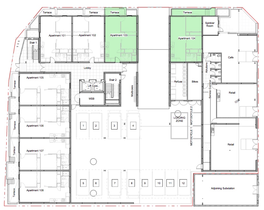
It’s interesting to see the ground floor of this apartment development – there’s parking for more than a dozen cars (some in double stackers), a loading dock (needed to keep WCC’s traffic division happy, if nothing else), a bike locker/room, rubbish room etc, as well as a corner cafe and a couple of very small shops opening onto Adelaide Road. There are also a few apartments scattered around on ground floor – I hadn’t picked that – and I hate apartments at ground level, if people can look in to your apartment as they walk past. Luckily that’s not happening here: the apartments are raised up a little on the West side. There is a bit of room for motorbike parking there as well, but basically, people in this development are going to be walking, cycling, or scootering to work, or catching a ride on the fast, smooth, safe, rapid transit system that whips past the door every few minutes. At the moment that is a bus: hopefully one day it will be more than that.
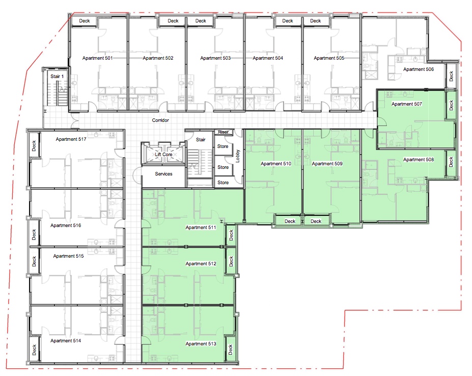
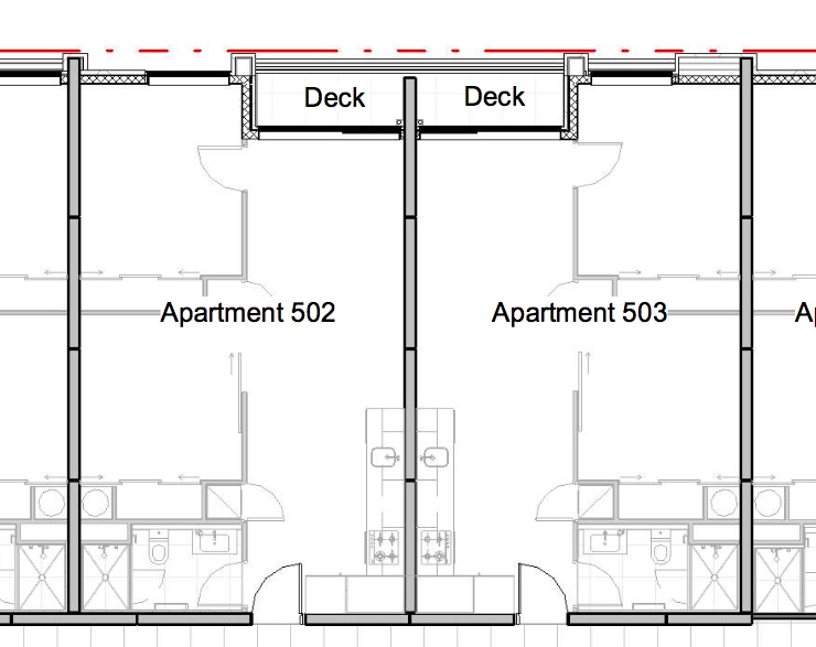
These are not going to be fancy apartments, despite the fancy website: there are a couple of variations, but basically, all the apartments are the same: that surprised me. About 60m2 in size each (if you include the small 3m2 balcony), they each include a single bathroom, two bedrooms, and a kitchen right at the back of the apartment. One bedroom gets a window to the outside, while the second bedroom really has a very indoorsy quality. I’m not sure how the second bedroom complies with the requirement for a habitable room to have natural light – let’s just say it relies on “borrowed light” from the living room. The building is evidently planned around precast concrete panels, if we assume the DesignGroup Stapleton Eliot visuals are correct. So, fire-rating taken care of: tick. Acoustics: tick. Hard-wearing surfaces: tick. 57m2 of space to live in: given two bedrooms, it’s on the smaller end of what I would consider liveable, but one bedroom will be very nice with the view to the outside. That second bedroom though…
Here’s a quote from the DGSE website:
“Located on the fringe of Wellington, Monark is a timeless, upscale new residential building that will look out over the city’s southern suburbs and surrounding green hills. 94 brand new 1 and 2-bedroom apartments are planned for the build, each spacious, modern and to be finished to the high quality.”
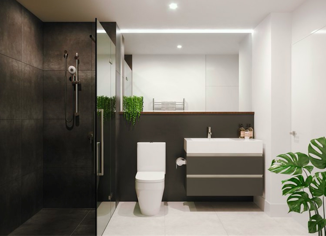
Careful what you say on your company website everyone, it may come back to bite you one day. But also be careful with what you post as pictures: some of these images are stretching the truth of believability more than a bit too far. Take the bathroom visual, for instance. Technically, it is correct for the typical bathroom of this project – but only if you take away the bathroom/tenancy wall and plant the camera in the corridor outside the unit. The bathroom looks large and spacious: I think that we can all agree that actually, looking at the plans, it is not. It is small, although adequate, but certainly not really compatible with what is shown here.
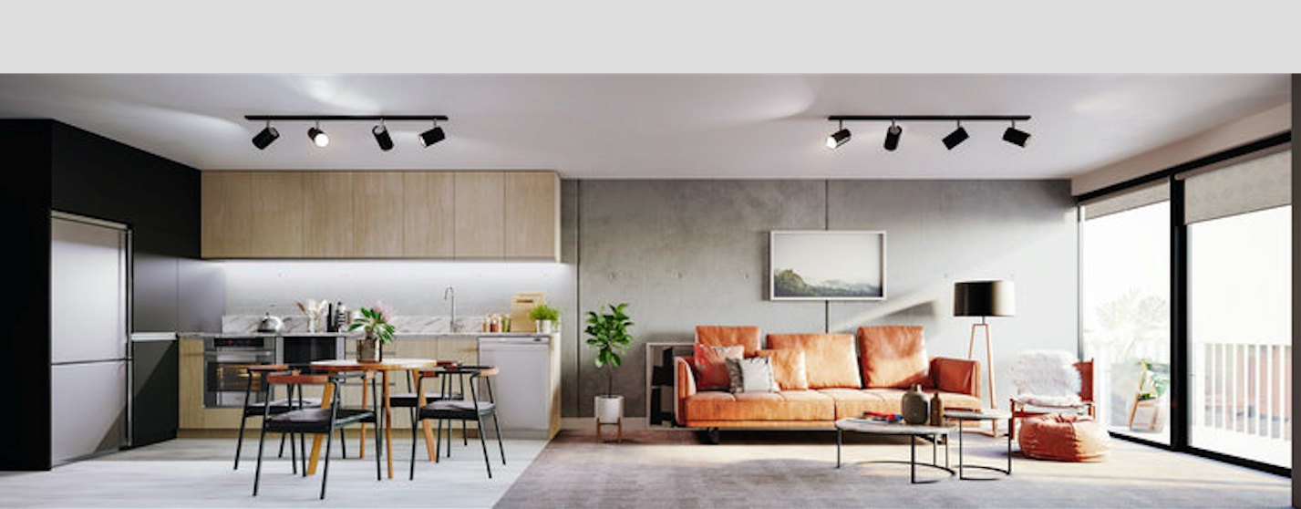
Similarly, the view of the kitchen/living room. Looking at that masterpiece of CAD rendering below, I thought to myself – nice work, I could live there. Spacious kitchen, nice bare concrete sound-deadening walls, a great-looking comfy orange sofa and a fair bit of space to move around in. But then the plan tells me something different: to actually get that photo, both bedrooms and the bathroom would have to be removed – honestly: totally removed. That silvery-looking door with a tall handle and a line across it that looks like a fridge? Yes, I presume it must be the fridge – I thought it might have been the front door for a while, but that must be just out of shot. The piece of white-ware in the kitchen could be a dishwasher, I guess, or maybe it is a washing machine? Maybe the laundry is hiding in the cupboard opposite from the kitchen bench: otherwise someone is going to need to open a laundromat pretty soon!
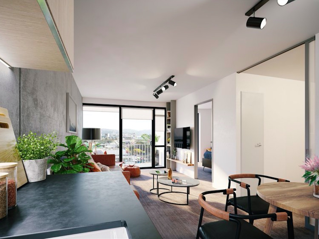
The next rendering (below) is more honest: showing the bedroom walls in place. But here we can also see that the wall to bedroom 2 is sort-of missing: the wall is actually a frosted glass pane, opening onto the living room/dining area. Personally therefore I’d say that this is unusable as a real bedroom – you couldn’t have a grown-up flatmate living in there for instance, if they wanted any privacy. It is certainly usable as a study, or as an occasional stay place (for Mum when she comes to visit perhaps), or as a nursery-room perhaps if you have a toddler, but for two grown adults to share a flat, and try and have separate private lives, it is just not possible in reality. That’s an issue for me as the reality of the pricing is that a single person on an average wage could not afford the pricing of a Kiwibuild apartment, and you would need to have at least two salaries: likely to be a couple therefore, rather than two individuals living in two separate rooms.
The big news today is of course that the KiwiBuild system is getting a “reboot” – Megan Woods taking on a massive workload (she is a damn hard-working Minister) – and so by this afternoon we will know what happens regarding KiwiBuild. Maybe it will stay, maybe not. One these plans here at the Monark, the green areas indicate Kiwibuild apartments, while the white areas are to be sold on the general market. Basically, all the slightly view-compromised or sun-deprived apartments are reserved for the Kiwibuild apartments, while those with a bit more sun or outlook are reserved for those with more money: that’s the way it has always been in life. Those with more money get a better deal. Here they may get sunshine, but they get no more space on the plan. Not even on the top floor – a missed opportunity there.



Nice post – good to see you post about buildings again, instead of just reading issues.
It is interesting to compare this 2-bed product against the dual-key system that Archaus so dearly likes. Dual key units seem to pair a small bedsit unit of about 20m2 with a larger one bed apartment of about 35m2 and then package it up for the bank at about 55m2 all up. So, similar size, but 2 bathrooms (and 2 kitchens) with the dual key system. Plus you get a quiet, lockable second bedroom. So – which is the better outcome ?
Thanks for the plans, I can now actually imagine this is an actual building, rather than a 2 sided render..
Its interesting that they have a “cut out” on the south/eastern corner, I guess they are worried that the exiting “Jaycar” building which is 3 stories high, could eventually go higher..
Another potential wrinkle is that the 3rd floor wall on the Jaycar site above the substation – which is remaining, is a lit adverting billboard, If this remains. or in the future becomes an electronic billboard- there is the potential that those units facing the corner could end up with a perpetual night time glow…
Aaah, greeny, there is many a fine film that has been set with the protagonist looking out at the city from behind a giant advertising billboard – such is the stuff that dreams are made of. Not that I can remember the name of any off hand, but I know I’ve watched them. Actually, you would possibly get a good view of Government house on the hill behind the east side of the road, so maybe some shady government intrigue would ensue…
Alan – yes, I can see your point – I’m not sure how the prices would match, but I’d sure rather have a Monark apartment than a Duel key thing. I think I’d just rip out that rubbish second bedroom wall, and make it all much more open plan. Get the second person to share the front bedroom with me – problem solved. You can’t do anything like that with the Duel key system – you’d just have endless rabbit hutches with endless gormless sad looking rabbits, moping.