
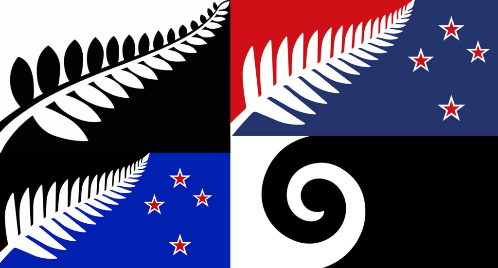
I’ve not yet heard a single person say that they think any of the 4 selected flags are the right one – so, fairly predictably, the whole flag / rebranding exercise has failed. Which is not surprising when you get people as design-unsavvy as an aged ex-AllBlack and a reality TV show creator on the panel. A horse/flag designed by a committee is a camel – and we have 3 camels to choose from. Even a kiwi with lasers shooting out of his eyes would be better than that awful corporate logo mash-up of a silver fern and Southern Cross.
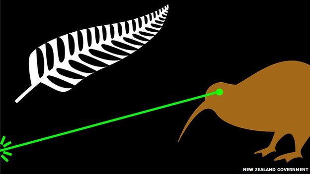
So it seems almost as if the exercise was deliberately set up to fail. Like the actual flag design public meetings which were shunned by the public (a review I read made the observation that it cost effectively $8300 for each member of the public who bothered to turn up), we should shun the bullshit flag referendum as well, and then vote to retain our existing flag. Not that our existing flag is anything to be particularly excited about – but a flag is not an opportunity for rebranding.
A flag is a symbol of the people, and the people need a revolution to really have a reason to change the flag. South Africa had a revolution and got rid of Apartheid – and got themselves a new flag. And they deserved it – the country had changed. Personally, until we ditch the monarchy, or fundamentally change the system of government in this country, we don’t have a revolution on our hands and we shouldn’t change the flag until we do.

The Southern Cross, after all, is not just seen from New Zealand – it can be seen from anywhere in the lower half of the Southern Hemisphere, and so is as unique to NZ as it is to Chile, Peru, Argentina, and Lesotho – in other words, not at all. It’s a feature of the big South African sky, and the Patagonian mountains. Putting it on our flag and claiming it as uniquely New Zealand is just: pants.

Similarly, with the Silver Fern, symbol of Rugby teams and selling butter. We’re more than that. How many people do you know who still eat butter (willingly)?

How many people think there is more to New Zealand than just rugby racing and beer? We’re a nation of Asians now, especially our biggest city Auckland, with (whenever I go to Queen St) an almost pan-Asian appearance. Our favourite eateries are Thai, or Chinese, or Pacific-rim Fusion Noodle Bars. Or McDonalds. But in honour of our country changing to a new, mainly Asian flavour, I’d like to propose a new flag design, inspired from our humble origins, and nodding a head firmly in the direction of Chow (the restaurant, not the Brothers).






Re: butter – nothing better on a scone hot out of the oven. =)
Maybe it’s just a natural reaction from a fish though? (Mmmm, pan-seared fish…)
Seamonkey – how could you? That’s like cannibalism to me!
So what do you think of my bowl of noodles then? More striking than the crap from the official committee?
How about a Long White Flag?
Surrender? The Land of the Long White Shroud ?
Butter is no worse for you than margarine in small amounts, and tastes way better.
If my furry ears weren’t mistaken, I heard someone wise (Jim Mora?) say that NZ is the only country where the Southern Cross is visible from all parts for the whole year. So that’s going for its use.
We’ll need to change the national anthem though. Guarding Pacific’s triple star is a bit confusing where there are four of them. Maybe we could use “Beneath our radiant Southern Cross” – oh oops, that’s in verse 2 of that forgettable Ozzie dirge. Maybe not then.
I’m not sure that we have 29 or 33 cultures in NZ (one for each frond, depending on the flag, apparently). Anyway, doesn’t Auckland have more than 200? Or was that languages spoken…
Should the left-hand corner be black or red? Well, if you don’t know which you should use, then neither are correct.
Maybe JK could just pay a flag designer to design a flag, rather than a bunch of geriatric do-gooders.
I’m with Gareth Morgan on this. The one and only time.
Chico – Jim Mora is ill-informed. The Earth spins. We all see the same sky at the same latitude. And yes, the Morgan funded flag makes way more sense to me too….
As soon as Tino Rangatiratanga was off the menu I knew the whole thing was bullshit
I’ll keep this debacle in mind come election day
Mr 60 MPa ! Hello and welcome! Surprised and pleased to see you. Yes, the Tino Rangatiratanga flag is best looking – but to many, the adoption of that flag would mean that pakeha had lost, and maori had won. Which is not yet the case.
On a completely different note, the Eye of the Fish website is being continually infiltrated by a unknown dickhead scummy spam person. Keeps breaking into theist and making himself a User with admin privileges. Uses the same name:
us_editorck@hotmail.com to log in with each time. I keep on deleting him, but somehow he keeps breaking in. Not sure what his motives are, bound to not be good. So I’m not sure how much longer this website will survive, before he deletes it all or something. If anyone has any advice, please post it – it would be greatly appreciated.
Change can be evolution, not just revolution – but overtime, the results are just as radical. Our society is vastly different from when the flag was designed, as you acknowledge. That’s not a case for slowly evolving the flag, but IF a flag is to reflect its society (and I don’t consider that a ‘given’), there will inevitably come a point where the flag no longer suits us.
The US flag, is itself an obvious evolution of a colonial flag – it has had 26 evolutions since 1777, with the latest, and longest flying, arriving in 1956 (see wikipedia). But the thing about it, and most successful and identifiable flag designs, is that it isn’t based on trite cultural symbolism. The stars represent states, the stripes and colour palette are a hangover of the East India Company’s precedent flag. It’s all kind of a bit accidental rather than a powerful process of nation branding. The flag becomes a symbol through a history of use – not by trying really really hard (which pretty much describes our 4 finalists). The US flag is one of the most powerfully recognisable brands in the world, but by use, not design.
The best (most recognisable and distinctive) flags do not represent their societies – but rather operate at more abstract symbolic levels – the Union Jack – simply represents patron saints of the nations it represents. The Rising Sun has mythological origins. The French flag is simply an evolution of the flag of Paris, with white added, and so on…
So for those saying that the flag doesn’t feel New Zealandish enough, the solution to that is time, not ‘iconic’ branding. The ‘iconicness’ needs to be much more abstract. Also, the silver fern is a NZRFU trademark, and the version selected looks like a bunch of birds sitting in a line, with their shadows inverted from black to white. If we’re going to go representational, we should probably avoid ambiguity.
And I love butter – especially on freshly baked brioche…
Excellent comments m-d, i can’t argue with those points – I just hope that Señor Don Key does not succeed in rebranding NZ with one of those corporate mockery things. Hideous. The stars and stripes, I’ve always liked the imagery and the way that graphic can go anywhere and be instantly recognised for what it is, whether transformed into a bikini, the side of a truck, or sprinkled by the hundreds down US boulevards to celebrate almost anything.
I’m starting to think that a far more suitable design for a flag, should just go back to the age old simple device, of blocks of colour. And for me, those colours would be to just have 3 colours – a thick blue stripe for the sea at the base, a thin white band across the centre as the land of the long white cloud, and then a thick green stripe across the top, for the lush greenness that we used to have, and still do, in parts. That’s it – that’s simple New Zealand all over, as a place for all the people who live here. No fern, no stars, no black, no kiwi firing lasers. Just three colours we are all a part of.
Why didn’t I think of that before?
http://www.radionz.co.nz/news/national/282999/flagged-flags-what-could-have-been
Levi, I heartily endorse the colour-band proposal. I think, though, I would go for four – from the bottom: blue for sea, green for land, white for cloud and blue again for sky, mainly because putting white at the edge might be problematic for graphic versions.