
What is the Cycling network based upon? It’s a bit of a quandary to me, because while in the online discussion form the WCC the other day, the designers were claiming that they had been studying the situation for years, looking which areas to link to which other areas, and this was the first time that they had gone to the step of actually showing Roads linking them.
I don’t buy that at all – for a start, how can you look to link one suburb with another without also, obviously, looking at the existing roads and routes that already exist? But secondly, if they have looked at the roads, they haven’t put any names on any roads, so it is a guessing game from 10,000 feet as far as I’m concerned. I mean, that little squiggly fat line – is that Cable St or Courtenay Place? Taranaki St or Tory? Or perhaps it was Cambridge Tce after all! Why on earth would they do this? Ask us “have we got it right?” but not actually give us any definite information on exactly which routes that they are thinking about? Maybe they want us to be mind readers.
I thought that I would have a completely fresh look at the routes, not trusting anyone from the Council with directions ever since they recommended that a sky-high bike route be put next to the motorway across the Basin. Dumbest idea ever. Anyway…
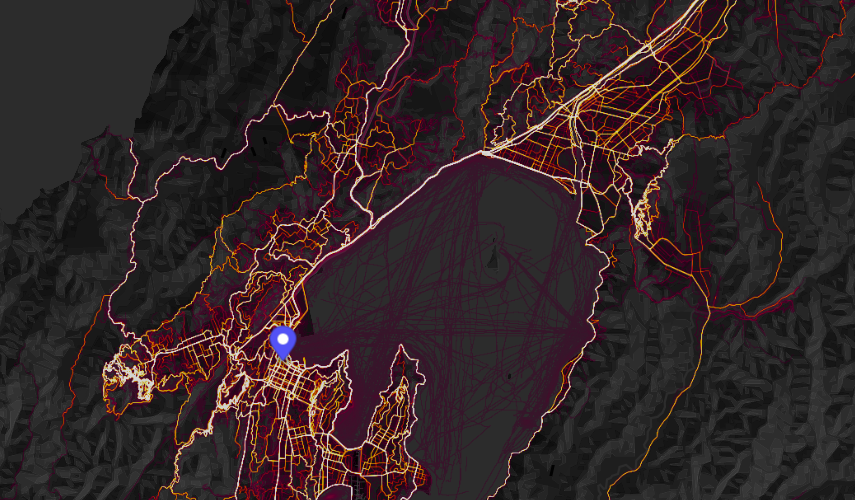
So: who knows where cyclists go the most, in real life? Why, the cyclists themselves, of course. And who tracks their every move in real time? Why, Strava of course. You’ve probably heard of it – its a fitness route tracking app, and lots of keen walkers, runners and cyclists have it turned on as they travel. I managed to download an assortment of pix that show where the “hotspots” are in Wellington, and it is quite interesting.
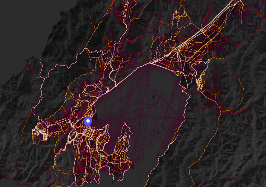
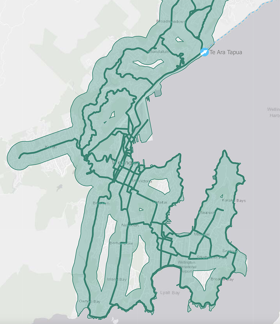
You can get a map version in quite hot, electric, sparky looking colours, which I really like. As you can tell, there is quite a bit of difference between what Strava sees, and what WCC is offering. Is this an issue? I’m not sure. Let’s have a look at them side by side (below), with Strava in more easy to read blue and red.

The one huge difference that you can see is Mount Victoria. From Strava, evidently, its a hot-spot of cycling and walking – no surprise there. But this is all completely absent from the WCC official offering. Let’s have a closer look.
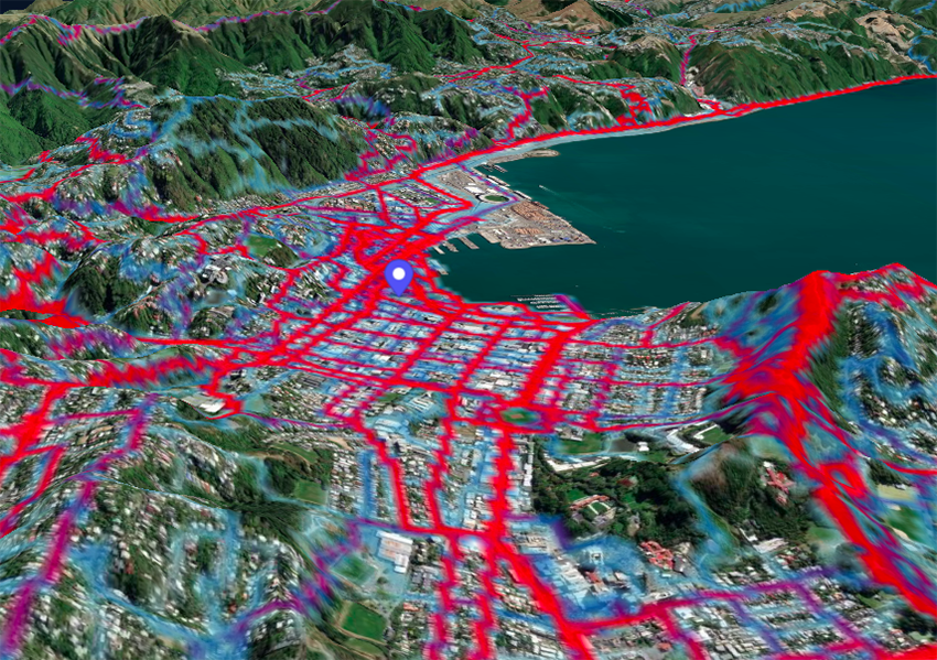
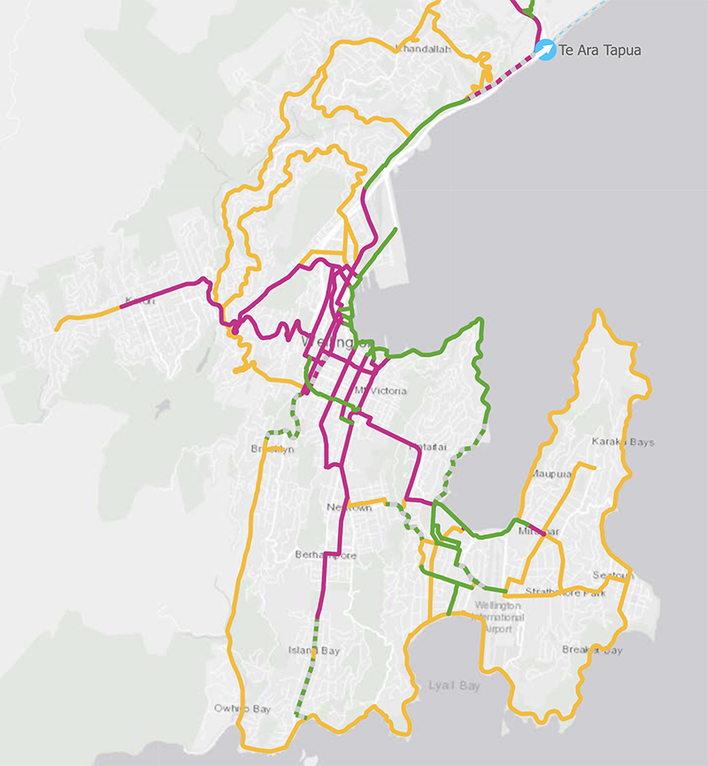
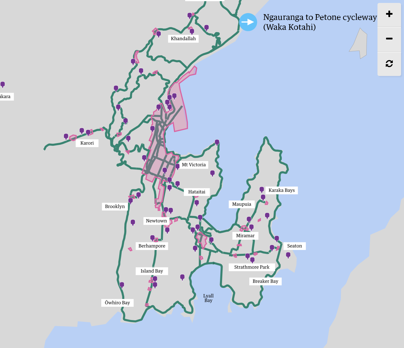
Well, that’s quite clear then: there is a heck of a lot of cycling up along the Ridgeline on Mount Vic and none at all at the Governor General’s place. There’s also quite a lot of City streets used as bike routes – its up to you, the cycling fraternity, to nominate the routes that really need a safe separated cycling route. I know my answer is more likely to be a simple: Do ALL of them! To be a safe road, every road needs a safe separated area in which to cycle or to scoot or to skateboard. That’s what truly needs to be done. But at least the Council have got one thing going well for them – this lovely pic shows where all the Schools are (the purple blobs) in relation to the main selected bike routes. Bravo. Well done.
Hope this is helpful. Submit by 14th Dec !


The Hot Pink on you Cycleway maps are cycleways that are part of LGWM…
They are not in the Council’s 10 year wishlist…
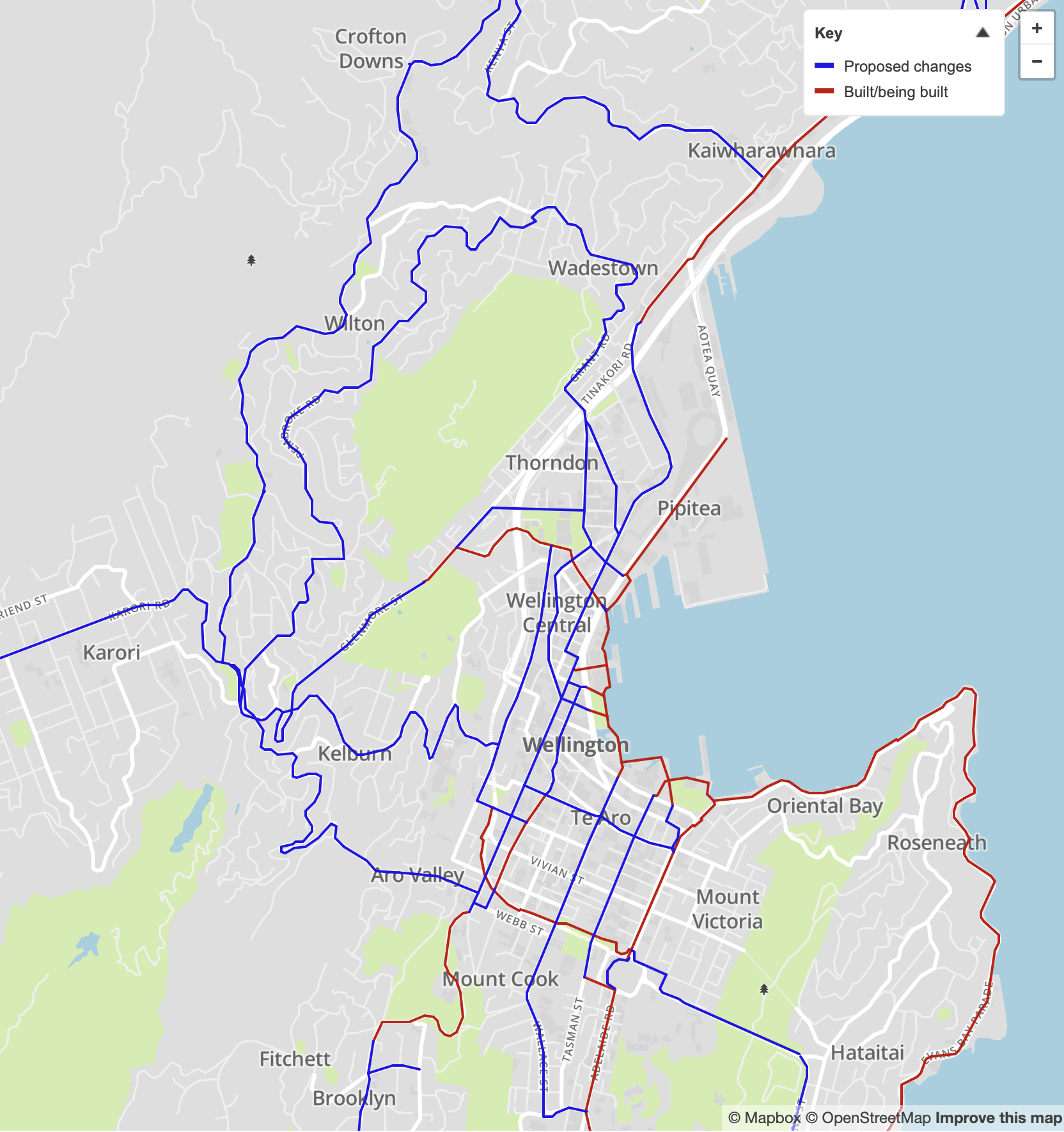
Drawing lines on maps is one thing but actually making them fit on an existing road corridor is the tricky bit, places like Karori are particularly tricky. and TBH any cycle way Should NOT be on Karori road, which is crying out for a bus lane… ( then there is the Tunnel question)
Using back streets like Homewood and Friend would be a better cycle way option..
Thanks for that Greenwelly. Yes, I thought that it must be LGWM, but that seemed to be asking too much of them. After all, they’ve had a decade already and achieved nothing….
Yeah, well they claim to be improving Thorndon Quay for cyclists and other users, but even before they have come up with a preferred option, they Council has already jumped in and obliterated all the angle parking,, which are dangerous to cyclists.. already dramatically improving it for them…
https://lgwm.nz/all-projects/thorndon-quay-and-hutt-road/
I’m still waiting to hear what the outcome of their “quick win” to cross Cobham drive is going to be…
its was promised by about now
“LATE 2021- Potential speed limit changes and construction of crossing”
That’s the one where they paint the white lines on the highway isn’t it? On the very fastest piece of he highways that the whole of Wellington loves to speed along on…
The problem with Strava is it will largely capture the movements of sports-fitness riders, but not everyday transport. It also doesn’t capture people who currently aren’t riding for lack of safe routes. So we should apply some caution interpreting that data when choosing where to put routes for the “interested but concerned” class for potential riders I think.
Yes, absolutely right Stephen regarding the sports-fitness riders – and being fair to the Council, that is what I suspect that they have already done. Those are certainly not all workday cycle commuters being depicted there – and taking the example of Mt Vic once more, I think that we all know that there will be long lines of weekend mud warriors thrashing around – some getting there with a leisurely ride up the ridge road to the top, and then zipping down every possible tree-lined route to the bottom – then repeat ad nauseam. They’ll all be very capable and experienced riders, with probably no requirement for a cycle way – but then again, even those who are confident can get run down by cars, so there is no reason why safe routes are not installed even to routes like these. It only takes one dickhead in a car to run everyone’s day….
And data from Strava also fails to capture the movements of regular cyclists such as myself who are not into logging all their rides and who do not prioritise carrying a smartphone as an essential aspect of life.
Most important, in my mind -and almost absent from the current discussions- is to enable kids to ride to school in way that parents think is safe.
Primary school age is where most of the behavior is formed, including choice of mode.
Yep, you’re absolutely right there. That’s a crucial consideration.
So – what do you think of the Council’s proposed Cycle network then? Enough lanes? Not enough? Are you putting in a feedback to Council?
Yes, I have submitted. To be honest, I’m not quite sure about the proposal. It seems to focus on commuter routes. They mention quiet neighborhood shared streets as one of the main principles, but I have not found much more about it.
Could just cut speed limits in residential areas and introduce a relatively dense network of roads where active modes have right of way. Most Wellington residential roads have a design speed of 30kph in best of times.
In the UK, 1/3 of residential roads are now 20mph.
Would not solve everything, but would be a good step and quickly done. Behavior change would follow, but that takes much longer.
I can already hear the outrage of commuters who won’t be able to park outside the Botanic Garden and walk down to the office buildings around Parliament.
But I can also hear the thanks from bus drivers and other motorists who won’t have to contend with cyclists slowing them down as they trudge up Glenmore Street, or cyclists going wide to avoid slow cars headed to work. And the cyclists who won’t have to worry about parked car doors swinging open and, at the same time, cars whizzing past them with 20cm to spare. And the bus drivers who won’t have to watch for cyclists as they swing left to stop.
I prefer the latter. The parking civil servants can sod off.
Definitely need to make sure cyclists and buses are not sharing the same lane – I had the frustration of being on a full bus going to Karori the other evening, on a dedicated bus lane but going only at the speed of a single cyclist ahead of us.
Its even scarier en you are a cyclist with a 40 tonne bus trundling along behind you in the same lane ! Yes, they are both non-cars, but I think that I would rather be run over by a car or a scooter than a bus !!
single deckers are more of the order of 8 tonne
A fully laden concrete mixer is more like 40 tonne
If you see trucks around with an H on their bumper it is for “Heavy” – it is some kind of exemption for going over the single vehicle weight limit which is somewhere around the 50 tonne point