
There is a movement that is growing rapidly, for reasons unknown, that is slowly colouring our urban outlook. It reminds me of the old adage that goes: “A doctor can bury their mistakes, but an architect can only grow ivy.” And when your building is 10 or 12 stories high, then the form of ivy that grows that high, is randomly-distributed, assorted colours of cladding. It has been going on for a few years now, since the first project grew beside the sea-side, in the form of the Lyall Bay Surf Club. Small scale, only one (or two?) stories high if you count downstairs, there was a sort of highly coloured charm, with various shades of blue like fish-scales, flecked with a smattering of other colours, like the odd red scale.
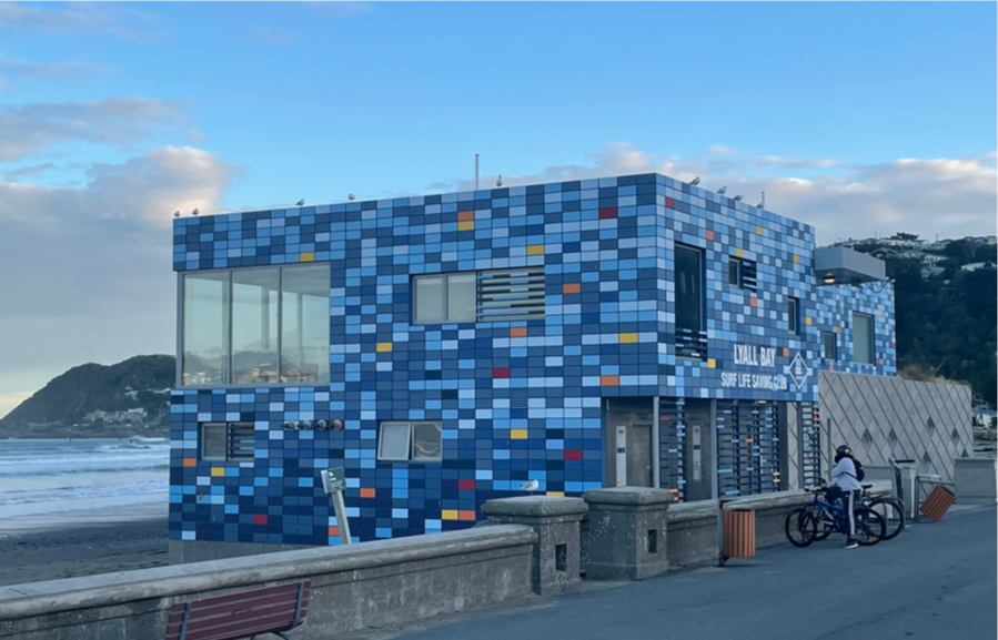
It is fairly obvious that this was undertaken to mimic the sea behind, given that the siting on the edge of the seawall blocks out a small chunk of sea view. Splish splash, we’re taking a bath. Building looks like the sea. Dude looks like a Lady. Looking at you, looking at me. So why did the Lyall Bay Surf Club feel they had to disguise their building in fishnet stockings and fish-scales, despite being small and relatively nicely proportioned? I suspect we may never know what went on behind the scenes, many years ago, but it probably involved nasty neighbours. However, it is notable that the Maraenui Surf Club, their fiercest surf-club competitors just about next door, is solidly monochromatic in a vaguely vomit-coloured hue, and is a lot bigger, blocking out a lot more view, and yet nobody seems to object to that. Is it that Maraenui is better-looking architecture, despite being just two or three boxes stacked untidily in a heap?

Then the next building, possibly chronologically, but certainly one of the largest, is the massive block on the landscape, over at the golf club in Miramar. One BIG block, pretending it is not there at all. It is actually a massive car parking building for the airport, but it is resolutely trying very hard to hide and pretend that it is all trees and skies. Blue up top and green down the bottom. Does it fool anyone? Does it really look like the sky at certain times of the day? Do the bushes really cover the base so much that we don’t even notice that it is in reality a massive concrete cube full of ramps up and down? Up close it is very obvious that it is indeed a massive box, but further away, at various times of the day, the boxiness fades away and it almost breaks down into the background. Is it a success? Maybe. Is it successful architecture if the building is pre-loaded with ivy to disguise its boxy ugliness so much? Maybe not. Your thoughts?
I’m sure there must have been much conversation over this multi-coloured move, but I haven’t heard it and so I’m not sure what others think. There was certainly weeks and even months of commentary over “the Rocks” at the airport – the copper-clad roof forms of the International Terminal nearby, where the irregular form of the building raised eyebrows and hackles equally. What did they call it at the time? The Pumpkins? The Rusty Testicals? Yet here we are a decade or so later, and the Rock / Pumpkin / Ball-sacks seems to be ignored – as does the giant Cube of Carness. Is it just newness that we humans don’t like? If someone was to propose demolition now, would people cry out, “No, no, no, not more change!”?
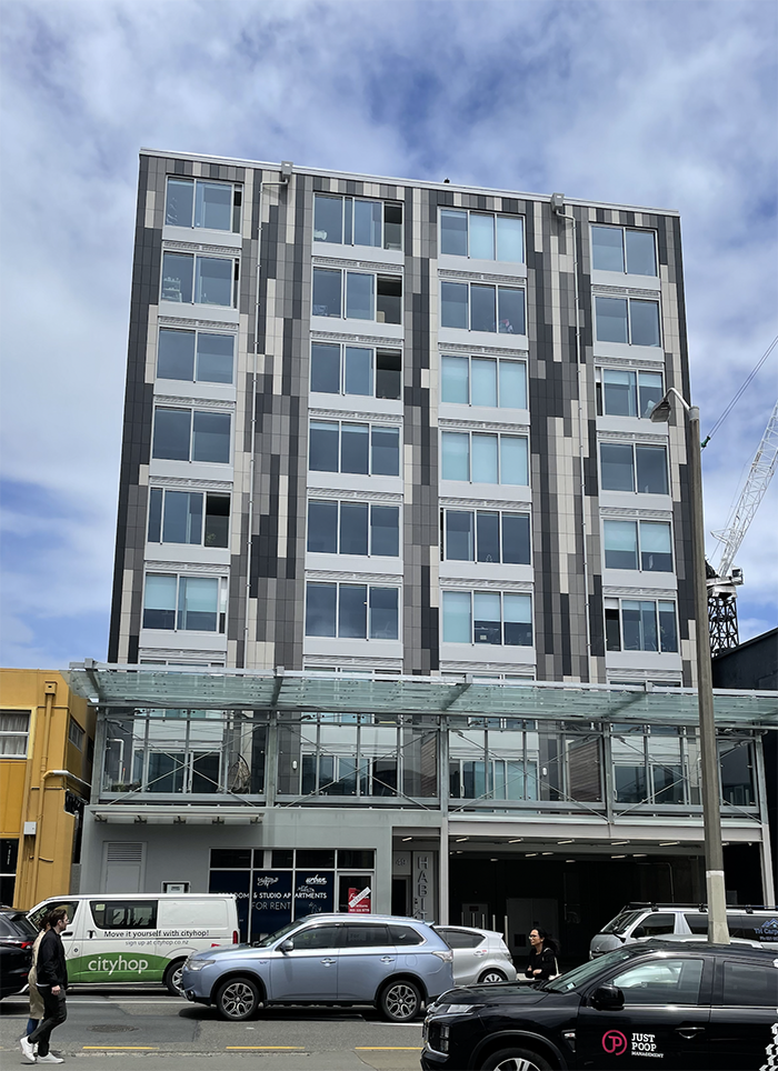
But the move to multi-hued cladding has not stopped over there by the seaside and the airport. Recently, it has been spreading into the urban habitat, with a whole flotilla of buildings now setting sail with multi-coloured facades, flecked with a limited colour palette. I’m not sure what is driving this splatter-gun sensation, gurning and flickering with multiple random colours, but it seems to be increasing in popularity. There was just an occasional random splash of colour at first, but now there are entire walls of multiple-hued cladding panels, all over town. One building on Vivian Street, amusingly called Habitat, is clad in various shades of grey and adorns quite possibly the most ugly building at street level as you drive past, with a gaping black hole wide open onto Vivian.
Honestly, it makes me shudder each time I go past – I’m not sure how that one slipped past the “specialists” at Council who are meant to keep our Urban Design standards up. It is like staring up at a Scotsman wearing a kilt and dancing rather vigorously as you drive down the road – I don’t need to see all that garbage laddie!! Really needs a clean pair of undies on to disguise the shocking view behind, the entry that is literally an arsehole. Wins the undoubted prize of worst entrance in Wellington, every time you drive past, down State Highway 1, with just a turntable and an exposed anus onto the street. No idea who the architect was, but above the waistline, the walls are covered with random-coloured panels of cladding. Have you not got the gumption to actually coordinate a cladding colour scheme? Why does random patching take the cake?

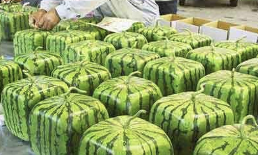
Then of course there is the nearby shocking Cubic Minecraft watermelon on Taranaki Street / Frederick Street, clad in a hideous range of screaming greens and now visible all over the city. It is so much like a watermelon built by a 10 year old boy, the insides should have been pink with black pips to keep the illusion going. God alone knows why the building was decided to be coloured that way. Would it have been better if it was just one shade of green? Or perhaps it would have been better if it were not green at all? Is this just a gigantic joke play on the words “greenest building in Wellington” ?
But the fun doesn’t stop there. Camouflage cladding is growing all over Wellington. The new Hyde Park barracks on Lower Courtenay Place (can Courtenay Place actually get any lower?) is now complete and open for business, clad in a set of camo in various shades of brown and beige. I confess that this has been a sleeper for me – one day it was just a steel skeleton, and then seemingly not long afterward, it has blossomed into a completed building. It is a real behemoth – a huge beast – but it is pretending to be hiding, by virtue of a Gillie suit of cladding, so we think it is not there. But it is there, isn’t it? I could swear I saw it once, out of the corner of my eye, but when you look at it, the camouflage is complete, and the whole building simply vanishes into thin air.
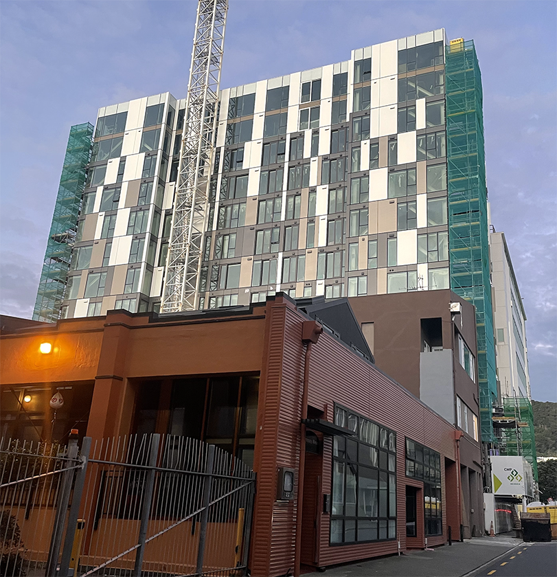
But wait! We’re not done yet! There is even another new creation in town, on something that used to be Eagle Technology House. Incidentally, who or what was Eagle Technology was never clear. Eagles seem to have been flying for many years, possibly even centuries, without having to have a house for their cunning technology. Anyway – the ET House is now phoning home, reborn, as presumably more accommodation for very small people, as it now seems to be accommodation of some sort, but – yee Gods !!! What on earth is it clad in??!? The colour scheme can only be described as like a Battenburg cake caught in a car door, squashed and dribbling like an infant with an ill-fitting bib.
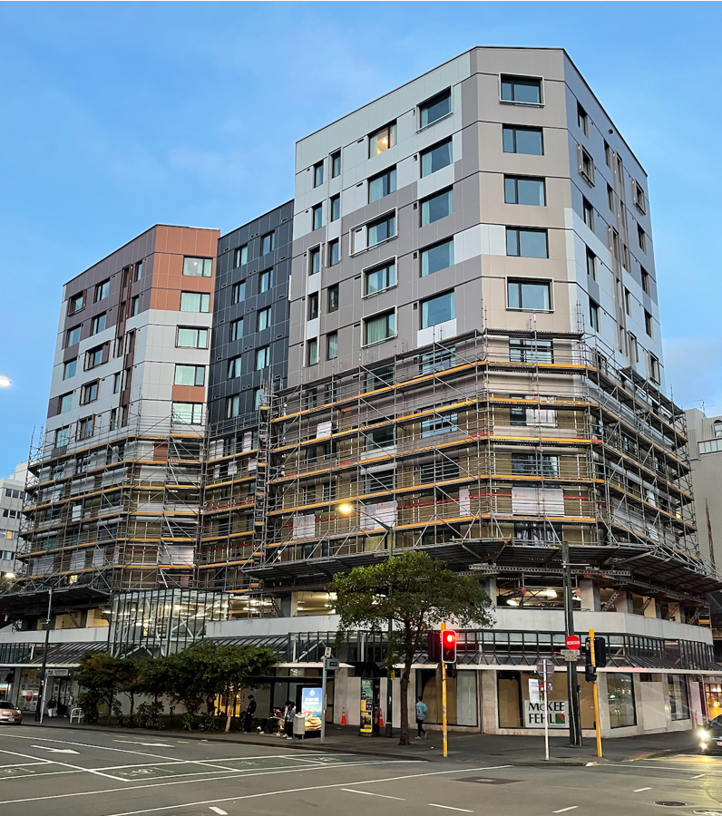
Who or what is doing this to us? Why have we gone from an architectural world based on proportion, and order, and calm, rational thought, along with coherent colour schemes, and now we are blundering headlong towards a car-crash symphony of colours and shapes and lack of rational planning, blundering from pillar to post like a Trumpian game-plan for clear and coherent democracy. Is tasteful colour and careful proportion now a bad thing, rather than a good answer in polite company?

Why does Wellington in particular, but perhaps also the world in general, have such damned ugly buildings these days, coloured in by toddlers wearing day-glo onesies? Is this just because old farts with a sense of proportion and tasteful colour ranges have been put out to pasture, pushing up the daisies while the lunatics take over the asylum? Or is it because the cladding company has employed a colour-blind consultant advising what panel type would go well together? It certainly seems to be a particular cladding product that is being featured, in Wellington at least. It is not necessarily happening in other cities though – seems to be a Capital connection, because down in Dunedin, the new student digs down there has got a clever, interlocking pattern that intrigues my eyes, rather than the random effect we have up here.

It certainly is what is happening in the real world of politics, where President Elon and his puffy-faced orange sidekick are rapidly dismantling the States formerly known as United, whilst simultaneously allowing the steely-eyed Goblin of Rusk-land to wreak havoc on world order.
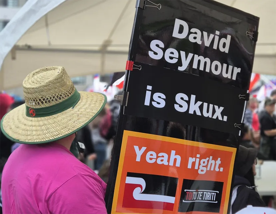
Or here, where a badly drawn hologram called Seymour devours a carefully balanced Treaty agreement that seemed to be working and tries to replace it with one based on different rules. Or the continuing farce where Te Pukenga, or Oranga Tamariki, or Auckland Transport, or whatever Government Department you want is established, repurposed, disestablished and then downsized one week, before being rebranded, reoriented, spun round several times and then put back on the shelf again in the next week. Has ANYONE got any idea what is happening, or better yet, WHY it is all happening? Why is the entire known world imploding in such a rapid and confusing manner? Have I missed a memo somehow? Answers on a post-card please!


For my part, I was an early mourner for the Gordon Wilson Flats when they painted over the Dulux colour card scheme. Now that was a varied palette!
As for the cladding of your downtown popinjays, I am phlegmatic. Somewhere under there are some bones and I fully expect these buildings to shed their skin a few times before they get swept away by the tsunami. Paint is temporary, form is permanent.
Very zen, oh Master of the Pudding Race.
Although I suspect that while you may be correct, the current paint job may outlast my allocated remaining time on earth. Ten years? Twenty? Thirty years till next reclad ? This blog certainly won’t still be running !
And Yes indeed, re the Dulux colour card scheme. Or was it Resene? That’s probably a historically significant distinction to make !
There is a precedent – the Telecompost building in Manners St was a lime green slab like a seba-med soap bar and that was ages ago, 90’s I think
As for your wider wobbling Weltanschauung, all I can advise is to tend one’s own garden. Control what you can and get all Buddhist about what you can’t
There is also entertainment to be had in the whole car crash sense or, as the kids say,
Yo shit’s on fire
“Yo, shit’s on fire” was actually going to be the original name of this article. Especially seeing as Enshitification was selected by some newspaper as the Word of The Year in 2024, seeing as everything is going down hill. Fast.
Incidentally, I’m glad I’m not working in the USA right now. It’s a real crapfest over there!
Telecom House was an Athfield design from 1988.
Indeed, Kumara, you are right. I am not sure if you were around then – but am I right in thinking that the green-ness of the Telecom Tower was controversial at the time? I’m suspecting that it probably was…?
My recollection was that it was greeted with quite a bit of enthusiasm – if only because its thorough adherence to a novo-deco aesthetic was a considerable relief in the context of stick-on PoMo like the Majestic Tower and various Chase abominations. I think people liked the way it sat on the street too, with those Manners St shopfronts, apartments and balconies instead of plate glass and a tiny, windy plaza.
The airport car park gets a big tick from me. I don’t really understand how it works, it certainly isn’t invisible but from more distant viewpoints, e.g. from Seatoun Heights your eyes just seem to slide right past it.
Given how ugly most car park building are I think it was worth the effort
Wonder if there was any issue in getting approval for a nearly invisible building next to an airport, guess it is a quite a distance from the runway
Well, yes, good point, although I think that if a plane runs into the car park building, we probably have a bigger problem at hand !! It is quite a way from the runway…
I would love to have been at the meeting where they presented their designs to the client / council though, it’s not often that an architect has to sell their building on how well you can’t see it ! It was actually quite difficult to photograph too, because when you are close to it you are normally driving, like, near the Burger King, hard to see it cos of all the giant advertising. Best place is actually when you in the car – which is worst place to have to take a photo from. Hence: from the car park.
After a bus trip across the city, it’s clear that camouflage alone is not sufficient – it needs to be supplemented by the strategic positioning of invisibility generators.
I was initially skeptical about the airport parking building cladding but was pleasantly surprised at how effective it turned out to be. That was, until the airport execs decided it would make a profitable location for a billboard, thus destroying the effect.
HUGE billboard. Maybe so it can be seen from space? Certainly seems overly large, considering it is only there for viewing by people in the car park, who i think are not really concentratign on anything except flying. Weird.
Another example are the new WCC offices at the refurbished Datacom House. I’m not against more colour but this trend of pixelated facades makes it feel like we’re walking through a real life video game.
Oh dear – haven’t seen that. Maybe all this colour pixelation is actually being mandated by a blind person at Council? That would explain a lot…
Looks like a case of “modern architecture sucks and nobody knows how to fix it”. See also: rules to break up massing, rules to have at least 2 clashing exterior finishes, etc. Or this need to preserve every moderately decorated façade in a new build, like what is happening in the SkyCity convention centre.
Well at least they’re trying something.
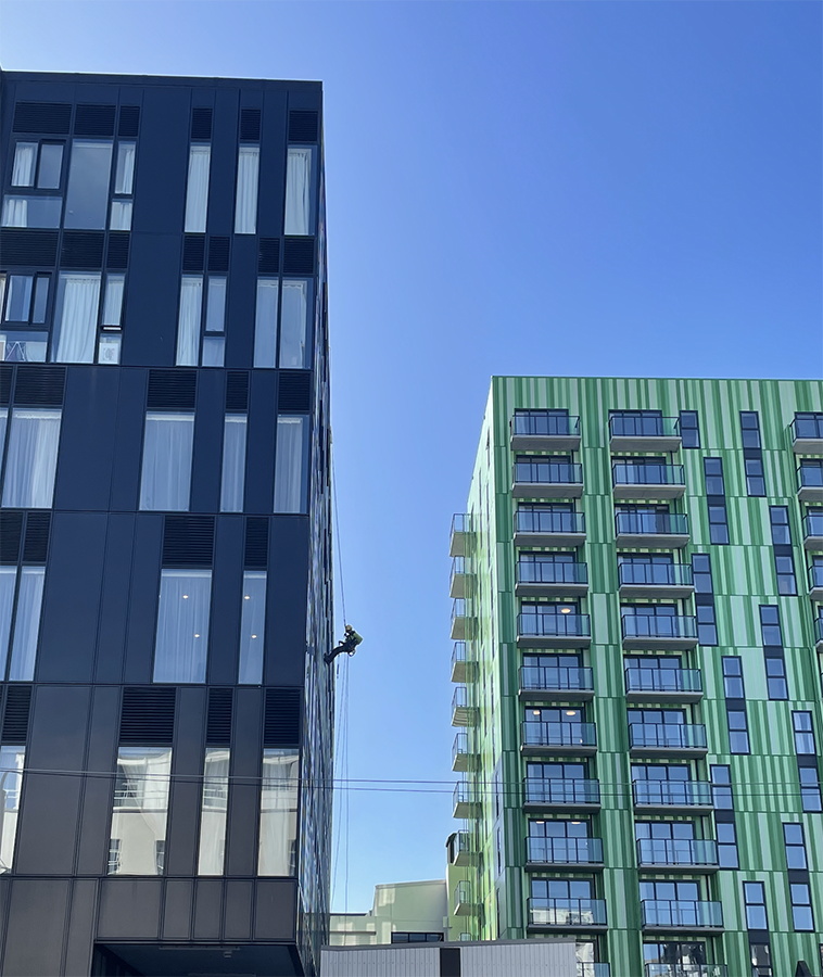
I think these buildings and their cladding clearly reflect the influence of Minecraft on the newer generation of designers and architects. Compare them to the 8-bit styling and use of coloured blocks in the game and it’s all there to be seen… and then the particular palette of some of them is driven by a the current (well – for many decades now) desire to be neutral, hence the putrid browns and creams and the dull-as-ditchwater greys. So, more a reflection than an attempt to be camouflaged. Minecraft cladding is the new mirrored cladding!
Eeeeh Claire I think you’re on something there. All those browns and rich colours – would that be a chocolate eclaire?
Will they paint the new wharf handrails camo too?
Gee that’s not a waste of money is it?
I have yet to see anyone put up the argument for Darwinian selection refining the gene pool by removing people too dense to not fall off a wharf
The Dutch can handle it, are we just a pack of mollycoddled idiots?
See the discussion on the next post, around the waterfront with Brooklyn Nine-Nine….
Exactly 60, you read my mind….
Speaking of the airport carpark
https://www.nzherald.co.nz/nz/the-15-million-issue-with-wellington-airports-carpark-building/7Y5W3VZY6RB5FKN27GAOYDGQSI/
I had heard that a lot of the beams had insufficient concrete cover to the steel
Fletchers lose again
When Fletchers sacked all their old white men, who knew how to actually build buildings, did they keep ANYONE who knew what they were doing? It is extraordinary – the most competent construction company in NZ for 75 years, rapidly turning into the worst. The answer must be the people – but why?
Or it got too cosy with its monopoly position…
https://www.rnz.co.nz/news/business/529497/what-went-wrong-for-fletcher-building