The apartment blocks going up in New Zealand are a little lacking in imagination. But it does not have to be like that. I was rifling through a stack of photos from a couple of years ago, and spotted these of a building in Amsterdam that I had snapped some pics of – it is soooo much more interesting than the rubbish we are getting served here in Wellington at present.
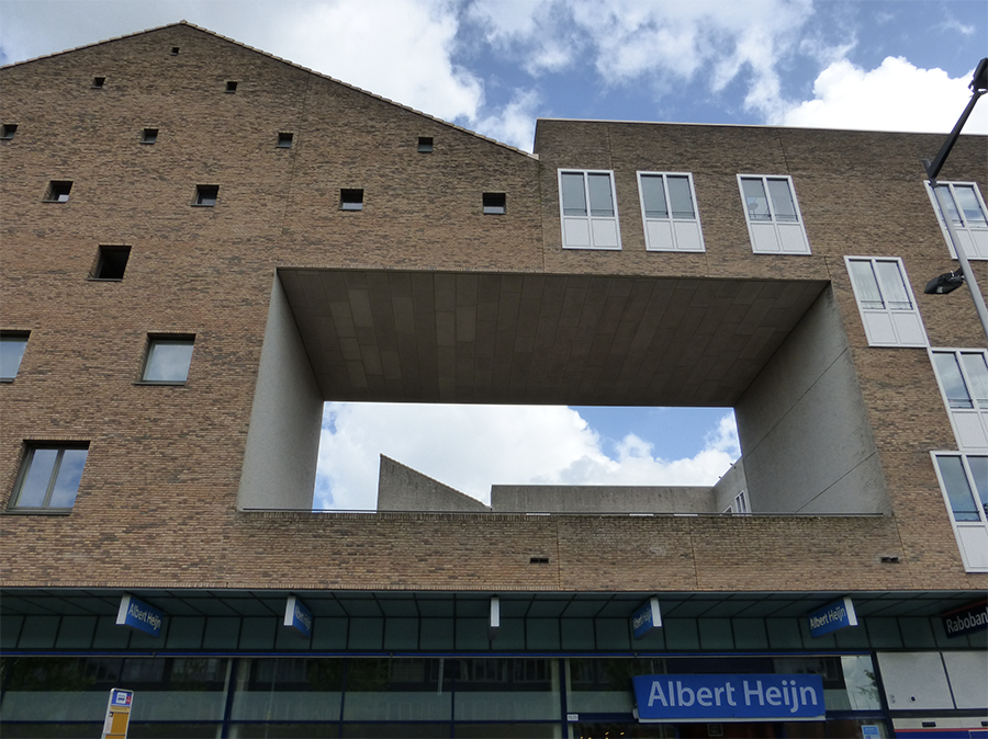
I’ve no idea what the building is called or who the architect or developers might be – or the engineer, who has evidently done some clever clogs thinking behind the closed doors – but what a little beauty ! By the way – although the Albert Heijn sign looks like an Airport sign or a Tram Stop – it is just a sign for what is, evidently, the largest supermarket chain in the Netherlands and Belgium. So, not actually the building name…
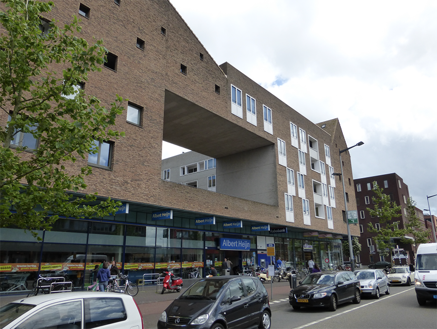
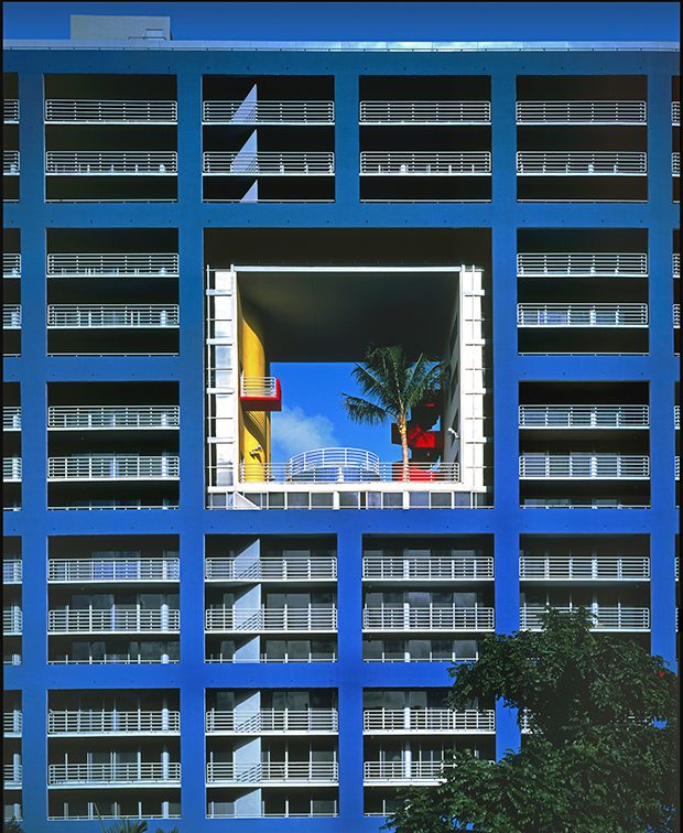
The big statement is, of course, the master great hole in the wall – reminds me of Arquitectonica in Miami from back in the 1980s, but here it is all very subtle and down-played, no Miami Vice flashiness here. Just good old brickwork.
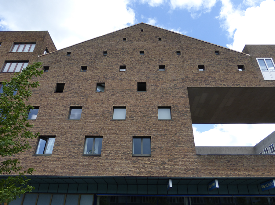
But the other side of the coin, so to speak, is the playing around with window sizes. Forced perspective? Referencing back to warehouses and barns of old, I’m sure, but still looks great!
And then there is the balconies and window fenestration – somehow it all just fits in together better. Very non-symmetrical. But still well-considered.
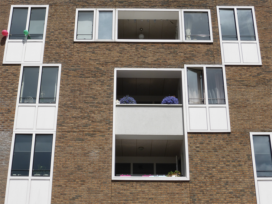
I would really LOVE to see some more exciting and interesting / different apartment buildings in Wellington. Any chance of that?
Post-script
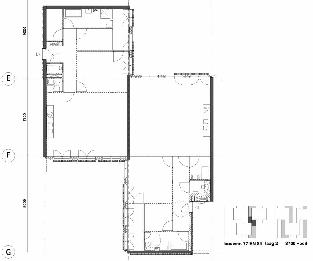
Just thought that people might like to see this – thanks to Greenwelly and Jos for putting me onto this. Here is a plan – I think maybe it is a typical plan, but its hard to tell. It is very different from what we might build in Aotearoa. More open, more flexible, more ambiguous. Interesting!
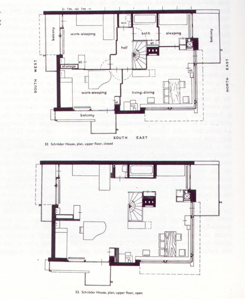
We have to remember the precedent set by the Rietveld / Schroder house, which is still there in Holland (Prins Hendriklaan in Utrecht), and still is way more inventive and ground breaking than most NZ houses – despite being built in 1924 ! https://www.rietveldschroderhuis.nl/en/rietveld-schroder-house

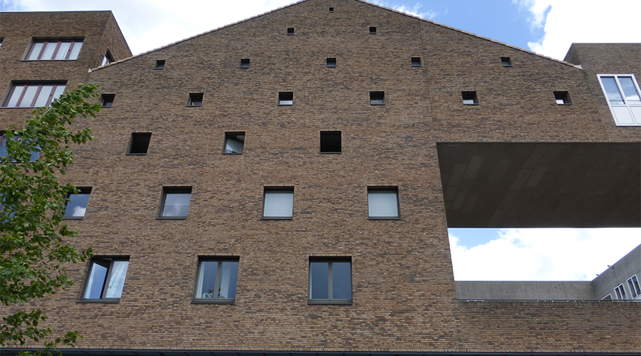


Fyi, this block is called ‘Blok 5’ in IJburg, Amsterdam.
Designed by three architectural firms:
https://www.ijburgblok5.nl/geschiedenis-blok-5/# (suggest to let google translate the website to English ;) )
Fantastic, dank u vel Jos !
“Block 5 in IJburg has been designed by three architectural firms: Architectenbureau Ellerman, Lucas, van Vugt, Koers Zeinstra van Gelderen Architecten and Arons en Gelauff Architecten. The starting point was that the collection of buildings together determine the block composition, the ensemble of the block. In this way, the mass structure of block 5 was determined simultaneously by the three architectural firms. In this way, the diversity and articulation of the building have led to the desired variation in building heights as requested in the urban development plan.”
“Because the total block depth is designed by each architect, the articulation of the facade on IJburglaan and on the square deviates from that of the facades of the Vizier, the Dwarsstraat and the passage through the block. Here the total block depth will speak more. The treatment of the shop facades and the facades of the business premises is different. The facades of the commercial spaces on the square form an integral image with the housing facades and actually stand on the ground. The freely divisible shop fronts are more independent in character and are different in width and scale compared to the houses above. In the elaboration, the design of the “strips” has been continued in detail by the three offices up to the mutual connection of the facades.”
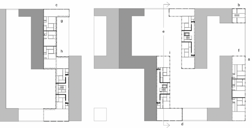
“The design consists of a block of 170 m long and 60 m deep, three to six storeys high on a shop floor. The parking garage is located under the building. The shops are located at ground level with business premises in 2 layers on the square side. The block is split in the middle, creating two small squares on both the IJburglaan and the square side. The block has a continuous façade surface down to ground level at the square, the Dwarsstraat and the Vizier. The façade on IJburglaan is further differentiated, partly due to the arcade. The block here has a “substructure” of shops with an independent layout. The housing program of block 5 is mainly made up of apartments in a great diversity. In addition to the apartments, there are company homes (single-family homes) with business space on the ground floor and studio homes with the studio on the ground floor. The apartments are accessed through porches, which extend into the parking garage.”
That website is great ! In more ways than one. Any idea if there is any info on apartment sizes? Numbers? Any plans?
Plans and more details are on Page 45 of this.
50 apartments, all 2 bed by the look 1 double and 1 single Bdrm .. ( well at least that what I guess the room in the middle of the plans is) – no sqm thou
http://www.zeinstravangelderen.nl/download/zvg-portofolio-EN.pdf
Thanks Greenwelly ! I love this interactive helpful community we have here!
will be great when we have district plan that enables apartments like this in far more places.