Wellington’s buildings continue to surprise and delight me, relative newcomer as I am to this small, perfectly-formed city. It’s not a place that you could say has great traditions of anything in particular – it has demolished most, but not all of its Victorian heritage, has a fine collection of post-modern eighties buildings that have firmly gone out of style, with the remaining collection being eclectic at best, and motley at worst.
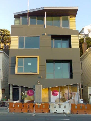
But being unbound by tradition obviously has its advantages. You can play around with the status quo to your hearts content, without having to worry about upsetting established sensibilities. Sometimes that’s good, at other times it makes small children and old people run screaming for cover. This building pushes the boundaries in a number of ways, bringing out instant dislike in some, and curious admiration in others. Sited on the edge of the city proper, its a four storey structure that I’ve been watching with interest as it nears completion.
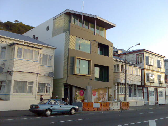
Designed by Alan Blundell (RAB design), the building sits slightly above the surrounding two storey houses and is one of the more curious creations in recent years. It looks like it has weatherboard down at least part of the sides, but really its all precast concrete, painstakingly crafted to appear just like good old fashioned bevel back. A feat of clever engineering, the front facade is suspended out, but then supported by an off centre fluted ‘column’ so it all slots together like a giant cardboard puzzle. It cuts back the roof at an angle to the north, and then cuts back the walls too on the west. One windows poke out, all the others pull back in. None of them line up. It’s resolutely asymmetrical and non-conformist.
The fun presentation of the building disguises the rigid box of height limits that it is required to fit into. If you look carefully, the roofline is flat and sullen, aligning with the less than exciting ‘tasteful’ modern boxes further along the Parade. The cutback on the roof helps to disguise that, a fate the more orthodox apartments were unable to avoid. As a result, they look sawn off, hammered flat, while this manages to look tall, certainly more graceful than the tired and oddly shaped houses nearby.
So, what’s it all for? Judging by the graphics in the ground floor, its going to be a boutique hotel – a ten bed ‘ohtel’ to be exact. Unlike most hotels, there does not appear to be any parking – but then this is an ohtel, not a motel. Besides, being in the most urban city in New Zealand, you could probably just roll up on your skateboard, fresh from the skatepark opposite; although their website is obviously aiming at a more upmarket clientele for when it opens in February.
Its a far cry from the outlook this ‘ere ‘otel would have had a few years back. Home of the town’s mortuary, dump, destructor, and a derelict dry dock, the ohtel now gets to look out of the sun-bather dotted green expanse of the new city lung: Waitangi Park.


[…] the far end of the waterfront promenade from the recently opened oHtel, lies the newest addition to the waterfront: the BNZ ‘groundscraper’. It’s a big […]
[…] work for CAS, in two developments around Oriental Bay. The first one, alluded to earlier in the ohtel post, is a successful, but pretty bland and flat looking development on the edge of Waitangi Park. At […]