Following on from the previous post, where the power of the mighty telephoto reduced tall buildings to flatness in a single bound, we here at the Fish thought that it might be time to try that trick on other streets.
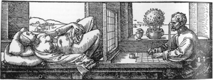
Flattening out perspective, as shown here in the classic (but I’ve always thought, slightly dodgy) example of Albrecht Durer from 1525 “Draughtsman drawing a recumbent woman” can have interesting effects, sometimes bringing things to attention in an unexpected manner. Methinks Durer copped an eyeful there, and stuck to drawing hares after that (with some considerable success).
Fore-shortening can work wonders for some things, mostly in a good way, although no doubt someone (M-D? greenwelly? Flattie?) will point out some hideous examples. Hogarth, one of the Fish’s favourite artists, had great fun playing around with the side effects of this in 1754, with a footnote in his Satire on False Perspective, to remind ourselves of the importance of this knowledge:
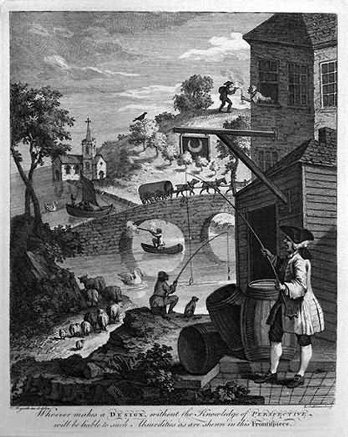
The footnote says: Whoever makes a DESIGN without the Knowledge of PERSPECTIVE will be liable to such Absurdities as are shewn in this Frontispiece.
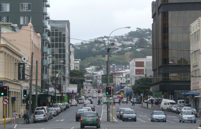
But in the mean time, and just because we can, here are two photos of a couple of our important streets, with a bit of maximum zoom action happening. So, first up is Taranaki Street.
The standard picture doesn’t really show us much of the life of the street. It shows us the side view of Bellagio, and that they’ve got great views (until someone builds in front of them), along with some fairly dull side elevations to the black Panasonic building and the 80s square block where Saatchi live. It also shows the massive great width that Taranaki St possesses, with hectares and hectares of dull grey asphalt. What about if we zoom in closer?
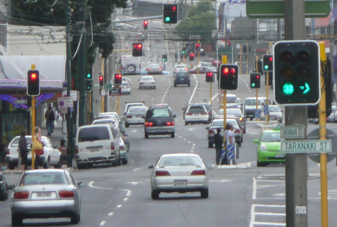
And there we see it: the truth is, Taranaki St is a terrible place for pedestrians. Great for cars.
But really: on one of our main arterial streets (for cars and for people), we need to do better. Mayor Kerry mentioned a year or two ago that Taranaki St would become a tree’d boulevard. I can’t wait. We need to treat pedestrians better in this town – and that means more than just repaving Lambton Quay.
So: what about the next street over?
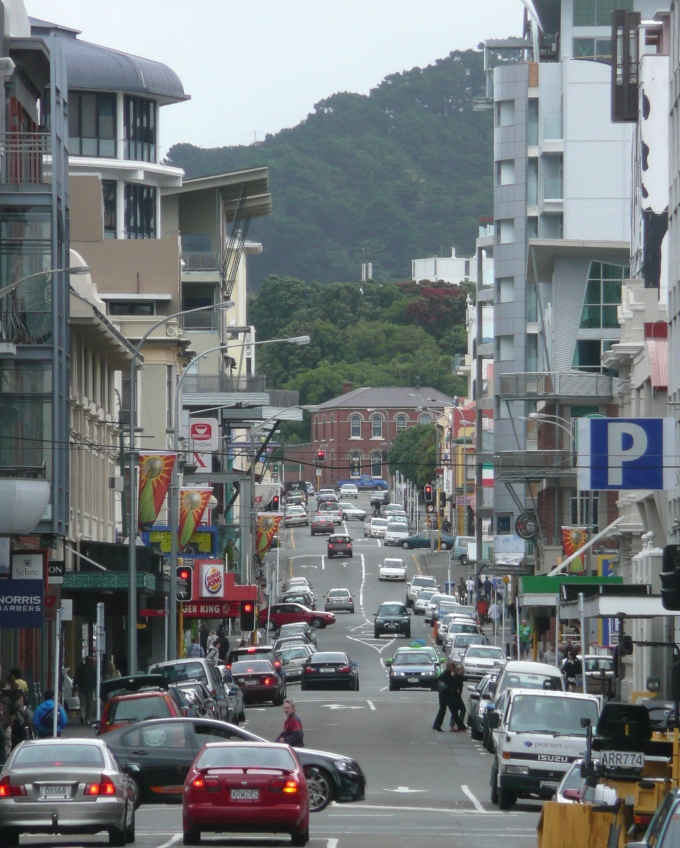
Tory Street: named after the ship that bought settlers to NZ of course, not after the right wing UK parliamentary party (explanation only inserted for our overseas readers, as all the locals will know that), and you’ll notice that the Fish will stand in busy streets to get the right photos. The things we do for you…. Risking life and fin.
What do we see? Lots of cars, coming from every direction, and the old Police Barracks (go Foster Architects!). A pretty motley collection of buildings although a lot nicer than Taranaki St, some nice greenery on the side of Mount Cook, but: no sign of the National War Memorial (by the way: whatever happened to the Memorial Park idea? That seems to have vanished without trace!). But there’s a bit of a quandry here. Should we abandon the ‘Naki to the automobiles? Should we restrict Tory to pedestrian only? Or at least pedestrian priority? For a street that is so much more pedestrian friendly, it still seems to cater mainly for cars.
Of course, other streets cater even more so for cars. One last look then, at another well-known local thoroughfare:
Yes, it’s Vivian St, and the heat haze is rising. This street has a great history, many tales to tell if tarmac could talk, as the Fish takes a foto from near where Carmen’s old cafe did stand. While the businesses there are being slowly strangled by the car, the shape of the street is a classic, and great when viewed from either end, as the topography takes over from the surveyors marks.

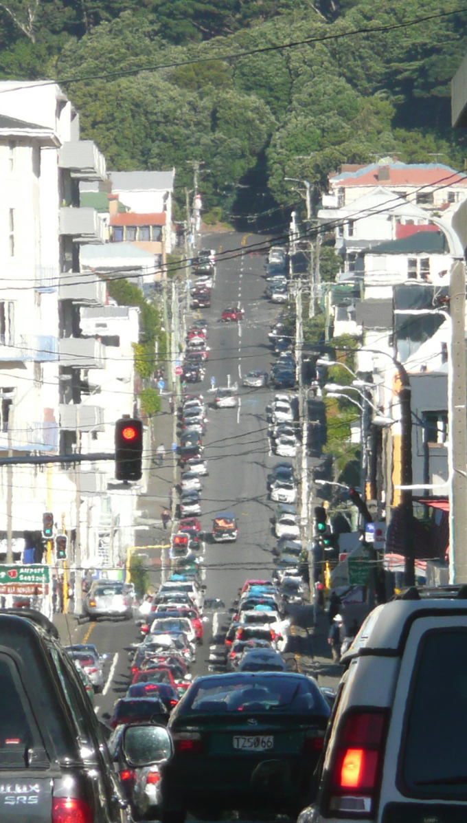

Although technically most of the empty asphalt in that last photo is Pirie Street, but I agree that when viewed from either the Uni or Mt Vic. It is the only true classic “cross street” in Te Aro.
Apropos the Durer engraving – actually, that image is ironic, because clearly the woman was not draw from life (the breasts don’t droop for a start), and it seems to me she is intended to be perceived as side on. She is in fact not in perspective at all, and could not have been drawn by the method illustrated.
Apropos the streets – last Thursday I was wandering around as the streets had just been closed for the carnival. How weird and strange things looked. And then I realised that one never sees things, as a pedestrian, from the open middle of the road. Our views are usually obscured by other pedestrians, and by overhanging structures. One of the nice things about pedestrian-friendly streets is not just the actual spaciousness but the _sense_ of spaciousness.
Our habits are ingrained. Even when a street IS closed off to cars, people often still stick to the footpath out of habit, missing out on the chance of walking down the middle of the deserted street.
And of course, the thing about NZ is the verandahs. Uncommon in many countries, they’re obligatory for most of our cities, to ward off the weather – both wind and rain. But then we have a different attitude to architecture – cos for the most part we can’t see it. We can’t look up. We just look sideways.
Yeah, most people were hugging the sides. Personally, I felt as though the party had already started, as soon as I started ambling down the middle of the road.
I’m not sure if you quite ‘get’ the telephoto/flatness’ thing, which, being a function of lens optics, is quite different from foreshortening.
Let me attempt an explanation:
Telephoto lenses compress perspective, reducing the perception of space and volume, and making all subjects on different depth planes within the image space appear about much closer together in terms of distance away from the viewer. This is nicely illustrated in the Taranaki Street images above, flattened perspective of the zoomed-in image makes the hills seem much steeper, with the cars appearing almost stacked on top of each other. Similarly, compare the effect of the traffic lights, which appear to be quite close together in the zoomed-in image, but they contribute to a much more realistic sense of receding street perspective in the normal image…
Here is a classic archgitectural image, where telephoto has been used to almost eradicate the sense of perspectival depth: http://en.wikipedia.org/wiki/File:Nybldgs.jpg
There endeth the lesson… Test on Tuesday…
Why, thank you for that. I feel much better now.
Stephen – “She is in fact not in perspective at all, and could not have been drawn by the method illustrated” – well, yes, but i take it that we’re meant to put ourselves in Durer’s position, and peer up her skirt (or lack of) to imagine what he’s seeing. It’s like he was writing a text book on biology, and not tech drawing.
Although, if Durer did the actual woodcut, he can’t be the one at the desk about to spike his eye on the model of the eiffel tower. I mean, what’s all THAT about? 375 years before Eiffel even built it !
And, if this really was done in 1525, and the famous hare seems to be dated 1502, so in 23 years his drawing ability has gone drastically backwards. It’s all just tooo confusing.
———–
However, to be honest, I’m more worried that she’s going to fall off the bed, and he’s too busy drawing to catch her in time.
I preferred the mathematical theorum – what happened to it…?
Damn. I thought I’d stopped that going out. Changed my mind. Didn’t want to blind you with science. Ho hum !
Yay! My home appears (just) in EOTF. The Vivian St image.
I like Tory St. Partly because it is my most direct route down to Courtenay Pl and the harbour. And also because some of the buildings have a zany quality to them. Like the kiwiana painted on the side of MW’s, or the zebra backpackers, or the art nouveau of the Norris Barbers building, or the odd projecting balconies added to Lone Star. I’m not sure why traffic needs to use it at all, except for building access. There generally isn’t a lot during the day, altho there are queues trying to turn in to Vivian St in the evening rush hour. I’d be all in favour of traffic calming in order to encourage traffic on to Taranaki St and Cambridge Tce.