Excellent news, and thoroughly deserving, that today the extension / refurb / complete rebuild to the AAG won first place at WAF. I think it is the first time that i have visited a building on the World Architecture Festival list, and it is also the first time that I can completely agree with them. It is a stunning building, both inside and out, and the architect, Richard Francis Jones from Francis Jones Morehen Thorpe + ArchiMedia deserve huge applause. Actually, so does Auckland, for having the guts to go for it. And the engineers too. And the contractors – especially the contractors! Hawkins Construction take a bow – it is a work of exquisite beauty.

I have visited it a couple of times over the past year – never managed to get in there while it was under construction, but the completed building is without doubt the most beautifully and carefully detailed building in our entire country. I’m surprised that it isn’t getting more discussion / more press – perhaps it will now. Overseas tourists should flock to the country just to see this building – don’t scoff – I’ve visited several countries just for the privilege of a single building. And, at last, there’s a decent reason to visit Auckland (have I mentioned how much I dislike that city? Uggh, it makes me shudder with it’s appallingness). I tried to go to the movies there recently in the central city – and there is only the one ghastly great edifice at the Edge (or whatever it is called) and that has to be the most embarrassing awful design of the century. But enough of that complaining – the Auckland Art Gallery – now that’s something to be proud of!
Of course, with the lead architect working in Australia, the Aussies are bound to claim the building as their own, but actually, if memory serves me right, Mr RFJ himself is British, which means that we all win. I don’t know who the architects from ArchiMedia are, but they must surely deserve the lions share of the kudos, for the sheer amount of work they must have completed.
The design, of course, builds on the basis of the French chateau-style heritage building that sits proudly in place just up the hill from the centre of Auckland’s old centre. Their new centre is aiming at the Wynyard Quarter, down with the fishes and the tsunami – here on the old site, they built sensibly on solid ground, part way up a hill, and well away from waves and liquefaction, unlike Te Papa. Of course, they also built the Auckland Art Gallery on the side of a old volcano, but that’s by the by. The setting is great. The Art is safe. The building stands serene.
What is even greater is that they actually have Art in their Art Gallery. It’s a novel concept that Te Papa plays with every now and then, although they mostly seem content to stick to frocks and children’s playthings. The art in Auckland is immediate – not up 5 flights of stairs, but is accessible almost right in from the front door, and up one flight into the grand main space, with pulsating flowers suspended from the ceiling. The first gallery to meet your eye is the Pacific gallery – local / homegrown art, from the abundantly fertile pool of Aotearoa and the surroundings. Crusty old white bugger’s art is deeper inside, and is also of stunning quality. Eventually, right out through to the gentle hillside on the other side of the gallery, you find the old building again.
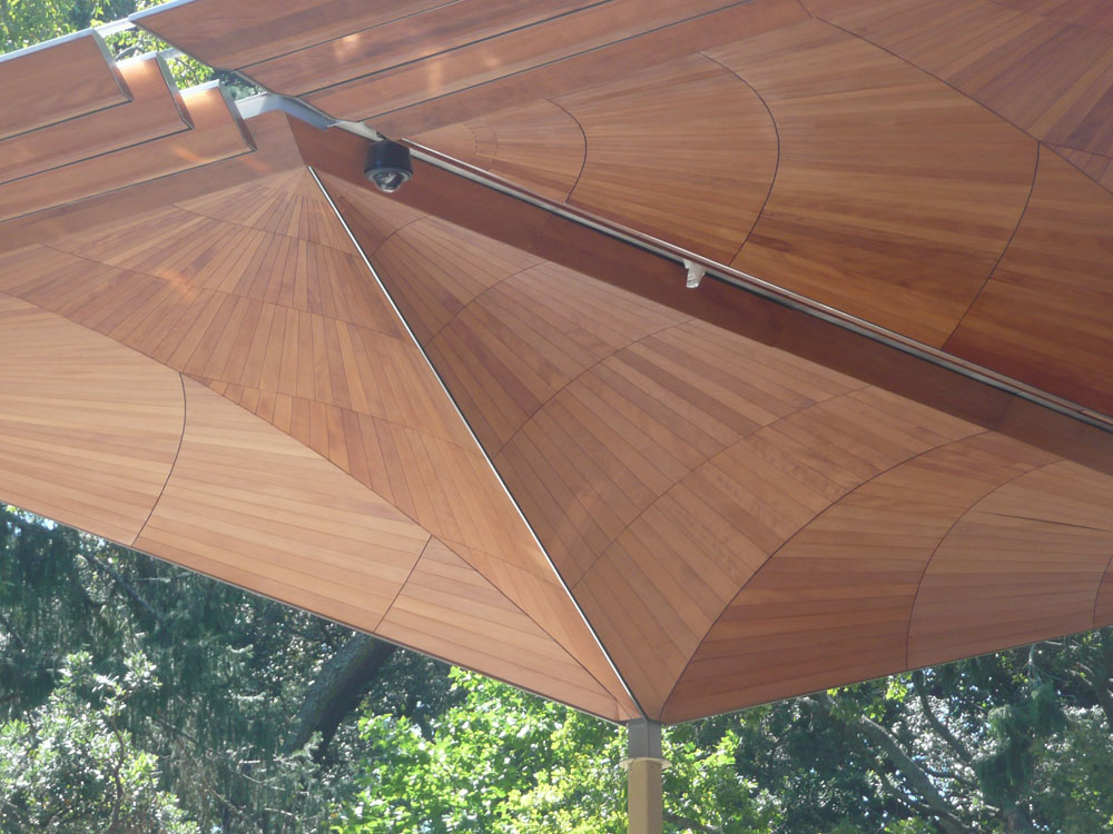
While the art inside is stunning, the building itself is such an exquisitely crafted work of art in itself, that they could have the building empty and it is something that I would be more than happy to walk around. This is one case where the materials themselves are the highlight. Beautiful, heart-achingly beautiful kauri umbrella roof forms rise up from the floor and soar to the ceiling. The edge is feathered (to lessen the weathering I suppose), the timber wraps around a steel heart, and the roofs act as a beacon – a draw card for the curious cats down on Queen St / Lorne St / Wynyard St. I don’t think any of us have ever seen so perfectly formed kauri workmanship outside of a boat building yard, and the joinery company who worked on this can barely believe it themselves. I’ve seen the progress photos somewhere – and it wasn’t an easy job to build. But perfect to behold.
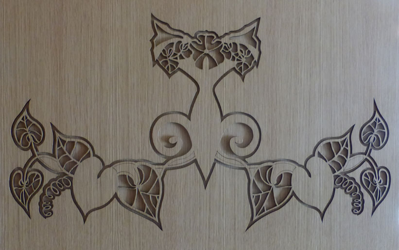
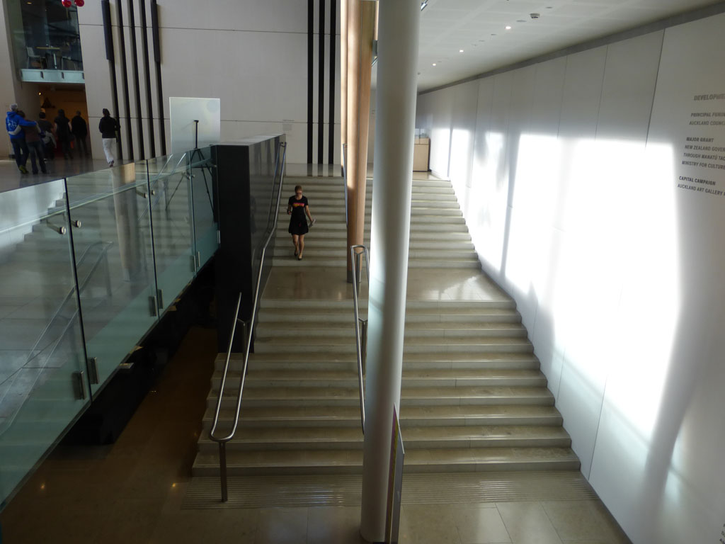
Stepping inside, the stone finishes in the main hall are very warmly lit with late afternoon sunshine (in my case) and the stone itself is lovingly carved and sliced. I couldn’t stop caressing the walls. Nearly got thrown out by security. But I challenge you to resist! Timber walls are embellished too, with laser-cut scrollwork, almost moko-like, adorning some doors. Subtle plays of light change the depth.
I have to confess that I am amazed that they could get away with as much as they have on this building – the heritage parts are still there, but the old 70s addition has been totally swept away, brown carpet and all. In it’s time it was good – but its time has gone. Hard to imagine though, that they would ever want to rip out any of this new work. But it would be interesting to know what the discussions were like over the tables as the proposal to change the floor level in the old gallery were mulled over. The solution they have ended up with, a floor suspended within a floor (and blatantly so) is magic, but a weird sort of magic – levitation of sorts, that the average punter barely registers. Its a sort of Clayton’s decision – ie the decision you’re having when you haven’t got a decision.
I’m going to pause there, to find some photos that i just KNOW i took. Can’t find them yet. I’m just going out for a walk. I may be some time….

Totally agree – I went for a wander through there the morning after a concert and came to the conclusion that the Auckland Art Gallery experience was the best thing about my whole visit.
As for Auckland itself Max, surely you remember how downtown used to be empty concrete canyons? Now there are restaurants, bars and lots of life on the streets especially the area down the hill from the gallery. I really enjoy the place now (apart from the beggars) and hopefully they can reclaim their waterfront from the port company like the Wynyard Quarter shows is possible.
60 – yes, the Lorne St area is certainly one of the more vibrant areas of town. It does however seem to be overrun with a plethora of Korean noodle bars and women’s shoe shops etc, of which I don’t have a great deal of need for at present. I’m sure the range of shops used to be wider and more interesting. Although, quite weirdly and somewhat magically, the Lorne St Cafe is still going. It used to be THE only place for food on that street years ago, and somehow has survived, even if it is now really just another noodle bar. Good noodles though!
Actually, I quite like Queen St, and the little side streets like Vulcan Lane. But there is no doubt to me that Auckland Central has gone down hill quite markedly. The money has clearly gone to Newmarket and to Ponsonby, and the big chains are out in the St Luke’s Mall and Westgates of the world. Meanwhile, if you’re remaining in AklCentral, you’re left with burger bars, $2 shops, and general cheap and nasty tat for poor students. Auckland may be growing, but their CBD is dying, at least at ground level…
Thought you might like to read this review of the gallery as well, by Michael Barrett on the Architecture Now website:
http://architecturenow.co.nz/articles/auckland-art-gallery-worlds-best-building/
excerpt:
“A quick recap: in 2006, as reported in the New Zealand Herald , the gallery extension was described by one protester as an “insipid, mediocre effortâ€. Today, Francis-Jones and Mackie praised then-director Chris Saines for his resolute championing of the project in the face of such adversity.”
“In its cultural category, Auckland Art Gallery Toi o Tamaki faced off with global luminaries and crowd-favourites Zaha Hadid Architects. Hadid’s fluid, futuristic and almost amorphous forms clearly didn’t affect the jury members as did the vaulted kauri pods of the Auckland Art Gallery. This timber, dragged from fallen specimens deep in New Zealand’s forests, and then stitched together in joinery workshops in Papakura, are the new building’s obvious drawcard. Not to be forgotten, however, are the extensive amnd clever restoration works to the French renaissance wing of the building, designed by Melbourne architects Grainger & D’Ebrowhich in 1887.”