The Courtenay Place Park seems more-or-less finished now, having recently unveiled the second and final stage of it’s development. A very minimal and very urban park, it’s strengths lies in the quality of the finish and detailing, as well as the enhancement of pedestrian flow within this highly-traffic area.
The park creates two axes, each in parallel to the adjacent street or footpath, resulting a wedge-shaped open area. Although this central space is fairly large, its awkward shaping is perhaps too restrictive for the programmes of “markets, street performances, theatre crowds, festivals” that the council had envisioned. 
Wellington’s ubiquitous terracotta tiling is out in full force. This, more than anything, enables the park as an extension of the footpath. While this is certainly in-line with the park’s goals – would a greater variety in the ground plane be too much to ask? Even a minor substitution of the secondary tan brick would go a long way to creating more of a unique sense of place.
Seven light boxes line the Courtenay street-site, seemingly gigantic incarnations of the cycling advertisement boards found at many bus stops. Awaiting the installations of “graphic art,” the boxes appear to be a great way of providing some visual flair to the park, presuming that the pace of their rotation isn’t too gaudy. It would be great if art pieces could be linked to particular times – smooth and bright palettes by day, shifting into more vibrant and luminous pieces for the evening.
So far there is no sign of the (iconic?) Courtenay Place Clock, although Tom had it on good authority back in January that it would eventually be making an appearance. However there doesn’t seem to be any obvious areas that have been left ready for its re-attachment….
Just off from the Courtney/Taranaki corner, something of a graveyard scene is painted by the wizened trees, pointed iron fencing, random litter and the tomb-like mass of the heritage toilets and surrounds. Sombre and aged, it definitely stands out against the light and pristine tones of the new development. Although they certainly have an appeal, the toilets and surrounding shrubbery desperately need some form of maintenance and renewal – no doubt suffering due to the abandonment of a proposed wine bar conversion.
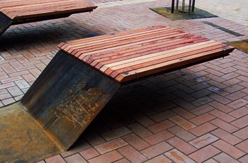
For me though, the real draw card of the new park is the seating. These things have fascinated me ever since a lone sample unexpectedly appeared at the Ghuznee bus stop late last year.
Sleek and simple in their elongated S-shape, the seat/bench hybrids echo the rustic materiality that has populated the waterfront. Since their Ghuznee debut, they have gained a softer timber seat-cover, as well as map-etchings and swiss-cheese punctures that add character to the design. I have to admit though, my first reaction to the design was wait, can I stand on these things?Apparently quite a common thought, as evidenced by the multitude of footprints found on the seats during the first few days (the novelty seems to have worn off by now).
Perhaps it is just us that are less inclined towards maturity, but I really wonder how many people it was designed to handle. I’m sure that the Courtenay revellers will be putting things to the test soon enough.
In all seriousness though, the curiosity that these things inspire is impressive. I’ve seen kids run up and down from the edge of one to another, like some kind of downscaled half pipe. Similarly, they offer wide variety of seating options. The sizing and proximity of each seat seems perfectly able to cater to large and small groups alike, as well as the individual. Hopefully more of these will crop up throughout the city, along with some new variations in form or layout.
Meanwhile, at the 2008 NZ institute of Landscape Architects awards, Waitangi park has received the Sustainability Award of Excellence, a testament to the ongoing success of the parks ecological systems. In addition, the Supreme Award for Landscape Design/Urban Design was won by Isthmus+Studio Pacific for the Kumototo Wharf Development, further representing the strength of Wellington’s waterfront.
The other (old) news is that the Hilton has decided not to appeal against a court ruling that denied it resource consent – signalling the “end of the line” for the project. Nevertheless they “…are confident there will be opportunities for a Hilton hotel elsewhere in Wellington and we continue to look for such opportunities.” However, I can’t help but think that in reallocating the project to a less prominent site will in turn lessen the quality invested in the hotel.
In the meantime, I agree with Mrs Swann that a competition should be organised for the site. However, this would be quite a complex competition that would need to be handled with care. If competition entries were to be viable proposals, they would need to ensure that they can gain developer funding as well as implement the structural reinforcement that is very much needed by the site – two conditions that are likely to be restrictive on the success of smaller, or international entrants.
Still, the competitions held so far for the waterfront have been quite successful, so here’s hoping.


>I have to admit though, my first reaction to the design was primarily: can I stand on it?
They look like diving boards to me, inviting people to bounce up and down on the free standing ends in the hope that they might be flipped high enough in to the air to execute a somersault.
There better be a good ton or more of concrete holding each one down. They’re going to have to cope with multiple simultaneous drunken bouncers, and lever multipliers come in to play.
They also look like they would be good to skateboard up onto – ha! sucked in! I saw a skateboarder go full speed towards one the other day, trying to launch up and over the seat from the ‘ramp’ side – and while he continued flying on, his board stayed firmly at the bottom… although i’m sure that they’ll figure out a way to overcome that soon.
Regarding the “ubiquitous terracotta tiling” – I really like the honed grey concrete coloured pavers used in Manners Mall.
They look fantastic.
I too would like to see more variation in colour / texture, although I am sure that the grey pavers and the inserted lights might be a bit “modern” for those that aspire to the old world terracotta tiles that are popular in old world countries like Italy (extremely relevant to us, of course….)
I really like the LED light inserts in Manners Street, but absolutely hate the little fishy tiles and concrete fish inserts in Courtenay Place which were a bit twee when they were put in and have not aged well also….
And, yes, I love the cantilevered seats also.
Re: the clock. Next time you’re there keep an eye out for the large box of plywood hoarding about 2m high between the seats and the old toilets. By my reckoning (could be wrong) it’s in roughly the same place as where the clock used to be, and likely to be where it is to be re-placed.
Re: the “ubiquitous terracotta tiling”. In my experience, WCC is adamant that any and all of their public footpaths will be finished in that particular brick. Nothing will sway them. Maintenance, cost and cohesion are, apparently, vastly more important than design-specific solutions. Long live terracotta!
I also love the seats! Simple, flexible, quirky, but structured.(Nice work Simon.)
My only gripe is with the signage panels which are exact similar if not identical to other WCC signs in close vicinity. I like them, but why use coreten steel on these ones when the ones across the road have a painted finish? Arguing that the seats are made of the stuff doesn’t really cut it. It appears cohesion is used only sporadically…
Good Post Philip. I’m the designer of the park and thought you may like a little more info too the points you raised….
The seats have been well tested and act as a ‘perfect’ cantilever with half the seat embedded into a large concrete foundation. The engineers tell me it can withstand a load of 100kg per sq cm and not deflect more than 4mm. but i guess we shall have to see how it stands up too 10 liquored up props… Your right thought it has been fun to see people using and having fun with them!
With regards to the paving, its safe to say it was not our first choice, and if you have seen the earlier plans large 800×400 Bluestone pavers were spec’d. They were also the first item to go when money became very tight. The rationale being to keep the items people can touch and see [lights, art work and seating] and retain the ubiquitous clay pavers. These pavers were laid in a very restrained pattern to not emphasis them at all.
The 8 light boxes will have the first work installed for the opening this Friday. The first exhibition features 8 Wellington based photographers, Andy Palmer, Amelia Handscomb, Shaun Lawson, John Lake, Victoria Birkenshaw, Clare Noonan, Jess Silk and Steve Rowe. The first exhibition should last 6 months with the Public Art Panel taking over the on going running of exhibitions in the space.
The Clock is being refurbished in Kapiti and will be installed within the next few weeks. There was more repair work required than was initially thought. The clock will go at the end of the row of trees along Courtenay Place where there is a steel plate covering a hole. This retains a relationship to the street it has always had and keeps it close to the toilet block. The ply hordings have been removed and the limestone sculpture that was there previously is retained.
There are still plans to re-use and conserve the toilets but no fixed plans yet…watch this space I guess…
Hope that helps, great to see a continuation of Wellurban’s urban perspective and more people that care about our city!
Simon,
Thanks for posting and thanks for the info.
Too often the Comment sections on blogs turn into The Great Unwashed throwing comments around with no basis, wild speculation, and misinformation.
You have clarified a number of points and provided us with a couple of “ohhh… now I see” moments.
Nice job on the design of the park.
Great to see some care and attention being paid to left-over and interstitial spaces within the city.
While we are on the subject of the cantilever seats… perhaps someone could explain why the original (Ghuznee St) model has now acquired a gruyere effect, with a bunch of holes appearing on the upslope…
Ah, limestone sculpture–I guess I don’t walk down Courtenay Place enough to be in the know!
I was there on Saturday watching the poor guy who had to melt all the holes in the upslope. It didn’t look like fun, but the end result is entertaining.
Actually Le Gruyere Switzerland are our sponsors and will be placing signage all over the seats….
I digress. The holes are actually to allow sun light to filter through and cast some cool shaddows on the park surface, also at night for the under seat lights to cast light out the back of the seat. There is the addedd bonus of detering [visually more than physically] skateborders, or at least the 70%-80% of skaters. although the seats were designed with skaters in mind it would be terrible if they dominated the space…
So, Mr Bush-King : you designed the seats with skateboarders in mind? As in, you planned for them to go flying (without their boards?)? Hmm, curious…
Tell you what presses my buzzer : the laser cut tree surrounds. Sexy as. Looks like they should outlast the trees themselves by, oooh, a good 100 years or so. But a lovely repeating graphic.
The tree surrounds were something I also meant to mention, a nice way of covering/protecting the soil – unlike the lambton plantings which tend to be having a few issues. Anyway, thanks for your replies Simon.
Monday – out of interest – with what was the ‘poor guy’ melting the holes with? Was it just an oxy-acetylane torch, or did he have a portable laser to get a nice neat edge? ….cos that would be rather cool to have someone waving around a laser strong enough to cut steel and not just blind cats…. …i’m intrigued!
Or is it just a Ray gun (like Dr Grordbort’s Infallible Aether Oscillator?
http://www.wetanz.com/collectibles/index.php?main_page=product_info&products_id=47
hmmmmn, the holes were cut by a ‘magna drill’ or at least thats what i know them as? Basically a large magnetic drill with a 52mm drill bit….Dr Grordbort was my next option though
As my bus was running down Courtenay Place this morning, I noticed that several of the art panels have now been populated. I quite like the look. Well done, Simon.
I am worried, though, about vehicle traffic in there. I noticed that there is enough room to get a truck up there – well, I actually noticed a truck parked in there; is the paving is in danger of being destroyed in the same way Manners mall has been?
Yeah, what Simon said. My flatmate tells me it looked like they attempted cutting with a “plasma cutter”, and then cut with what we now know as the “magna drill”.
I saw the light panels this morning – quite liked them but looked a bit like more advertising for a start
I would have thought that the ubiquitous terracotta and light brown paving bricks would be more labour intensive, and thus more expensive, to lay and maintain than larger paving of a different colour might be. I don’t dislike them at a distance, but they seem to discolour easily and appear dirty. I got the impression that the council was trialling larger, and quite attractive, pavestones next on Waring Taylor Street some eighteen months ago (these might still be there?) and got quite excited, as it felt as though the trial tiles addressed a dangerous flaw in the design of the terracotta bricks: slipperiness.
My balance is poor at the best of times, so I am often foiled by the slippery bricks. The slipperiness is especially dangerous at roadsides on rainy days, as people run from shelter on one side to shelter on the other side. The asphalt retains some grip on smooth soled shoes in the rain which lulls pedestrians into a, usually brief, false sense of sure footing. A friend of mine made the mistake of wearing jandals on Cuba Street and ventured too close to the Bucket Fountain splashes. He’s going to be okay.
It would have been nice if the light-boxes were arranged a little less obviously. Perhaps more like that Earth from the Sky exhibition at Chaffers, or in a way that encouraged pedestrians to traverse the park in a more interesting route but, despite their similarity to the council advertising hoardings that offer little shelter for bus users, I like them.
I wonder how long before our beloved traffic engineers reconfigure the turning/straight ahead lanes from Courtenay to Dixon. It’s been months and a lot of people still haven’t picked up that you can no longer travel straight through from the left lane.
Jason: My opinion on the red pavers is exactly the same. I can actually slide along those pavers in my hard-soled outdoor shoes. If the footpath has been freshly washed, I can get nearly a meter before stopping. Fun on shoes, no fun on rollerblades.
I kinda thought that people were catching on with the new lane configuration. It’s been a few weeks since the last time a car got in the way of my bus in the morning.
Just to add another skateboard incident: I recently saw a guy who I think was attempting to skate up the side of the seat, along the top and then off on to the footpath. He managed to get up the side of it, but his board his the bit of the seat top that slightly hangs over, and he spectacularly fell on his arse. But it’s ok – his deadlocked girlfriend hugged him.
Re: the clock. Next time you're there keep an eye out for the large box of plywood hoarding about 2m high between the seats and the old toilets. By my reckoning (could be wrong) it's in roughly the same place as where the clock used to be, and likely to be where it is to be re-placed.
Re: the “ubiquitous terracotta tiling”. In my experience, WCC is adamant that any and all of their public footpaths will be finished in that particular brick. Nothing will sway them. Maintenance, cost and cohesion are, apparently, vastly more important than design-specific solutions. Long live terracotta!
I also love the seats! Simple, flexible, quirky, but structured.(Nice work Simon.)
My only gripe is with the signage panels which are exact similar if not identical to other WCC signs in close vicinity. I like them, but why use coreten steel on these ones when the ones across the road have a painted finish? Arguing that the seats are made of the stuff doesn't really cut it. It appears cohesion is used only sporadically…