Had enough of talk about bus lanes for the present? Thinking of summer holidays and Christmas presents? In a slight change of tone for this blog, I thought you might be interested to see what sort of house people might build where money truly is no object.

Yes, I know that some architects always behave as if money is no object, but in most cases there is always a budget that has to be strictly observed. But what if you’re one of the wealthiest people in the world, and you can do what you damn well like? Say, like Bill Gates, who is giving away over half his fortunes of zillions of billions, and still doesn’t know what to do with it. For a while in the 90s he spent it on a house. A modest wee thing, with large amounts of parking underground, and a large fish tank I hear. Pictures, you want pictures. Very well – the Fish goes fishing.
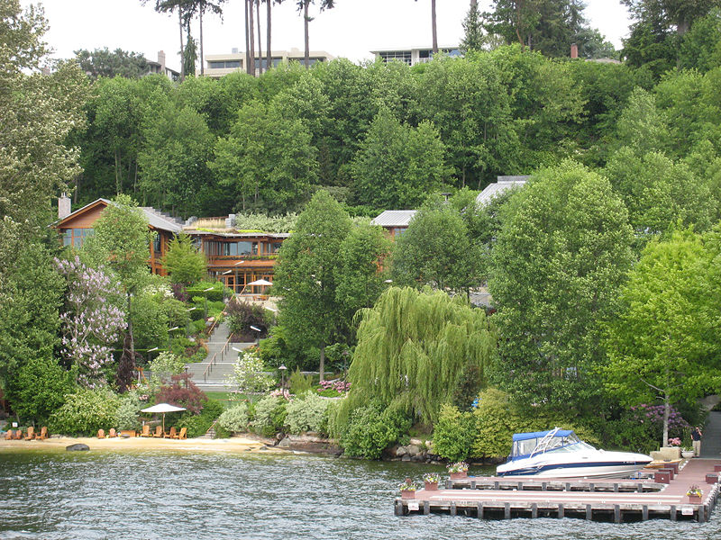
There, that’s a nice quite view, “Xanadu” house nestled amongst trees on the shores of Lake Washington. Nothing too extravagant there. Much like the Windows program the world uses – a nice front cover / home page, hiding all the workings behind the scene. Wikipedia says it is 6,100m2 and valued at US$147 million. But what if we were to, say, jump in a chopper and fly up a little, to get more of an idea how big this house is?

Gosh – that’s a little scary. Like Windows itself, there’s a large mass of disorganised planning and bolt-on additions hidden just behind the surface. It cost millions and millions and kept on growing in a bloated fashion. There’s a picture on the web of a fish tank purporting to be Bill’s – although I don’t really believe it. It just seems too big, and too uncluttered, but it could be where old Bill got the idea for the Windows “blue screen of death”.
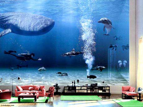
Yes, exactly – amusing, but highly unlikely. A whale, a shark, a dolphin, and a diver, all happily swimming together – naaa, I’m not buying that. It is hard to know what is true about this house – one website, where you can ‘take a virtual tour’ (no, not really, but there are some pop-ups), notes that the garage is:
“Size: 6,300 sq. ft. This cavelike structure is the largest and best hidden of three garages. Built entirely underground of concrete and stainless steel, it can easily park 10 or more cars. Some of the concrete is purposely broken for a “deconstructivist” look”
Ooooh, yuck, bad 80s / 90s deconstructivism. That’ll date you. Just have a look at this fireplace!
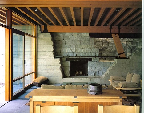
Hideous beyond reproach. I suspect we all knew, but I think it is official, and a reminder as to why Windows is just so naff (design direction from the head down… …and don’t even get me started on Steve Ballmer!). I’ve seen enough. Architects on this were Bohlin Cywinski Jackson- here is the link from their website.
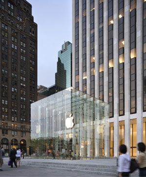
So, enough of that crap. What about that other computer system mogul, the notorious design nazi Steve Jobs, king of Apple? Seeing as Apple has now grown to such proportions that it is the most highly valued company since just about the beginning of time, and Jobs has made us all covet iPods, iPhones, and iPads, not to mention a gleaming MacBook Air for Christmas… what would he build? I found this quite interesting – it seems, they are also the architect for his own house. Oh-oh, not sounding good so far, right? But then again, they are the same architects on the super-gorgeous minimalist Apple stores in the US and UK – all by Bohlin Cywinski Jackson as well. Which I think we can all agree are a tour-de-force of minimalism.
So, having seen all that, what do you think of these plans – rumoured by Gizmodo to be Steve Jobs latest house plans:

Too small to really see the details, I know, but basically it is just a simple sleek 3-4 bedroom house, minimalist, calm and quiet and with a logical sense of order and no bloated silly features. All the service spaces in one single simple row, tightly packed into a solid state core, and the rest is glazing. Oh, wait, no, that’s the iPad.
Here’s a young Steve jobs, pictured in a Diana Walker photo from 1982, when Steve was meditating on a minimalist approach:

Yes, surely a minimal house for a notorious minimalist – that must be it? But the house plans, sad to say, are not the real Steve Jobs house. In fact, you could say that they are Fake Steve Jobs house. So we’re still left none the wiser. The new Jobs house is rumoured to be under 500m2 in size, and still under design. Jobs has had a lot of criticism over the last few years for buying a heritage property, the Jackling House, and then applying to tear it down.
“Nearly everyone knows that in August, after almost a decade of delays, the Apple CEO was finally granted a demolition permit to tear down the now-dilapidated 1920s Woodside, Calif. estate of copper magnate Daniel C. Jackling, where he plans to build his own house. On Tuesday, Gizmodo released what it said were exclusive blueprints of the mansion.
There’s just one problem: The plans that the site chose to show (see below) were scanned from Woodside’s June 2009 Town Council Agenda, and were for the sole use of estimating the environmental costs of various demolition alternatives for the Jackling House. Designed by famed California architect George Washington Smith, the 17,250-square-foot, 14-bedroom Jackling House was once a pristine gem of Spanish Colonial Revival architecture. Jobs bought the six-acre property in 1983 at the tender age of 29, with the explicit intention of tearing it down. “[It’s] one of the biggest abominations of a house I’ve ever seen,” he was quoted as saying in The New York Times in 2004, when he first applied for a demolition permit. The house was ”poorly built. It was never really a very interesting house to start with, so I think I could build something far, far nicer and far more historically interesting down the road.”



That’s an interesting picture of the mansion Jobs wants to demolish. I’ve read about the ongoing battle for years and that’s the first time I’ve actually seen a picture of it. The articles I’ve read always painted this lovely picture and depicted Jobs as some history hating monster, but seeing that picture definitely puts me on his side of the battle.
I hate the windows vs. mac battles, people are free to like whatever they want and to have it become personal attacks is ridiculous. That being said, for me the difference between the products and the people who buy them is purely about design (or perhaps more properly aesthetics). Windows has never shown any interest in design whereas apple has always made design the number 1 priority (and sometimes that has been their failure – the mac cube was beautiful but flawed)
There is another entrant in the architectural discussion – Paul Allen, also of MS is a huge developer in Seattle. His development company – Vulcan Real Estate has had a huge impact on the city, particularly the south lake union area. What’s interesting to note is that in 2000 he had a fairly provocative design with 505 Union Station.
http://www.glasssteelandstone.com/BuildingDetail/569.php
Since then however, it has been tired and boring designs one after another. 505 isn’t even featured on their website anymore.
http://www.vulcanrealestate.com/default.aspx
Now, whether you like the design of 505 Union Station isn’t really the issue, rather the lack of interest in provocative design that characterises all of the work since then. (It should be noted that the Seattle architecture scene is fairly conservative, with a few notable exceptions.)
There is something about the microsoft culture that does not celebrate design exploration.
And if anyone has missed it, there is a great video highlighting the design problem (which came from within microsoft)
http://www.youtube.com/watch?v=EUXnJraKM3k
http://www.ipodobserver.com/ipo/article/Microsoft_Confirms_it_Originated_iPod_Box_Parody_Video/
that 505 Union Station is quite a doozie. Sort-of, very like-of in fact, the Maritime Tower building in Wellington by WAM, and the following comment from the site Minimus references says it all really:
“….The one that caught our eye was 505 Union Station. Let us first be so gauche as to say that we find it très European, even though it borders on the city’s International District, which is primarily focused on Asia. The green glass curtain walls seem separated from the building itself, as if they were a cocoon protecting the larval office workers germinating inside. It hangs over Fourth Avenue in a way that is most likely unsettling to drunk drivers and those not paying enough attention to the road. It’s a great green avalanche waiting to happen on one side, and a waterfall of algae frozen in time on another.
There is more than just the “Union Station” name tying 505 to its sister buildings in the same complex. There is also the matter of a giant rubber band. It runs under the buildings, is indeed made of rubber, and holds everything together in case of an earthquake.”
Now that is an earthquake strengthening method i have not heard of before – a giant rubber band. I’d be interested to know more about that !
Paul Allen’s main contribution to Seattle architecture is likely to remain EMP (for Experience Music Project) which sits in the park next to the Space Needle.
http://www.gkweb.net/galleries/gallery.php?id=807
It’s one of those Gehry computer-generated paper crumples sheathed in shimmery titanium like the ultimate boy racer paint job. Apparently Allen wanted to build a memorabilia museum for his collection of hometown boy Jimi Hendrix’s clobber, but when Gehry and the multi-media technocrats had done with him he found himself stumping up for a little bit of Bilbao on Puget Sound.
The EMP’s impact is minimal compared to Allen’s real estate development efforts. The whole South Lake Union neighbourhood development is from him. He’s developed over 1 million square metres in downtown seattle. That’s larger than all of Wellington CBD. The experience music project is an architectural folly by comparison.
and not just a folly – wasn’t it a disaster? or was that just the Sheffield music centre, which was pure unmitigated mess.
If money’s no object and you want something very tall…
http://en.wikipedia.org/wiki/Antilia_%28building%29
Location is everything. If you had several billion dollars, would you choose to live in either Seattle (wet, cold, and not very interesting) or northern Silicon Valley (ugly, not very interesting)?
Personally I’d be renovating an old building in Venice. Well not personally, of course, since I’d be able to afford minions. Or I’d live some cool fun place like New York or Prague.
@maximus- yes, it (the EMP) has been a disaster, both architecturally and economically. The only redeeming feature about it is that you go around the exhibits with headphones, so it’s a great place to take the parents you can’t stand to be around when they come to visit.
@davidp – wellington literally gets twice as much rain, seattle has actual summers with hot weather (unlike wellington), and it doesn’t have the wind we have. I like wellington, but as a city and a climate I would much rather have seattle. It’s just a shame it’s connected to the US.
You unfortunately have no idea about what you’re talking about. The house has not been added to, that’s the entire house as it was designed.
Suggesting “disorganised planning” (SIC) as well as quoting a website that completely misuses the term “deconstructivist” (No, really, look it up. It doesn’t mean ‘broken’ or ‘taken apart’ at all.) indicates you haven’t the first clue about architecture. Only the worst buildings are designed strictly in plan (That’s ‘from above’ FYI) considering most people can’t hire a chopper and look down on the complex but instead see it as they exist within it.
Next time keep your snark in your pocket and don’t feed the trolls.
Darken = Bill Gates’ long lost architect?
OooooOOoooooh look at you! Wow, really touched a sore point there! Maybe you’re an architect working for a certain US firm. I’m most amused at your comments that I haven’t the first clue about architecture. I think I may just agree to disagree on that, but thank you for your input to the conversation. As regular readers of this site will notice, we try to encourage discussion about architecture, and frequently make provocative comments, although I didn’t think I was making any risque comments there at all.
If indeed the house was designed like that, and it was not added onto in the design process, then I think it proves my point completely about a lack of clear and logical forethought in its planning. It is messy. It is all over the place, like a fire ant on a hot plate. I would be fired if I produced a plan like that – and yes, I’ve seen the scheme for the house as published, and the bigger glossier photos don’t do it any more justice. Maybe that’s just because I admire modernism more than post-modernism, and I find ‘organic’ planning tiresome. I had heard that the client added more features to the mix during teh design phase – I haven’t met a client who doesn’t do that – but that could explain why the design is confused. My comments about the similarities with Windows itself seem completely justified, to me at least.
“Only the worst buildings are designed strictly in plan” – well I’d agree that you can’t design buildings only in plan, and that I always work in 3d with emphasis on the section, but “only the worst”? Think I’m going to disagree with you there as well.
Yes, I agree that the website I quoted from misuses the term deconstructivist – but then again I would argue that the picture of the fireplace shows an atrocious piece of design – unnecessarily forced – and a hideous over-sized angled column – the picture of the front of the garage was even worse, and made me shudder. On balance, I think I would stand by my words – including the NZ spelling of disorganised – we don’t use a Z for that S in this part of the world.
Anyway – glad to have your input. Do keep up with the reading and the commenting!
I think you rely too much on hear-say with this article.
I’m not suggesting you need to like it, but you’re not doing your readers any favors by trying to justify your personal taste with architectural lingo, especially when you have your terminology incorrect from the get-go. Educate your readers, and maybe they will join you in your opinions.
And I am neither an architect nor have I ever met Bill Gates. Or Steve Jobs.
Well… that was FUN!
My guess is Bill Gates just graced us with his presence. With a screen name like Darken, it could only come from the evil empire in Redmond.
I kid.
only 50% of what I said is true.
@darken
You do realise that you as well could “Educate your readers, and maybe they will join you in your opinions.”
So why don’t you give us a lesson on the meaning of deconstructionist architecture?
What’s that? You’d rather just make snide comments and criticisms?
well then, Next time keep your snark in your pocket and don’t feed the trolls.
minimus>wellington literally gets twice as much rain, seattle has actual summers with hot weather (unlike wellington), and it doesn’t have the wind we have. I like wellington, but as a city and a climate I would much rather have seattle.
If I were a multi-billionaire then I wouldn’t be living in Wellington either.
mimimus, I wish I was proficient enough in the intricacies of the movement to do so. I’m not, so I’ll spare you the attempt. But like I pointed out before, careless usage of a term can lead to uneducated opinions run rampant.
Darken, no, don’t go – I’m enjoying this. The computer says you come from New York, but you obviously know Seattle well, or at least this house? Maybe?
I’m wondering – have you ever been to the house? Not sure if the inner sanctum of Billdom ever gets opened to the common folk like you and me – I presume not, but you never know. But maybe once a year his Billness and Melinda throw open the doors to members of the Lake Washington Architecture Appreciation Society, and cook up a few hot dogs on the barbeque… …but probably not.
I actually quite like the concept of feeding trolls – not that any of our readers are trolls of course – and am chortling with mirth at the thought of “is that a snark in your pocket or are you just pleased to see me.” I might use that on US Customs next time I grace your country with my presence.
But you do raise a good question – what exactly IS deconstructivist architecture? I mean, even the people who still do this (now pretty tired and outdated stylistic) stuff can’t probably put their finger on exactly what it is. Wolf Prix and the Coop Himmelbau are just so… yawn. Wigley can talk the hind legs off a donkey, but no sense ever comes out, its all just hot air, and verbal gymnastics, and he has never built a thing in his life as far as I know. Gehry is a wildly successful one-line joker, and I think the public are now understanding that his architecture is a fraud. Zaha – well, Zaha is a goddess, but her buildings have moved well away from deconstructivism towards a more fluid super-modernity, and photograph better than they are to experience in the flesh. Much like Zaha herself.
So – how do you define decon? For instance, Wikipedia says: “Deconstructivism in architecture, also called deconstruction, is a development of postmodern architecture that began in the late 1980s. It is characterized by ideas of fragmentation, an interest in manipulating ideas of a structure’s surface or skin, non-rectilinear shapes which serve to distort and dislocate some of the elements of architecture, such as structure and envelope. The finished visual appearance of buildings that exhibit the many deconstructivist “styles” is characterized by a stimulating unpredictability and a controlled chaos.”
Now, while I personally wouldn’t have called that troublesome fireplace ‘decon’, it does seem to be fitting a fair few of those points above.
Fragmented? tick
Distorted? tick
Controlled chaos? tick
Dislocated elements? tick
Well I’ll be damned, along with my snarky pockets – my ‘uneducated opinion running rampant’ as it may be, that fireplace does seem to be somewhat deconstructed after all.
I have not been to the house. I’m as much at the mercy of the photos as you are.
I’m not a big fan of Deconstruction, because it’s attempting to take a literary exploration (Derrida) which at its roots attempts to take apart language using said language (an uphill battle if there ever was one), and apply it to the built environment. It’s not as simple as taking something apart and looking at it, or building something so you can see how it’s made. So I feel that the entire movement is something that is a bit like tilting at windmills. It’s definitely not my cup of tea, but Morphosis makes some really great spaces, as does Coop. Zaha is not my cup of tea, but I do enjoy her buildings on an intellectual level.
The fireplace is, in my view, not attempting to co-opt the deconstruction movement (or style, as it has become) but attempting to knock the edges off of a strict modernism, literally in this case. Bohlin, Cywinski, Jackson’s work is modernist in foundation, even though the tenets thereof seem to be discarded whenever it suits them. So having a deconstructivist hearth seems like it would be going a bit far afield for them. Then again, the design was a collaboration, so maybe Cutler Anderson Architects had something to do with that. Then again, they seem to be modernist as well.
Regarding uneducated opinions, my last post was not aimed at you, but at the idea that offhand comments can create permanent ideas in others’ minds without the speaker’s intention. I was not calling you uneducated, and if I came across as saying so, please accept my apology.
If I ever get down to NZ (which I’d love to,) I’ll buy you a beer.
Any way to edit one’s comments? I noticed too late that my previous comment had numerous cups of tea in it.
Now: onto the subject of Trolls, specifically those on the Internet. Again, the font of all knowledge, Wikipedia, says:
“In Internet slang, a troll is someone who posts inflammatory, extraneous, or off-topic messages in an online community, such as an online discussion forum, chat room, or blog, with the primary intent of provoking other users into a desired emotional response or of otherwise disrupting normal on-topic discussion.”
Hmmmmm. Not sure if any of my comments are trollish really. But on the subject of Bill’s house, here is a blog where some real troll-like characters live:
http://labnol.blogspot.com/2005/05/inside-bill-gates-home.html
I’ll quote you some of them – to me, these are the real trolls:
• oh my god dawn i wish i was you bill gate. i do not care what other people say about you. all though i did not see in side your house i still like you by the way where did you get all that money i wish i had all that money i just love that house but just let me see in side of it and then i will tell u the rest. love you
• well i just can say that mr.Bill Gates is the owner if the biggest and the most comfortable house in the world
• It was wonderful view of bill gates house.i think he must be the happiest man in the world.i wish no one could beat him via knowledge or money .BILL GATES the role model of all youngsters.
• Boy! I wonder how it feels like to be Bill Gates!!
• man bill gates has so much money he could buy every car company in the world,and thats in a good way dude id like to take a tour of his house dodnt get me wrong but i love my parents, but the life of being his kid sheeew i bet his kid wear corvetts on his feet his so rich
• Thank you very much sir for you support to people. I vote you as my all time hero. May God bless you.You lead the world richest forbe until you are invited to heaven and i will have to succed you because you are my roll model
• I can’t imagine living in a house that size. It really is beautiful. I’d love to see the inside. It must be an amazing site at night with the lights on. I love that Bill put the house right on the water. Beautiful!
• Its really great to see the achievements of Mr Bill Gates.
He is a Innovator who has changed the world into the digital gadget by developing world class Microsoft applications in day to day Office and private Life. He is real technical HERO of the World . Syed Farhan –India
• Gates is one of the greatest men that ever lived. He’s my mentor especially in the area of philanthropy. He’s really great. Thumbs up for you man!
• awesome house…great sucess but friends did you know that Mr Gates can not hold himself even for 20 secs while having sex with his wife. In early 1980’s his marriage was on the rocks because he sucks as a sex partner. Its just the money that is keeping the family together…trust me its all so hollow!!!
• You’re an idiot. He didn’t know his future wife in the early 80’s and wasn’t married until 1994.
No, once the comments are posted up there, only our administrator can edit them – you’ll just have to stay with two cups of tea. No offence taken – its all good. But I’ll take you up on that beer offer. Come on down!
You’re right about the transliteration from the literary quagmire of Derrida into the built form as being like tilting at windmills – the work of the decon architects often look far better just as a drawn form, than as a built one. It is perhaps an art form more suited to an intellectual pursuit, than to a built one.
A question – do you live anywhere near Fairmont?
If I were a billionaire (and I might be, because on the internet no one knows you’re a dog) there is NO way I’d let people post photos of the inside of my home online. You’d think Gates would be able to afford some privacy.
David, if you were a billionaire you wouldn’t be living in that apartment building, but maybe you would be up on Mt Vic in Terry S’s old pad (I wonder if he will have to sell his Lambos and house – he is still sponsoring the Phoenix and the Wellington Cup day I see).
I can imagine that there have been a fair few discussions on his privacy between Bohlin Cywinski Jackson and Mr Gates’ PA. The ‘house’ has won :
1997 National Honor Award – American Institute of Architects, and
1997 Honor Award for Design Excellence – AIA Pennsylvania
which is not very many really, and has never been publicly acknowledged as Gates’ House in the publications – if you look at BCJ’s published works, there are some more views of the inside.
So far, everyone has been ignoring the point of the post, which was actually about Steve Jobs house. Given that he does not live in the Jackling House, as it is derelict, and is being prepared for demolition, where does he live? I’m picturing something more than just the one room pictured above (taken 2 years before he invented the Macintosh). Or is it just that he lives full time at 1 Infinite Loop, Cupertino?
Re: The Jacking House — the building has been purchased by an investor who plans to move it to another site and restore it.
The photograph shows the house in a derelict state. Not too many houses look their best after years of neglect.
George Washington Smith is perhaps the greatest architect of the California Mission style after Addison Mizner. His houses are beautifully modeled and proportioned and achieve their effects without the trickery associated with period revivals. That Jobs could not look past the condition of the building to see it as what it is – a supremely livable work of art – suggests a philistinism that no amount of kneejerk “minimalism” can whitewash.
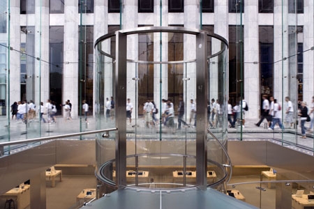
The Apple stores are absolutely and irredeemably hideous. I can only assume Fish has not seen them in real life. Cellophane garbage and the one in New York desecrates Edward Durell Stone’s original General Motors Plaza.
How does one desecrate a desolate, wind-swept failure of modernist urban planning?
David G – thanks for the input, and you’re clearly a man who knows the works of George Washington Smith more than me, but as far as I can tell from the few pictures I have seen, the house has been butchered by the renovations and additions in the 1960s. I know that the proposed removal of this house has stirred up a huge amount of local animosity towards Jobs – and there is a lot towards the argument that if he didn’t like the building, he shouldn’t have bought the site – but honestly, the house does look a little…. uninspiring. I don’t know if i would agree with Jobs’ quote that it was an abomination, but then I can’t agree with your comment that it is a "supremely livable work of art" either.
Have you got any links to some decent pictures where we could learn more?
The Fish may not have seen the Apple stores in real life, but I have. So far have visited 4 stores in New York, 1 in Sydney, and 2 in London – and totally disagree with David G’s comments that they are “absolutely and irredeemably hideous”.
That’s just a ridiculous statement to say. They are superbly detailed, both internally where they intersect glass stairs and bridges, with the existing (and in some cases, heritage) fabric of the pre-existing buildings – and also externally, where they intersect with the existing urban fabric. The old GM Plaza by Stone has come to life in a manner unseen since its inception (in the 60s?) and the minimalist interventions could in no way be described as a desecration. As Darken says, it was a bit of a failure of modernist urban planning – well, most of the 1960s urban planning was a bit of a failure if we are to be honest, and the substitution of the glass Apple for the central former fountain on this Plaza has really picked up the game. When I was there in June, the Apple store on 5th Ave was easily the most popular place to shop in New York, and the cleaner was going non-stop to keep the glass pristinely clean and no rubbish was seen at all.
I can presume that you’re obviously a fan of heritage rather than modernism – which is fair enough, each to their own, but can I ask you – what do you think of the new Hurst tower you can see from the forecourt of GM Plaza? I’m in two minds – interesting new building, but a bit of a shock to the old Hurst mansion / podium.
Oh – and while I remember, if you’re a fan of Spanish Mission style architecture, then you should come out some time and visit the cities of Napier and Hastings in New Zealand. They were both destroyed by an earthquake in 1931, and rebuilt in a mixture of Art Deco and Spanish Mission style buildings. Not as grand as Montecito of course, but then what is. Still, you might enjoy the visit to see a variation on the work of GW Smith and also variations by another architect on FL Wright.
David G – don’t go away! Tell us more !
Darken – I think I’m with you on this one…
Guy – got any pics? We can post them up if you like.
Maximus,
If you really want to see what a house with no budget and property with no limits looks like, then maybe you should scroll the net for some images of our own Sir Peters house just out of Masterton. Reportedly so secret, the contractors were allowed no cell phones, or cameras on site. A man made lake, complete hobbiton on an island in the lake and an underground tunnel below the lake linking it to the main house…It may be sheilded from prying eyes, but goggle has a nice shot, and you can even make out the train around the lake.. and a possible extension to it. I’m sure no one can be grudge him the house, but given the wonderous worls he’s taken us to, we’d probably all like to see it!
So many Davids this week. I presume you are neither David P nor David G, but a good idea nonetheless. I’ve been wanting to cover that for quite some time – must have slipped my net. The rumour I heard was that he was not keen on Architects either, so he approached his plumber instead for the alterations to his Karaka Bay house. Allegedly, the plumber then asked an engineer, who asked an architect – and PJ never knew. Bound to have at least a kernel of truth in there somewhere…?
What do we think of Norman Foster being tipped to design Apple’s new Campus?
http://www.maclife.com/article/news/norman_foster_design_new_apple_campus_apple_city
Masdar City always seemed like a bit of a pipe dream, but Apple has the cash, and the need, to started building a new campus in the near future.
Don’t know about you, but I think the end results will be very very minimal, and very, very white…
Oooh, just found this on Wiki (pedia, not Leaks). You probably already knew.
“Often, calling someone a troll makes assumptions about a writer’s motives. Regardless of the circumstances, controversial posts may attract a particularly strong response from those unfamiliar with the robust dialogue found in some online, rather than physical, communities. Experienced participants in online forums know that the most effective way to discourage a troll is usually to ignore him or her, because responding tends to encourage trolls to continue disruptive posts — hence the often-seen warning: “Please do not feed the trolls”.”
http://www.casadelherrero.com/ is the website of a GWS mansion being restored as a museum. The photographs show how Smith achieved a wonderful sense of sequence and mass with a minimum of fuss and almost entirely without the showy effects associated with most architecture of the Gatsby age. The Jackling house has been severely compromised, but even in its desolate state it shares something of the serene horizontal forms of Irving Gill’s now-demolished Dodge House, a work of great sophistication which yet was perhaps less well integrated on its site.
GM Plaza “a desolate, wind-swept failure of modernist urban planning?” Ah yes, those sweeping, searing, midtown winds. For those unfamiliar with the site, it is a small plaza before a large white marble skyscraper that is also bordered by the Art Deco Bergdorf Building to the south, the French Gothic Plaza Hotel and the Pulitzer Fountain across Fifth and the wonderful Gothic skyscraper of the Sherry Netherland to the north. Hardly a poke in the eyeball with a flaming stick. Stone’s own brand of luxy, slightly camp casino futurism has its share of detractors, but it is at least an attempt to accomplish something by way of form and materials. The Apple Store looks like a plastic package left in the plaza from some cyclopean take-out bento box.
Had Rogers’ addition to the Hearst Building been one bay narrower it would have carried the day. As it is the trunk of the building seems too stout. The new lobby is quite dramatic.
Max, I can confirm that PJ’s place in Matahiwi has a tunnel from the wine cellar leading to a replica hobbit house – as for the Karaka Bay place it used to be owned by a building contractor who would chuck another room on whenever the boys had a bit of downtime.A hallway leads to more bedrooms than one feels are appropriate which is an odd sensation. Mr J may well have changed all that but I know he’s got the stained glass dome in there that I think used to be in the Nat Bank cnr Vivian and Cuba before it became Logan Brown.
A rumour has it that he gets an engineer to certify that the place will stay up and the council are too polite to ask for permits – at any rate I figure if a guy puts that much money into the local and national economy he should get a bit of leeway.
I was in the Sounds last week and if you want to see some hideously expensive follies, Paritai Drive is not the only place to look.
Your use of hyperbolic simile has convinced me.
hyperbolic simile? Me too. David G’s “cyclopean take-out bento box”? Yep, hits the nail on the head. Although, I’ve always admired bento boxes…
He’s right about the Hearst Tower too – a bit too fat and chunky, (by Foster and Partners, not Rogers), but with a fantastic foyer. I’ll fish out some photos and send through to the Fish.
And, for those that are interested, a few more photos of the Apple Store in New York, posted over at the Architectural Centre website here:
http://architecture.org.nz/2010/12/18/apple-of-my-eye/
Foster it is. My complete indifference to modern British architecture has tripped me up!