Today is a big day for architecture in Wellington. No, not because some architect has been given a gong in the Queen’s Birthday honours list – that hardly ever happens in NZ – we only award people who run, jump, or otherwise sweat their way into awards. I find that curious – that the people who have the biggest effect on the physical world around us, the architects and engineers that plan and design the built environment, and the contractors that build it, escape time after time from the award system as if what we do is of no consequence. Of the architects who have won awards in the past, I can recollect only one high roller – Sir Miles Warren. And also Athfield, Moller, Walker, Natusch, McCoy, McRae, Mercep and Sang with slightly smaller gongs. There may be a few more – please enlighten me – but it does show that perhaps our craft is not held in high regard by those pesky politicians who wield the power.

Instead the politicos give the highest awards to those who once ran very fast, or gave away lots of someone’s money, or someone rarely deserving who helped save the Maori language. The next highest orders of merit go to people like talk show idiot Murray Deaker, and a lot for people who either administer sport or who once played sport. A total of 21 awards given today for those in sport. The banality of our obsession with sport exhausts me at times.
A massive amount of awards also go to hitherto unknown mindless folk in government, or to those others for ‘services to the community’. The whole system is a total farce, made even more so by the petty resurgence of naming recipients as Sir or Dame. Pathetic grovelingness knows no bounds. Queue hordes of fat cat business men to rip off the country and then put their hand out for a reward. Stand up Fay and Richwhite, richly rewarded for asset stripping the country back to the stone age, then leaving to exile in Switzerland, knighthood firmly thrust in bulging pockets. The grubby reality of knighthoods is rarely as good as the noble chivalrous imagery.


It’s better then, that we applaud the imminent opening of the newest building in Wellington, the massively large white-clad edifice on the waterfront that will be known as the BNZ. For years having resided in the large black obelisk that came to be known by some as Darth Vader’s pencil case, and is now confusingly known as the State Insurance tower (despite it still housing large chunks of the BNZ), the BNZ is once again retreating into one building, but with a massively different slant. The old BNZ (26 floors, designed by Stephenson & Turner in the 1960s, constructed over a period of over a dozen years and completed only in 1983), was a expression of it’s structural pedigree, and proudly stood up as a paragon of proud financial virtue, safeguarding our funds, the BNZ name and the NZIA logo emblazoned along the top: the tallest building in NZ for 3 short years.
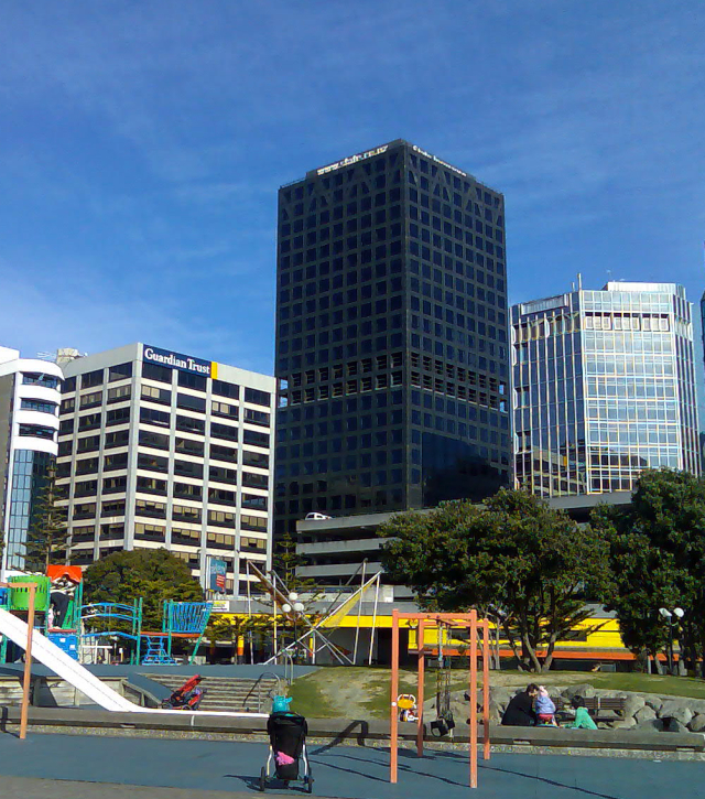
Obviously, due to the length of time the building was tied up in the Boilermaker’s Union dispute (including 9 years as a rusting skeleton), the building was out of date before it opened, and is now anathema to the way that modern companies like to work. Not enough interaction between staff. The old upright model of a bank building has in effect fallen on its side, if not on its sword.
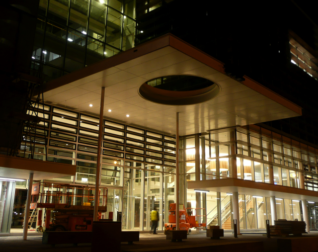
The new BNZ building represents a ground shift in thinking for the newly rebranded ‘tooth-paste logo‘ BNZ. With the new building, there are no more individual office floors, and impregnable realms of bosses hiding away: with its new 5 storey Jasmax design hugging the ground and hogging the shoreline, the new BNZ instead has 3 large floor plates interspersed with 2 giant atriums.
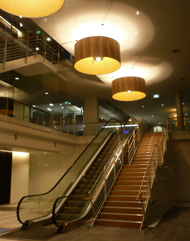
While one of these atriums is still held aloof one floor up and presumably will be accessible for staff only, the remaining atrium appears to be directly accessible to the public and should be a fantastic space for Wellington. It is crossed with aerial walkways that help the staff circulate, and has stairs rising up within. I also trust that it will have publicly accessible functions on the ground floor. If it does, I shall go and have lunch there every day. It is so close to the sea that you can almost imagine the fishing boats pulling up to the front of the atrium and selling their fresh fish catch direct to the public within the pleasantly large volume of the building.
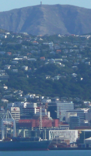
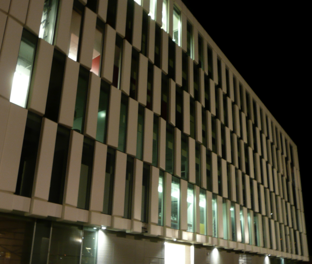
But of course that won’t happen. There will be no public interaction within the building – the space will be closed off each night – we will not be having a Bavarian beer hall in the foyer during our occasional inclement weather. Still: at least it does make (or has been forced to make) a space for people. Yes, we know that the building is too massively large to comfortably sit there and hog so much foreshore, for sure, and that the relentless telescoping checker pattern facade doesn’t really work as a visual illusion, instead acting more as a giant white snake shedding its skin: but this is a building that offers a rare chance to add to Wellington’s public space network, to extend the lure of the waterfront walkway along from the central city and may one day even link in the forlornly marooned Centre Port facility back into the loop to let the workers there feel like they are still part of Wellington.



A bit harsh on poor old Key and English aren’t you? They’re only doing their best to keep their right wing business backers happy after all. Crusty old farts in pin striped suits love to think that there is a chance they could be called Sir. Or Madam, if they’re into cross dressing.
So you like the building? I thinnk its banal. Large, lumpen, boxy, and just too large.
well, it is large and boxy, there’s no doubt about that. But largeness and boxyness in themselves are not necessarily evil, bad things.
Revell in its boxyness…. Enjoy the largeness. and reserve judgement until you’ve seen the space….
don’t forget Sir Michael Fowler…..I’m sure he was knighted for Architecture and not for his time as Mayor. surely
Aaah, Simon, you’re right of course. How could i forget? But then again, his moves on architecture were all administrative rather than creative – he authorised destruction and renewal of buildings rather than be known for their creative origins – in fact, I can’t think of many buildings he may have designed at all. Enlighten me.
So, on reflection, i think he may have been knighted for services to Mayordom than ArchiDom…..
When are you coming back? Had enough yet?
but anyway, that would been in the late 70s or early 80s. Say 30 years ago. Sort of proves my point that its a fairly uncommon thing, no?
try looking at the box from the lookout halfway up the wadestown hill. not only does it block out the entire inner harbour view but after about 2 seconds the facade pattern causes excruciating eye strain. the perfect outcome for an ugly building.
The most famous building of his is the OPT I think? And he designed some large vineyard buildings in Marlborough and I think a few Churches? He was on reccord for endorsing the Athfield proposal for the OPT i think
Haven’t had enough yet…..I Cant tear myself away from the Netherlands yet its summer over here……
I’ll tell you what I think is strange about the new building, (well, not the building itself, but it’s environs….) are the really clumpy macrocarpa (?) seats? bollards? landscaping features? out the front.
They just look really….. rural.
If they wanted an idea of how to do a macrocarpa seat they didn’t need to go far – the Athfield ones are great, as are the Isthmus ones around Meridian.
Strange that there is no real consistency of style.
Is it because the BNZ is on Centreport land and the rest is Wellington Waterfront?
They need to talk to each other….
As for the building itself – I think some facades are better than others.
I like the east and west views. It was like Jasmax thought “we’ve got one big f**koff bulding here, we need to break it up a bit….” and by and large they have succeeded on those fronts.
But the North and South are not so good. Too big. They have tried to create interest with the window / panel treatment, but it just ends up looking bitsy to me.
The building does look well detailed though, and the atrium’s look like great spaces.
The view through at night is great.
I look forward to walking through.
The seats around the Meridian are particularly good (especially underlit at night) – great slabs with the front that rises up rather than the seat that overhangs. Nice. Apart from the strange northernmost ones that have grown a silly back… out of proportion and completely unnecessary. Perhaps they are on CentrePort land and beyond the scope of Wellington Waterfront? In the end we should assess public spaces as much by things we can touch (seats, walkways etc) as the thinks we look at. Which is why the user-unfriendly thumping great aggregate concrete Frank Kitts park must go.
I’m not surprised that there are some differences between the landscaping that was done at CentrePort and that completed at Kumutoto or further round the waterfront. I think that Wraight and her team did the landscaping at CentrePort, as well as at Waitangi Park. Athfields did the landscaping around the Taranaki Wharf, and then a combined Studio Pacific and Ishtmus team did the landscaping at Kumutoto. So there are bound to be a few different designs along the way. Not sure who is doing the landscaping alongside the BNZ though.
Perhaps the Council are doing all the tree planting?
dr who – “try looking at the box from the lookout halfway up the wadestown hill. not only does it block out the entire inner harbour view but after about 2 seconds the facade pattern causes excruciating eye strain. the perfect outcome for an ugly building.”
it’s a sensory effect used by the daleks to reduce visual stimulant input in timelords such as yourself, due to the diurnal beating of your twin hearts. Mere mortals (and fish) do not suffer from this hallucinatory effect….
mobsta:
apparently the north and south facades are patterned like that to mimic the effect of a check pattern wrapped around a cylinder. So that as the white panels get closer together, they supposedly look like the surface is curving round into the distance.
not sure it works though