I’m still trying to get to grips with how to publish prodigiously here on the Fish, as my esteemed predecessor did, and thinking of articles – and actually writing them, are two very different scenarios it seems. For instance, today in the Dom Post the front page of the World section notes that “Better buildings needed as cyclones move south”, which at first seemed totally relevant to a column about architecture – until I realised that it was really just discussing a general need in New South Wales, rather than an actual here-and-now need in New South Zealand. Apparently the Tropics are expanding at the rate of 150-300 kilometers per 30 years, which at that rate I will be about three hundred years old before NZ is officially part of the tropics. I need something more current than that.
Just inside however, is a much more juicy story – that Mark Zuckerberg is planning on building a waterside village nicknamed Zee-town – near Menlo Park in Northern California. It’s in the paper, but not online, except at the Daily Mail, which I refuse to link you in to. The big news there really is that Zuck is getting Gehry to design it for him – which could be a recipe for the most brilliant concoction ever, or more likely, an unfolding disaster. I dunno: Gehry – world’s best architect, or a has-been well past his use-by date?
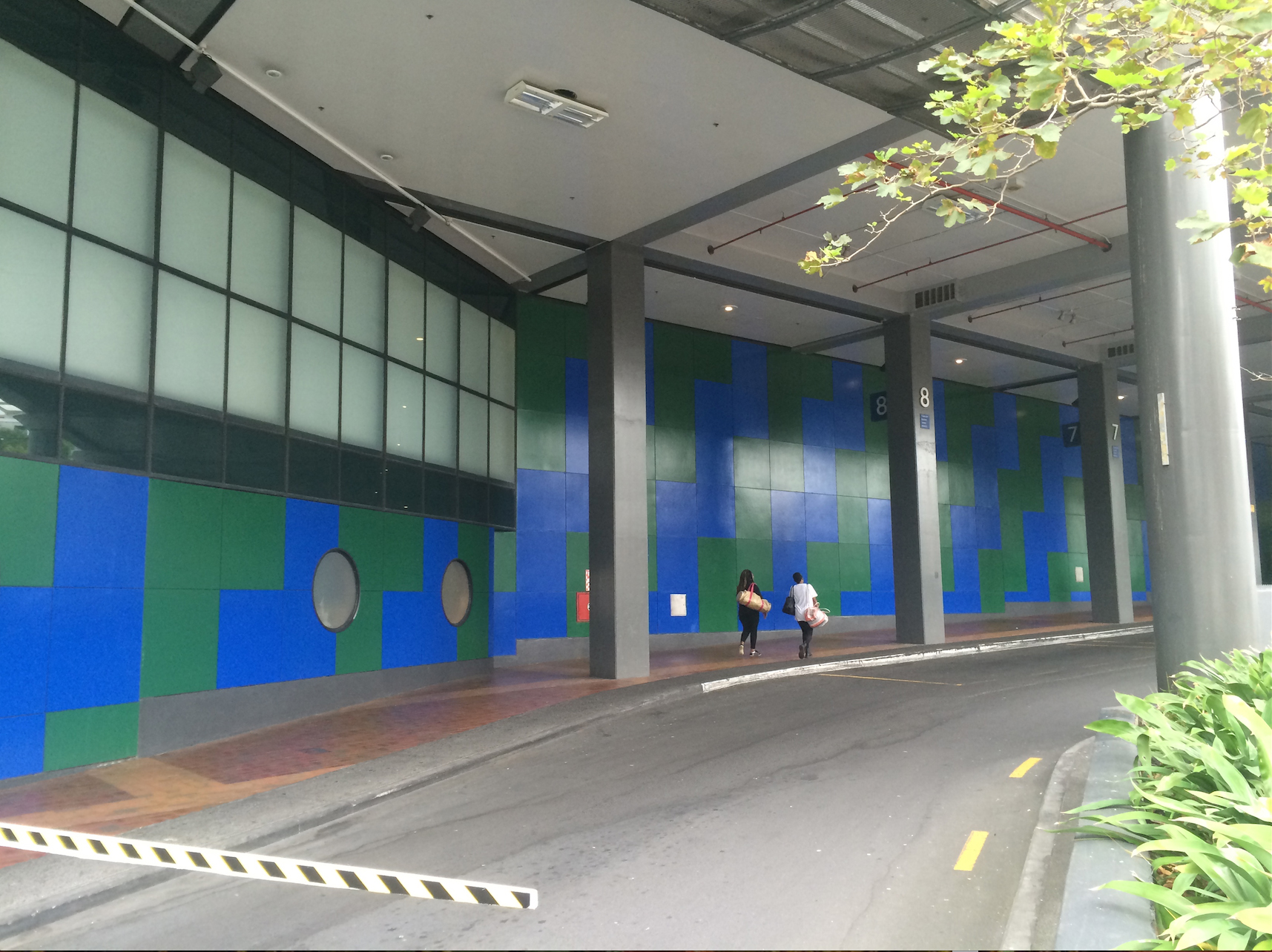
So instead, just for now, I’m going to include a picture of the current Sky City entry in Auckland – not the pedestrian entry for the rich Asians who come by limo – but the pedestrian entry for those who actually walk up the street and in through the “bus-station” – otherwise known as the arse-end of the beast. I don’t know about you, but if Prime Minister John Key says that the Conference Centre may have to get a bit ugly to get it built, can the architect for the new section possibly make it any more ugly than the existing Sky City Conference Centre? Because this is honestly pretty bad… Scant attention paid to the experience of the pedestrian. I get the feeling that the Bus station was forced on Sky City at the last minute, when all the money had already been spent. Miserable…


” Scant attention paid to the experience of the pedestrian. ”
But, but, there’s colour and round windows and things. What more do you need?
One thing that architects / designers / builders here (in Wellington at least) don’t seem to care about is what is happening at the street-level.
It’s either garages or entrances so unwelcoming that you are actually quit glad that often you don’t find them.
BTW has anyone seen any updated renderings for the new apartment building in Boulcot St.?
They’ve now started construction.
D.
diessoli – While I’d agree that many buildings are poor in design, I’m not sure that Wellington has any particular hold on unwelcomeness. But this example i show above, seems to have it in bucketloads to me…
Re the new apartment building in Boulcott – nope – not sure what / who. No, wait, hold on – do you mean the new one going up almost directly in front of St Mary’s of the Angels? I wonder if it is by Archaus? – as they did the one directly behind the new site. Maybe someone from Archaus would like to write in and tell us.
Well worth your words – it is ugly. Thankfully someone has thought to plant a few trees in an attempt to hide it.
Personally, I think the new design for the conference centre in Auckland is an hideous abomination and it repeats the mistakes of the ’80’s where new developments completely sodomized (no better word for it) heritage buildings. So yes, bad can get worse despite having some good architectural talent trying to negotiate a half decent answer.