As I love Wellington so much, I hardly ever get a chance to to leave the harbour, but very occasionally I have to leave town (I’m not really much of a flying fish).
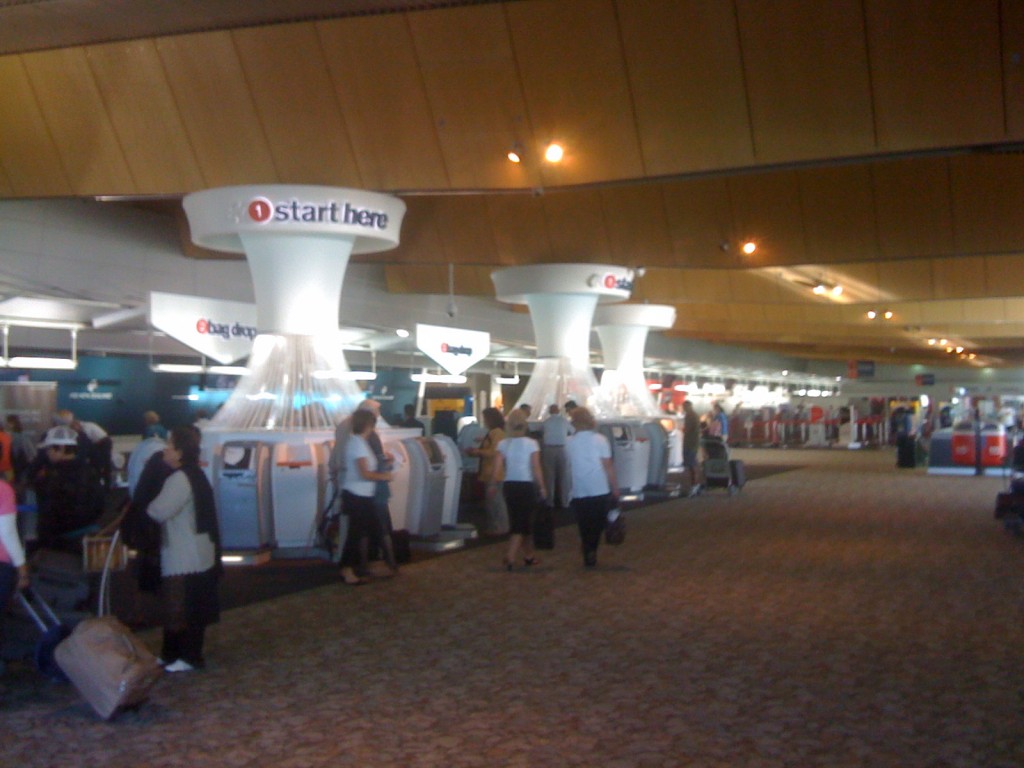
I’d heard about these things being installed at Auckland Airport, and I just thought that was typical Jafa bad design in that godawful domestic airport of theirs, but knock me down with a wet kipper: we’ve now got them here in Wellington as well.
You all probably knew about this already – and I can’t believe you’ve been keeping quiet. Is it just me, or isn’t this just the most terrible piece of product design that has ever set foot in this country? I am literally flabbergasted at how inept the design appears to be. Like a bad lampshade from the 80s, or a haircut from the Cure (ok, same thing really), for some unknown, unearthly reason we have swoopy plastic string coming racing down out of the ceiling, into a tightly corralled circle of robot machines. The robot computer machine things themselves seem to be newer and yet less functional than the previous standalone models (that were perfectly acceptable) – lets hope they didn’t spend money replacing all the old technology just a couple of years after the other ones were installed.
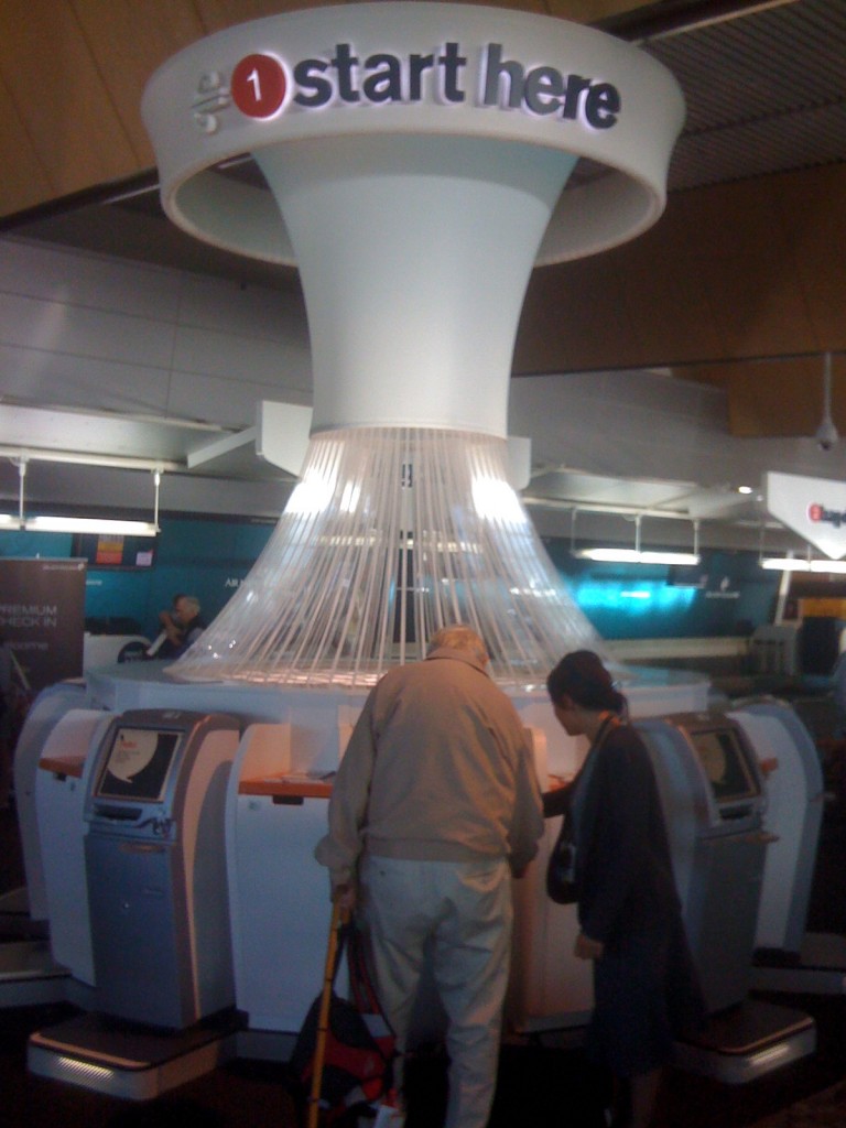
But what is meant to be happening here? The swoopy-up-into-the-ceiling bit implies that you can check your bag right in there, and some giant pneumatic vacuum will suck your bag up and whisk it away to the right jet airplane. I caught myself even looking at the giant exposed trusses in the ceiling to see if there was a possibility this could be so: but no. Mere frippery, the lot of it.
If I was the architect of the building, I’d be hopping mad at how badly designed these ridiculously pod things look and (don’t) perform. What on earth is happening at Air NZ that they feel the need to do this? Call the Design Doctor!
Updated 20 June
I’m not sure if I should use the term if you’re talking about steam-punk pneumatic-tube technology, but regardless: I’ve just found a few pictures and links to info about the “giant pneumatic vacuum” system I was alluding to above.
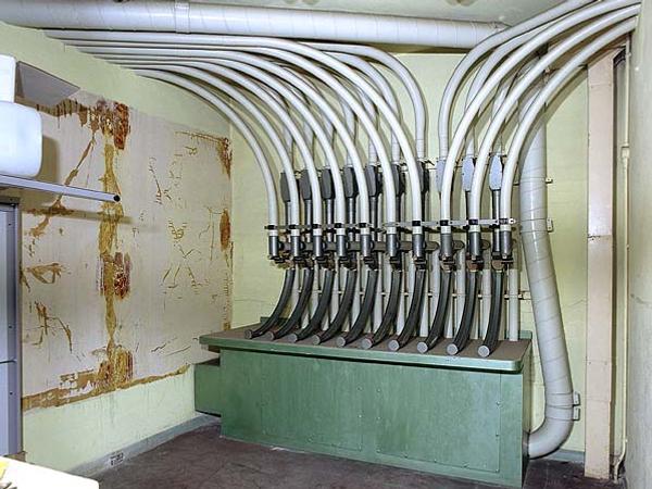
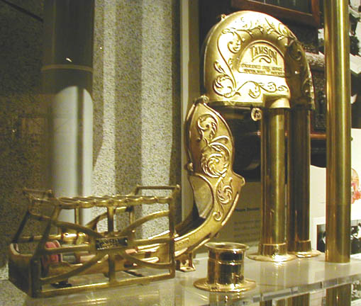
It appears that pnematic tube systems are often called Lamson tubes, after one of the older and more popular systems. While this image here is one of the newer models, with a strikingly similar appearance, and below is one of the older, more juicy, totally steam-punk, Dr Grordbort style entry capsules.
Most interestingly of all, however, is this link, which describes the pneumatic system still in use in Prague – knocked out by the nasty floods there in 2002, but hopefully restored to full use by now.
The Prague pneumatic delivering system has five main paths equipped with switches and concentrators, and 20 other direct lines. The total length of the system is 55km. It crosses the river Vltava three times. It was used to deliver packages with a weight of up to 3kg, with diameter up to 5cm and length up to 30cm, from any station to any other station by the means of the central system control room (illustrated). The central control room is located in a building of the main Prague Post Office (about 300m from Wenceslas Square).
That’s what’s I call a quick check-in baggage system!



Don’t even start me, seriously.
Don’t start me on the look of the things. Don’t start me on the usability of the things. Don’t start me on any of it.
But while we’re on it, can someone explain how to get a seat next to your companion?
I assumed that all of the sweeping cables were to disguise power and data connections from the ceiling so that the units can be placed anywhere (scary thought). For some reason they don’t look quite so bad in Auckland – and they do match that appalling TV ad with all the painted bodies. What is going on at AirNz?
Jason: try reserving your seats online just after you book your tickets. If you wait till check in you might be stuck on your own next to the toilet.
I’m with Jason – don’t get me started!
But, seeing as you have… This smacks of a serious and systemic lack of critique by or of the many designers involved with the airport. It started with the nausea-inducing repeat of the ‘stone’ carpet and now coninues with these monstrous wonders of ridiculousness. In my experience, they do appear to work well (haven’t stood in a queue at the airport since they were introduced) so it appears the concept works in terms of function. Aesthetically, however, this installation is so incongruous one has to ask who, if anyone, is responsible for the overall design integrity of the space? Is it a sign of more to come?
Another issue that grates somewhat is AirNZ aligning itself proudly with all things NZ (trivia on the in-flight screens, cabbage trees on the tickets, NZ designed uniforms), yet that supposed engagement with NZ culture doesn’t translate into its interior design strategies. It becomes just another miscellaneous company with a few kiwi, sheep and koru taped on the surface.
From a usability perspective I’ve found these to be great. No more queues, worked perfectly every time, my check in is now less than a couple of minutes, literally. Design, meh. When it works that well I couldn’t care.
I agree they are sprouting up (they look like mushrooms) just like the pumpkins being grow next door. Not a great look for the creative capital, considering we have a constant stream of international film stars, creative visualiser’s etc coming thru Wellywood.
Someone’s been watching the Jetsons again.
Jason: try reserving your seats online just after you book your tickets. If you wait till check in you might be stuck on your own next to the toilet.