Updated photos included – see end of original post
Although we’ve just recently posted about Apartments being the green shoots of economic recovery, we weren’t exactly sure if that was true. Is that a proven fact, or just another Eye of the Fish pescatorial scheme? Well, probably neither. But we didn’t think that our economic theory would get another item of proof just the next week.
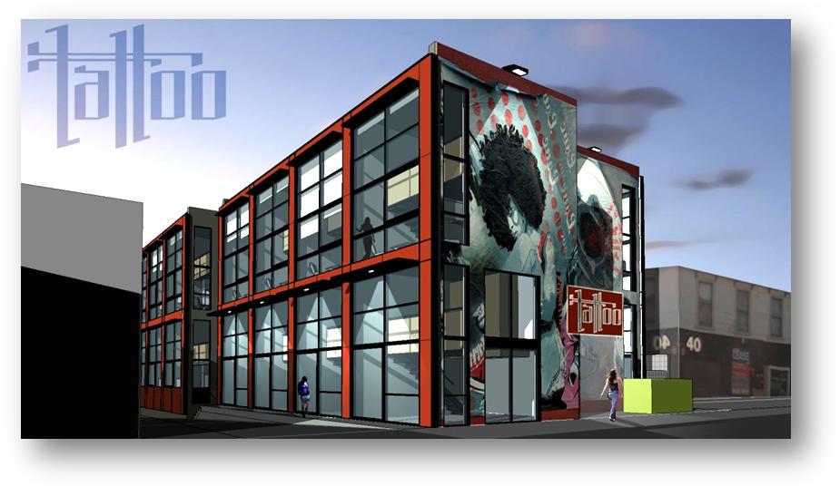
And so, with a big hello to all the ReMax twitterers out there receiving our feed, we bring you the latest incarnation of the site where the Tattoo Museum was in Abel Smith St – yes, it is now proposed to be the Tattoo Apartment site. Interestingly, it is to be just 4 stories tall – way below the 9 stories that the tacky Orange apartments have achieved just across the street (next to the Southern Cross).
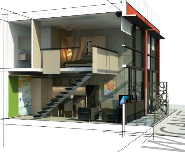
Tattoo hasn’t officially launched yet – hope we haven’t burst your bubble but someone forwarded us the info – and the developer (unknown) proposes that these are to be a total of 36 apartments, each double height 50m2 studios each. Designed (of course) by local small apartment supremos ArcHaus, these studios are going to be small, but actually liveable. 50m2 is nothing to sneer at for a one/two person flat – in fact, it meets the guidelines that the Mayor of London set down (our full article here) so maybe ArcHaus have been taking on board the minimum size suggestions.
Well done to Mike Cole and Taylor Pressley for the design – and for the proposed massive graffiti style elevations to the north and south – and fantastically well done to the developer for not going all out with a volume hugging monster like many of the dogs around town. Wigan is just a small street, and needs a bit of space – which this scheme provides. With prices around the $300k mark, they’ll probably sell fast – if anyone can get the finance.
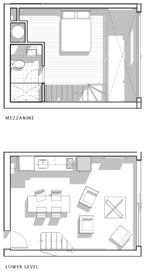
Yes, it’s formulaic, and is just a simple row of little double storey boxes, but it’s a far better space on offer than many of the little hovels that have been built or proposed nearby. Being on the site of the old tattoo studio, and with hookers plying their wares on the next corner, it’s a pretty gritty funky urban site and is bound to see some noisy street action, but it seems just the right sort of response to the site. My only gripe would be that they haven’t left a space for Mr Maddock and his Tattoo Museum on the ground floor.
In fact, I can’t really figure out why there isn’t a commercial use of the whole ground floor. Wigan St is one of the last places left in Te Aro where uses such as panel beating, and light industrial uses still abound – it’s a vital resource for inner city dwellers, where I would take my mighty V8 for a refit – if I had one. With schemes putting apartment lofts at ground level, this will tend to drive another nail in the light industrial coffin, and a bit of multiple use wouldn’t go amiss here. Especially if it is a low rent space suitable for a Body Shop – no, not the smelly panda-free stuff, I’m talking Car bodies or Tattooed bodies.

Thanks to the power of the internet, world wide media, and helpful eager persons, we can now bring you an update on the previous scheme. The project has not yet got Resource Consent, although I’m sure that won’t be too hard to get as it has no issues with the height limit. Interestingly, of course, it has no parking – most small apartment schemes have a small number, but here, you’ll be right at the centre of the action, and so aren’t likely to need one. But if you do: currently, the only 3 free carparks in the whole of Wellington Central CBD are in Wigan St. Expect them to get fought over more once this baby goes up.
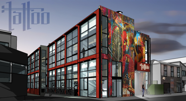
Of more relevance however, is that the issues of people living at ground level on a busy corner have been addressed a little, and apparently the scheme’s proponents are indeed looking at a Retail unit on the most prominent corner, with grade separation, fencing and a small setback for other exposed living units. I think there could be a more imaginative solution here though. The phrase ‘live-work’ unit often gets bandied around, but to really make it work it needs to be worked at, made relevant, and decent provisions made. I’d agree that Retail is not really the answer there – but small home style businesses such as graphic designers, architects, and yes, even tattooists would fit in well there.


in all truth, the graf art “urban” lifestyle image is pretty bad modern kitsch.. the over 40s wont understand it and the under 40s will cringe… i’d also worry about associations with the former tattoo museum and its infamous dodgy/mismanaged image..
That’s one big afro
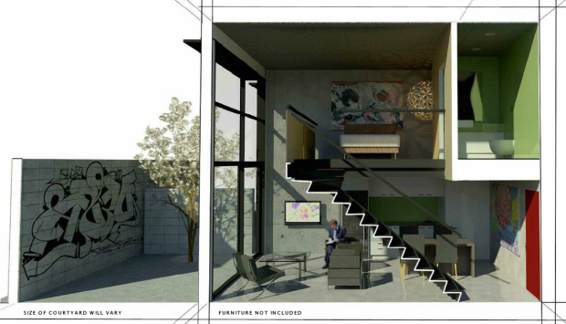
I like the way the picture of the external courtyard has already been pre-graffittied. Is that an installation from the developer as well, or just a breakin from an enthusiastic and agile urban tagger?
And is the proximity of the hookers on the next corner anything to do with the full height windows on the ground floor units? Seems like it could convert very well to an Amsterdam style red light district.
It seems that the concerns noted above – of the ground floor living areas being a bit too exposed have already been recognised by the sharp eyes at the Council, and we’ve been sent some new images which we’ll try and post shortly – without jeremy’s giant afro sadly.
And probably definitely without Rain’s red light district.
But also without the extra floor of retail we suggested.
It’s good to see that architects are being responsive – remember, that if you wish to contact the Fish directly, then just email us at :
contact at eye of the fish dot org Yes, it’s that simple. Many do. But curiously, not that many architects actually post here in public – remember, you can use a pseudonym.
I don’t like the courtyard pictured, even if you painted over the graffiti. The giant concrete block wall just looks like it’d make the space dark and cold. If you wanted a yard, then you’ll probably live in the suburbs. The only reason I can see for having one in the CBD is to stop people looking in your ground floor windows. Fish, of course, like living in a tank where people can peer in at them swimming around. But it freaks the rest of us out and attracts perverts.
An alternative? Shops on the ground floor. Retailers usually WANT people to look in their windows. Or restaurants. Or light industry. Or even under-building parking at a push.
Updated photos now included – giant afro now replaced by a parrot. But the same slinky streetwalker is still hanging around the entrance, showing off her nice curves in her tight jeans. Hmmm.
There is still, on the far end (ie north side opposite that tall new building), a few feet of space that could be used. I’m not sure if there is enough space to get under-building parking Mr DavidP, unless all the residents drove low-rider convertibles. Which, given the location, might be a rather cool and funky thing to do.
The problem for a developer with ground floor retail is nobody want’s to rent it.
Century city, Dual on Vivian, Monvie, all empty and I’m sure you can think of others.
Maybe council need to be a little realistic about what’s financially possible Vs having new development in times of recession.
I’m a fan of Urban design and integration with the street scape but I also dislike empty lot’s that have been cleared for development with grass growing through them.
Aaah, Spleeen ! Welcome back – long time no hear. I thought you’d left town and gone away.
Yes, but no. An answer to empty ground floor retail would surely be solved if it is put on the market at the right price for the retailer – or light industrialist. Car repair yards are rife in Wigan St (and Haining St) and would rent quickly I’m sure if specced and marketed right.
But what’s the alternative that is good for the city? You can’t seriously be suggesting that Century City would be better off with residential on the ground floor, people on Tory St walking past and looking in the windows. Isn’t there meant to be a bar for midgets there some time (I think 60mPa said that).
Better an empty lot for a few years than a lifetime of the wrong building….
Ground floor of Dual on Wigan would do as well as either of its neighbours – ie either a brothel or an asian takeaway – although in some cases that’s the same thing.
“Century city, Dual on Vivian, Monvie, all empty”
One of the retail spaces at Century City has been leased as a kitchen showroom, and while the others spaces there are empty, there’s an article in today’s Capital Times asking whether Tory St is the new Courtenay Place, and pointing out the desirability of those spaces for restaurants. It may just have been a puff-piece for the estate agent, but that stretch of Tory is definitely getting livelier and besides: wasn’t it alwasy part of Terry’s grand plan to have a restaurant/bar for his hotel?
Rumour has it that Dual on Vivian will become a new 4 Square.
Yes, Monvie is still to find a tenant, but there’s the occasional flickering of retail life along Holland St (Fuel, Osteria poking its Toro around the corner, a couple of short-lived boutiques). What’s more, there are plenty of commercial tenancies along the ground floor: designers, caterers, photographers and so forth. I’m sure that if Movie’s owners were to be realistic with their rents, some sort of commerical tenant could be found, and if the market picks up in a few years time, then the rents could go up accordingly. In the long run, it would have the potential to become retail, thereby enlivening the street rather than having the deadening effect of blank walls or car parking.
I must admit that I find myself in the minority with some of my views on this forum, and yet I do enjoy the discussion and informed post’s from contributors such as Grounded.
And thanks for the warm welcome Max, I never left just lurked for a while.
Having said that you are mostly all incorrect, because your thinking is that of urban design, aesthetics and design quality, while the typical developer is more concerned with banks, funding and profitability.
While I know that profitability is considered a dirty word by sandal wearing long haired council types those of us in the real world have an appreciation for the fact that without it nothing ever gets built.
“profitability is considered a dirty word by sandal wearing long haired council types” – them’s fighting words ! I’m sure it’s far too cold for sandals.
It’s good having your comments though Spleeen, we appreciate the view from what may be viewed as the other side of the fence. My take on it all is that good design and profitability can exist quite happily together, as long as you aim high at the start. Fantastic design = great profit margin. Crap design = let’s not bother with any of it.
There’s an interesting blog you may be interested in, where I lurk occasionally. A local property investor gives his thoughts on property development at:
http://www.ventureproperty.co.nz/blog/default.aspx
The double height spaces look really spacious, its a shame we dont see more of them in wellington.
I’m interested in whether the young businessman they depict in the sections really look favorably upon the graffiti in his yard? The Mies/Corbusier chairs he appears to own would suggest not; but the Banksy print above his bed says otherwise. Anyway, the branded design/marketing is a ballsy move, and hopefully it will pay off for them.
re: grounded: When I lived there, I really hoped that that Monvie ground floor would get rented. Fuel and Productspec bring a lot of life to the street, and it would have been great to build on that.Admittedly, its not a great location for retail, but would be perfectly viable for a small-medium sized business office. The Holland st area has great potential IMO, it just needs improved access and a little bit more development.
Theres actually quite a vibrant little business community in holland st, between Fuel,
Philip>The double height spaces look really spacious, its a shame we dont see more of them in wellington.
My place has the sleeping area on the mezzanine floor and the living area downstairs. I love it for its sheer funkiness, as well as the light and the space. Essentially I have a three room apartment, and two of those rooms are bathrooms. But, and this is a big BUT… the lower area is really hard to keep reasonably warm in winter. By the time it is tolerably warm downstairs, the upstairs is tropical.
Davidp – stick a fan on the ceiling – centrally located moving slowly and quietly
Hey, great blog.
Ive sold Archaus projects for 15 years., including the QBA apartments just up the road…really good to see comment on Tattoo. They want it to be a step up.Mike Dennis & on this, Ash are keen for the right reasons.
Hows this for the old days.
In 1992 I tried to sell 4 townhouses off the plans just along the road. ( The caryard on corner of abel Smith & Cuba). Area was not the trendy deal of today! For John Robinson. Only got one taker ( the colourful John Hunter, born 100 yards away in Tonks Av) so it was screpped. The Piercing studio building was derelict, full of urine & streetkids. I think it sold (4 flats, trashed, & 3 shops for $325 000) It was I suggested “Colin go back to selling $85 000 cottages in my Vic .No one is going to shift back into town.”
Good they were wrong.