Following the previous post on Spine Studies, and the closure of the inevitable “consultation” period (where they waste our time by asking for our opinion, and once they have it, they will just ignore it), I realised that the big issue with the Spine Study is that it has missed the really big picture: its not the method of transport, but it is ALL about the actual route of the Public Transport Spine.
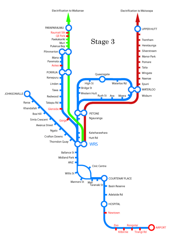
There was this one, pictured above, which was around at the last election. Published by the Greens I think? Along with a ginger group for better transport?
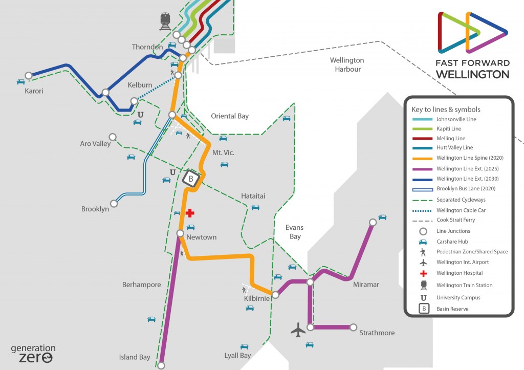
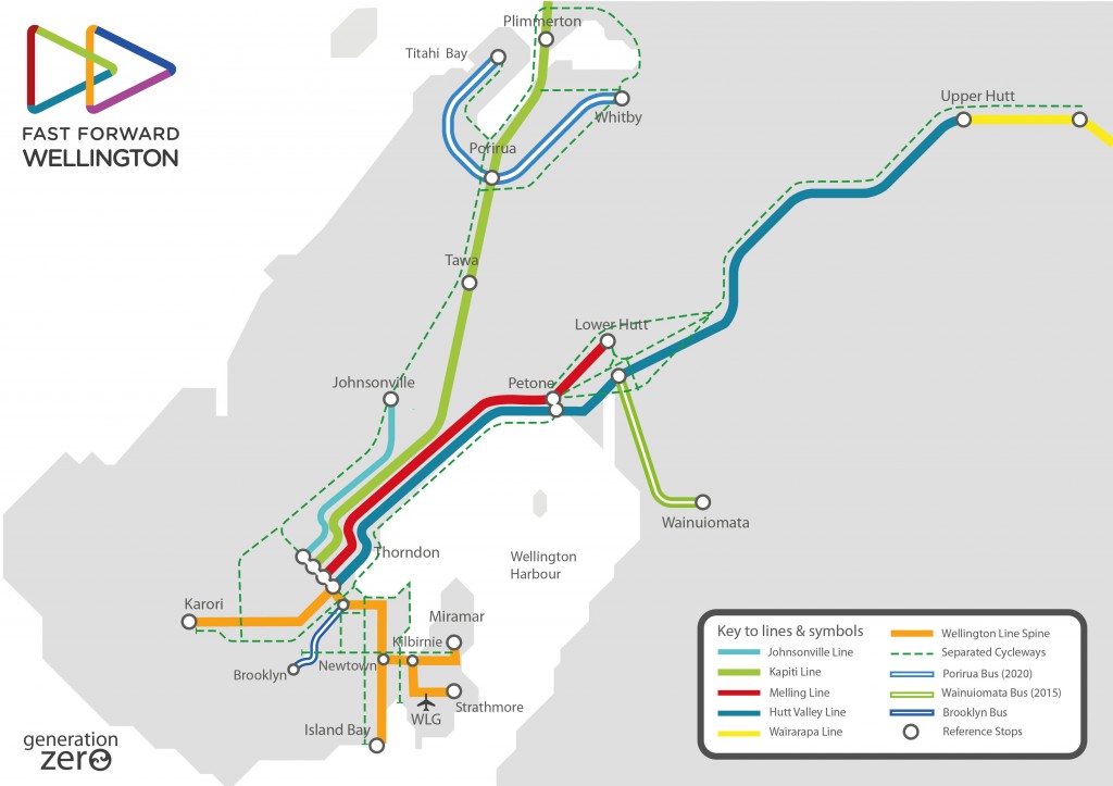
By comparison, the more recent design from Generation Zero is here for comparison, in two scales – zoomed in, and zoomed out.
…
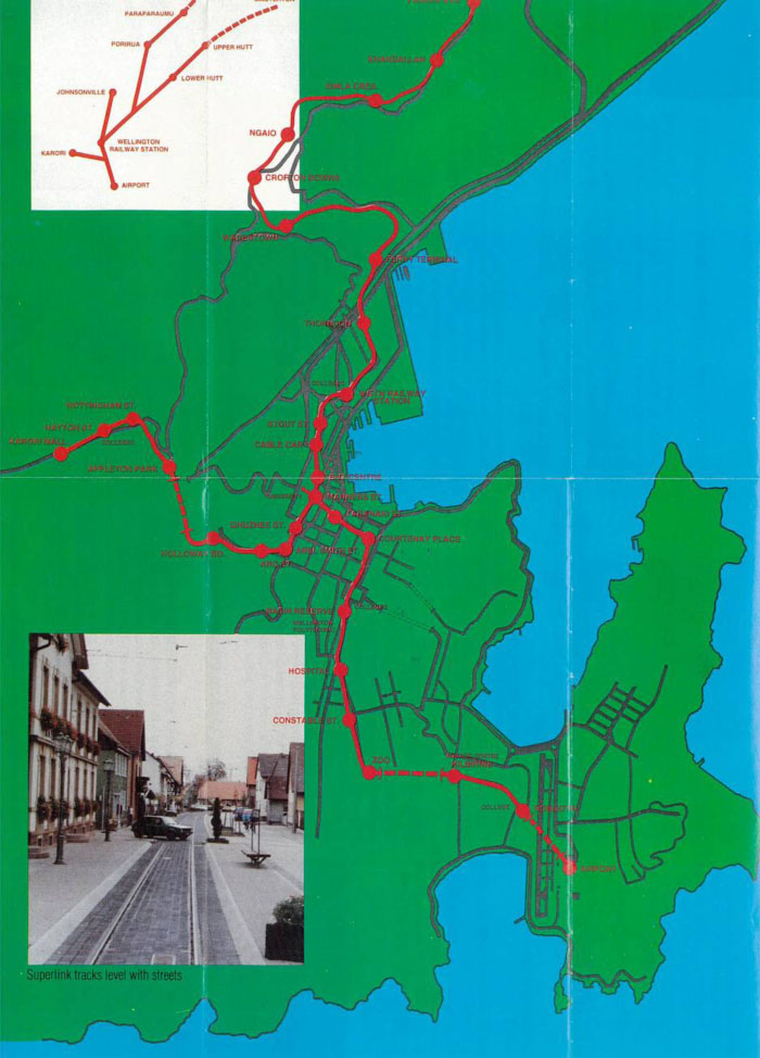
We can compare this to the routes planned by the Superlink group promoting Light Rail / Modern Trams in the late 1990s, where their route looked like this:
Of course, what we really need to link this to, is the official current route plans, and to the future options. At present, MetLink shows this:
Umm, nothing. They’re crap! Amazing – there is NO single network Metlink Map online – truth be told, it is so complex, that it is too complex to actually download as a PDF – so we will be doing the world a favour by posting a few versions here, of selected slices. Here we go:
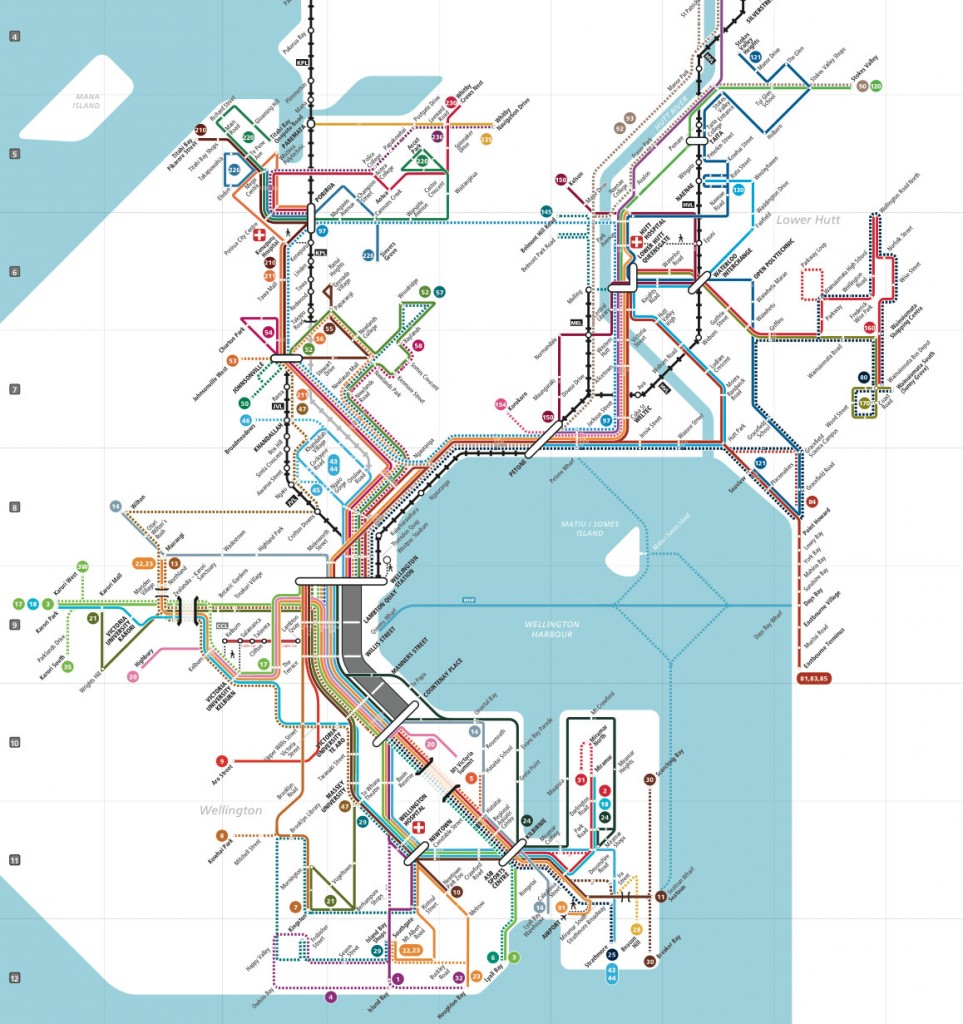
or this:
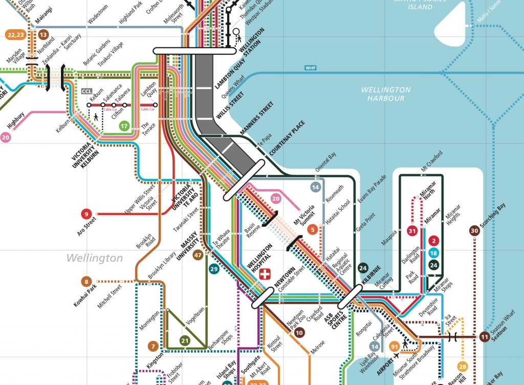
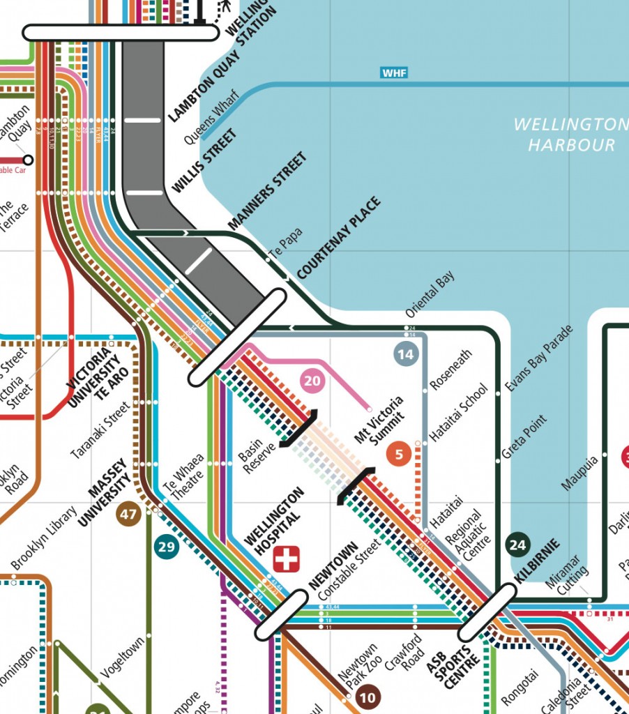
and finally, zoomed right in, there is this:
Of course, what we are trying to do is to compare the route against the official options in the Spine Study:
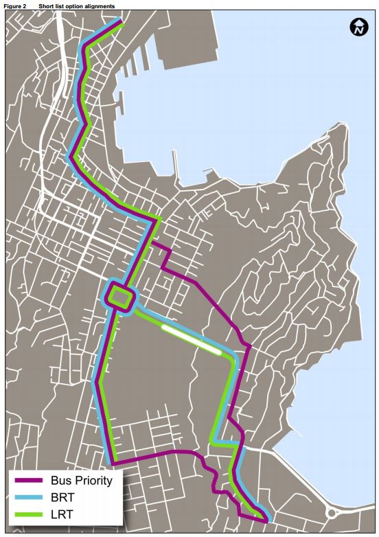
Here it is in a bit of a simpler format, produced by volunteers again, to show the “frequent bus” network, and it is a lot more easy to visualize with this simple graphic:
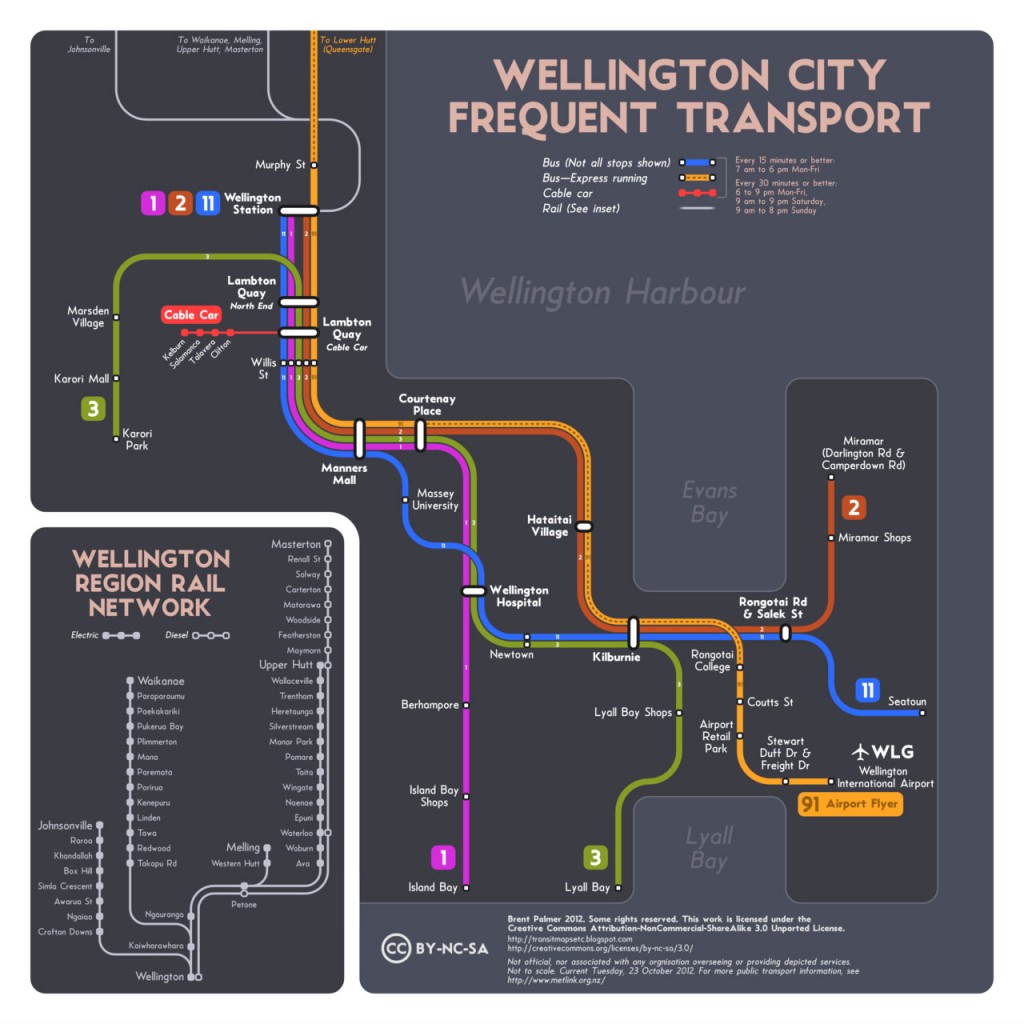
We can also see it here in a map of the “core network” routes:
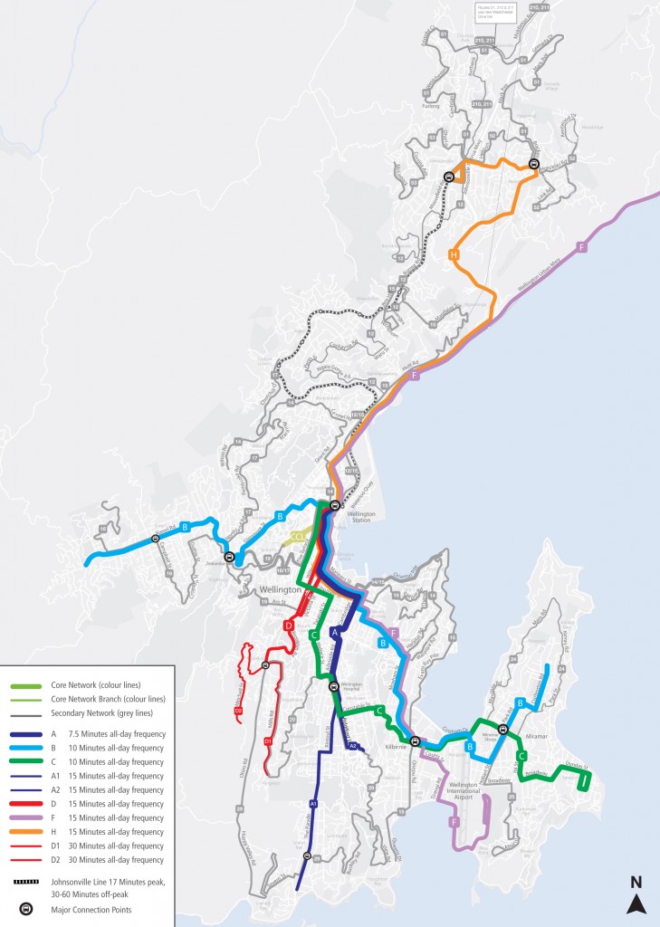
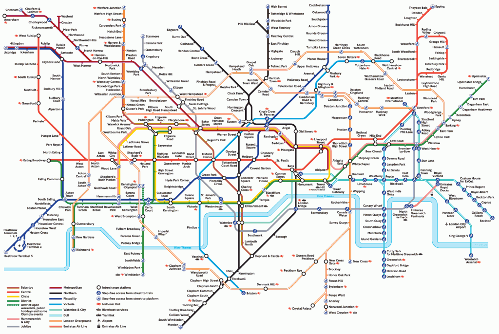
Where is all this leading? I’m not at all sure, except that I think it is evident that there is huge confusion over the route, especially if it cannot be reproduced on your own council website in one piece, and it is a far cry from the relative simplicity of the famed London Underground tube map, which has changed a zillion times since the 1930s, and yet still stays essentially exactly the same. You know the one:
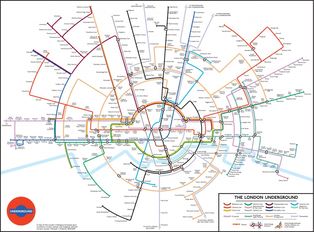
(Except, of course, someone has this year decided to remake the most well-known, iconic map of the century, and gone rather circular instead):
I’m actually more impressed with the efforts of Generation Zero in Auckland, where they have somehow calmly planned out the next 40 odd years of Public Transport routing, free, for the benefit of the city. You’ve probably seen them before – but if not, then have a look at this Congestion Free Network sequence: it’s a masterpiece!
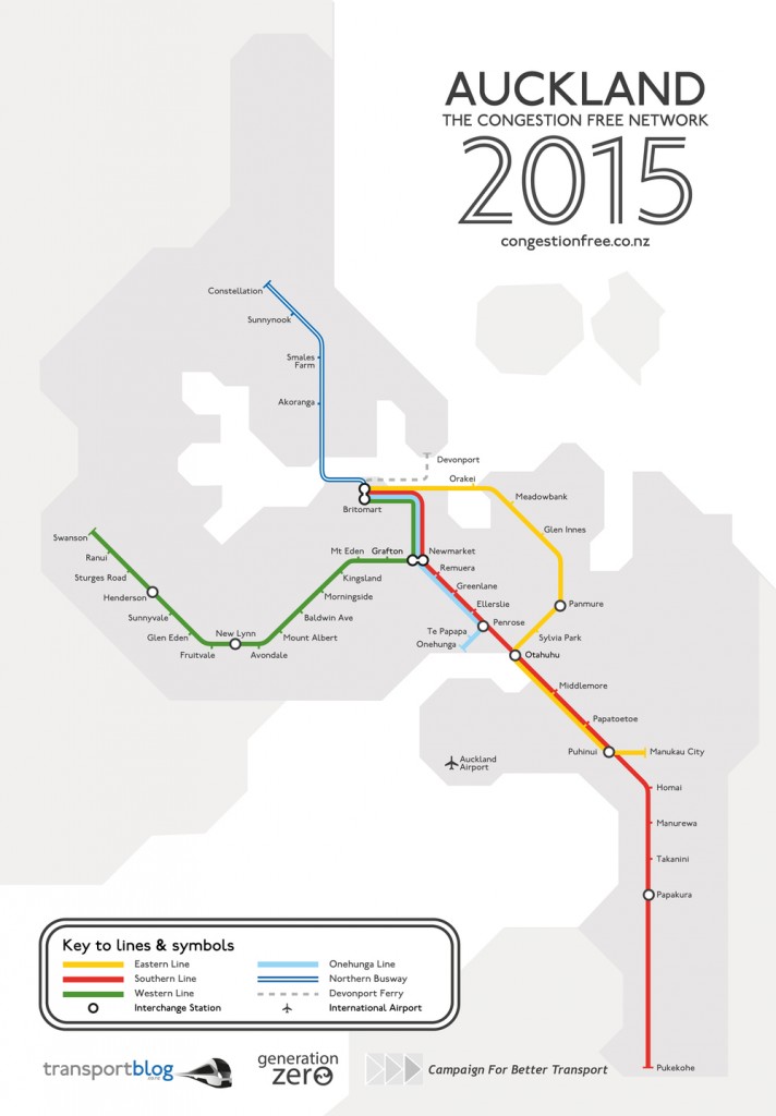
… then
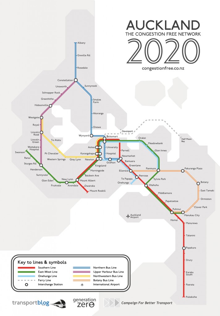
… and then
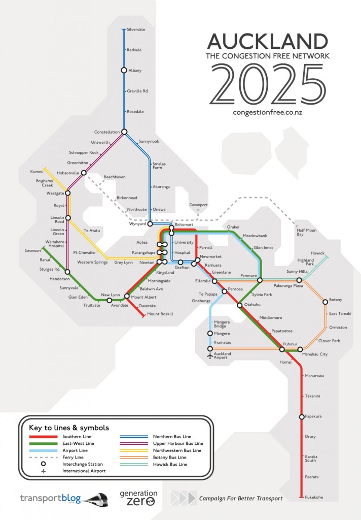
…and finally
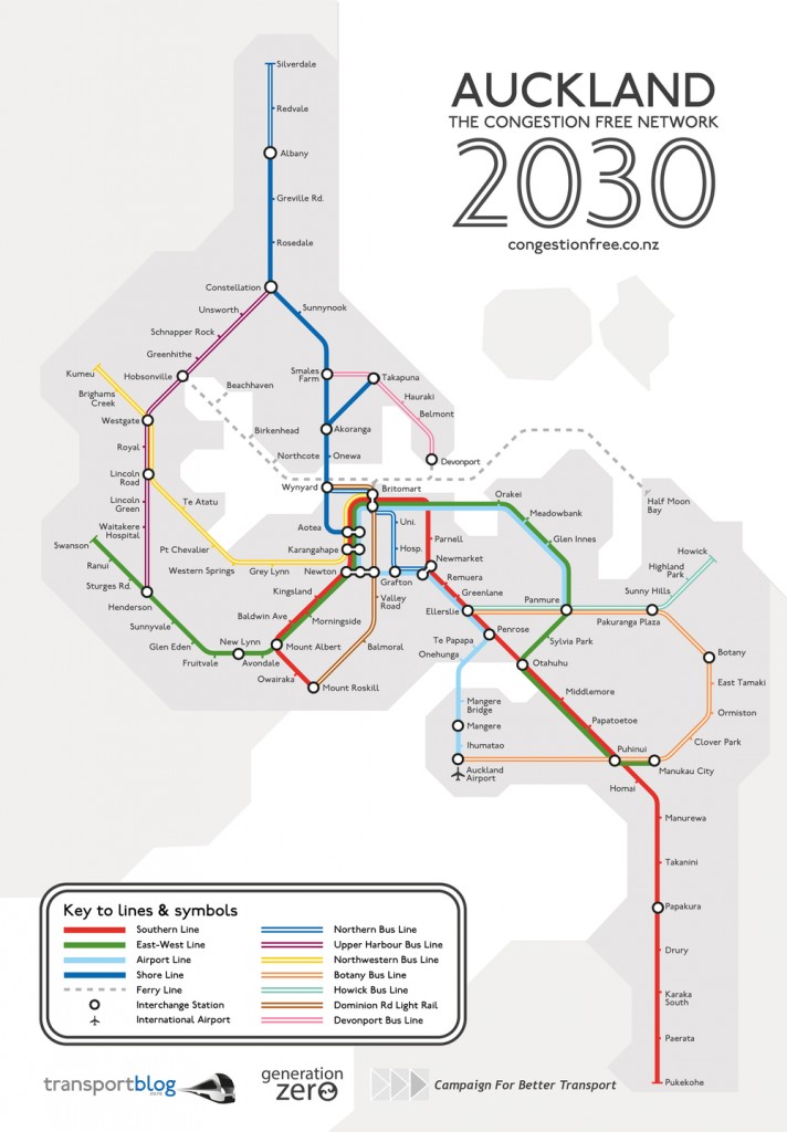
Seems to say to me that we have a wee bit more planning to go through before we get to the right answer.



I’m intrigued to see how congested it is in Wellington, with no overall discernible traffic route planning logic – unless the logic is to just try and cover every single part of the city and bring them into the very centre. Not a bad thing, but a bit more logically thought through might not go amiss?
On a related point though: on the Metlink plan, the very zoomed in version, what is that enormous fat grey sausage on the map, paralleling with the bus services? Does grey imply urban motorway? Or is it acknowledging a pedestrian footpath? I mean, it’s huge. It can’t just be there for laughs. The designer must have put it in there for a purpose. But I can’t for the life of me figure out what it is for.
Fine words Max.
Am always in awe of the Underground map simplicity. I loves me a bit of transport network maps, I do.
Sandy,
The ‘grey sausäge’ indicates the Wellington Station -> Courtenay Place route:
– routes from Western and Northern suburbs terminate at Courtenay Place.
– routes from Southern and Eastern suburbs terminate at Wellington Station.
– there are exceptions to this, please view individual timetables for more information.
– routes that travel through Wellington CBD are shown.
As shown in the middle of http://www.metlink.org.nz/info/network-map/ .
Thanks Sea-Monkey – actually, that link to Metlink’s network map does not work for me, on two different browsers. Which is partly why I called it monumentally crap in the first place. I just get a blue square of death, as if I am floating somewhere in the harbour.
Which, of course, I am.
The Underground maps simplicity is of course helped by it only depicting rail lines, and even then only specific rail lines as it leaves out many national rail lines. The complexity of the Metlink map is product of it attempting to show everything.
Sandy
“I’m intrigued to see how congested it is in Wellington, with no overall discernible traffic route planning logic – unless the logic is to just try and cover every single part of the city and bring them into the very centre.” Yes thats pretty much what is happening and the council were pretty totally torched by the public when they proposed moving away from that approach.
@LX: If a PT Service shouldn’t “try and cover every single part of the city and bring them into the very centre” then what exactly should the “traffic route planning logic” be trying to do ?
I was one of those who put a torch to the original GWRC bus review plan. This plan included Johnsonville bus services to the CBD being routed via Newlands. Please explain why this was such a great PT plan when it included chopping a Johnsonville bus service that takes 15 minutes to the Railway Station and travelled through to Courtney Place so we would be forced to take a “Rapid Transit” rail service that takes 21 minutes and even then, only to the railway station ?
Tony R>Please explain why this was such a great PT plan when it included chopping a Johnsonville bus service that takes 15 minutes to the Railway Station and travelled through to Courtney Place so we would be forced to take a “Rapid Transit†rail service that takes 21 minutes and even then, only to the railway station ?
Similarly there are bus services from other places that have railway stations in to town, such as the airport bus which starts at Upper Hutt railway station. It’s unsubsidised, so presumably enough people prefer a no-change bus service to a combined train and bus service to make this viable. I’d agree with them. It sort of torpedos the argument made by the tram supporters that there are people itching to interrupt their commute just so they can sit of a vehicle that runs on tracks.
Sandy, Tony, LX et al – regarding a PT traffic planning logic that relies on bringing people into the centre – if you look at the maps above, it’s quite clear that the type of map that Wellington has, with a massive concentration on, and jump in mode change at rhe Railway Station, is very different from the map of London, where there is no one, single discern able point where all passengers discharge. Of course, their map does not quite tell the truth either, in that instead of just one point, they have several: Kings Croos, Euston, Paddington, Charing Cross, Waterloo, Victoria, London Bridge, etc etc. each one of those stations handling probably 100 times more passengers per day than the WRS handles.
Nevertheless, the thing to note is that the focus is spread out, rather than concentrated in one place. This could mean, for instance, that people could, say, get off and change mode at another station, instead of all having to disembark at WRS. That’s the rationale behind having one line – say, the Melling Line – converted to Light Rail, and extended to, say, Newtown, so that a transfer between a Hutt mainline rail stop and the Melling stop could take place at, say, the bottom of Ngauranga Gorge, rather than all at the WRS.
Having an alternative means of PT is good – so if one breaks down, you can catch the other – as long as they are both faster and more productive use of your time and money than taking your car into town.
Maximus, with 70,000 odd jobs in the centre of what is otherwise a small city it is no surprise that everything is focused on the middle. Big cities like London and Tokyo are much more polycentric so there are multiple points of demand and their networks reflect that having no single point of focus.
Regarding light rail from Melling to Newtown read Kerry Woods submission on the Spine Study prepared for generation zero http://www.generationzero.org.nz/wp-content/uploads/2013/09/Spine-submission-Kerry-Wood-130927.pdf. It sums up why that isn’t as feasible as some think.
“Trans-Metro needs 6- and 8-car Matangis to meet peak demand in the available passenger-train ‘slots’. Tram-trains with adequate Trans-Metro capacity would be far too long for city streets at about 170 metres. Additional capacity would be very costly, with new tracks to Porirua and Hutt City. Tram-trains might be cheaper if these tracks were standard gauge. The Johnsonville Line is impractical at present because trams on single-track cannot match the capacity of the Matangis. In the longer term it is an option if the line is double tracked. It would be very costly but would allow the spine route to link up all WCC’s growth centres.”
@Maxmimus, I agree with your point that “ if you look at the maps above, it’s quite clear that the type of map that Wellington has, with a massive concentration on, and jump in mode change at the Railway Station, is very different from the map of London” And would note the follow.
Firstly, your postings comparison of the Wellington all modes route map with the London, Generation Zero rail maps is apples and oranges. The London underground map IS iconic and yes more than three million travel on it each day but, like Wellington, for every rail passenger TWO travel by bus. OH, and when you look the Central London Bus Route Map, they go everywhere just like Wellington ! Even the London Night bus map does have that nice (but fictitious) sense of order given by its underground map.
I agree with your key observation that everything stops at the Railway station but this is an effect of the mode used. Rail cannot get south while trolley buses cannot get north. We cannot do much about the former but the latter is also forces people to interchange. When my teenagers go to the movies from Johnsonville, they have a choice: train and walk or bus all the way. Generation Zero will continue this approach.
Sorry, I meant to say:
Even the London Night bus map does NOT have that nice (but fictitious) sense of order given by its underground map.
Maximus: a PDF of the Wellington transport map is at http://www.metlink.org.nz/assets/NetworkMap13012013/network-map-at-13-January-2013.pdf – it’s linked from the main map page, http://www.metlink.org.nz/info/network-map/ . (Those links work for me on both Chrome and IE.)
davidp: the Airport Flyer is unsubsidised, but since it was reduced in length (and off-peak frequency) earlier this year the only railway stations it stops near are Petone and Wellington. Other buses serve out-of-town stations only incidentally on route to non-rail-served suburbs (eg Eastbourne), so it’s hard to see how their (limited) existence “torpedos” anything.
Mike – thanks for that – those were the links I couldn’t get to work properly last week, using FireFox and Safari – both working better this week. Of course, what I should have done was the same as what the USA is doing at the moment: shut down completely, wait a while for things to cool down, and then restart. At least, that is what has worked for me….
But i still think that Metlink need to have a simple, understandable map, without having to put 7 million options. London Underground (for instance) have several different versions of their map, some with buses on, some without, some with zones marked in, some with network trains, some with river ferrys, etc etc, as well as some which are just the Tube. Personally, I find it highly ironic, that the best maps i found of Wellington’s public transport system, were all on a website belonging to a Canterbury-based cycle organisation, where they seem to have done their own. Do a google search for Wellington Metlink map and see if you can find a single image of the Map from their website – they need to sort their shit out!!!