Despite the small space in which it is situated, the retrospective of Bill Toomath’s work is an expansive exhibition. Beyond the vintage photographs and precise drawings located within the Hirschfeld Gallery are a series of interviews and articles that reveal the the full range of Toomath’s work as architect, advocate and educator. My visit barely scratched the surface of these records, but I wanted to draw out a few finds that may be of interest.
“the visitor is guided by the overall form of the Gallery”
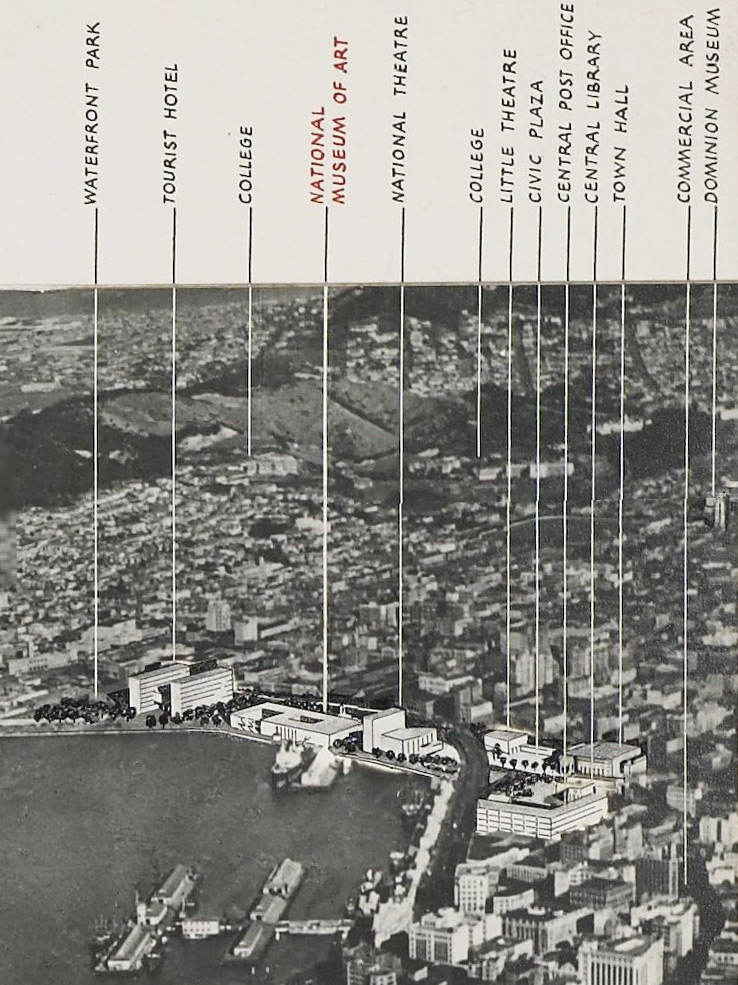
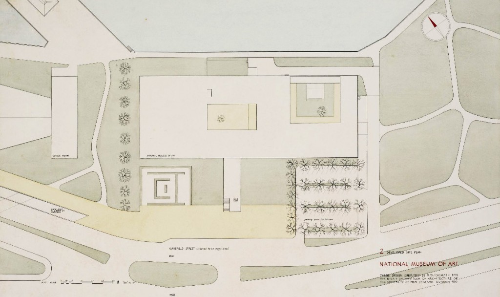
Reference in the exhibited drawings, and in the supplementary interviews, is Bill’s final undergraduate project: a national museum. Although this project and our current national museum are similar in location and programme, Toomath’s design is stunning counterpoint to the the aesthetics of Te Papa, and the full set of images on display in Te Papa’s online collections are definitely worth a look.
Images courtesy of Te Papa
“the finest student project he had seen”
Buried deep within the recorded interviews are the details of another of Bill’s student work: his graduating project from the Harvard MArch. Produced in 1952 — a time when shopping malls were just emerging — the design opted to reject the standard rectilinear format of a mall in favour of a trio of circles that surround an open public space. Each of the circles is placed above an indoor parking area, and serves as a distinct ‘module’ of shopping stores that connects across the adjacent sections and central community area. The team behind the projected presented the project to a panel featured I.M. Pei, earning the above quotation.
‘notes on the use of space’
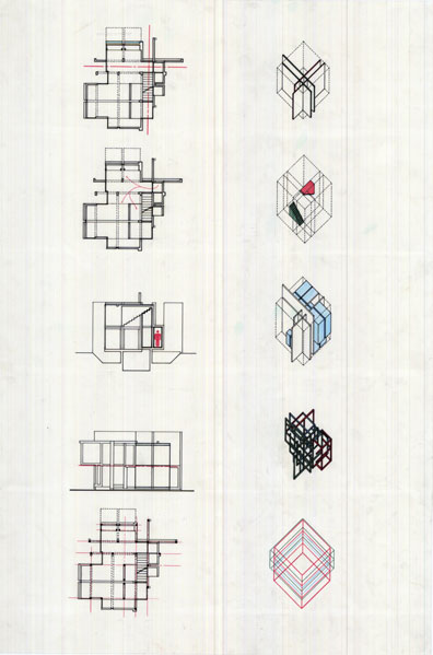
Its a shame that the exhibiton shows only one set of proccess drawings — those produced in the design of Toomath’s brother’s house. These were by far the most illuminating pieces in the exhibition.
Spread across several pages, the notes were mostly comprised of a series of diagrams that perfectly explored and rationalised the design intent of Toomath. There were daily calendars — rendered as pie graphs — that displayed the schedules and requirements of each of the inhabitants throughout the day. Following on from that was a series of clustered bubbles and initials that progressively planned the arrangement of spaces; eventually crystallising into the rectilinear cells that comprise the completed house. A box plot measured the levels of sun exposure against the needs of each spaces function and time of occupation. A histogram deformed into protractor, becoming a hemispherical sun path that deduced the orientations required for each of the rooms.
Perhaps these diagrams are so fascinating because they associate the work of a mid century modernist within the more contemporary use of the diagram. The great architects of the modern movement are typically viewed through a discussion of their principles; or the buildings that they create, while the intermediary step — the design process — was something that was hidden away, or disguised behind a few rough ‘genius sketches’. However the avant-garde of today — whose principles are far from unified — often seek to lay bare the design process, and the diagram is a key tool in doing so.
The puns of BIG, the algorithmic of Morphosis, the hyper-rationalisms of REX, the syntactics of Eisenman
What is so surprising about Toomath’s notes is to see the modernist design process in action. In contrast with the diagrams of contemporary architects, the decisions that Toomath makes with these diagrams are always logical and utterly self-evident. More than any of the models, plans, or photographs, Toomath’s notes seemed to actualise the convictions of his ‘fundamental modernism:’ the perfect mapping of light, space and form to the needs of site and client.
Architect Bill Toomath: Liberating Everyday Life runs until the 14th March and is now free to enter.





Interesting that you should find the elaboration of the process interesting – it is actually a common trait of this era, with architect’s intent on the rationalisation of Modern living so that it would be hygienic, efficient, acknowledge the assumed ‘needs’ of the family/occupants – that is, above all, functional. The freeing up of the floor plan was more than just about spatial flow (at least by the second half of the 20th century). I guess that I have the benefit of having seen many such diagrams in my line of research.
I think that we take a lot of this for granted (the rationalisation of the plan rather than planning for formal layout, social morality, or whatever), we still base most of our domestic planning on the principles derived from this time…
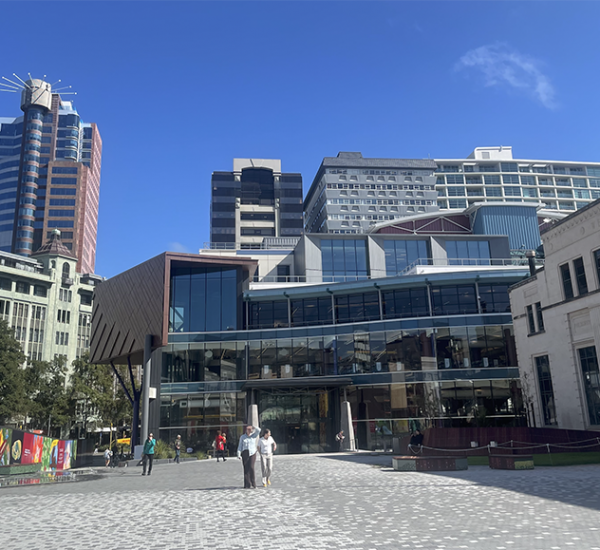
+, looks like Google needs a reshoot of this area (Gallery, Chews Lane…) – the question is, should they bother waiting until after the immanent(?) Frank Kitts Park redevelopment…
You know, I have a strong interest in Modernist architecture, and a lot of respect for Bill, but that first picture looks like Milton Keynes-on-Sea.
MD, what seemed so interesting was that the elaboration was visual. Maybe its just me then, but I’ve yet to come across similar examples from other modernists. Their rationalisations are presented pretty clearly in their manifesto’s and rhetoric, but I cant recall ever having seen the kind of process drawings of the kind present in the Toomath exhibition. Maybe they dont fit within the ‘genius sketch’ narrative? If you did have any examples handy, I would greatly appreciated seeing them.
The other interesting thread (at least with Bill’s diagrams) is their resemblance to contemporary infographics. The infographic has been around for eons, but they seem to have had something of a resurgence of late due to their ability to make complex sets of digital data salient. It’s pretty compelling to see similar forms used as part of the design process, rather than just as a kind of research or aesthetic (as people like MVRDV seem to be using them).
I think that Toomath also worked on the replanning of Te Aro in an early scheme? I recall there was a modernist replanning of the whole Te Aro slum area – demolishing the little houses of chinatown (Haining St / Lorne St / Wigan St etc) and constructing vast Corbusian tower blocks. Sort of glad that it didn’t go ahead – although on the other hand, not sure if what we have now is much better.