After what seems like an absolute age, this weekend we’ll have the City Gallery open once more. 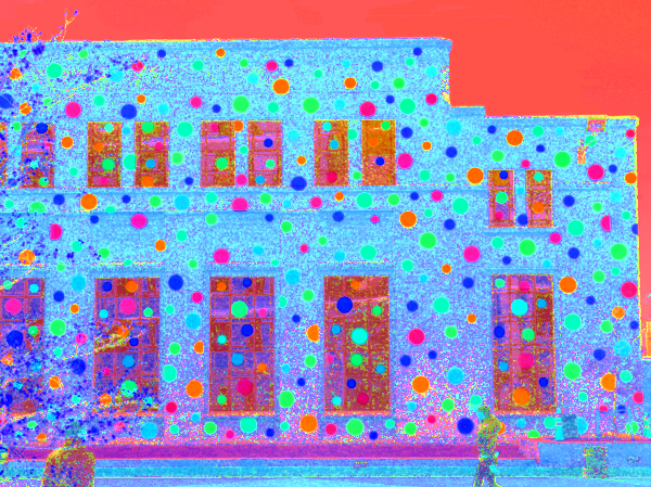
Having not seen many pictures or plans, I’ve little idea what is going on inside the doors, so can tell you nothing: you’ll have seen the many hyped up articles on the exhibitions inside and Cafe Nikau has already reopened, but I’m still unsure as to exactly what has changed within. No invites to the Fish have come flying through the mail, so I’ll not be at the opening brunch party, although the whole of Wellington have been invited along in the weekend for an all day Civic Square function with bands, art, and resplendent new architecture.
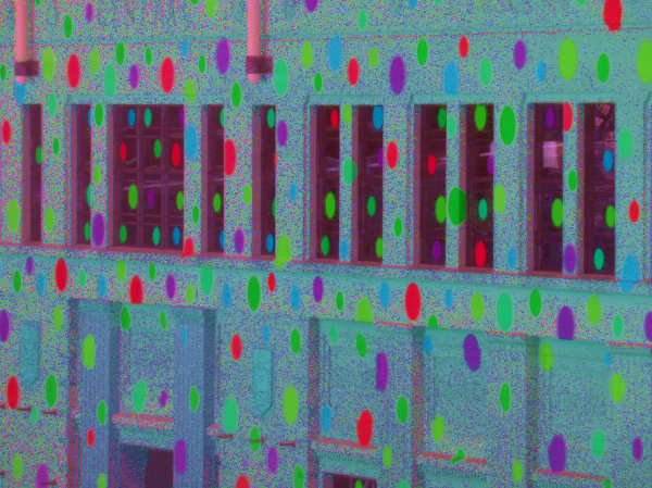
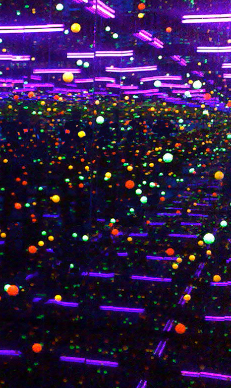
I do hear tell that the Hirshfeld Gallery is doubled in size (which, to be honest, wouldn’t be hard as it was so damn small: perhaps they have even tripled it in size), and the opening hall is longer and taller and should be far more impressive if my glimpse through the windows was correct. No doubt there will be a surfeit of dots, and perhaps even a darkened dotty chamber, but perhaps the best thing may be a new theatre space – again a rumoured doubling in size and hopefully without the squeaky floorboards this time. If there is one thing that was made obvious by the triple bill event last week of Shigeru Ban et al, it is that Wellington needs a decent arts function venue with modern projection and catering facilities. Let’s hope that the new Wellington City Gallery lives up to all our dreams. Write and tell us what you think.


“Having not seen many pictures or plans, I’ve little idea what is going on inside the doors”
There’s more at http://citygallery.org.nz/mainsite/images-of-expansion.html
and also, already noted here, a posting on Wellingtonista:
http://www.wellingtonista.com/spotacular
Aaah, yes, thank you both so much. Should have done my homework better. Still: keen to see inside as those only give a glimpse. Ain’t nothing like the real thing!
i’m a great fan of the black box. was worried in the beginning, but the rusty appearance that the iron wire gives it sits nicely in most city vistas without becoming overly obvious… as for the spots… … . we’ll see how the exhibition goes.
Sunday afternoon – a queue a mile and a half long with no signs of moving. No thankyou!
A big welcome to the City Gallery, who are now following us on Twitter – as so many of you are – Well Done with the renovations. The rejuvenated building looks great. The exhibition is wonderful. Congrats to Paula Savage, Stuart Gardyne, et al. (not the crap auckland art “collective” et al, just meaning you lot that did the work. Nice).
Can we keep the dots on the outside please? It’s Lovely!
I went tot he exhibition two days ago. It was kind of crazy, quite out there and definitely worth a look… If only just to see the results of the inner workings of Yayoi Kusama’s mind :)
a comment from Robyn’s blog that the Gallery should get feedback on…..
“The Adam Auditorium has one flaw that makes film screenings difficult – the blinds that block out the external light extend between two layers of glass, meaning the glass surface ends up clearly reflecting the film. This is annoying and distracting (much more than the ladder propped up in the wings at the Paramount) and quite strange to find in an otherwise nicely designed, brand new structure.”
http://www.robyngallagher.com/
Another flaw is that the top of the new gallery extension (the rusty bit) has two “things” running the length of the roof. I’m not sure what their purpose is as I have yet to visit (air vents?) but they completely ruin the view that you used to get from the windows running the length of the 2nd floor of the central library. What used to be a stunning vista over towards Taranaki Wharf and Mt Vic, is now a featureless blank slate of rusty metal just a few metres in front of your nose. Athfield obviously had the views towards the east in mind when the library was designed and these roof extensions almost seem like a F.U. from W.A.M to Ath’s.
Whoops – sorry… Architecture +, not W.A.M…
John H – i think those are the new top lit skylights for the Gallery – one of the key design features of the project. Surely not a deliberate action from A+ to ruin the Library? I wonder if it showed up on their contextual sections? Maybe just an oversight – but what a disappointing outcome then….