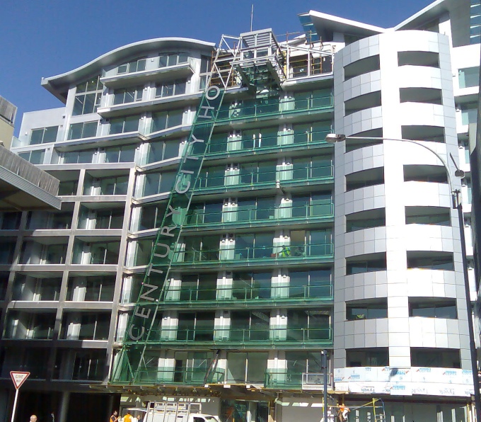
For a brief moment in time it seemed as though time had stood still, and that El Terry had given up finishing it, but then it was restarted with new contractors who actually seemed keen to complete the project. It’s one of the more complex developments Wellington has seen for a number of years: taking a barren empty site and layering on it a monster carpark for initial income generating potential, and then an apartment building which suffered the indignity and outright crassness of having another apartment building built slap-bang in front of it, and now the hotel part of the site has almost been completed and is being fitted with a giant diagonal sash across the facade like a winning race-horse.
And how appropriate therefore that we feature the finishing touches going on to the Century City development as the Wellington Cup is held again, graciously sponsored by Wellington’s last developer with any cash left in which to sponsor a race-meet: Mr Terry Serepisos. Designed of course by Wellington’s most convivial architect, the only man in town who has the wherewithal and ability to drive a Ferrari and the inclination to drive a Smart car instead, the sole reason that Wellington’s wine bars are still open and doing a roaring trade in MerlotPinot, the curly-headed pensioner bad-boy turned establishment figure: Mr Roger Walker.
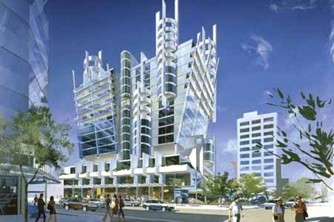
It has taken an absolute age to come together: who knows what the budget was or the programme was meant to be, but although the Tory St frontage is a bit too try-hard and spiky for my taste, it portrays less of Walker’s butterfly-roofed wow factor characteristic of some of his more recent works such as Scirocco apartments; and thankfully a whole lot less of the “explosion in a bling factory” (great phrase – thanks Wellurban) promised by his next work on the corner of Cuba and Dixon which looks alarmingly like a Jeff Koons take on Disneyland.
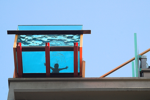
The hotel at the front is being fitted with a rooftop lap pool, that in a move reminiscent of the Adelphi hotel in Melbourne, has the glass front of the pool projecting out into the street, a design feature always likely to attract the eye of the Fish.
When seen from the side the roofscape is a fantastic rolling dune-scape of roof forms over the apartments, allowing views to peak north and south. While I haven’t been invited in for a tour of the facilities yet, and am most keen to find out how the several floors of apartments on the north side function without any access to daylight or sunlight after being blocked by MonVie, I must say that I am intrigued by the cladding on the building. It is a metal lovers dream: alucobond panelling, corrugated steel or aluminium side walls, stainless steel balcony frontages, and a large amount of steel structure in behind it all as well. Not a sign of dodgy fibre-cement board or leaky plastering anywhere. All they really need to do to finish the job off now, is to complete the signage out the front so that it no longer reads as the current somewhat tacky moniker: Century City Ho.

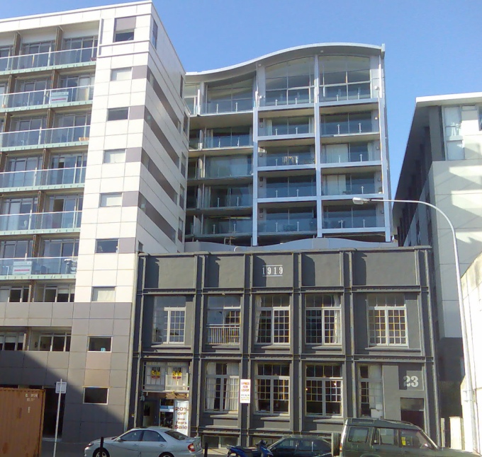


I’m really surprised that apartments are built in Wellington with windows and balconies facing neighbouring properties, only to be built out by a neighbouring property.
From memory, there’s some sort of bylaw in Auckland that prevents this, after an apartment building was blocked out by a neighbouring one many years ago.
Whatever happened to internal lightwells? Oh, that’s right – that’s all valuable space that could be used for apartments.
By the way, I live around the corner from here, and over the past few weeks, it seems every time I walk past the building, there’s someone taking a photo of the “Century City Ho” sign and sniggering.
“the curly-headed pensioner bad-boy turned establishment figure: Mr Roger Walker.” surely Ath is the only bad-boy turned establishment figure? They made him President of the NZIA after all. Rog hasn’t had that honour / curse yet has he?
Its good that Serepisos is still sponsoring the Wellington Cup. He loves that sort of dressing up stuff, meeting and greeting the rich and famous. I’ll say one thing about Cup Day in Wellington though – certainly on Saturday morning anyway – it brings out the best in people’s clobber. For one small moment in time Wellington was filled with gentlemen in nice 3 piece suits, and dashing hats, and the women were lovely – resplendent in flowing off the shoulder numbers, and with elegant (if not a little fool-hardy for a muddy field) shoes and of course all sorts of fantastic hats. All standing in line at bus-stops, ready to catch the train. Bring it on more often !
Of course by nightfall / next day we all looked like crap again…
Aside from the superficial tack-on detail, the roof excitement, and the gesture of excitement with the almost daring cantilevered pool, the essence of the building looks as cell/crate like as any MonVie. One of the best things about Sirrocco is the spatial gymnastics that occur inside the building, with the result of some fairly interesting apartments (well, the penthouses at least). I wonder if the same is true here at the Ho, despite outward appearances?
…and please let that catch on as a name for the development…
– I’m staying at the Ho
– Can you get this round; I left my wallet in the Ho?
– Your Ho or mine?
– etc
I live at the Ho… other design features worth mentioning?
1. the deadman walking metallic catwalk that links it all together instead of hallways inside. great idea for light and airflow. bad idea for
a) women getting their heels stuck in them on a regular (squealing) basis
b)appalling noise level from footsteps of any kind and even worse, suitcases being trundled over them at a decibel level similiar to a jet landing
c)ability to hear in detail what the drunk people three floors up are talking about when they roll in at 3am.
2. lifts that announce their arrival with a high pitched ting. great if your’e sight impaired, very uncool for all of us who have bedrooms five feet from the bloody things
and yes please, they gotta add the TEL soon…
Sorry Pol that’s an R W special design feature. He put the same thing into the Egmont St apartments as well. I thought he would have figured out by now that it’s a silly idea. But then again it must have some advantages in terms of fire cells or something. Can you tell us what happened to the north facing units that lost their view? Are they occupied or just abandoned?
Its stunning the amount of power and influence that this Blog has. No sooner has the Eye of the Fish commented on the Ho in the City, than an enormous crane is there – right now – installing the last bits of glazing so that the name can be finished off. Mind you, I quite like Ho as a name. And i have no idea why Pol thinks it is going to say TEL at the end. It could be USE. or TTY. Or VEL…..
I noticed earlier today the “O” was removed… probably fastening the bolt positions. More progress right here.
Athfield’s definitely made peace with the architectural establishment, but Roger Walker is still something of an architectural larrikin.
The O was removed to get the new glass in place. Road closed, crane to the top floor, lots of panasap green glass for the sash. Abseilers will stick the lettering back on and complete the words later this week. Maybe even today !
Pol: Roger’s half deaf. Send him an email. Or go visit him.
I lived in monvie for about a year (up until a few months ago). The obscured century city apartments slowly filled up over the course of the year – they were about 75% filled by the time I left.
The light isn’t actually too bad for either building; unless your at the bottom-most floor or two. If you weren’t aware, the monvie building is U-shaped on the back, so theres a light well that gets surprisingly decent afternoon sun.
More awkward is the fact that – from Monvie – you can not only see directly into the other wing of the building, you can also see into the entirety of the adjacent century city apartments. Some people just ignore this fact, others leave the curtains drawn 24/7. Its an interesting dynamic.
I should meet Roger for some girly input- just watched another chick go a-over-t this morning trying to walk down the sheer slippery tiles in the entrance way in heels (bad when its wet).
I dont know much about the units obscured by another building- however my floor is mostly empty- they seem to be rentals (hence the annoying suitcases coming and going).
Internally most people keep the blinds from the bedroom onto the internal stairwell closed, saves having to tidy your room, make your bed…but light coming in is great, apart from the noise issue, they are lovely apartments to live in.
I have a view into the zebra backpackers. They also need to close their curtains. Especially the mens dorms. It aint pretty.
I prefer Pinot Noir to Merlot.
“If anyone orders merlot, we’re leaving”
Clearly I’ve made a huge mistake in wine type and have been mis-informed. My apologies Mr Walker. But thank you for fronting up and correcting us !
Pol. Video proof of mens dorms misdemeanours can be emailed to us at the Fish…
…..women’s dorms also accepted. More importantly though: can anyone post a plan? I’ve never been in there – and am intrigued by this giant internal stairwell / lightwell / walkway. Walker is a master of the convoluted space, if not the audible clanging, or the Merlot bottle.
Sorry no plan – threw it away in disgust after building the damn thing.
You can get a good idea of it from the carpark area where the letterboxes are located, it continues up to the top in the same shape. The floors crank halfway up each side so the “prisonguard” walkway has stairs down to the front doors of the southern units.
Maybe Pol could take a pic?
BTW Pol – the rattle is cos we ran out of deadening strip (the grey stuff) halfway through and the client wouldn’t supply any more..
I shall endeavour to supply pics of catwalk. I will however not supply video of aforementioned dorms or misdemeanours. I believe there may be legal issues around that type of filming.
MPa- thank you for explanation, always wondered why no deadening strip used (at my end at least).
perhaps someone could explain why the apartments in the newer Tory St block have sliding doors that open directly onto an internal multi-storey car-park. is that what’s called drive-on access?
Newbs – They were always in the plan that way since day one – They are meant to provide a modicum of light, however small that may be in practice.
They were originally called hotel rooms rather than apartments but we all know how our Terry works..
The bar area on the ground floor (not open yet?) originally had a mezzanine floor that got so squished by the floorbeam requirements within the overall height that it reached <1.75 m and had to go.Tragically Welly’s first midget bar never did see the light of day..
“I’m really surprised that apartments are built in Wellington with windows and balconies facing neighbouring properties, only to be built out by a neighbouring property.
From memory, there’s some sort of bylaw in Auckland that prevents this, after an apartment building was blocked out by a neighbouring one many years ago.”
There are now rules in the district plan to prevent residential buildings being built right up to the boundary if later developments could compromise access to light an ventilation, and in fact it was the Century City/Monvie spat (appeals, judicial reviews and all sorts of fun) that prompted the change. However, that doesn’t protect _existing_ buildings, and in practice the whole RMA process appears to lean heavily on so-called “anticipated” effects, which seems to only refer to the simplest quantitative rules, not more subtle, holistic or even common sense arguments, even if they are based on statutory design guides. I’m no expert on the RMA, but it does seem that the thought of lawyers getting involved seems to scare the bejesus out of a lot of authorities.
The “Ho” is now hot.
Thank the good lord. I couldn’t suffer the slings and arrows of my friends tittering much longer…
Pol, are you still HOT? or has it grown to the full TEL yet? My theory is that Terry (a name often shortened to Tel in some cultures) is going to live in the penthouse, and wanted to look through the window to see his name in large letters on the top floors…
…except of course then it is just going to read LET to him from the inside, ( with a backwards L ). Theory obviously not very well worked thru yet.
Roger – I owe you 20, Obama is in…. may come in handy this yr, e.g. Terry
Georgina,
I haven’t got the faintest who you are, but am nonetheless staggered that you thought Obama might not get in! You put money on the other guy? wassisname? thingummy?
Hooray ! Its in the paper Saturday – with the full name at last. And whaddya know? They decided to settle for HOTEL instead of HOVEL, or HOTTIE, or HOUSE. Hrmpfh. the “mystery” solved at last.
The mystery has been solved, but the life-size Elvis in the foyer raises whole new questions for me.
I’m not sure about any Elvis statue (are you sure it’s not meant to be Terry S in a jumpsuit?) but I did notice that the words Century City are now lit up in blue at night. But not the word Hotel yet. Mind you, if you had the penthouse apartment there, would you want a big backwards blue letter outside your window?