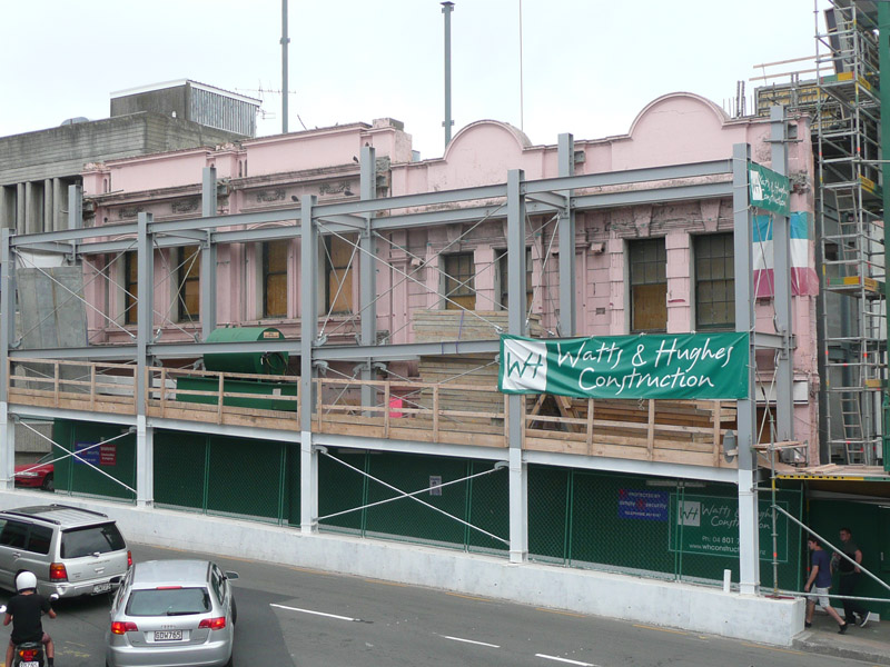
I mentioned this project in passing the other day, in a post about the return of the cranes to the city skyline, and thought its worth having a bit of a closer look at it this morning. I’ve been sneaking off into Moore Wilson’s car park to take photos every so often, and so this first photo is from a few months back, when just a skeletal framework is showing. There is, to my eye anyway, something quite beautiful about the clear simplicity of the structure on this building: there’s an insitu concrete wall, and then there’s some steelwork. The columns are relatively small and slender – the work is being done by the concrete wall, and so all these babies have to do is cope with gravity.
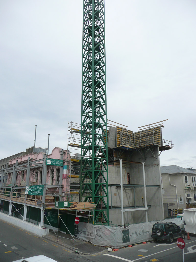
I may be wrong, as I haven’t checked the consultants board, but this steelwork approach seems to be the approach of the keen minds at Dunning Thornton, and in particular local boy done good Alistair Cattanach, who is a mighty fine engineer, from what I hear. I think he was the engineer on the Blair/Wakefield apartments, where the columns are so thin and slender that they almost disappear at times, and he has also been the go-to engineer for interesting projects around town, including CoCA at Massey University. Long may that continue.
Il Casino was of course the site for the famous restaurant that Remi Bresolin ran here for years, a Venetian style trattoria I believe (never having got there myself). The front of the three old brick houses remains, in hideous pink, and are supported by massive steel structure just to hold it in place while work is going on.
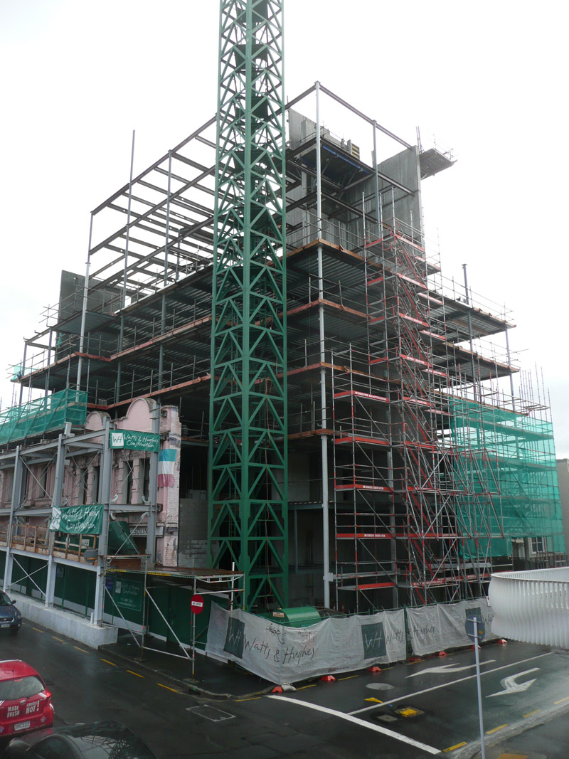
The new building has probably reached the top by now, and is currently shrouded in netting, but these photos still show the structure before the netting went on. The title of this post is, of course, a thinly veiled tribute to Tarantino in his Pulp Fiction days, as well as a weird mashup of Bond. Casino Royale of course was filmed partially in Venice, and so it all ties back together, sort of… in my mind anyway.

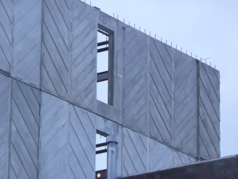
So we’ve got two stonking great in-situ shear walls running full height, big concrete diaphragm floor plates holding it together, and then a precast wall at the rear that finishes off the backside. I do like a well finished backside, I do. No one wants to look at a building that has an ugly arse end – but every one enjoys a finely proportioned rump. Or have I just been admiring rumps and drinking rums too much? Whatever. Sometimes buildings have no backsides, sometimes they’re all just a bunch of arse (see recent post for discussion…). This building, of course, is oriented towards the sun, towards the sea, towards the happy ending of Tory Street where it comes into Courtenay, and yet this building has an all important back side as well. In fact, perhaps more important than at first it may seem – the rear facade will be seen by every single driver of the State Highway through to the Basin, and so it’s carefully manicured striations will be a subject of many a traffic light ponderer for years to come. It’s also going to be highly prominent from the new Memorial Park, where it will stand out like a beacon. Let’s hope that it stands out in a better way than the other tower blocks presently visible from the Park.
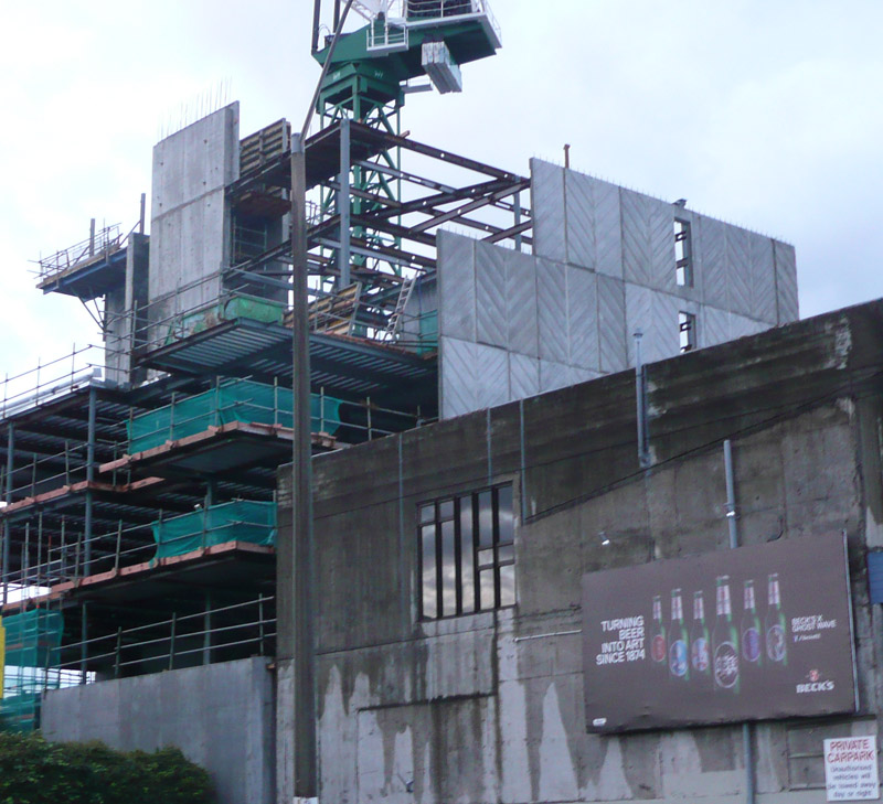
There is also a nice continuance with the concrete brutalist facade of the old Cricketers Arms, now (still?) Happy, which haunts this corner on Vivian. Our frequent browsing archivist Stark likes this building, or so he has said before, but not all Wellingtonians do. Let’s face it – it can be harsh. But it’s appropriate for the setting – and so too is the back of the Casino.
And so we come back to the beginning. The cladding is going on, rustling behind the wrapping, and this will be the main ingredient for the recipe here. Architects for the job were Studio Pacific, but the job is being carried out by another firm I believe, so I’m not sure who will take the credit on completion. Certainly the restoration of the old brick facades will be a big important part of the job, and I’m hoping that the hideous pink can go away and never return. How will the ultra new modern apartment designs go with the old crusty walls of the existing carcass? How will the new apartment owners cope with the eternal traffic jams of Tory, Jessie and College Sts? How will the sounds of late night revellers wandering and carousing their way up Tory St on the proceeds of a night of cheap wine and vodka red bull chasers go down with the expensive budgets of the presumed apartment owners, poised above them? Time will tell. So far, though, it’s looking good.


I think that Happy is now called Puppies
Happiness is a warm puppy.
Hmmm, thank you, I think. Looking back at those pics above – and the dark stains of water cascading down the side of Happy Puppies / Warm Gun, it does make me wonder what the rear facade of this building is going to look like in a few years time. It’s got that diagonal hatching patterning thing going on, although I’m not sure if there is a bigger picture / overall effect. Will e concrete stain in an obligatory diagonal pattern, or will gravity and the wind win out, and the water find its own way down?
I guess I should be relieved at not having to defend the honour of the Cricketer’s Arms again, but I do feel moved to point out the less than satisfying contrast between the heft of its in-situ poured concrete and the rather vapid precast slabs of Cheeseburger Towers. Shades of Countdown (http://eyeofthefish.org/Prison-Shop/).
The keen minds at Dunning Thornton would like to point out that they are not associated with this one…
Aaha! Dissension in the ranks! So, once more I’m wrong – Starkive doesn’t like the concrete here (not quite sure by what reason you call it Cheeseburger towers?), and Matt D says that DTC were not involved. Interesting – ill have to go and censor my comments – but, so, Matt: who are the engineers then?
I’m a little annoyed at myself there – I was getting cocky, so to speak, as I thought that I could detect a “house style” in engineering emerge, in the same way that you can often see a “house style” emerge in architectural projects. Much harder in engineering projects of course, because A – it is often all covered up, and B – the same laws of physics apply and so the same issues need to be resolved by the same pieces of steel.
Cheeseburger tag courtesy of your Tarantino reference… but also because it won’t be the nourishing sheer walls that are visible at the end, but the salty pre-cast topping.
>where the columns are so thin and slender that they almost disappear at times
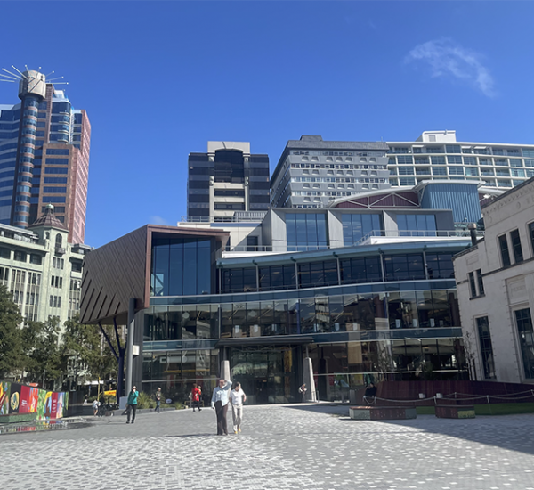
On the other hand, check out the new The Hub at VUW if you want to see columns that are absolutely massive. I popped in to see it a couple of weekends ago and think it’s a pretty cool space.
I think Silvester Clark are the engineers. They also completed Patent 326 Apartments with Globe Holdings
@DavidP Yeah, I wandered through the HUB the other day, and yes it is a cool space, but I was a little disappointed that it had so many stairs, I mean yes you can have access on wheels (chairs, trolleys etc) at all level, but you have to use lifts and other elevating devices.
It really felt as if the barrier free access was added as an afterthought when with such a major redevelopment, it should have been possible to incorporate slops and ramps as part of the design to make it totally seemless,
But the stairs are the seats. Dd you see it when the students were there, or when they were not? Full of students, it is amazing – the mountain of stairs becomes seating everywhere.
@Andy B, yes I know the stairs are the seats and I am not advocating removing them,
What I am saying is that it should have been possible to also incorporate a sloping path through the space that for example would remove the need for the clumsy “lift” that is needed to span the small height difference between the easterfield level and the lower floor level… It just stands out as a last minute solution and not part of an intergrated design