For years sitting as an empty hole in Courtenay Place, an eyesore, a broken tooth, a scab upon the sullen carcass of downtown retailing – we Wellingtonians had joy in our hearts and hope in our chests when, 16 years ago, the hole was at last infilled with a lightweight facade and a large name tag: Courtenay Central !
Such big city delights as a multiplex cinema, a food court, multiple shops, a link through to a car park, an upstairs restaurant, and an escalator! Such sophistication! A premiere destination mini-urban mall!!!

However, since then it has gone seriously down hill, to the extent that now it is (once again) an empty hole in Courtenay Place, an eyesore, a broken tooth, a scab upon the sullen carcass of downtown retailing. We are, effectively, back to where we started from.

..

..

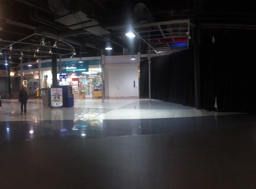
I’m hopeful however that this is the low point and from here it can only get better. Well, it can hardly get worse, can it? The dining upstairs is a dog and needs to go – awful. The dining downstairs has already gone, and may be even coming back -= so far we have a McDonalds that is pretending very hard not to be a McDonalds, and a lone Chemist. Brave people. Everything else has gone – the Whitcoulls first, then the DVD store, then even the Dungeons and Dragons man – and you just know that when even a seller of tiny plastic toys for spectacled nerds moves out, you have got a problem. So – they have deleted the silly double entrance, and reduced it to just one, and of course the multi-story carpark building has gone now also – they’re starting from scratch. What now? Suggestions please! The only way is Up, baby!
I’m going to leave you with a favourite quote from Blubberland, a cutting (but gloriously accurate) book by ex-Kiwi Elizabeth Farrelly:
“So it is interesting to note the increasing interiorisation of shopping as an activity. From the traditional street market where interiors were ususally makeshift and temporary, to the modern mall where entire city blocks and precincts are interiorised to give the (usually female) shopper the illusion of being in a vast, sparkling, bejewelled, cathedral-like home. Woman like malls because they’re known, comfortable, clean and safe – from muggers and spitters, from sun, storms and mendicants. Here, at fantasy-home, women will relax, and when they relax, they will spend.
Malls titillate and relax, even while they make you feel needy, inadequate and dreamily disoriented. They’re meant to. It’s like chocolate. If you can be made to feel bad, in a small way, the more want soothing, and the more you buy. One thing you don’t see much of in a mega-wall, therefore, is social life. Whereas in a high street you might stop for a coffee, in a mall you bump into someone, you say hi and press on. This is because, from the first car-park moment, the place is designed as a disconnect, separating you from your reality and from your higher, warmer self. It’s designed to put you in a bubble – a car-like bubble – of self-gratification.
This is another reason why the mall experience begins and ends at the car park. Grey, fumy and jammed with other irritable, bubble-wrapped humans, the car park is no pleasure-dome. It’s designed to do a kind of good-cop-bad-cop routine with the mall interior, to make you more susceptible to the shopping urge. And because it is important that we come to it through the gates of hell, the mall is the first architectural typein history that has an inside but no outside. The mall has interior design, heavily themed and fantasised, but it has no street presence, no public self, no architecture.” p150 – Blubberland, MIT Press, 2008.
That, in a word (or two) is what a mall is meant to do. Make you feel good. Warm your heart, titillate you, give you a feeling of fantasy! Currently, this black ceiling is no more than a nasty gothic nightmare…


* The Games Workshop (i.e. the Dungeons and Dragons man) is still there, just tucked down by the back entrance (oo-er!). There is also the PostShop (although that seemed to be semi-integrated with the chemist next-door?!).
So it isn’t all doom & gloom, but it is a spectacularly dim shadow of what a “mall” should be. That bit of astro-turf with the picnic tables, directed towards a projection screen is just…sad.
Word has it that the owners of the mall and adjacent site desperately pushed for the Countdown to be developed on their Wakefield St site because they believe that it could be the saviour of their failing mall-ette. There is to be no direct entrance to the supermarket from Wakefield St, just a ratty little alley from the street to the supermarket entrance…in the mall. Thus, on-foot customers (which would surely be a large part of the reason for having inner-city supermarkets) would be forced into the shoddy, grim Courtenay Central in the vain hope that they would buy some Maccas or slushies on the way to get their cornflakes. The supermarket will turn its back on the street even more so than in the usual vehicle-driven big-box model, in a desperate attempt to save a poorly-conceived and even-more-poorly-designed mall that has failed in a market that clearly values street life over suburban chainstores.
I was among the selected throng who were present on the opening night of Courtenay Central. I still remember the baffled tone of the property developer guy from Noo Joisey who had to respond to a lengthy speech by the Prime Minister lauding him for bringing cultural vibrancy to the capital.
I suspect he was thinking the opening of a mall this size back in in Springfield would be lucky to the mayor.
From Reading’s Full year report in March 2017
looking at this, it seems that they want to change the ground floor of the ex car park on Tory to Retail, ( with parking likely above), but countdown still appear to be keen on the site
” Courtenay Central Redesign and Expansion : While we continued to make progress throughout 2016 on our supermarket development project at our Courtenay Central shopping center in Wellington, New Zealand, on November 14, 2016, Wellington experienced an earthquake. That earthquake rendered our parking structure unsafe and ultimately led to the demolition of that structure and temporary closure of our adjacent ETC, due to reopen late March 2017. Our supermarket tenant remains committed to the site but has delayed commencement of construction in order to upgrade its supermarket to a “premium†offering. Under the agreement to lease, our tenant is responsible for any increase in our costs resulting from those design changes. In light of the demolition of the existing parking structure (most of the cost of which is covered by insurance), we are undertaking a comprehensive redesign analysis, intended to materially increase the amount of retail leasable space at the center and to better coordinate the interface between the parking structure and the remainder of the center. “
Id like to see more apartments myself. Anything but more carparking.
Update:
http://www.stuff.co.nz/business/property/92475998/quake-hits-reading-cinemas-income-hard
Yes, but they have business continuity insurance, presumably. A friend of mine works at Reading and has been paid to stay on the workforce (but not actually working) from Dec till April. I’m sure that Reading aren’t so generous that they are doing this out of the goodness of their hearts?
When I’ve been past the now ground-level car park on Tory St recently it’s been well-nigh deserted, with the nearby park on Wakefield St almost as empty, despite both undercutting the on-street rate. Has car parking demand collapsed, just like the car park threatened to do?
As far as I know, that was always the big problem with the building – the car park was never really used that much. With the return of some decent suburban cinemas (Empire, Roxy, Penthouse etc), and the rise of people living in the inner city, not many, if any, people are driving in to the city to see a movie. Am I right? Well I went to see the Guardians of the Galaxy volume 2 the other night, and the Embassy was full (800 odd seats, right?) but there is no 800 car parking building nearby. After the film, people walked off into the town.
My guess, which I’ve said here before, is that the Reading car parking building was repairable – but who wants to pay to repair a building you don’t want, don’t need, and that is stopping you making the most of the site? The developer / site owner is just marking time while the architects draw up plans for new retail on this site.