There was some wonderful wooden news about Wellington last night, with the announcement of a new timber tower for the CBD. It’s a new building being developed for Robert Jones Holdings, which in itself is unusual as Sir Robert Jones normally just likes to buy and hold, but here his company has decided to redevelop the existing site.
The new building has been designed according to the development principles that remain crystal clear to Sir Robert: only ever buy corner sites, especially corner sites that face north. Make sure that there is no column in that northernmost street corner, as that’s the most prime office space. Always make sure there is a balcony so you can sit outside and have a smoke on your pipe, in the sunshine, with a glass of port, and watch the world drive by your doorstep. Make sure there are enough lifts so that the people in the building are kept happy and don’t spend time waiting for a lift. Good open-plan office space that can be simply and easily divided up into perimeter offices (as Bob Jones doesn’t like working in open plan space) and high levels of quality so that the space is always Grade A leasable for good returns. Robert Jones Holdings website is full of buildings that they own (they are the biggest property holders in Wellington) all of which seem to meet those principles, in Wellington, Auckland, Sydney and now also Scotland.
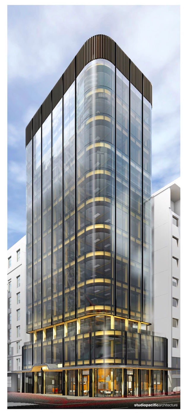
But of course the really exciting new thing about this building is that it is designed out of timber. Big timber. Engineered timber. Large logs of lumber, carefully sliced apart and put back together in a much stronger manner, so we will have LVL columns and beams and CLT for the floor slabs. And it plans to be tall – very tall. The world’s tallest timber office building it seems – bit only just, and only now, as there are others that are almost as tall in other cities around the world and others that are planned to be taller. But this is a record worth striving for – it really does aim to put Wellington right at the forefront of clever solutions in wood. That in itself is a great aim – Tina Morrison writes an excellent article in this week’s Listener magazine: “Raw Deal”, where she notes the current lamentable situation NZ finds itself: awash with wood, most of which goes offshore to supply logs to China and of which NZ Inc gets extremely poor returns. This building aims to reverse the trend and will ensure that at least 1500 logs stay in this country and are turned into a new laminated timber building.
The development itself does feature architects and engineers as well, despite Sir Robert’s claims to be the building designer, and luckily they are the best that NZ can find locally: Dunning Thornton Consulting Engineers with the “Bon Jovi” rock star of the engineering world: Alistar Cattanach; as well as Studio Pacific Architecture with their own rock star Marc Woodbury as lead architect, and no doubt a team of other players in the band. I’m not sure whether the building has got Resource Consent yet, but no doubt it will fly through, as who can resist a world-class exciting new building made from timber? Working with Bob Jones is an experience, so I hear, and these guys are in for a ride. Buckle in!
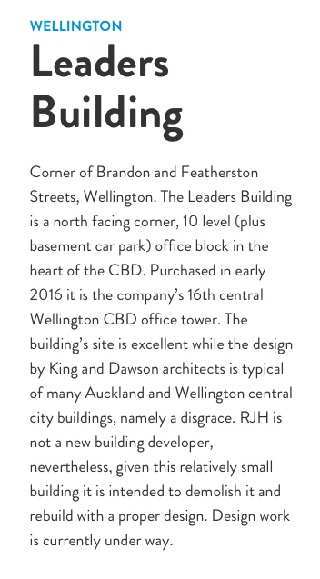
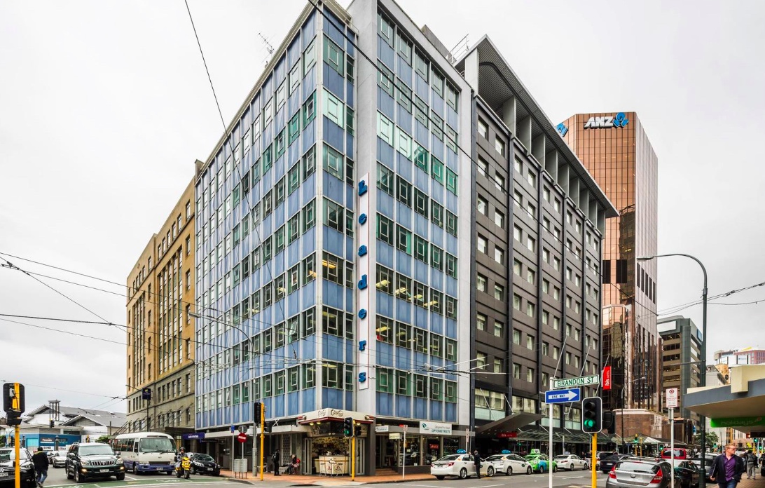
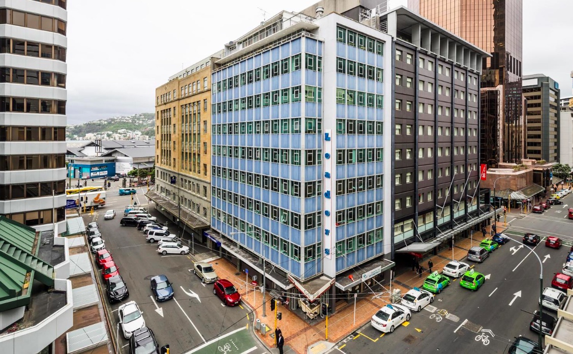
The project itself really is intriguing. The existing building is a dog – yes, it is on a corner, and yes, it faces north, but it really is a sad case and exemplifies everything that Bob hates about badly designed buildings. He has often made himself clear that architects should be put to death for their mistakes, probably by the most painful method possible. The current “Leaders Building” has an architectural pedigree of looking like a Modernist marvel, carefully modulated on the street corner, with a nice little set-back roof deck but in doing that it has screwed with the all important corner offices, and ruined the view out. It also has the most cocked-up street entrance ever, with some bad planning of amazing proportions, so much so that RJH filled up the former corner entry with a coffee shop. I remember going past this building years ago, pre-coffeeshop, and wondering how the architect could have got it so wrong. So, at last, this wrong is going to be made right.
I haven’t seen the plans yet, but no doubt there will be a much better lifting provision in the building, and there is a broad balcony at about level 2, presumably both to show off the timber construction, and also as somewhere for those who like to sit in the sunshine, smoke their pipe, and have a glass of red wine before lunchtime. What is exciting the engineers here is that in demolishing the existing monstrosity, they will leave the existing foundations in place and bolt the new lightweight building structure directly to that. Timber buildings are so much lighter than concrete or steel buildings, and when designed well, will perform much better in an earthquake. This building is not only tall, but skinny, with excellent floor to ceiling glass for views out and sunlight in, so it will be bolted firmly down to the existing piles and to help it ride out any quakes, the rooftop will feature a tuned-mass-damper water tank hidden behind the fins at the top. If you’re alert, you will note that the ground floor entrance has been removed away from the corner and given a much nicer entry of its own, leaving some lovely quality space for retail at ground and maybe first – and at every corner office we see the timber structure proudly exposed for the world to see.



Really interesting development – nice to see something that actually IS interesting.
I have to admit having something of a soft spot for the lines and proportions of the current building, and the way it sits in the streetscape. None of that makes up for bad planning however.
On the other hand I find the proposed building particularly ugly, with all those droll curves, and wonder whether something more tectonically interesting might have been possible given the innovation that it represents for construction technology. That’s just the modernist in me though, I guess.
I also find the colours particularly unsightly, but suspect that is mostly down to the render – I doubt whether the unnatural gold of the timber will retain much lustre where it is exposed or where it is behind the tinted glass. And then there’s that crown…
However, with all that aesthetic distaste aside, I am encouraged by this and would love to see this added to our stock of contemporary buildings.
I would be very interested to see some renders from the South East angle,
Will they take a punt and fully glaze the top floors, ( The Govt Life building is heritage, and the Ibis is reasonably new, so they are unlikely to be redeveloped in the near term – i.e before Sir Robert kicks the bucket)
or will we be left with two rather prominent slab walls looking out over the harbour???
Greenwelly – my guess is that where the south and east walls are up against another property boundary, a blank wall will follow. Unless, of course, they set back the top by 3m at the back to permit a glazed rear wall? But that would be totally economically madness, so, no. The rather prominent slab walls likely to win.
Unless of course i am wrong? The “droll curves” apparent in the render also seem to extend to the rear side as well. Perhaps there is glazing all the way round, all the way up? Being a timber building, it will presumably flex more than a concrete-columned building – so there will need to be a decent seismic gap at the rear anyway? Maybe a metre? Or more?
Argh – now that I see this on a proper screen (not my phone) I take back all favorable comments in relation to the Leaders building. I was confusing it with the Petherick Tower around the corner – a similar vintage, but much more successful articulation of detailing, form and expression.
Yes – this building is spectacularly bad in terms of its planning, but I wouldn’t say it is necessary the architects fault. King and Dawson were (still are?) a great company – and the regs of the time would have stipulated that basement carparks were needed. Because the basement is dug down to the waterline (high tide in Wellington only 2.4m below Lambton Quay pavement) then that would have had the effect of pushing the ground floor upwards. Hence the silly steps in the entry before you get to the passenger lift.
The corner office part is the bit that I suspect aggravates Sir Robert. He is quite right that the corner office should have the best view – up and down two whole streets, each with a stunning view in both directions. But here the corner office of the existing building is spoiled by not just a corner column, but also by a rogue blank wall that is then used by a silly vertical sign. The new building will make no such a mistake.
What about the height etc? It looks quite a bit taller than surrounding buildings. Does it fit within city limits? Indeed: what are the city height limits here?
Nice post Nemo ! The Herald says: “The office building, planned for the corner of Featherston St and Brandon St, would be 12 storeys high and about 52 metres tall. Jones said the foundations of the building would be conventional reinforced steel, but the rest would be composed of timber.”
(Presumably he means reinforced concrete? ). Yes, so: 52m – the WCC District Plan would appear to say a max of 60m above sea level here, so about 57m above footpath level. So, conceivably, the building could go another floor higher – but who wants a building with 13 stories…?
Re: “….and the Ibis is reasonably new….”.
Which demonstrates how well the Ibis Hotel hides its age; it opened in 1964 as the National Mutual Life building and was then reworked into what you see today in 1999.
I was a bit sad when this happened as it shared similar lines to the Leaders building though I don’t know whether it worked better in terms of layout. There aren’t too many of these early modernist buildings left that haven’t been “updated” and losing their classic features in the process.
I remember back in 1995 when North Korea took out a short-term lease on a ground floor tenancy facing Panama Street and set up a trade display for several months. They had a range of the most boring products you could possibly imagine (none of which you could actually buy except for the ‘snake wine’; a bottle with a real [dead] venomous snake inside pickled in alcohol), along with as many free copies as you could carry of the collected works of Kim Il-Sung in English translation. It was quite funny how the trade display fitted perfectly with the building’s “Thunderbirds” school of design.
https://tiaki.natlib.govt.nz/#details=ecatalogue.442595
THAT was the Ibis? Goodness me! Certainly has changed quite a bit. Of course John, there is one large Modernist building that is so far still standing as per original – the Gordon Wilson flats ! Hmmmm……
If only we still had a North Korean Embassy in town now. As far as sane and rational leaders goes, the temperament of Mr Kim seems far more straightforward than that of Mr Trump.
Speaking of the outputs of dictators, I once had a copy of Enver Hoxha’s collected works on the Albanian people’s annual production of tractors – which must have been almost as exciting as the collected works of Kim Il-Sung. Perfect bed-time reading – sends you off like a light….
Spoiler alert – uninformed informants advise the timber is to perimeter structure only. The core is concrete as any other office building and does all the seismic work with large shear walls… It’s a start though.
thanks Dave – but that is quite a common approach with large “timber” buildings around the world – to have concrete shear walls in the core. I wouldn’t go so far as to say that the timber is for the “perimeter structure only” – if it is just the core that is concrete, then that implies that the whole of the rest of the building is timber, which is so much more than just the perimeter. How big is the core going to be – say, 20% of the floor space? So, maybe then 80% of the building may be timber? Sounds like a very good start indeed, to me!
That does undermine the tallest timber office building claim somewhat though…
http://www.noted.co.nz/currently/innovation/must-haves-for-sir-bob-jones-world-beating-wooden-skyscraper/
Jane Clifton, with a column in Noted:
Rules for the world’s tallest wooden skyscraper.
What makes a functional, pleasant-to-work-in commercial building? The brief from Sir Robert Jones to Wellington architects Studio Pacific is his master list of must-haves.
1. No view-blocking corner columns. Jones says there’s no structural reason to have columns in corners.
2. The lifts and foyer are in the building’s centre, not, as is usual, at one end. This makes for better function and flow.
3. There’s an open deck on the third level. Jones regards access to open air and views as an essential amenity.
4. The front corner windows are curved, not angled, and there are large rear floor-to-ceiling windows. A building should be as light and airy as possible.
5. The lift ratio per metre of floor space is much higher than in other prominent buildings: one large lift per 1200sq m. Occupants should not have to wait long for lifts or sardine into them.
6. The ceilings are higher than in many designs: 3.5m. The feeling of space makes buildings more pleasant.
The RJH building has an additional feature, which the firm says will “hugely exceed†the new earthquake code’s standards. Dunning Thornton Consulting Structural Engineers is installing a heavy floating rooftop counterweight, which counterbalances the building’s movement in an earthquake, minimising it.
here’s more of the article by Clifton:
There’s quite a marketing story here too. Overseas, structural timber project owners and architects have hailed the lower carbon footprint of the materials they’ve used and the zero-waste production from sustainably managed forests. Pending projects in various countries feature a hard-sell on green virtue. What a pitch: our building will be made of carbon-sequestering renewables; how about yours?
The only potential flies in the ointment are that less-scrupulous laminate makers might secretly layer non-sustainable or protected timber in their products or will be careless with the bonding solvents they use – the latter has been a problem in past years, with some solvents proving toxic.
There can also be a lag in some authorities’ acceptance of any new technology. Even construction industry journal articles about the new technology typically feature sub-headlines to the effect of “Yes, you read that right: wooden office blocks.â€
Among potential future showstoppers is London’s 80-storey Oakwood House, proposed for the Barbican, which was designed with University of Cambridge researchers who believe people will be more receptive to high-rise, high-density housing if it’s made from natural materials rather than the more alienating industrial steel and concrete.
The tallest timber-framed building on record, at 49m, is a 14-storey tower in Bergen, Norway. But Jones says RJH’s Wellington building will be taller.
He says his ones “will be the first faultless designed buildings [faultless in a functional sense] in Wellington and Auckland’s CBD. If that sounds excessive, then RJH invites sceptics to name exceptions and we will point out the faults.â€
The RJH Wellington building will also distinguish itself from most other such buildings in not visually advertising itself as wooden.
Jones says the building won’t look externally as though it’s made of wood or make a feature of any natural wood inside. He’s not accepting any architects’ suggestions to that effect either, be they for natural wood ceilings or decorative flourishes. The point is to showcase the benefits of laminated wood in construction and design excellence tailored for the benefit of the building’s occupants, not the taste or preferences of the builders or owners.
Given the number of new wood technology high-rises being commissioned overseas, the Wellington building will not hold the “tallest†record for long, but its lack of obvious woodenness may remain its most distinguished quality. Although not quite log cabin-ey or Lockwood-esque, most of those so far built would strike someone of Jones’s tastes as ostentatiously woody-looking. Lendlease describes its International House in Sydney, its third timber-build, as tree-huggable.
The ultimate showcase for the heroic versatility of high-tech plywood is almost certainly Sweden’s proposed Stoorn – a 45m building in the shape of an elk eating a pine tree, atop a hill in Norrland. The tree will harbour the elevator to the elk’s innards, which will house a conference centre, an auditorium and a restaurant, while its antlers will be a panoramic viewing platform.
Were anyone to conceive of, say, a giant wooden weta for Wellington, they’d probably best keep this from Sir Bob.
This article was first published in the August 19, 2017 issue of the New Zealand Listener.
Huh:
“Jones says the building won’t look externally as though it’s made of wood or make a feature of any natural wood inside. He’s not accepting any architects’ suggestions to that effect either, be they for natural wood ceilings or decorative flourishes. The point is to showcase the benefits of laminated wood in construction and design excellence tailored for the benefit of the building’s occupants, not the taste or preferences of the builders or owners.” (from above post)
Well, I guess that might be why all the timbery looking stuff in the render looks like polished brass then?
I don’t really think I get it though.
m-d : despite what Jones has said, quoted above, the building will inevitably become an icon for tall timber buildings in Wellington – in New Zealand – heck, even in the entire world. There will (i presume) undoubtedly be timber on display, even if it is not made into an outstanding feature – I’m looking forward to seeing more!
Multi-storey in Kangaroo, Sydney
Believe this is now completed
similar effect perhaps
http://www.smh.com.au/content/dam/images/g/p/k/p/a/4/image.related.articleLeadwide.620×349.gpkmyk.png/1466057787086.jpg
That would be Bangaroo :)
http://www.smh.com.au/business/property/timber-lendlease-completes-first-wooden-office-20170426-gvt3ia.html
http://tzannes.com.au/wp-content/uploads/2016/06/TZ-International-House-05A.jpg
http://www.hess-timber.com/fileadmin/_processed_/csm_International_House_Sydney_2_fd22d1ccd0.jpg
http://cdn.newsapi.com.au/image/v1/c22a63f74d7a4e2faca223123868d177?width=650
Wow! Pity much of the crafty aesthetic is lost behind the glass (from the outside) though. And what’s with that crusty carpet? Imagine floor boards, parquet, even ’60s era cork tiles!