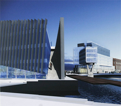
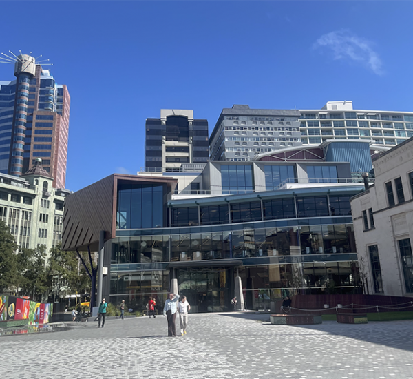
Athfield Architects have scooped the waterfront prize-pool, with a clean sweep win of all the sites covered in the Kumutoto North competition. Well done indeed to Ath and his merry band of cliffside dwellers. Wellington Waterfront also deservers kudos for having running a competition in the first place, and for sneaking out the press release a mere 5 months after the competition was held. We’re not quite sure why it has taken so long for the decision to be know, but we’re glad that a new conversation can now begin in earnest.
The first question therefore is, have the judges chosen the best scheme?
No doubt all the competition entrants will have their own opinions on this somewhat controversial decision. I suspect that the rest of the architects in Wellington will certainly be watching with sharp interest, but also perhaps a weary bitterness or resigned tedium to the news that Athfield has landed yet another commission (even though the entries were anonymous). In recent months they have have:
- won the commission for the Overseas Passenger Terminal
- been tasked with designing the architectural elements in Frank Kitts Park
- battled for their South coast Aquarium
- completed work on the Odlins Building, Waitangi Park and the New Dowse
- had their three buildings on Chews Lane start construction
While other practices subside on a lean diet of house extensions and bathroom alterations, the steady trickle of CVs working their way to the house on the hill could become a flood…
Anyway, the decision has been made, so there is little point in debating the merits of the losing schemes. It is genuinely fantastic that a winner has been chosen and will be built (consent approving). But it is worth a good hard look at several aspects of the winning scheme, made difficult given that the paper only published 2 perspectives and not much in the way of plans.
There has, of course, been one commentary already on the merits of the various Kumutoto schemes, courtesy of a certain blog. Back in September 2007, WellUrban’s erudite commentator noted this about the entry concerned: ‘Option A’:
The “fossil” is described as “something found – now unearthed and exposed”, it explores the language of geomorphology, all tilted planes and cuttings. On a more urbanist level, these angles help the transitions in scale from Shed 13 to site 10 and from the Meridian building down to the water, and invites the public to climb up the slope of the smaller harbourside building to a series of roof terraces. I’m not quite convinced that these would be so inviting in real life, though I like the idea of a basement-level “Old Sea Wall Bar” as a further exploration of these layers. The “cutting” between the two halves looks a bit gloomy on the renderings, but from the plans it seems like the edges look active enough, so it might be more appealing when realised.
There are quite a few things I like about this scheme. The angular geometry of “the fossil” is distinctively different, yet it doesn’t seem to be too much of an arbitrary “look at moi” design. There are a few environmental features (seawater cooling, planted roofs, glazed chimneys topped by turbines) that would be interesting to see implemented. But I’m concerned by the fact that the guiding metaphors are derived from geological landscapes and industrial areas, neither of which are cities. Is this to blame for some of the awkward pathways and inactive edges? In real cities, people don’t walk among fossils or cranes; nor do they wander up narrow stairways to roof terraces or enjoy walking beside ground-floor carparks or offices. These flaws may not be insurmountable, but the architecture isn’t aesthetically compelling enough to put metaphor and theory ahead of a pleasant pedestrian environment.
And that’s the bit that concerns us. WWL chairman Ian Pike was reported in the Dom Post as saying that the buildings: ” could include apartments, ground floor cafes, restaurants and bars, but they will be predominantly set aside for a more commercial office use than anything we’ve done before, mainly because of their proximity to the cbd, which is just across Jervois Quay.”
Does that mean that the much lauded Waterfront framework – having mandated a public use for all ground floor areas – is to be discarded here? Surely not. The city has seen the disastrous results that come from blank windows of corporate offices at ground level (the waterfront Shell Centre), and the deathly effect that carparks have in a similar setting (Shed 21 and the Railway station). The ground floor uses will hopefully have to be kept as publicly available space, and the scheme revised to suit.
The argument is often levelled at the waterfront projects that there are enough food and drink outlets already, but judging by the crowds at the Sevens last week, there is always room for more. With the completion of the BNZ development, sites 8,9,10 would complete something of a missing link that creates a stretch of public retail across the northern end of the waterfront. Whether this new area will gain much ground on the traditional shopping areas remains to be seen, but perhaps it could be the start of a ‘Blue Mile?
There is one other possible use which was subject to some vigorous and successful urban activism last year. Currently using the aged and decrepit Shed 1, the Indoor Sports team put forward over 600 submissions requesting a replacement area for should their shed be axed. One possible suggestion was to situate the games in the ground floor of the proposed Site 10, and this was apparently taken quite seriously by the Council, shortly before the Waterfront Development Sub-Committee was axed. Seeing as the DomPost noted that:
“The site 10 building would create a buffer with the working port by mimicking industrial aspects, such as stacked containers, in its eight-storey design.”
then there should be able to be some room for a few Indoor sports courts there on the ground floor. It would certainly make for an interesting addition to an otherwise standard mixed commercial/retail programme.
While not being quite as radical as the other entries, the architecture is nevertheless bold and unique, while still being compatible with a range of potential uses. It feels that the most important part of this project will not be in the initial design, but instead in the ongoing elaboration of programme and landscape. The building themselves will no doubt be successful, but whether this translates into success for the waterfront as a Place is still up in the air. Lets hope that we see some revised plans soon.


Regarding Ath’s success in Wellington – Ath struggled early here also, as other Architecture firms have done. He, at one stage, laid off 80% of his staff because there wasn’t enough work to go around. He has plugged away and is now (IMO) the pre-eminent architect in Wellington.
The thing I like about Ath is his “Wellingtoniss”. He (and when I say ‘he’ – I mean Ath and his cohorts) has an ability to read a site and understand the forces at play.
It is no accident that the Civic Square is New Zealand’s best urban space, (and it would have been better if Ath had been able to realise the whole scheme….)
It is also no accident that Waitangi Park is the best urban park in the country (even if the grey-hairs wring their hands and spout their babble…)
Ath + Megan Wraight are a formidable pair.
And besides there is enough major work to go around – CCM have the Defense and Vogel Buildings, StudPac had Meridian (don’t get me started….), Jasmax have BNZ, Herriot+Melhuish have the Bowen Campus etc etc. All of the good players are getting their share.
I personally think that Ath’s work makes our city a richer place.
[…] a few days after a clean sweep at Kumotomo, the Athfield-designed proposal for the Overseas Terminal has suffered a setback when an […]
[…] my way down to the Waterfront Information Center, I was able to take more of a broad look at the Athfield Kumutomo wins. The pictures and write-up shown in the Dom really don’t give a full idea of the scheme, so […]