For the last two years since the demolition of the antiquated Wellington hospital, a massive construction has been taking place in Newtown, balanced on its giant rubber base-isolated foundations. Yes it’s too late to ignore it anymore – the hospital has reached a state of completion that, while still some way to go, affords us a chance to review the progress so far.
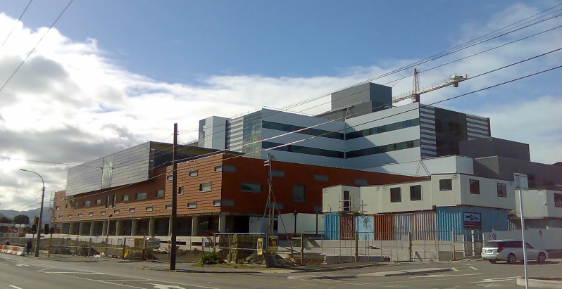
After a number of years of fighting whether it would be situated in Kenepuru, miles from its constituents in Wellington, it was agreed that a new hospital should rise in the east like a biblical star. Sadly it’s yet to fulfil the promises of its birth (and in fact I haven’t heard a nice word said about it yet), but let’s take this step by step. Is a hospital just a machine for being sick in? or does it have some greater obligation to the huddled and downtrodden masses of Newtown and Government House? or even to architecture? While it can’t be an easy job designing a massive structure in an area of quaint two storey Victoriana, the architects have unsuccessfully endeavoured to hide the massive part of the hospital back from the street in a bland white corporate box that speaks more to the needs of office stationery and regular injections of hygiene than it does to the gentler taste of culture and the public at large. Should the public obligations of a hospital be confined to the most narrow sense of the pragmatic? or was this yet another opportunity for architecture which has grandly missed its mark?
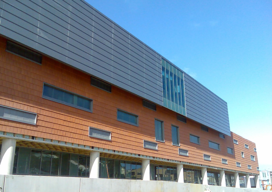
Truely the building treading on the street-front is banal. Its first confusion is the attempt for symmetry clashing with the “random” pattern of the windows, clad in beautiful terracotta tiles, sadly somewhat crudely detailed here. Bizarrely the windows are not all they pretend to be – most appear to be filled with solid metal panels rather than glass, probably because they are situated at ankle level. If the building were being honest, it would just have a continuous terracotta wall, which would surely be more aesthetically pleasing than the nonsense of non-visible windows. Perhaps they were installed as a sop to the local population, trying desparately to tie in with the old buildings nearby. Or perhaps instead they are low level louvres, ready to open and admit fresh air, although this would be an unusual step in an otherwise sealed facade.
Let’s not be stingey – the hospital is a hugely needed and none-too-soon addition to Wellington’s admittedly minscule chances of surviving an earthquake unscathed, and we should be very grateful that it was built here and not in Porirua. The difficult question must have been what idiom to respond to the nearby brick and timber twee-ness of buildings such as the Victorian Ballroom – while simultaneously attempting to innoculate the population against rubella, TB, and whooping cough, and seemingly immunising those on site to good architecture.
The true crime however of this building is that, while providing better quality rooms than before, it allegedly provides very few more beds, and the envitable waiting list will be only a little smaller than before. The Florence Nightingale rationale of sunshine, fresh air and plenty of it, has been surplanted by the service engineers’ insistence on a sealed box, which may serve to keep the gems safe inside and protect the surrounding populace – but really – is that healthy for the poor sods within? Give me sunshine!
Aalto’s Paimio Sanitorium in Finland no doubt had the same irritation of service engineers and hospital adminstrators but seems to have engaged with an architecture of well-being traced from a very different lineage than that selected for Wellington’s new hospital. Here, instead of being graced with slim balconies and keen proportions, the worst architectural frugalities of post-post-modernism, multiplexes and the big box retailing of Queensgate lend their banal detritus of Americana. Corporate bottom lines rather than Victoriana or modernity lives here.
Let’s hope that the inside is better.


This is dire. I don’t even know where to begin. It’s high low-rise. It’s Newtown’s garish castle made on the cheap. Words fail me. I’ll compose myself and try again later.
Archeologists uncovering the grand cities of the Old and New Worlds draw sociological conclusions from the scale and complexity of the structures that remain – however fragmentary. Hence our image of ancient Egyptians and Mayans as being obsessed with religion, when they were probably as distracted by sex, alcohol and sport as all the rest of us. What then will future excavators make of our ruins?
Presumably this will be seen as the greatest culture of hypochondriacs to ever walk the Earth (or ride across it on our mobility scooters). It seems the most imposing, elaborate, permanent buildings we make are these Temples of Health.
If they are to be our Pyramids and Parthenons, shouldn’t somebody want more from them than energy efficiency and plenty of parking? Shouldn’t that be an architect?
The facade is totally a missed opportunity. It was also sad to see another historic building go. Inside??? well you may have heard news reports recently of the maternity wards filled to over flowing and women queuing for delivery suite – the new maternity unit has LESS beds. where is the form AND function people??
It all just seems so…. heavy-handed.
But should that come as a surprise?
CCM have been heavy-handed for quite some time now – ASB and Todd Towers, IBM Centre (Petone) and more recently, The Defence Building. (The Defence Building I can understand – you want to appear solid, grounded, and heavy when you are the bastion of ‘keeping the peace’ – witness the Wellington Central Police Station…)
But the Hospital?
The top photo is very Huntly-esque (it just needs some cooling towers).
But that is being kind to Huntly.
I love the Huntly power station, all hulking mass of it (talking about a building whose form follows function), but as a hospital – not so much.
CCM do some lovely work – the airport is light and airy and evocative of flight (it is too bad that they did not get the extension to the International Terminal – those copper turds are about as far from ‘flight’ as you can get…)
The Hospital?
Very much a missed opportunity.
Hmm. The first thing that pops into my mind each time I pass it is “Ziggurat”. Inappropriate? Ah, yes, definitely. The white panels and green glass are uninspired, the terracotta tiles are an attempt at softening that could have worked well, as the article suggests, if the detailing were of a superior standard–but ultimately all in vain.
Whilst Aalto’s sanatorium is indeed a wonderful example of humane hygienic architecture, it setting and context are too different to directly compare (though the curved entry canopy could well be a direct rip off…).
Before I bag the design completely, I am trying to think of a contemporary urban hospital I like. Any suggestions anyone?
A couple of years ago I attended a lecture on the history of the Wellington hospital which was replete with historical photographs of the buildings and grounds. I was struck by the attractiveness of the site (compared with today, I doubt it was characterised by anything of particular beauty at the time) which included very pleasant looking gardens and walks. I don’t know whether the medical profession back then believed physical surroundings aided the healing process, but it looked like a good place to get well in! The gardens were eroded throughout the twentieth century, particularly the latter half, as the entire site was developed for buildings. I don’t know if there’s any garden left to speak of, aside from the space which will house the arches salvaged from the demolished building. My son was born in the hospital last year and while I have no complaints about our treatment there, I certainly felt well and truly sealed off from the outside world. From what I can see I wouldn’t have felt much different in the new complex. To steal a cheesy phrase from the real estate world, perhaps a bit of indoor/outdoor flow with pleasant garden surroundings wouldn’t go astray.
Historically ‘fresh air” was very much part of medical treatment and rehabilitation however people stayed in hospital much longer. These days you are expected to be in and out and sitting at home in your own garden recuperating.
Its actually really interesting the siting and planning of Sanitoriums – particularly for TB pre-antibiotic treatment. They were often in out of the way places in very beautiful (if somewhat isolated) surrounds e.g. Waipiata. The buildings all had sun rooms and designed for good airflow etc. The architechture of mental asylums is also very interesting in that changed with the times in response to “enlightened” views (or not)
It IS possible to create a hospital that is pleasing on the outside as well as effective. A great example is Christchurch Womens Hospital. Sure there are issues with the size (over 400,000 people all popping out their children in one place will do that) but that’s the way it is with the health service. Check out photos at: http://www.chowhill.co.nz/architecture-chchhospital.html
Regarding the number of beds. My Mother nursed at Wellington Hospital five years ago and said that due to the layout and ward structure of the current hospital, the number of beds wasn’t the problem. Apparently the new ward structure allows for more flexible and varying use of the same beds. So you don’t have six empty beds in one ward at the top of a building on the other side of the hospital while there are people in aisles in another ward.
Grain of salt, though.
regarding beds again, according to this PR from the DHB
will keep grace neill Block in use It appears the someone may be listening,
Utilising Grace Neill gives them a whole lot more room for additional beds and other facilities,
Of course the obverse to this point is, what were they planning on doing to the block before they decided to keep it?,
I thought the Grace Neill block was an earthquake risk. Also, it’s very scary in there at night.
The above analysis and comments are far too generous.
I find it difficult to look at this building without thinking of the first point of The Architectural Centre Manifesto for Architecture:
1) Architecture must be better than what it replaces (fresh air is better than some buildings)
Sure, it might function better as a health factory than the old buildings, but come on, the building doesn’t even hang together in its own parts, let alone in terms of its urban context. I have not seen student work that would compare with this in utter lack of delight. And don’t tell me that functional concerns have over-ridden aesthetic ones, because it is obvious, even from the outside, that many of the buildings design features are not wholly functional – this is shocking design.
Finally, CCM, let’s quote another manifesto before defenses are raised:
The Architect’s Responsibilities: The architect alone is responsible for what leaves his [sic] drawing board and carries his signature. No politician or developer will bear the architect’s cultural guilt for a botched environment…
(Rob Krier – Ten theses on Architecture).
“Of course the obverse to this point is, what were they planning on doing to the block before they decided to keep it?,”
They were going to convert one of the old blocks into administration/office space for the bureaucrats. Don’t know if that was the “grace neil” block though…
At one stage there was talk of selling to Grace Neill block for conversion to apartments. I thought that was a very odd thing to do, but perhaps it would have appealed to the hypochondriacs among us. Obviously though someone with sense canned this idea.
GNB is being turned into office/admin for the hospital, im currently working on the job
It all just seems so…. heavy-handed.
But should that come as a surprise?
CCM have been heavy-handed for quite some time now – ASB and Todd Towers, IBM Centre (Petone) and more recently, The Defence Building. (The Defence Building I can understand – you want to appear solid, grounded, and heavy when you are the bastion of 'keeping the peace' – witness the Wellington Central Police Station…)
But the Hospital?
The top photo is very Huntly-esque (it just needs some cooling towers).
But that is being kind to Huntly.
I love the Huntly power station, all hulking mass of it (talking about a building whose form follows function), but as a hospital – not so much.
CCM do some lovely work – the airport is light and airy and evocative of flight (it is too bad that they did not get the extension to the International Terminal – those copper turds are about as far from 'flight' as you can get…)
The Hospital?
Very much a missed opportunity.