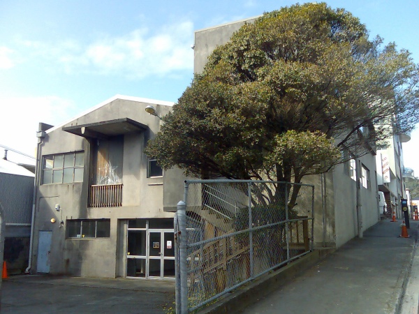
In the heart of Wellington’s old Chinatown, namely the narrow low-scale neighbourhood of Haining St, there is one of the few trees that are growing in Te Aro, nestling happily in the lee of an also fairly non-descript warehouse building. Until fairly recently the site was the home of a film unit, a student flat, and parking for assorted businesses, until it was sold and resold and eventually ended up in the hands of the property spruikers known as Rich Mastery: organizers of ‘property seminars’ – otherwise known as a way to “get rich quick”. Unfortunately for the majority that sign up, it’s mainly the leaders of this property-mania cult that stand to get rich.
In this case, Steve Goodey of Venture Property Group has assumed the mantle of developer, rechristened the existing building “RichMastery House” for the seminars – which must sound pretty grand until you visit the site and find it is just a retrofitted warehouse. Never mind that it sits amidst a predominantly two storey high neighbourhood, this proposal is for a 10 storey building – and I suspect there is no doubt that they would have gone up further if they thought they could have wangled it through the city council. As it is, the proposal is just tall enough to break the height limit, and yet probably not quite tall enough to force it into a Notified consent.
 .
.
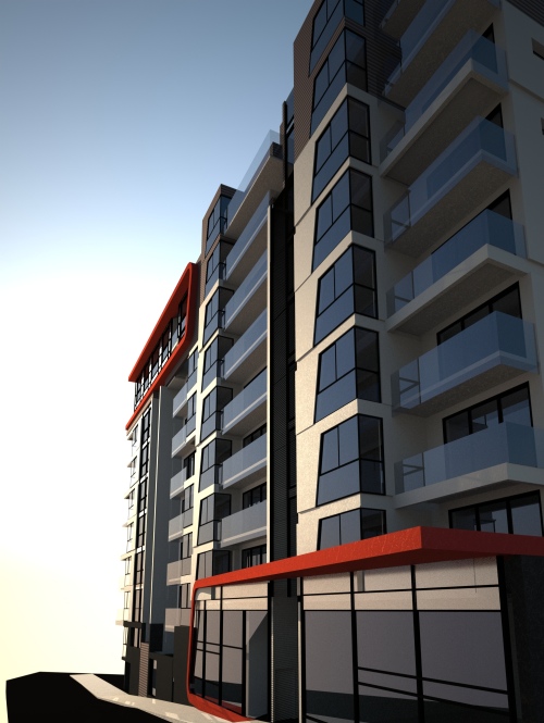
Yes, this is another ArcHaus proposal in the same tiresome vein of two-for-one “investor apartments”. This one proudly spouts its name as Due Pensione, which is a clever play on words, not just for the Pensione bit (“Cheap Boarding House” in Italian), but also the implication that it is an investment home – in place of a regular pension. The idea is that you buy two tiny apartments as one, and then when times get tough, you can rent the smaller bedroom out (to some homeless dwarf perhaps). With each ‘Due’ apartment pair being about 55-60m2: that would put the larger unit at 35m2 and the smaller at 20m2, if you’re lucky.
Archaus have tried a lot harder here than their nearby rather dull Te Aro Towers, with the project looking almost interesting on the outside with a red racing stripe or two, although it is still the same rabbit warren of rooms inside. Many of these butt up against the boundaries of other sites and thereby almost guarantee some units a lifespan free from those bothersome basic things like light and air. I don’t quite understand how those proposing such buildings have the gall to claim “careful, sympathetic” design, when quite clearly the plan has been to stuff as many of these onto the site as possible, and damn the consequences for anyone having to live inside them.
But there’s a worrying difference when it comes to the portrayal of the building by the architects. On the previous scheme we looked at, Perry Architects had sought to portray the project honestly via a multiplicity of viewpoints, in order to try and persuade the Council that breaking the height limit was an OK thing. Here, however, ArcHaus have avoided any context in plans or perspectives, and are perhaps hoping that no one will notice that the street is a narrow lane with 2 storey buildings on the south side. The proposal above looks glorious in the sun, except that the building faces due south and therefore will get little, if any sun, and the cheery sunny plan above carefully ignores the fact that there are other buildings to the north, hard up against the boundary. More fool then those investors who buy one of the units, only to find it bereft of daylight and unlettable.
But what saddens me most is that the proposal ignores the delicate nature and history of Haining Street, which after a half century of neglect, is just starting to get its Mojo back via reoccupation of the formerly industrial wasteland. A giant elephant’s foot like this would just squash the life out of the street, and Wellington becomes worse off for it – it just seems inappropriate. Wouldn’t it be much nicer to work with the urban fabric of the surrounding buildings and work towards a more human scale of neighbourhood? Perhaps even one that celebrates and recognizes the original Chinese character of the area, as they do in many cities abroad?


This building seems to have been designed in a vacuum. It doesn’t look like it knows it’s located on Haining Street, or even where Haining Street is, for that matter. It doesn’t even appear to have been constructed as a good place for people to live. Its sole purpose seems to be as something for people to invest their money in.
I had a look at the Richmastery website for clues to the psyche of the owners. I found a blog of one adherent to the Richmastery movement who was in the process of turning a house into two flats, and squeezing in extra bedrooms to maximise rental.
Right, so that’s what this is about. That floor plan, it’s not spaces for people to live, to make their homes. It’s maximising the available space for optimal wealth generation potential. I feel ill.
Talk of Chinatowns reminds me of the No Chinatown art project in Auckland last year. It asked “Should Auckland have a Chinatown? Does Auckland in fact already have Chinatown(s)? What indeed constitutes a Chinatown or any (self) determined cultural identification with place”. A public survey was conducted at the Lantern Festival, where punters seriously pondered the hilarious idea that only world-class cities have Chinatowns and so if Auckland wanted to become a world-class city, it’d have to have a Chinatown, complete with those red gate things.
The architect’s statement refers to the scheme adding to the vitality of the area, and increasing the chance of “serendipitous interactions” or some such tosh.
Killing off all life sounds more likely, i agree.
Unfortunately their website seems to be down, but judging purely from that (hugely akward) perspective, the facade seems ridiculous. Theres no attempt to maintain any coherence, or even to celebrate the diversity of thresholds – are arbitrary ‘racing strip’ folds and angled windows really the best that they could come up with?
At least monvie knew what it was
Curious indeed that their website seems to have mysteriously gone down, right when they get some non-favourable attention. Surely they have nothing to hide?
Interesting – these are the same guys that were hocking off little slums on Taranaki/Frederick Street overwhelming the Chinese Mission church – that one (a 10-and 11-storey twin towers type arrangement with something like 8 carparks for 160 mini apartments) fell over when neighbours lobbied the council
I took a walk down Haining Street today (in the rain!) to check it out (despite my mother telling me she was afraid to even look down it in the 1950s).
It’s a lovely little street with a variety of buildings from different eras. It absolutely feels like a neighbourhood that is reverting back to residential, albeit at a higher density than its original inhabitants.
That space where the Duelling Pensioners block is planned for would support a multi-storey building, but not as high as they’re planning. Maybe six storeys at the most.
I like the open space that’s there at the moment. Why not keep the tree and build the apartment block around it, with a sort of courtyard/public space in the middle? (Oh, cos trees don’t maximise wealth generation) That part of town is so bereft of green space. Even one tree is better than nothing!
Jane – the same guys? Same architects i know, but different developer i think? The Frederick St project fell over by itself – nothing to do with the neighbours though – the developer withdrew and never bought the site. But yes, they were spectacularly bad…
Thanks for the link to that No ChinaTown link Robyn – interesting, especially given that the artist involved in the Auckland project, Kah Bee Chow, is the same artist that just had the small installation at 10 Haining St last weekend to celebrate the historic remnants of Chinatown still extant in the street.
http://www.asianz.org.nz/culture/inthelimelight/goldenslumbers
Small scale, sweet but a little wet, it also served as a memorial to the murdered Chinese man Joe Kum Yung in September 1905. Some links to this, which may go some way towards explaining why your mother was afraid of it still, some 50 years later:
http://www.nzhistory.net.nz/timeline/24/9
http://www.stevenyoung.co.nz/The-Chinese-in-New-Zealand/Current-Historical-Research/REMEMBERING-HAINING-STREET-With-both-eyes-open.html
This second reference, to Lynette Shum’s work on the Chinese in New Zealand, is especially useful in terms of Haining Street’s relevance to the surrounding Chinese community. One of the reasons the street was a scary place in Pakeha eyes was the alleged smoking of opium, the other was the gambling – pah-ka-pu. You choose a series of numbers, luck determines whether your numbers were chosen, you take the winnings, or the bank takes the lot – illegal, banned in NZ from 1881-1974, its now been superceded by the big corporate version, government sanctioned: Lotto.
Haining and Jessie Streets are both little treasures and along with other mini-fares like St Martins Square surely the prime residential streets of Te Aro in years to come – if they survive.
I am personally fund of the Naenae Modernist building next door to the proposed Archaus block (just visible in the photograph). It is a perfect match for three more in Torrens Tce and a good example of how a bit of time and customisation can lend charm to even identikit spec buildings if they are made well enough in the first place.
Any idea who designed the “NaeNae Modernist” (nice phrase) buildings you speak of? They are verrrry 40’s, and quite lovely with it.
Tell you something even odder about the Rich Cockery stuff – it appears that the founder, Phil Jones, apart from just having been to the Playboy Mansion in LA with Terry Serepisos, and their wives, has also just penned his last entry into the RichMastery website and left the organisation. To do what, I’m not sure – perhaps move to LA with the rich plastic people and make money there? Anyone know?
Steve Goodey – if you’re out there reading this – want to tell us what the story is?
ah yes, that would be Phil Jones, the ever-so-humble founder of Rich blah blah:
“I have always said this Business is never about me, its about our customers and their outcomes. Now its time for others to step forward and lead, to stop being passengers and to share their strength, wisdom and experience with others.
We leave an army of trained students that I have personally served for nearly a decade and a team of the most brilliant people I have ever had the priveledge of working with in the 9 Richmastery offices around the country. One man is an island, the national Richmastery team is a unstoppable force of excellence and expertise that will continue to serve you in the years to come.
Thank you for your kind thoughts.
Phil Jones, Richmastery Founder”
How does the Wellington City allow this crap to be built. There appears to be intense scurtiny of everyone elses earnest attempts to build reasonable structures with adequate space , light, views to live …. and ARCH bloody HAUS seem to be have no thought for the poor people you will HAVE TO live here because of proximity to the city and university and that fact that no-one will police the numbers of sardines jammed into these apartments .
We have to live with all of the ugly social and aesthetic results that are the fallout of the appauling and disgusting structure that was built on the south corner of Frederick and Taranaki Streets.. and you would have thought that this building would be a stark reminder of how ugly and disfuctional a building can be ..but those you do not remember or respect the failings of the past … are doomed to repeat them.
There is absolutely no justifictaion for this cheap and nasty crap to be built in our city …. other than unadulterated greed
Say you are a developer who wants to max out the potential of your site. You go to Archaus and get them to draw something that that just squeaks inside the planning rules and has some distinguishing features. You submit it to the Council for resource consent, complete with a swag of nice colourful pictures and montages.
The planners hummmm and hahhhh over it and eventually end up approving it because either they cannot find a lawful reason to decline it, or because Archaus manage to cause enough stink at the council about nobody knowing what ‘design excellence’ actually means. Or why this isn’t it. Or why this doesn’t need to be it.
When you come to build it, you take off anything that costs extra money, i.e any sort of decoration or feature that distinguishes the building, or any quality fittings. The Building Consent chappies determine that it’s basically what was granted RC for and don’t mind that cosmetic details change as long as it meets the code. Or they require changes to meet the code that alter the design outcomes.
What gets built is something that bears just a passing resemblence to what you got Resource Consent for. This happens all the time, usually to the detriment of design quality.
Funnily enough my classmates and I have taken over the ground floor of this building until Sunday the 12th of October – we’re using it to hold a photography exhibition (so come down anytime from midday to 7pm!)
I really like the building – it seems a pity to pull it down. There again I’ve always loved old industrial spaces!
Unfortunately their website seems to be down, but judging purely from that (hugely akward) perspective, the facade seems ridiculous. Theres no attempt to maintain any coherence, or even to celebrate the diversity of thresholds – are arbitrary 'racing strip' folds and angled windows really the best that they could come up with?
At least monvie knew what it was