Late last year, I had an amazing opportunity to meet Bill Toomath, and explore his Roseneath house. In particular, the building features a dramatic addition – a study room that was designed to replicate a scene from the 15th century painting, St Jerome in his Study.
My impressions of the ‘design den’ were that it seemed very functional, easily storing a huge array of books, as well as providing areas for reading, drawing and computer use. The timeless geometry of the replica seems to fit in perfectly with the modern New Zealand building, just as it did in the original chapel. Furthermore, the room has a great mediation of light, and some stunning views out to the harbour. All in all, an amazing work space.
The rest of the house was also excellent: a 60’s modernist building in Roseneath, clad in dark timber, and the middle of a row of 3 Toomath-designed houses.
The painting itself depicts St. Jerome working on the Vulgate, the first translation of the bible into Latin. Although the translation took place in the 4th century, Jerome is depicted in an environment contemporary to the painting’s time period (15th century). A few more facts for those interested:
The scene is devised such that the light rays coincide with the perspective axes, centering on the saints’s bust and hands.
The lion in the shadows to the right of the saint is from a story where St. Jerome pulls a thorn out of a lion’s paws. In gratitude, the lion follows St. Jerome around for the rest of his life, like a house cat. The peacock and partridge have no importance to the story of St. Jerome. However, the peacock more generally symbolizes immortality (something that a saint would be guaranteed in heaven) and the partridge symbolizes the truth of Christ (another thing a saint would be especially concerned with).
William (Bill) Toomath is of course, a renowned Wellington architect, and has been a key proponent of New Zealand modernism. Having studied architecture at Auckland University, he was one of the founding members of the Architectural Group (be sure to check this link – 1950’s news reports are always worth it). Later studying at Harvard Graduate school of design, Bill worked briefly with major international figures such as Walter Gropius and I.M. Pei, before returning to New Zealand in 1954. Having been in practice since, some of his major projects include Wool House, Wellington Teachers’ College, the Mackay house and the Toomath Senior house.
Bill and his study were the subject of the documentary Antonello and the Architect, which was shown at the 2007 JASMAX film festival. Unfortunately I didn’t get to see it myself, but from what I’d heard, it was played to a very warm reception. The DVD is available for purchase here.

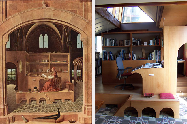
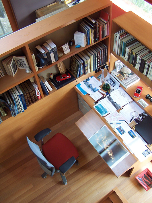
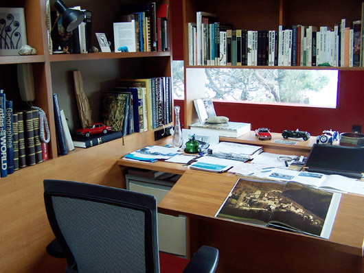
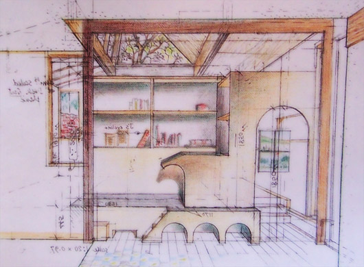


This is a delightful piece of whimsy, but I’d have to disagree about it fitting in with the original house. When I was there I felt that the one-dimensionailty of the surfaces were a far cry from the almost brutal structural truths of the original building. This, along with the playschool-like arches give the den an air of Postmodern linguistic playfulness (also evident in the painting ironically enough) rather than the purer Modernism of the house itself. To me it is a definite ‘other’ to its host architecture.
This of course is not necessarily a bad thing, but I think it should be recognised that it works in contrast rather than with the original house itself. Incidentally, the film doesn’t really address the house at all, or the den as being a part of it. I found this to be somewhat disapointing considering the use of the footage at the end where Bill accepts the Enduring architecture award for the house. However, I guess this also reinforces the ‘otherness’ of the intervention.
M-D Not sure that i agree with you that it is a piece of whimsy. In a way, i think the opposite. The original picture of St Jerome (the Antonella da Messina – there are many other version) has always seemed a highly unlikely piece of staging to me – the study appears one sided, unenclosed, highly draughty, and probably a little too exposed to ever get much work done. Widely touted as being an example of one of the first examples of a an ‘office’, as in a designed purpose-built space, it is very different from others drawings of St Jerome such as Albrecht Durer’s version. See:
http://www.clarkart.edu/museum_programs/collections/prints_drawings/content.cfm?ID=76&marker=6&start=6
Here you can see that the study in this case is a simple room, with a desk. Yes, somewhat unusual in that it has a lion lazily lounging in the foreground (all part of the St Jerome legend), but also more standard in that it looks like a room that anyone could have, and hence not as exciting to interior deskologists…
The thing about St Toomath’s study as opposed to the dimensionally accurate St Jerome’s version, is that it actually does feel warm, comfortable, usable. Perhaps being set in a home rather than a church building helps, but i’d posit that it is better, and less whimsical in the Toomath house than it is in the Messina version, where, to be frank, it looks ‘not at home’ at all.
I maintain that it is whimsical in relation to the solidly realised Modernism of the house itself – not comparative to the painting. This doesn’t mean that it isn’t warm and functional, but that the ‘feel’ is of surfaces rather than structure – a wholly different architecture imo. With little emphasis on the almost brutal structural articulation of the house, the den perhaps even has a more humane feel?
It is difficult to illustrate this as most images of the study just focus on the study area (as do the above ones, and the film). A wider view that reveals the sitting area that precede the study, and even (especially) the staircase, would highlight the otherness of this intervention. Toomath’s sketch above does provide some indication of the philosophic/aesthetic disjunction between the host and the intervention (look at the larger view), where he uses the heavy structural elements of the original to frame the new.
But don’t get me wrong – this whimsy is to me a point of celebration – it is what makes Toomath’s work distinctive. I think that in building a case for Toomath as the St Toomath of postwar New Zealand architecture, this whimsy needs to be recognised as that which elevates his work above his more ‘rational’ peers…
I agree with both michael, and maximus. From what I remember there was something of a disjunction to the study in terms of texture – a light, more airy feel against the strong and dark tones of the rest of the house.
What I did find compatible between the two was the way that the space of the study acted in relation to the original extents of the house – the area formed by the study seemed to be a very organic working space, and that the extension acted as a very seamless continuation of the original (while still being unique).
MD – If Bill(T) is our saint, what does that make Bill(A)?
I concur with you also Philip, and the spatial gymnastics of the den up through to the skylight, and back into the upstairs living area is a wonderful counterbalance to the spatial play of the sculpted staircase. That aspect is pure genius to me, much more so than the idea of the den itself…
And as for the canonisation of Bill A – I’m working on it ;)
the major point of interface between the study and the person is primarily the chair, apparently a Formway in Bill’s study, and a wooden piece of furniture in the painting. The Formway supports the person in various states of vertical and recline. The ‘original’ affords self support through the spine etc, in fact it is a perch rather than a bed. I welcome a conversation about this aspect of architecture and design, the functioning person. Please check feldenkrais.org.nz Cheers.