Looking up Vivian St, past the closed down peepshows and the sadly tacky brothels, a new building can be spied on the hill.
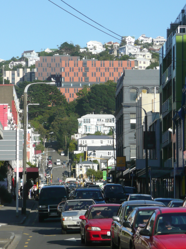
It’s the new student accommodation block called Te Puni, and the neighbours on the hill are in trepidation – apparently 375 horny 18 year olds are inside. Yes, it will be noisy – expect lots of puking in the bushes for the first few weeks, and then they’ll settle down. But I’m more interested in the architecture.
The building is by Architectus, an Auckland based company with offshoots in other towns in NZ and even in Oz – and somehow they pipped the local architects to the post when it came to scoring this job. They’ve got some of the best and most exciting minds at their office, apparently, although so far there does not seem to be that much sign of it going on here. Sadly, as far as looks go, Wellington / Victoria may have got a dud. It looks like it’s a Tectus perhaps, without the Archi. I don’t quite no how to put it, but the building just looks very…. flat.
Very flat.
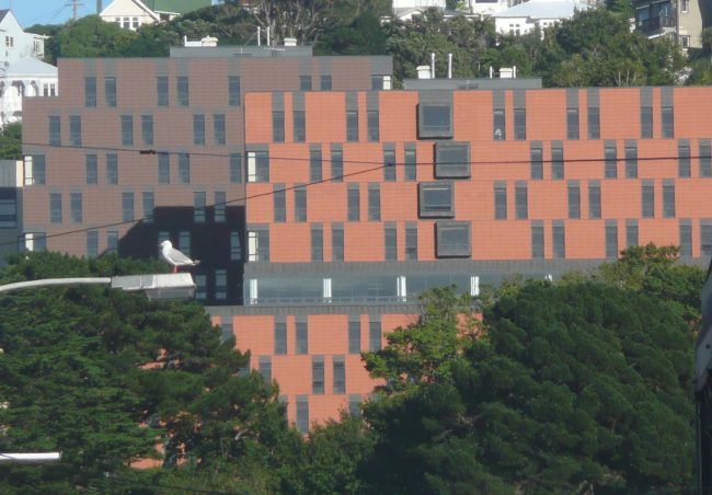
Look, this is it from afar…
but as we zoom in closer, we see that its flatness becomes…. even flatter.
And flatter still.
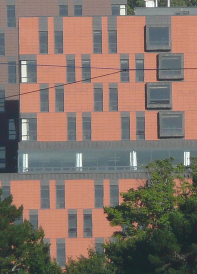
Not that there is anything particularly wrong with flat (some of my favourite fish are flat), but it just comes as such a surprise to me after the work that Architectus have done on other campus’ around the country, such as Canterbury, where their building for the Maths and Stats Department was such a beautifully sculptural affair, with wing walls fanning out, all expressed in plain old fairfaced concrete of the highest order.
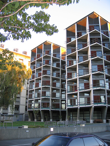
But here, obviously, budgets were different. This is not so much a University building, as a Student building, and Victoria’s widely reported budget cuts a few years ago have seemingly left it keen for a simple solution. Like, a flat solution. Besides, who’d want to spend lots of money on students?
There’s no balconies, as the students would just
a) party on them,
b) turn them into an extra bedroom,
c) throw empty bottles off them, and
d) jump off them just prior to exams.
So: the students are locked away, nice and secure, with a small opening window so they can blow cigarette smoke out the window and perhaps even drop small skinny water bombs on the unsuspecting rugby players down below. Yes, that’s correct – the building has sprung up directly from the sidelines of a small rugby pitch halfway up the cliff, and will make an interesting sideline pattern for the players down below.
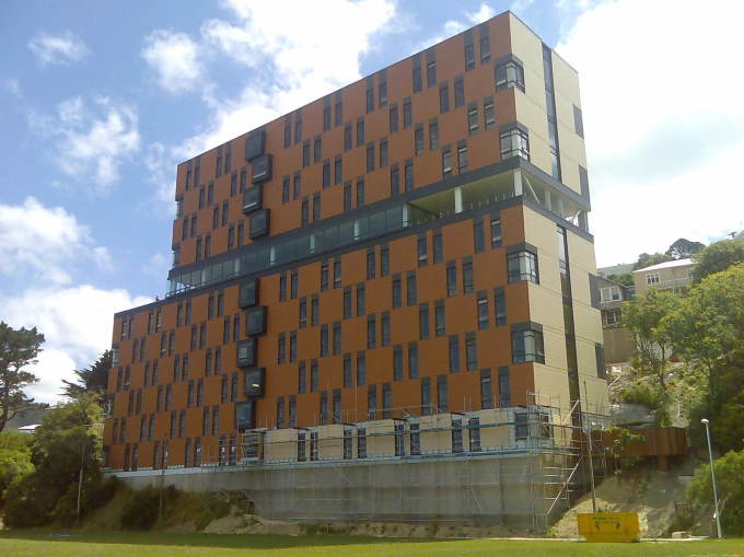
And the concrete basement foundations should certainly stop them running too fast off the sidelines. When I was last up there, there was little-to-no sign of any landscaping being done around the base of the tower – nor is there much that could be done to soften the blow to the neighbours who wailed loudly as the building steadily took their long-cherished view. Indeed I think, from memory (please correct me if I’m wrong) that the scheme almost ran to a halt during the Resource Consent process, as neighbours complained, and was there a floor or two lost?
However, it had to be: 2007’s failure of one of the private sector’s university accommodation providers meant that the University needed to take back control of the housing situation, and this is the answer. The cladding has been tastefully finished in 3 different shades of terracotta flat panel tiles (such as those used by Renzo Piano to such great effect in Sydney and Europe). Sadly, on such a scale writ large as here, the perfect flatness of the tiles and their equally flat windows is not a pretty sight to see. The Fish is unlikely to be invited in there, unless we suddenly find ourselves on the party invite list to a bunch of horny 18 year olds, so I’m unlikely to ever be able to report on the size and fitout of the many tiny bedrooms, although their website shows them to be tiny. Or even smaller. A monastic cell, perhaps. So if you’re a student in Te Puni, please tell us what it’s like. And tell us just what is behind the 9 little projecting window bays stuck onto the outside, breaking up that otherwise oh-so-studied flatness?



Looks like a couple of old ’70s computer punch cards.
Thank You EOTF for opening this facade to public discussion.
It is clearly a building which deserves and warrants attention, given its absolutely unavoidable contribution to our city skyline and urban slopes.
What a pity that it should result in negative attention.
There are some promising moves made with the circulation routes (the sky-bridges between all three buildings) and the apparent ‘free-space’ visible as a cut through the foremost buildings’ level 7, however without internal investigation it is difficult to comment fairly.
The visual disturbance of this building to the urban condition, is however, worthy of discussion. I personally have always held an admiration for our academic fortress being proudly perched on the Kelburn slopes, visible to all. The fantastic circular geometry of the Central Services Building, and the modular simplicity of the Rankine Brown Library, especially at night with its modular packets of light housing our archives and aspiring minds.
In Te Puni however, I can not find similar poetic intrigue.
The new vision from the city floor is undeniably -and correctly identified EOTF- as having an uncanny flatness, almost an illusion of depth perception -or the lack thereof. Its massive(ly inappropriate) scale has also sadly blanketed a huge proportion of the hill behind it, completely disturbing the existing grain of the Kelburn domesticity.
The foreboding cliff it now presents to the Boyd-Wilson Park is ridiculous and rude.
The prominence of this building -visible from Aro Valley, Vivian St view corridor and just about the entire city- has unfortunately (for the city) created an imbalance in the grain, scale and visual quality of the Wellington slopes.
I suspect all three of these qualities are vulnerable in the near future anyhow, which should prompt us to be incredibly wary (that is, informed, intelligent and reflective) of future projects of comparable effect.
According to this report
http://www.victoria.ac.nz/home/about/newspubs/publications/Appendix_1_Design_Report_2.pdf
The projecting windows are where the common rooms are on each floor,
All the design docs are here
http://www.victoria.ac.nz/home/about/newspubs/consult/Student_Accommodation_Project.aspx
I am mostly disappointed that the “tower” building has such a monolithic colour scheme , I mean you have a nice horizontal break with the glass common floor that would allow you to break and differentiate the building and make it appear as two smaller boxes, and you could have made the bottom portion a forest green and blend it in nicely with all of the greenery in the view paths up from the city, but as with many architects these days it is all “look at me”
Hideous.
I see this a few times a day and I honestly thought that was some sort of temporary, or insulation panelling to be covered over, and not the finished product.
I’m a failed Architecture student but even I can recognize this building as failed Architecture.
I had a walk around it the other day, and it’s an intriguing mix of success and failure. I think that from just about any other angle it doesn’t look anywhere near as flat: it shows interesting three-dimensional compositions from most angles, emphasised by the change in colours and the way that the corner windows read as notches. Of course, from a true elevation it looks very flat indeed, which is emphasised rather cruelly by your telephoto lens, but from most other viewpoints it has much more depth. On the other hand, the view along Vivian St is a very important one, as it terminates the longest east-west view in the CBD, so more thought should have gone itno that formal aspect.
Up close, there are a lot of reasonably pleasant details, but the attempt to define it as a “village” is ridiculous, given that it’s built around and over a road and carpark. I don’t really mind the architecture per se, and in another context it could have worked rather well, but the poor quality of the space between the buildings, and its crude interruption of the context, create a poor outcome.
Thanks Black for that very considered response. You’re obviously not Joanne Black, who would have just said she didn’t like it cos it made her daughter sick, or some other such banal comment.
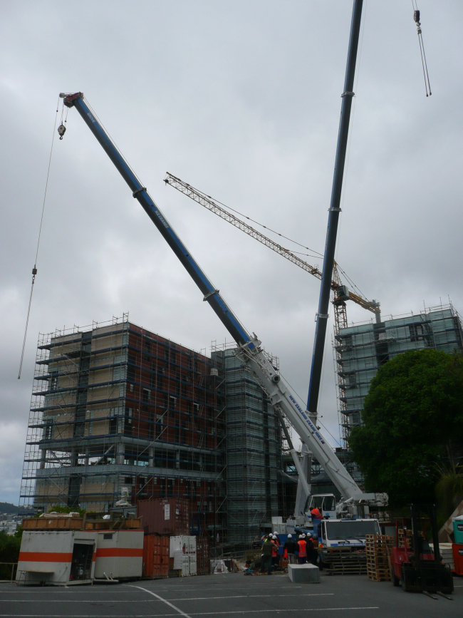
I really, really, really wanted to like this building, and feel bad that it’s not as good as it could be – but, as you say, you can’t really judge it till you’ve been inside it. The little VR animation from the link shows it however to be pretty damn mingy on the inside. But then again, as a piece of urban sculpture, the aerial walkways (only just visible in the last photos with the cranes) are pretty groovy. But i can’t help feeling that if only it had a bit more surface articulation, and was a little less cliff-like, that it could have been a whole lot better. Will de Cleen’s right: the semblance is overwhelmingly like the computer punch card, which is, co-incidentally, much like how the average student will feel like they are being treated in here.
I kind of like it, though my only experience of it is from a distance.
I used to live next to some Auckland Uni student accommodation in Parnell. They were perfectly well behaved neighbours, but it was more an open, village-style arrangement surrounded by lovely trees. And a railway line.
I second the thanks for opening the debate! I’m with you, Maximus, in that I really REALLY wanted to like this building.
However I am not against its height, its location, nor even its flatness per se. But it is dissappointing when compared to other buildings by Architectus. The ones I have experienced are a joy to behold from afar and at a detail level–trinity apartments, the building at canterbury uni etc. I’m always partial to well articulated facades but, conversely, flat can be appealing if done deliberately and clads a considered design solution.
The building continues the VUW tradition of tall, precarious buildings on the cliff edge. These are strong, emphatic statements from the university that reach the whole of wellington and as such I would support this aim. Vivian st doesn’t by default require a view of the Kelburn domesticity; the University is a physical gateway to Kelburn through Salamanca road, and a visual fence from the city. I’m not sure why this is a negative condition and why it shouldn;t be continued.
In regards to university planning, the location wouldn’t be so bad if the project had recognised the need to landscape (and it did have more landscape works in the original plans that addressed the field than the photographs show–perhaps they are not finished?). It also wouldn’t be so bad if the carparking was underground or incorporated into the building more succesfully–though this is probably a failing of the client brief requirements, something I suspect Architectus had little control over. The connection back to the university needs work, and certainly should be part of a wider masterplan for the university.
As pointed out already, this building presented an opportunity for a signifcant marker at the end of Vivian st. The scale is not inappropriate–it is bedded in trees from this view, and the hill towers above it still. From an urban persepctive it masing is well framed. All through the construction period I looked up at it with nervous anticipation only to be so thoroughly disheartened with the detail and visual amenity. Does anyone else think that particular combination of primer-coat colours is just, well, awful?
The architects of this building are, according to a graduate that works there, the finest architects in the country. Their buildings are notable for rigourous detailing and honest use of materials. It should garner at least one Institute of Architects award.
The first accoladed Architectus building I remember was the Newmarket Honda showroom around 1990. For some reason it was soon demolished and a Honda showroom by someone else has occupied the site since.
Then there was the much lauded and awarded New Lynn community centre which featured on Shortland Street (and in some suburban newspapers where users expressed the naïve opinion that, although they had a great work of architecture in their midst, a second half to the basketball court would have been preferable).
Of course there’s the Canturbury maths/science building with the modulated office towers on the interesting, much photographed, side and the St Peters buildings, including a middleschool in the neo-soviet-60’s-brutalist-revival style.
More recently there has been the mega publicised and awarded Waitakere civic centre. To experience the full grandeur of the entry sequence you start at the point where the building connects into the urban fabric of Henderson, drive a few hundred metres along Railside Ave, take the first on the left and head back down Henderson Valley Road until you get to the rear of the building. From here there are about 4 carparks from which you can disembark and head up the grand stair under the soaring portico. If these spaces are unavailable you will need to park in one of the large parking areas adjacent to the building and approach from the side, through the door with no raincover, like the staff.
Some may suggest that irreproachable detailing doesn’t compensate for conceptual flaws in a project; however such persons would be philistines. God is in the detail, so with the same cladding system as Renzo Piano these buildings should have a nice aureolic glow when viewed from Vivian Street at night.
On the other hand, it has to be said that the units should represent a massive increase in quality / standard of living from the previous provider of accommodation. I recall reading about somewhere on Willis St or near the Southern Cross? that had water running down through their ceiling and mushrooms growing in the carpet, and was it sewerage in the stairs? Something anyway – it sounded awful – and the Uni stripped them of their right to host students? or maybe they just went bust by them selves?
Although, all that aside, the new bedrooms at te Puni are damn small.
think of them as monastic cells… no distractions for studying – and there’s nothing wrong with being able to touch both opposite walls at the same time…
al – an “aureolic glow” ? Is that a nipple reference? I don’t get it.
It looks a whole lot like a prison from afar… wonder if that is a deliberate comment on student life??
I was going to mention the well-known flattening effect of telescopic lens configurations as well, but see someone beat me to it…
I too, really want to like this, but it is the much trumpeted detail that really lets this down. The scale and sheerness over the Boyd Field is, I think, one of its best features – tapping on the cat-flap of the architectural sublime. And, I actually don’t mind the effect when seen from the city. But why didn’t the architects have the conviction to really celebrate the separate the two vertical volumes, rather than diluting the separation by adding the flush glazing in between them? (further emphasizing to the flatness of the elevation…). The dark ‘demarcation’ bands are ridiculous, and the vertical split in the end elevations unconvincing next to the corner cutouts (which I quite like). The jutting out ‘punctuations’ might have been more successful if they were open, but in th current form, are also rather unconvincing.
I’m willing to suspend judgment on the base, which I expect will be landscaped appropriately…
PS – perhaps Puni is a misspelling of Puny, which refers to the apartment size?
i think perhaps that the nomenclature is more from the venerated maori chief:
(as noted on http://www.teara.govt.nz/1966/P/TePuniHoniana/TePuniHoniana/en )
TE PUNI, Honiana
(? – 1870).
Te Ati Awa chief.
Honiana Te Puni was a Te Ati Awa chief of high lineage who was descended from Takarangi and Rau-Mahora. His own father was Rerewha-i-te-Rangi, son of Aniwaniwa and Tawhirikura, the originators of the Tawhirikura subtribe of Te Ati Awa. His mother was Te Puku. Te Puni lived at Pukeariki pa, New Plymouth, and took part in the successful defence of Otaka against the Waikato. Later he accompanied the followers of Wharepouri, Rawa-Kitua, and Ngatata, southward in the “heke” Tama te Uaua.
His people settled in the neighbourhood of Cook Strait or Whanganui-a-Tara and, by about 1832, he was fully established at his pa on the beach at “Pito-one”, now known as Petone. In 1840 Te Wharepouri and Te Puni welcomed the first New Zealand Company pioneers to Port Nicholson. Soon after, Te Puni was one of the signatories of the Treaty of Waitangi and the deed of purchase of the land about Wellington. He accepted the portion of payment due to the Maori residents at Petone and effected the construction of a store for Colonel W. Wakefield at his own pa. The leading position which he held is evident from the fact that the toast at the opening of Barrett’s Hotel in 1840 was to “Te Puni and the chiefs”. Along with Wi Tako, Te Puni vigorously defended the Europeans when Boulcott’s farm was attacked on 16 May 1846. In recognition of his friendly services, Te Puni was presented with a silver cup in 1848 by Alexander Currie, the Chairman of the Directors of the New Zealand Company.
In 1848 Te Puni was appointed an official visitor at the Wellington Hospital, while Governor Grey chose him as one of his esquires on being knighted. In 1850 he returned with Rawa-Kitua to his ancestral lands in Taranaki, where he was to experience during the 1860s racial tensions and physical collisions between European and Maori. Yet, although Te Puni must have been grieved and at times angered towards the European attitude and actions, he left the following words for his people: “… Be kind to my European brothers and sisters, be patient, be tolerant …”
He died on 5 December 1870 and was accorded a State funeral with full military honours. Among his pallbearers were Sir Donald McLean and Sir William Fitzherbert. His name is commemorated today in the Lower Hutt suburb, Epuni.
“Puni” means something like “camp” or “campsite”, though IIRC it’s sometimes interpreted to mean any group or team of people. “Te Puni Kokiri” (apologies for lack of macrons) means something like “Going forward together” or “Collective advancement”, and the “Puni” part there refers to togetherness or grouping together. “Wharepuni” referes to the guest house or sleeping house of a kainga or pa, so in this context they appear to be aiming at connotations of camps, villages and guest houses. Which is not inappropriate for the intent, but let down by the execution.
http://www.maoridictionary.co.nz/index.cfm?dictionaryKeywords=puni&n=1&idiom=&phrase=&proverb=&loan=&search.x=45&search.y=12
I was making a pun(i)… geddit?
so, just a little pun then?
Yep – sigh…
I just noticed that in the first image you can see the green building (on the right) sans space-age guttering/ducting – is it time to revise your opinion on that wee gem?
(I was trying to find the original post to link to, but it seems you have some weird problem with your search box…?)
You mean this one? http://eyeofthefish.org/wellington-goes-high-tech/ Yes, the plumbing has been all straightened up and made normal, the missing bits of Kingspan have been replaced, the scaffold is down and the verandah is on. It’s all complete – and it’s still just dull. But dull’s ok, at times. I guess. But is mediocre ever ok? Is lacklustre acceptable? But who am I to speak, with a dud search box and all…
But I tell you one thing, since you’re asking. : Glass verandahs. Never a good idea, unless you plan to clean them every couple of days. Or unless you can guarantee rain from the right direction. The little green-eyed monster on Vivian: glass verandahs. Crazy talk. Cheap apartments, student bedrooms, chunder on verandah. There, caked on, for us all to see. Dust, crud, passing diesel lorry muck, and things thrown out of flat windows. There’s one i pass regularly, never been cleaned once in the last 5 years. The cruds built up so much now that it has reached an even smear. And no body to clean it off, except perhaps for the odd bottle of beer poured over the side. Sometimes there are things the council should enforce: no glass verandahs would be close to the top of my building consent wishlist.
Its like a glass bottomed boat. Great for the people in it, looking down at the fish. Mark my words, looking back up at wobbly bums on planks and spilled bait on the bottom of the boat: the view is not so good for the Fish.
I’m a bit ambivalent about the building.
Thinking about it positively – as clearly several people want to – does its intense flatness redefine ideas of landmark, which traditionally have been about visual climax and axiality?
I also wonder if the difficulty with the building is in part a general resistance to pattern-making and the 2-dimensional, compared with spatial architectural concerns. I think its facade (as oppressive as it is) is much more successful than the hospital one by CCM, which is a truely compromised composition. Te Puni may be one of the best examples in NZ of flat architecture (http://www.flickr.com/photos/lugarplaceplek/99239932/). Given some of the hideous proportions and facade design the country has seen in recent years, I think there maybe some merit in this. Why is flatness so evil?
Agreed, flatness is not evil. I quite like the play of patterns, and the sort-of tartan grid / hole punch effect, and the “notched” corner effect that Flattie identifies, although I’m not sure that i would want to live in there. And you’re certainly right that it’s miles better than the hospital, which is a sad and sorry lump. I’m just thinking that some of the work from Clifford Bowes and Thomson has been of incredible sculptural standard, and could show up the local architects with regard to playing with solid and void.
Not here however. It’s just a very functional box.