Architecture + (plus what, one may ask, to complete the equation), have been one of the busiest architects in the city of late, barring Athfields and Archaus of course. They have recently unveiled the Republic 2 apartments, close on the tail of the Republic (1), which itself followed quickly behind the Monument, which followed the Piermont, and that followed the Portal. Someone’s been spending long hours at work!
More on these projects in a later post. But for now, lets look at the finished results from some of their earlier work for CAS, in two developments around Oriental Bay. The first one, alluded to earlier in the ohtel post, is a successful, but pretty bland and flat looking development on the edge of Waitangi Park. At least half of it is called the Aqua, although i can’t remember the other half’s name, and that’s the crux of this scheme: it is really just one development, pretending to be two, so as not to upset the neighbours.
This has been done by flexing the floor levels up and down (not just done for effect, it as it allows for the entry ramp to the carpark). The two halves were built at the same time, share the same basement carpark, and definitely share the same roof line, even if the balconies are different shapes and colours. One half is timber(ish), the other is glass and louvred. Balconies are glass, and just a little too exposed so that we, the public, can see the assorted potplants and furniture of the residents on display. It is clean, modern, very glassy, and sadly, just a little boring. Why so?
To me, at least, an answer lies in that roofline. Dead straight, dead level, dead boring, it screams out to the casual observer “Oriental Bay height restriction!” and indeed the height of the new ohtel seems to prove it. Whatever the height limit, this scheme is clearly right on it, not a mm more or less. Mmmm indeed. While that shows how silly the rigid application of rules are, it is a situation forced upon the architect and developer by the District Plan and the Resource Management Act: a mm under, and no public notification needed, while a mm over, and the cost to the developer is notification, and hence time and mmmmoney.
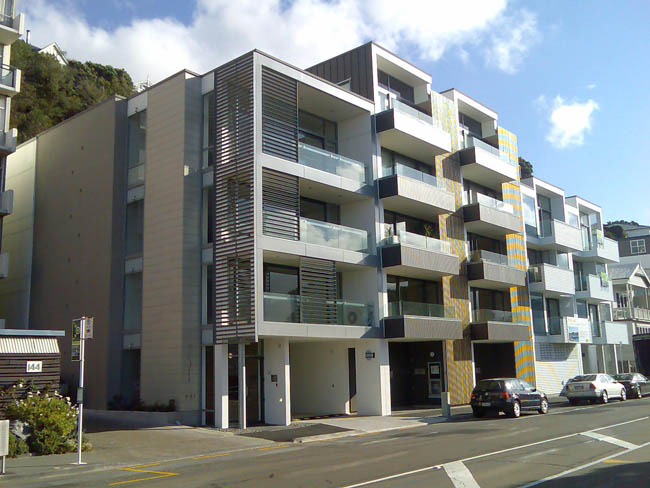
There is some scope however for the council to twist the rules, and on the basis of the next scheme, thank heavens for that. Just a bit further along the Parade, almost opposite the wonderful sculptural roofline of the Freyberg Pool (from an age when attitudes to rooflines were more relaxed), is the next development also by Stratum (or CAS, as they were). Replacing a truly hideous Spanish style monster and some other older, undistinguished houses, it is also by Architecture + and is also one development, pretending in this case to be three. Indeed, an expensive marketing decision, as the three adjoining schemes were all marketed separately in the property press at the time. But here there are some more believable differences. Balconies vary as before, with innies and outies, although also with considerably more privacy than the earlier scheme. No longer do we have to see the laundry in all its glory. My only real complaint is the grossly insensitive way that some of the owners have plonked an aircon unit right on the balcony, in two units so far, standing out like the proverbial dogs balls. Not a pretty sight, but also it is a sign of something we shouldn’t have to do in Wellington – we live in a moderate climate, where the air quality is good to breathe without needing to resort to aircon.
Mariner / Dune / Blanc is also a four level development for the most part, although in the centre, away from the neighbouring properties, it springs up to five floors, and this is where the scheme succeeds the most. Apparently the subject of some struggle with the neighbours, the extra floor and the extra height in the middle is what makes this scheme a success, certainly more so than if it had been forced to be flat. There are also familial similarities to the Dorchester – the taller, nearby apartment tower at 144, also from an age with less restrictions. But it appears to not be in anyone’s way, as there is just a blank greened cliff behind, and the houses way up on the hill behind are certainly not affected by increased roof height way down here. Full marks to the A+ team in managing to vary the roof height, and its only a pity that the same couldn’t be done to their inner-city developments as well, with their brutally truncated rooflines.
On Mariner, Dune, and Blanc, materials are mixed between the three schemes, with some running vertically, some horizontally, some timber, some metal louvre. Even the side wall is modulated, in a similar manner to the Arch + scheme at Portal by Te Papa. The tiger-striping of yellow is just a byproduct of my camera, rather than a true leap into full chromic patterning, although its a nice thought for the future.
The only remaining question then, really, is what to do with the ground floor of apartment blocks like these. There’s no call for more retail along here, although another cafe to supplement the Parade Cafe wouldn’t go amiss. Older houses nearby have low level gardens, and living rooms tantalisingly close to peer at. Surely, somehow, we can do better than a blank line of carparking that just kills the street?


I too have noticed the condenser units plonked on the decks, not exactly great planning.
I mean how hard would it have been to use a wall cavity or plumbing wall to run the refrigerant pipes up to the roof and put the units there, ( should have been done at the design stage), and not as a after market add-on ( I mean for $1.4 million you sort of think that you might get built in heating and cooling)
Wellington might not need aircon, but in reverse mode as heatpumps they are one of the more energy efficient forms of winter heating in this climate
It’s interesting that the streets of West London, Paris Barcelona etc aren’t usually seen as “Dead straight, dead level, dead boring”, despite similarly consistent rooflines. Is that something to do with the greater facade complexity?
There’s a narrow line to be trod between consistency and monotony. Too little consistency, and you get Taranaki St (towering lumps next to carparks and Briscoes, for a gap-toothed look with no sense of the street as a volume); too much, and it gets boring. One storey here or there seems about right, though it depends upon the overall context, and perhaps some of the variation could be achieved by setting back the top floor or two on some of the developments.
Of course, I don’t suppose we could rely on the developers to take it upon themselves to sacrifice a floor here or there for a better aesthetic outcome? Silly question.
Gary: i’m sure the architects concerned are just as annoyed as you are at the appearance on the deck of these units, but it is difficult to design in for every eventuality.
Mystical Oriental: that’s a good point – then again, the rows of Georgian townhouses in, say, Bloomsbury Square have almost no facade complexity at all, yet somehow they work. Perhaps it is just that they blend quietly into the background, to become urban wallpaper, while at Aqua there seems to be an impression of trying to impress, but somehow not quite succeeding.
and re your last point – of course, perhaps i have it all wrong. Perhaps that is exactly what the developers have done here – ie it is only the middle block that reaches full height, while the side blocks may be lower, or harbour a roof garden?
Maybe height limits should be based on the number of floors rather then a fixed height in meters.
This could allow a control over the general height of buildings but encourage a variation in height and design as some developers build low minimum height apartments and others build quality apartments with a high ceiling height.
Historically this is what you see in older streetscapes in Newtown or Jackson Street where most buildings are two stories but still have a variety of heights. From memory older streetscapes in Paris or Berlin also have this minor height variation between buildings that all have the same number of floors.
Hello there
I’m actually doing a project on this architercture project!
I have gethered info from all over the internet and compiling it can get quite confusing! So this was really useful, thanks. :)
question:
http://www.stuff.co.nz/dominionpost/0a25601.html
are these just the designs that were considered, and picture 9 was the winner?
If you have any other information on this project I would much appreciate any help. :)
~Kimmie
oops, wrong place, the above was spose to be under the “Wow Indeed” write up. :S
Kimmie, are you looking for info on the Frank Kitts Park competition, or on teh Sites 8,9,10 competition? Cos they’re different things. But if you go to Wellurban.blogspot.com, you will find commentary on both. Search back in October / November last year.
They are?
Yes I never understood the whole sites 8,9,10 thing! What is it???
I was looking at the Frank Kitts Competition..
What were your writings on?
Kimmie – yes, they are two very different things, but the competitions for both took place and were announced at similar times. Both are for projects on the waterfront in Wellington. Frank Kitts Park competition is for the revamp of a somewhat tired and dated piece of urban park on the waterfront. Sites 8, 9, and 10 is a competition for 3 building sites on the north side of the Meridian building, and that land is currently just under-utilised as a piece of asphalt for cars to park on.
I’ve not written on them, as eye of the fish is a recent blog. But there was another blogger, a fantastic erudite man who some say has gone to a better place, while others just say he ended his blogosphere on a high note. Whatever his reasons (actually, he spells them out quite simply in his Last Post), he provided a hugely relevant amount of information for you to look at in October 2007. Use this to get there:
http://wellurban.blogspot.com/2007_10_01_archive.html
all the best
Maximus
Maybe height limits should be based on the number of floors rather then a fixed height in meters.
This could allow a control over the general height of buildings but encourage a variation in height and design as some developers build low minimum height apartments and others build quality apartments with a high ceiling height.
Historically this is what you see in older streetscapes in Newtown or Jackson Street where most buildings are two stories but still have a variety of heights. From memory older streetscapes in Paris or Berlin also have this minor height variation between buildings that all have the same number of floors.