Hot on the heels of the Barrio development comes another development of inner-city apartments (first blogged on WellUrban). This one is designed by Archaus – the most prolific architects in Wellington. The site has had a couple of schemes proposed for it previously: one by Abri Architects of Auckland which was shot down in flames pretty quickly, and the other, curvy one that never really saw the light of day except for a feature in the Wellurban blog. This one may be around a little longer.
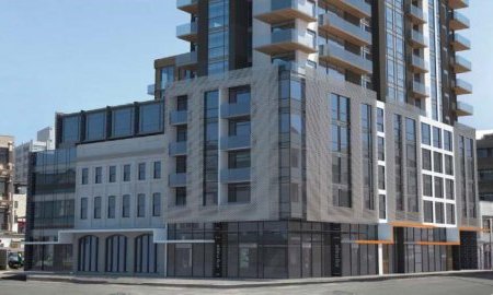
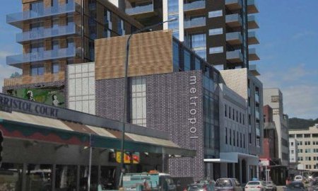
The site, is a highly sought after corner close to Cuba St, right on the edge of Ghuznee St and Leeds St. Looking at architects drawings it seems to be about 14 stories tall. So tall in fact, that in most of the shots the top of the building is cropped out, not quite lost in the clouds, but certainly too tall to show in a landscape format. Or is that just so that the public don’t get to find out exactly how many floors the building is?
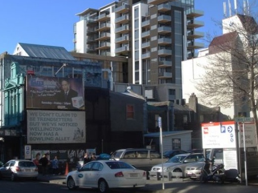
At present, the site is mostly empty – an empty Shackel Motors yard that used to house incongruously inappropriate 4wd trucks for sale, but now hosts a much more appropriate Scooterazzi yard. A building remains in the centre, of somewhat indeterminate age, anda former host to both a nut shop and a brothel – no, really, they are different things. At the back of the site, next to the multi award-winning Hannah’s Building and Hannah’s Lofts, is one of the last remaining woodworking shops in the city, and then a little modernist box splendidly emblazoned with a NEES logo.
Perhaps this development has been crafted a lot more carefully than previous schemes. In the architects own words:
“Set in the vibrant heart of the Cuba Character area, this ‘mixed use’ development covers many aspects of Wellingtons’ modern life. The development through varied design and usage provides retail, commercial, office and a wide range of residential alternatives. The site wraps the existing non listed building on the heritage portion of the site, respecting its size and importance to the local built heritage. The parapet and existing cornice lines are reinforced through the design of the new building adjacent. The relationship to the new is strengthened with the units above being set well back to both the street frontage and the boundary. This reinforces the urban context and framing the existing building. The podium and tower arrangement allow further definition of the streetscape, with reference to the existing local built scale. Whilst the tower fulfils the promise of a varied architecture developed within the site, benefits from the city and harbour views. Nestled in the centre of the site, lies the duplex residential units, topped by a rooftop garden, allowing amenity space for the residents. This continues to break the transitional scale between the building elements and the Cuba street heritage area. An active frontage is maintained by individual entrances to apartment cores and with potential for commercial/retail accommodation that can be broken in to smaller scale units.”
It certainly is in the vibrant heart of Cuba. Largely overlooking the last remnants of Wellington’s so-called Red Light district (umm, Marion St has no red lights, and only a handful of tired transvestites hawking their wares / lack of wears), it is on the edge of (and within) the 43.8m height limit, happily overlooking the masses of smaller buildings in the surrounding area. On the south side of Ghuznee St, the limit is only 27m.This building will have a large shading influence over the surrounding neighbourhood, although that’s entirely permitted under our benevolent Council’s encouraging policy to develop inner city living. The neighbours won’t like it, but there may not be much they can do against it.
I suspect that the Architects have spent a long time working on this project, carefully working it to get both the maximum volume from the site, as much of a setback from Cuba St to avoid shading, and integration with the existing ‘heritage’ buildings. The plight of those incredibly well thought through apartments in Leeds St has been ignored however. But the project is not without some good points: the finishes look varied, and interesting – is it just the render, or are there see-through bricks as cladding? Or is that a mesh fence with brick-shaped proportions?
The sad fact remaining however, is that this building is tragically over-height – while it may (nearly) squeeze within the height zone (taking full advantage of council officer ‘discretionary limit’, no doubt), a 13-14 storey building is going to stand out like the proverbial sore thumb, and looks to be overshadowing a large area of neighbouring buildings to the south, east and west. WCC rules however only safeguard any sunlight to Cuba St at mid-day, despite it obviously being a highly important outdoor area for Wellington throughout the day.
Archaus have had a lot of flack in the past – most of it well-deserved – but when they put their minds to it, they can come up with some excellent buildings. Their work on the Kate Sylvester shop in lower Cuba St and the new Porsche / Audi showrooms on Cambridge Tce (based directly from the Porsche / Audi manuals on showrooms, and apparently therefore a virtual replica of one in Australia, but still excellently presented), the Boatshed Apartments at Herd St / Chaffers Marina are all good quality productions, although some, – ok most – of their designs for apartment buildings have been shockingly bad.
Not surprisingly, a number of the Archaus apartment projects have not gone ahead, the easy-money crash happening just as the projects were going to market. However, a number of their investor-focussed, low-budget nightmares are sadly still going ahead – the old Forest and Bird site having been cleared in time for a dreadful Merge development, and an odd timber floored structure ascending on Vivian St. In Auckland, last week a developer was saying how there was unlikely to be another apartment building started for the next 2-5 years. In Wellington, we’re clearly different: this is the second launch in a week, and there are more to come. Whether this, or any of the rest, will actually come to fruition, is going to be interesting to see.



I’ve always found it strange that Serepisos (the cheapest, nastiest developer in town) has never teamed up with Archaus (the cheapest, nastiest architects in town)….
There is a reason that they are the most prolific architects around – they do things really quickly with little thought to aesthetics or resolution of the planning. There is no real craft with these guys…. (and cheap fees certainly help also….)
Actually Archaus do seem to have raised their game recently (although the development behind St Marys (?) on Boulcott Street is doing everything to prove me wrong…..)
The Audi / Porsche showroom was quite good, and yes Herd Street looks OK also (although there is a story behind that with Archaus kicked off the project, replaced by Warren and Mahoney, who were then kicked off and replaced by…. Archaus!)
Nice.
I spoke to a developer a number of months ago who said that he has been offered the above site 3 times in the last 3-4 years.
He could never make it stack up financially, no matter how he worked or massaged the numbers.
It seems that the current developers have made it work by including the (nondescript) building next door and possibly also the carpark on the other side of that, and going really, really high….
Design wise, I think the bottom third of this looks really quite good. The height might be a bit much though and it begins to get a bit ugly beyond the first few floors. Hopefully the quality of finished product is good.
Do you know if that 4-floor-section, just above theground floor, contains the offices?
The mixing of materials seems a bit odd. While the apartment main tower bit has a reasonably limited palette, the other portions seem to add a bit to many new colours/textures. This isnt necessarily a bad thing, but it would help to have one or two elements that keep the whole thing a little cohesive. These things are hard to tell in renders though.
Heritage integration seems decent – again, I would have liked a more limited pallet of materials to keep them a little more distinct. It seems they are a caught a bit inbetween wrapping/enclosing the building, continuing/extending it and projecting out from it. In doing all 3 it appears less considered than it could be.
Anyway, thats just my 2cents. I wasnt a huge fan of the curvy concept, this looks like it could turn out well.
Slight update – the Saturday Dompost noted that the development was actually 15 stories tall, but: not to worry, its apparently a ‘green’ building.
Well that’s alright then !
Mobsta, although the development in Boulcott St as shown in the DomPost was not acknowledged as by any particular architect, I don’t believe it was an Archaus project. Very similar to, but not quite their style – in fact, a lot closer to Perry Architects development at the Wellingtonian, than the normal ‘box plus smaller box’ twin bed developments of Archaus. Any confirmation greatly received.
Re the link up with Serepisos, and yes, i’m glad that hasn’t happened – but perhaps its more that Terry S fancies his architecture wild and free, as does his favourite architect Roger Walker. There is something about the mad, flyaway roofs, the crazy angles of walls, carefree placement of windows and exuberant splashings of colour that very few architects can imitate – Walker is one of a kind. His early work was wonderfully expressive, as evidenced by the many Walker houses dotted around the Wellington region, although some may argue his exuberant natural talent hasn’t translated so well to the apartment market.
However, the rumour mill seems to be saying that Walker and Serepisos have parted company for future projects, and that Terry is going to do all his future projects with his ‘in-house team’. We’re not too sure who that might be – probably its not an architect, but a ‘designer’ of some sort, or possibly just Terry’s hair stylist. Again, any confirmation – greatly received.
Maximus,
thanks for your reply.
the Boulcott St development I was thinking of was the one “out the back” of St Marys, with the multi coloured aluminium joinery. Not very nice behind the grandeur of St Marys.
I agree, the other development did seem like the work of Perry Architects. I cannot confirm, but it did seem like their style, (speaking of Perry Architects – they teamed up with Serepisos to give us the Prudential Development. I understand that Perry were dropped / left halfway through which is why we are left with a pretty ordinary box on top – although I do like the little jewellers that fills the interstitial space between the Prudential and its neighbour…..)
Yeah, Terry did have a thing for Roger Walker for a while.
Not my taste. AT ALL.
Walker and Athfield were the enfant terribles of the Wellington Architecture scene in the 80’s – fortunately for us Athfield grew up and is producing work of delight and enriching our urban lives… unfortunately Roger (with all his skills) never quite grew up and now we have to live with his urban follies.
Terry’s in-house design team is lead by Stephen White.
He started Design Zoo way-back-when (ugly rumours about Steve and the Design Zoo at the Dowse recently – not pretty).
He worked at Athfield’s for a while, then formed ‘Design Team’ (I think – on Vivian St – needs confirmation) with David Pawson, then went back to uni to finish his Arch degree, went overseas for a while, has come back, tried to revive Design Zoo (unsuccessfully), and now works for Terry.
He is not a registered architect.
I am happy to be corrected on any of the above.
Mobsta: the building “out the back” of St Marys with the coloured balconies is Boulcott Village, and that’s most certainly an Archaus job.
According to a Skyscrapercity post by WellUrban, the proposed ‘Serepisos Tower’ on Lambton Quay is to be designed by a ‘respected corporate architect’.
Something must be blocking my posts. I’ve checked my filtering software and it’s all clear. Anyhow, here’s my original post, or what I can remember of it:
—————-
Mobsta: the building “out the back” of St Mary’s Church is Boulcott Village, and it’s most certainly an Archaus job.
On Skyscrapercity.com, WellUrban posted that the proposed “Serepisos Tower” is to be designed by a ‘respected corporate architect’. (http://www.skyscrapercity.com/showpost.php?p=14016626&postcount=86)
Deepred, that box-like thing with yellow and red balconies is by Archaus? That truly is sad.
Perhaps its just as well that the new building is going to cover it up then?