In a break away from discussing the whys and wherefores of a proposed small road to the north of Wellington, lets return for a moment to the heart of the city to present and discuss a building proposal by The Wellington Company.
The building, designed by local architects Architecture +, is proposed as the new home for Telecom in Wellington, as reported by NBR and the DomPost earlier this week, although in typical non-helpful fashion, neither acknowledged who the architect was.
Also being marketed recently are glassy new proposals situated between Lambton Quay and Kate Sheppard Place, just next to the bus-station, which are an update on a previous scheme, by the same architects, as originally reported almost a year ago by WellUrban. Some hillside dwellers aren’t going to be getting much sleep if all these projects come off…
Telecom have been on the hunt for some time for a new base in the capital, to concentrate their staff – at present distributed in several buildings around Wellington, including on Jervois Quay and also in Tory St. Those avid property watchers amongst us will have noticed that Ian Cassells, head of the Wellington Company, bought the Tory St buildings some months back, and so probably has a good handle on Telecom’s needs.
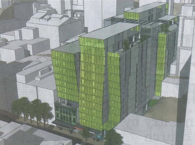
The building site, stretching from the Willis St New World Metro, all the way back up to Boulcott St by Antrim House, currently has some ‘relocatable’ apartments of hideous design up by Antrim House which will be removed to make way for the new ‘twin tower’ concept. It appears from the one grainy sketch leaked so far that the new building will sit on top of 50-52 Willis St as shown here, and probably swallow the old Airways House whole. That still leaves room for another building also rumoured, to slip into the void at 28-38 Willis St just to the north of this site. Munns Menswear are at 22-26 Willis St, well clear of this site. More on Cassell’s Telecom coup here.
The building as proposed progresses on from Arch Plus’s previous work at Conservation House in Manners St, where they refurbished the tired old carcase of the former badly designed movie hall, and have turned it into an environmentalist’s wet dream. In Doc House, filled with chilled beams, stylish wooden battens, and the smallest waste baskets you have ever seen, the only touch of conservation missing is a few tui flying around, although given that DoC are prone to shooting off pukeko and the occasional extremely rare takahe, perhaps its all for the best. Its also a good fit for Cassells and company, as he’s keen to recycle and reuse wherever possible, to excellent effect at DoC and to lesser success in places in Cuba St.
The drawing as shown here certainly doesn’t do it justice, and indeed I’m not sure that the amount of press coverage was planned. The snaky green panes of glass, waving in and out on the facade seem to be the trick de jour, no matter who the architect is. Of interest in the finished building will be a potentially giant atrium, rising possibly 12 stories up from ground level where currently exists only deep plan gardens and retaining walls behind the existing shops. With a bit of luck and good management by the consenting authorities, a through walkway and publicly accessible lift up to Boulcott St should also be available. That’s one of the great things about Wellington – the enforced cooperation of large commercial tenants to share their hill-climbing vertical transportation with the general public.


Cassell’s is a pretty clever guy.
Prior to developing Environment House he purchased DOC’s headquarters on Boulcott Street. He then offered them cheap (free?) rent, no ‘make good’, and other incentives to move to the new building on Manners Street….
So then he owns this development site on Willis/Boulcott Streets and then he buys Telecom’s buildings on Tory Street….
Anyone else see a pattern here….?
All credit to him. He’s going to do a development in a monetary environment where other developers (and financiers) are getting cold feet – by engaging in some very clever thinking.
Also much respect for employing Architecture+.
Stuart Gardyne is one of Wellington’s top architects and does some beautiful and well considered work.
It makes a change from those awful Archaus or Ignite developments that sprout like mushrooms across our beautiful city.
what’s the old buidling they are retaining (or at least the facade)? – the vault design store?. Are you sure this is the New World Metro site?
The original post is a bit wrong. New World Metro is to the left of the trees on the picture. Arthur Toyes Fabrics is behind the trees. And yes, looks like it will be leaping out of the roof of the Vault (heritage listed building).
Yes, guy is right – my wording was wrong – I miss-wrote, as Hillary might say. The building to the left of the green giant is the black painted apartments at 60 Willis, with the little rooftop apartment flying above. Looks like they’re going to lose their view north.
Its an interesting side effect of the Chews Effect – everyone is clambering to be in the centre of it all, much like a Key/ Clarke dive for the political centre. There actually used to be a great view out from this site, but any sea views will be mostly taken out by the Chews Apartment tower going up now. This part of Willis St, already busy, is going to get a whole lot busier…
I’d be keen to know who or what is going to go in the next site north – the blank site, possibly owned by a Singaporian company, if Skyscraper city rumours are correct.
Anyone know?
It is owned by a Singaporean company.
They also own The Grand and the building on Boulcott Street also.
It is all managed by Jones Lang LaSalle on behalf of the owners.
An Auckland architecture firm – Clark Brown Architects – have designed a tower for the site, and Creative Spaces have been charged with refurbishing the retail mall.
However I understand that it has been put “on hold” for a while.
Clark Brown have done some good stuff, and some OK stuff in Auckland.
So was this sketch(up) just a very early concept, or the proposed design as-is?
The roofscapes featured in the right of the render look interesting, its a pity they seemed confined to only a small terrace or two. It would be nice to see a true green roof around Wellington.
The atrium and public lift also sound promising. Wellington elevators tend to get co-opted by the public, especially around oriental bay and the terrace. It would be great for someone to see this thoroughfare used as an opportunity.
Any news on the development of the current telecom building clusters? Im hesitantly curious to see how the site is going to be transformed into an ‘urban green village’.
I’m guessing this is just the first stage, with the retail and office component being built first. At a first glance Willis Central looks like it has a modular structure, with the provision for apartments to be built on top, in keeping with the vertical village concept.
Am I the only person to find this design really weak and child-like? The wavering facades are as if the designer could not make their mind up, and the junction with the very dignified building that houses the Vault is oppressive and hugely clumsy. Ye gods, that’s the most insensitive junction i’ve seen since Britney was snapped getting out of that limo.
There is also a gross simplification of the sunlight coming into the street in this picture, with sun streaming into the east facade, and reaching down to Willis St. I do hope that the architects have not been using such blatant misrepresentation on their applications to the city. What is wrong with the picture (let alone the design) is that the sun is high in the sky, coming from the south (shadows are being cast on the north side of elevations, which is just 100% wrong), the shadows and indeed the buildings themselves are missing from the north and east. For a start you’ve got a number of existing buildings of not inconsiderable height directly on the other side of the street, including the brand new / under construction hideous Chews Lane apartment complex straddling the lane directly opposite.
So apart from this appalling render, you’ve also got issues that Willis St, one of Wellington’s busiest and sunniest shopping street, is going to be further plunged into gloom by this proposal. A lot of previous buildings were from the 60s era, when podiums were compulsory, and so the towers are set back from the street facade line. But this little green troll of a design has 13 stories straight up from the street, and even has 11 floors tilting out into the street over the pavement – into what presumably is public territory.
This part of Willis St at present is a pleasant, sunny, and enjoyable part of the city, with the current setbacks allowing midday and afternoon sun to stream into the shops here. All that would be lost if this design went ahead. Time for a definite rethink ! And a realistic render with all the real buildings in place, not this travesty of a marketing deception.
I hate this building. Waste of space, what happened to the vertical village concept? Not happy at all.
Really messy form-making too… a confusing arrangement of shapes and unsurprising material choice.
The building is broken/funked up for what reason beyond disguising blandness?
The central cross-cut (louvres?)and ground-level grass might be interesting although it appears to be quite thin and is kind of shyly absorbed into the glutinous mass.
It reminds me a little of the giant rogue adenoid in ‘gravitys rainbow,’ minus the humour.
Pretty confusing really… As so little information is provided, i wonder if this is still in early concept development?
And why is green glass so ubiquitous suddenly?
Nick: grass? Where? Surely not.
Has potential, but maybe this is just a quick, hey look you can fill in this site, not a fully considered proposal… looks pretty rough so I’d assume/hope so.
I’d like to have seen a more consolidated development there with a pedestrian lane up through to Boulcott, and perhaps some kind of plaza in the middle servicing all the buildings.
No comments from the architects yet – they could always send us a plan (hint, hint)…
But at a guess, the fragmented nature of the facade has evolved from the retention of the existing Airways House as a concrete framed shell, with separate structures both north and south of that to fill up the rest of the site. Its then been transposed across the central atrium to reflect a different logic on the Boulcott St side, possibly relating to the ground layout there.
Between the two there is a massive concrete retaining wall and ledge that the current temporary housing sits on. It looks as though the atrium will use that to scale up from Willis St to Boulcott.
Can be seen here in a post on Skyscraper City
http://www.skyscrapercity.com/showpost.php?p=19955268&postcount=569