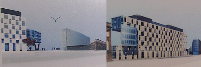
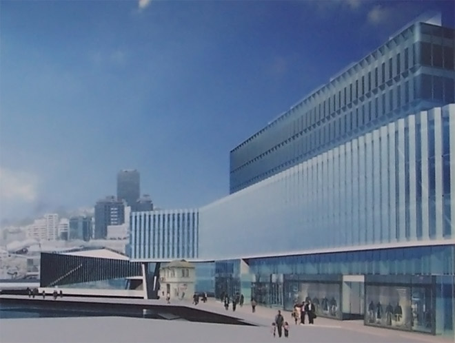
Having finally made my way down to the Waterfront Information Center, I was able to take more of a broad look at the Athfield Kumutoto wins. The pictures and write-up shown in the Dom really don’t give a full idea of the scheme, so here is something of a brief second look at the project. Apologies for the poor picture quality, need to start getting us those press releases….
For me, the biggest reveal was the city-side façades. Site 10 adopts a fenestration patterning similar to that used by the near-by BNZ waterfront project, but breaks the mould by adding a curious glass volume on the North-East side. This glass box seems to extend on from the middle section of the building, as well as linking the upper and lower portions. Almost impossibly thin, the purpose of this small projection is unclear. Surely it is too narrow to be more office space, a space for eating or admiring the view perhaps? Its hard to tell with the current renders, but it could be a dramatic addition to an otherwise unexciting elevation.
The treatment of the ground floor seems somewhat uninspiring. It uses the same pattern as the other floors, but stretches it slightly to make-up the extra height. Although the retail developments are only being placed on the water-side, it still would have been nice to see some more detailing on this elevation; perhaps giving emphasis to the corridors that traverse the building or possible view paths through to the water .
At site 8/9, Waterloo Quay is offered a slightly bent glass curtain, overhanging a dark base. Perhaps the fossil has been put on display?
The glass along the middle of the Site 10 building has something of an angled-undulation pattern, a palisade-like effect that should serve to delineate the span and produce some interesting reflections.
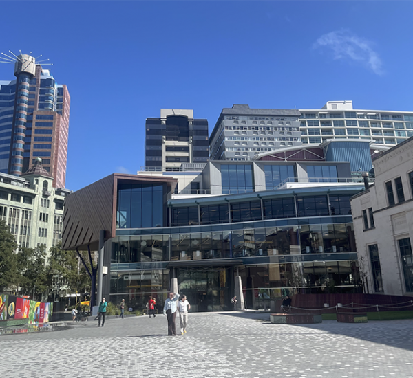
In the renders the buildings seem somewhat disconnected from the immediate pedestrian environment, but this should be resolved by some quality urban design – the nearby Meridian energy building sets a precedent with its unique and functional street furniture, infrastructure and landscaping. It definitely goes a long way to promoting the active edges of the building, creating a habitable (rather than purely transitional) area and developing something of a unique character of place.
Between The Fossil and The Rock, it seems Wellington is starting to become something of an amateur geologist. More on this later perhaps.


I have to say, on seeing these images for the first time, that i am deeply, deeply unimpressed. It all just looks so boring! I fail to understand why this was so impressive to the judges.
A bad patchwork quilt that is already a copy of a copy, and then an ugly podium that looks as near as dammit the same as the ugly podium on the much reviled NZ Post building it is trying to hide! And, by the look of it, a massive blocking out of the view shaft. Totally ludicrous decision to run with this scheme – these schemes. Any explanation why this was selected?
oh that’s really interesting!
I am doing a Geography project on this subject, so any information like this is great, thanks!
I agree Maximus – the blocking of the viewshaft is a travesty.
What the planners are thinking, letting this go ahead when this is the very thing they rail against…?
There are models at the info centre that make some things clearer, including the likelihood that the actual “fossil” bit (sites 8/9) will create quite a good edge for Kumutoto Plaza. On the other hand, this plan almost completely gives up on Waterloo/Customhouse Quay, with no real active edges to them at all.
The “impossibly thin” glass box shows up on the plan as part of the continuous office floors, and while it could probably hold a few workstations, it seems more likely to be intended for meeting & breakout rooms. While the “crane” bit protrudes into the Whitmore St viewshaft, it certainly doesn’t block it, and if handled well it could be a valuable part of the viewshaft’s composition.
It’s quite possible that what impressed the judges most was the commercial buildability and amount of floor space on offer, rather than any aesthetic qualities.
Briefly for now:
– If you look at the other entries, only a couple of them seem to be actually viable/buildable.
– Which viewshaft were you referring to? There’s a viewshaft diagram in the proposal:
http://img258.imageshack.us/my.php?image=1008870kq7.jpg
It doesn’t show the bit that overhangs out onto the water, but that bit is elevated by a few floors, so there should be something of a view.
There are models at the info centre that make some things clearer, including the likelihood that the actual “fossil” bit (sites 8/9) will create quite a good edge for Kumutoto Plaza. On the other hand, this plan almost completely gives up on Waterloo/Customhouse Quay, with no real active edges to them at all.
The “impossibly thin” glass box shows up on the plan as part of the continuous office floors, and while it could probably hold a few workstations, it seems more likely to be intended for meeting & breakout rooms. While the “crane” bit protrudes into the Whitmore St viewshaft, it certainly doesn't block it, and if handled well it could be a valuable part of the viewshaft's composition.
It's quite possible that what impressed the judges most was the commercial buildability and amount of floor space on offer, rather than any aesthetic qualities.